
Flaming
The foregoing posting appeared on Joe Clark’s personal Weblog on 2010.01.15 13:23. This presentation was designed for printing and omits components that make sense only onscreen. The permanent link is: https://blog.fawny.org/2010/01/15/bootied/
Was Tara Ariano ever Canadian?
Gratuitously irascible Tara Ariano was a pioneer at using the Internet to profit from other creators’ free contributions and inflate pageview numbers. A career founded on recapping American TV shows reached such flower that she and husband David Cole sold Television Without Pity to Bravo, though without finally revealing why its name had been changed from the original MightyBigTV. (And did you know she was also Paul Tough’s secretary for a while?)
Selling out to New York is a dream come true for many local cranks, but it is a mountaintop on which few Torontonians have planted the Stars and Stripes. It became apparent to Ariano and Cole in August 2008 that they “wouldn’t be moving out of New York,” as though some kind of visa had been denied them. This was nearly a year after their “permanent place [became] ready,” though that period would have been your narrow window of opportunity to stare through their windows.
What does Ariano miss about Toronto? There’s a list of trifles, but here’s the nut: “[T]he plentiful Simpsons reruns on every channel.” Because that’s what Toronto’s got going for it.
Ariano isn’t a “success story,” like Tough; she is not a victim of tall-poppy syndrome. She’s something much simpler: A sellout. Shall we examine her terribly clever new minisite (revealingly enough, a Tumblr), entitled Look at This Fucking Idea for a Blog-to-Book Deal?
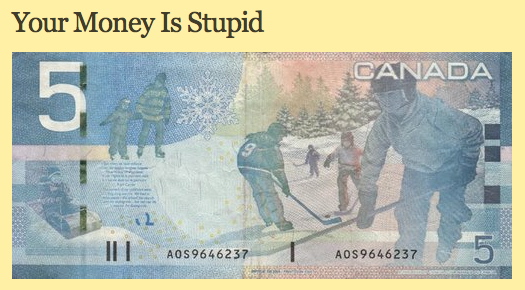
Indeed “your” money is stupid, because Ariano’s money always was and always shall be the greenback.
Was Tara Ariano ever Canadian? Or did she simply live here until, at long last, she could repatriate to the land where she always belonged?
The kind of people who – unaccountably – can stomach Ariano’s general ethos tend – also unaccountably – to offer her gigs. With her luck, Ariano is due to land Kate Lee as an agent. Then things will really go downhill.
The foregoing posting appeared on Joe Clark’s personal Weblog on 2010.01.12 16:08. This presentation was designed for printing and omits components that make sense only onscreen. The permanent link is: https://blog.fawny.org/2010/01/12/sellouts/
‘The problem section’
Esteemed colleague C. Sicha:
You are also definitely familiar with the Problem, which… is what gets pitched in a meeting or in an E-mail, and sometimes accidentally ends up in a piece…. It’s fine if you have to get some hook to get the editors to cover something that is maybe outside their comfort zone. Leave it there!
Something else you can leave behind: Historical digressions in books, especially books derived from blogs. When I opened Regret the Error, I expected more and better analysis of newspapers’ mistakes, not tens of pages of padding about how newspapers of yore handled the problem.
History sections are rote additions that fill a book to Costco size. They show the author put in time at the library. I’d prefer something original, and would pay the same price for a shorter book that gave it to me. Writing short is difficult and adult; regurgitating research is child’s play. I’ll pay for real effort.
The foregoing posting appeared on Joe Clark’s personal Weblog on 2010.01.12 14:18. This presentation was designed for printing and omits components that make sense only onscreen. The permanent link is: https://blog.fawny.org/2010/01/12/historical-digressions/
Surely you understand by now why comments are a bad idea
If not, have Simon Doonan decorate your house for Christmas. He’ll tell you.
Now that the dust has settled and the homicidal E-mails have slowed to a trickle, I realize that I owe [some right-wing asshole] a debt of gratitude. By dropping the First Elf in the poop, you have unwittingly provided me with a searing insight into the pathetic and disastrous state of our comment-obsessed culture. Thanks to you, I see now that there are two kinds of people in the world: In the first group, we have those who do, and in the second group, we have those who sit at their computers on their ever-widening asses blogging, platforming and commenting on the not-always-perfect efforts of the first group. Tinselgate has renewed my commitment to keep my tight ass fairly and squarely plonked in that first group.
The foregoing posting appeared on Joe Clark’s personal Weblog on 2010.01.12 14:05. This presentation was designed for printing and omits components that make sense only onscreen. The permanent link is: https://blog.fawny.org/2010/01/12/tinselgate/
What’s your publisher done for you lately?
According to a tendentious, borderline dishonest Jonathan Galassi, the publisher of your book:
- Picked a font for you. (Any of about ten fonts, most of them ill-drawn outline versions of old hot-metal faces. No mention of actual book design or typography, which always happen by rote, usually in Quark and often in Quark for Windows.)
- Offered several rounds of line- and copy-editing. (Not anymore.)
- Commissioned and published cover art (for which they have limited reproduction rights, not ownership).
- “Produced” large-print and audiobook formats. (The copyright owner has the exclusive right to produce those – that is, authors grant such rights to publishers. Publishers only occasionally bother, so the claim that this is in some way commonplace is a falsehood. Others have the right to create alternate formats without asking permission.)
All of these are formats. To Galassi, each is additionally an “edition”: “For each book, Random House exploited its edition in every then-conceivable format” (emphasis added). The publisher has rights to all editions and formats, Galassi implies. It does not; the author holds all rights and merely agrees to grant some of them to a publisher. (Alternate formats excepted.)
What this guy is really saying is that something as rudimentary and mechanical as checking an author’s spelling confers rights to the publisher functionally equivalent to the author’s. (Line-editing constitutes a derivative work.) The publisher becomes coauthor just by helping the author out. It only stands to reason, then, that the publisher gets to use every “edition” (or its fraternal twin, every “format”) to make money off the author’s back.
Not so fast, Jonno. There’s a word for this and it’s “copyright infringement.” Or, if that’s one word too many for you, try this one on for size: “Hubris.”
See you in court?
The foregoing posting appeared on Joe Clark’s personal Weblog on 2010.01.12 13:52. This presentation was designed for printing and omits components that make sense only onscreen. The permanent link is: https://blog.fawny.org/2010/01/12/galassi/
A digital magazine is not quite a ‘Web site’
[T]ablet-optimized publications will find themselves regarded by consumers as just another Web site, and the proprietors who thought they had a new, impregnable platform from which to sluice profits will be right back where they started – one site struggling against many.
As I have described already, the executives who are piloting the magazine industry into the mountainside believe a “digital magazine” should be published in a proprietary format (using a proprietary reader or software) and should be composed of “pages” that “flip.” While these people are enemies of the medium, they will eventually be fired or simply cause their companies to go bankrupt (in both cases leading to great risk of failing upward). Or, like many other Boomers, they’ll just have a heart attack and have to retire early.
Meanwhile, there is at least some articulation of a rational future for the magazine. A digital magazine may indeed be expressed in a form of HTML. No other kind of structured markup is really viable; HTML has had a decade to prove it is good enough. HTML is bereft of many structures magazines genuinely need, but its markup is expressive enough for magazine articles and illustrations, among other things.
Hence a digital magazine may be a “Web site” when viewed in a browser, or may be a form of rendered markup when viewed on something else. Cases in point: ePub, DAISY, iTunes LP. Note how the first two of those formats solve the problem of collating related articles into one unit, a defining characteristic of a magazine or newspaper.
At some point somebody other than me is going to notice a few problems with this scenario.
- Distractibility. Cory Doctorow is – uncommonly – quite correct in noting that any E-book or E-text reader with a net connection leads to distracted reading. You’re just one touch away from checking your E-mail or moral equivalent. Any reader with a net connection becomes a Web browser or, in essence, a netbook.
- Intrusions. Even highly-standards-compliant code can render hideous animated advertisements. Advertisers never bother with such niceties and use the most intrusive technologies available, like Flash. This alone is an argument against Flash support on any kind of reading device. Your digital magazine will be festooned with blinking, moving, shouting advertisements.
- Malware and spying. A platform that permits Flash may permit executable files of other kinds, installing malware on your device behind your back. At the very least your reading habits will be tracked and reported. (We already use this for benign goals, as by installing a 1 × 1-pixel Flash application to check whether or not you’re using a screen reader.)
The foregoing posting appeared on Joe Clark’s personal Weblog on 2010.01.12 13:23. This presentation was designed for printing and omits components that make sense only onscreen. The permanent link is: https://blog.fawny.org/2010/01/12/md3/
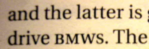
1 ≠ I
(UPDATED) It’s great that Al Gore noticed a ranging-figure 1 in Brioni was hard to read.
-
It’s hard to read because of the fake bullshit rule that acronyms have to be typeset in small caps, even if they’re 21st-century acronyms that also include numbers. (Or subscripts.)
-
This nonsense, promulgated by snobs like that bore Bringhurst who have not read anything written after Jane Austen croaked, ostensibly improves typographic colour. What it actually does is inhibit reading: Acronyms are not regular words. All-small-caps setting fools the reader into thinking an acronym is a real world. That discomfort you feel is a reverse fixation you underwent trying to reread the word.
This was always a bad idea, but it’s much worse with abbreviations that mix case (ATypI) and, indeed, with alphanumeric abbreviations (H1N1). Then what happens when you pluralize one of those? Plural s is almost exactly the height of the small caps.
(The foregoing is the work of a reliable producer of typographic mishmash, Mark Fram.)
-
Or there’s the equally nonsensical habit of using small caps solely for word-pronounceable acronyms, some of which are mated to acronyms you read letter by letter.
(Still think it makes sense?)
-
If you’re even more half-assed and are using fake small caps, as all the major American houses do, you don’t have a leg to stand on.
What works nicely, though? Knock the size down a point (UPDATE: As in Actium), add a few units of tracking, and equalize spacing. Or don’t do anything. Typesetting a postal code? You have no choice but to use capitals and lining figures, unless you want people to try to pronounce “M5W 1E6” or “FIQQ 1ZZ” as a word.
Use of small caps for acronyms and abbreviations is a surefire indication your compositor is a snob who should stop acting like acronyms are dirt to sweep under the rug.
An oldstyle 1 that looks like an I is a mistake. Let’s not propagate it into the digital future, shall we? It’s like mangling a surname at Ellis Island.
I call for a cabinet shuffle
This addition will come much too late for the 7,000 of you who visited via links from important Web sites. You will never see this correction; the last word you will have read is Ministry of Type’s. You’ll think he gave me one hell of a zinger, and with such class, too. (Save for one point: Ægir Hallmundur has the audacity to accuse me, a stalwart defender of online civility, of “trolling,” which itself demands an apology when I am next in Brighton.)
Substantively, though, he insists that
Clark provides some examples which at first glance seem to support his argument, but a little thought reveals them to be mere examples of ill-considered typography rather than a crushing blow on the use of small caps.
I proved – with pictures, no less – that small caps for acronyms do not work for acronyms that aren’t pronounceable words or that contain nonalphabetic characters. Everything save for NATO and AIDS, I guess, though I expect Hallmundur is under the influence of the British tradition of writing same as Nato and Aids. (Hence for British English, small caps for the categorized acronyms never work.)
I don’t know my esteemed detractor from Adam, but I know Bringhurst better than he does. I’ve read his books, including that asinine volume of aboriginal apologia that claimed oral histories are books. I’ve seen him lecture. Robert Bringhurst is a crashing bore, and his advice is often plainly wrong when not also outdated. Seriously: Not every snippet of typography is all about the golden ratio.
Here is what happens with Bringhurst’s readers
It is more or less what happens with Ayn Rand’s readers. At a vulnerable age, the picked-upon nerd discovers the sacred text of the philosopher-king. It provides a transformative view of the world: So this is how typography (or civilization) should have worked all along!
The nerd, still a 98-pound weakling in other respects, now feels he has an intellectual head of steam with which to take on the world. He feels better than everybody else. Henceforth his acronyms shall be small-capped and his economics selfish.
There are a couple of differences to point out here.
- One is that Randroids tend to grow out of it in their late 20s, right around the time they stop smoking pot and start accumulating credit-card debt.
- The other is that I too went through a stage indistinguishable from this Bringhurstian indoctrination. Except I got over it when I was 17. This is what happens when you’ve been reading about typography for thirty years. What’s new to you whippersnappers I know has been done to death already.
Bringhurst brings a chamber-orchestra sensibility to typography. Any musical form that came along afterward is mere noise against which the shutters must be drawn. Bringhurst’s advice takes its lineage from the typography of serious literature and scholarly nonfiction – but it is hot-metal typography, now more than a century old and no longer in use. I should know: I was the teenager who lugged home Methods of Book Design so many times the library should have just given it to me. (Its advice was functionally Bringhurstian.) But since then, some of us have upgraded. You should too.
Shall we return to the Minister?
Setting acronyms in small caps does work well in a large number of cases, and it does indeed improve page colour, thereby reducing distractions to the reader,
who is not reading the colour of the page.
Ever notice how skimpy the examples are in these Bringhurstian tomes? One or two acronyms in one or two lines of text? Or a reduced image of a full page? The small-caps-for-acronyms theory is about graphic design (page layout) and is not about typography (type for reading).
It also hasn’t been battle-tested. Being a standardista assists in typography; we can use markup to count structural elements (without recourse to difficult regex). My first book contained almost 300 marked-up acronyms and abbreviations. Typical, you might say, for a technical book, but people read technical books; Jane Austen ain’t everything. My WordPress blog posts have used 270 abbreviations and acronyms. And that’s just part of what I write – even my second book, manifestly nontechnical, used such structures.
Alongside this output are the 200 books (and countless periodicals) I read every year, and my 1,659 RSS feeds. Put all this together and what I’ve got is evidence, not theory. And I back it up with pictures.
So: Bringhurst and his Randroid-like acolytes may insist small caps for acronyms makes pages look better. Let’s say they do (but so does gold leaf). Those pages read worse in real-world cases. I have informed reason to say so. I’m right and Bringhurst is wrong. (Or just irrelevant.)
Articles like this promote a dichotomy, an idea that this way is right and that way is wrong[.]
Taken to its conclusion, all this means is “Do whatever you feel like.” How about “Don’t do what we know doesn’t work”?
Too obvious?
Ministry of Type, I call for a cabinet shuffle.
The foregoing posting appeared on Joe Clark’s personal Weblog on 2010.01.11 14:37. This presentation was designed for printing and omits components that make sense only onscreen. The permanent link is: https://blog.fawny.org/2010/01/11/goreschoice/
‘Stale Roles and Tight Buns’
Berke Breathed (1983):
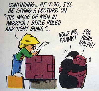
Katie Roiphe (2010):
[T]he sexism in the work of the heirs apparent is simply wilier and shrewder and harder to smoke out. What comes to mind is Franzen’s description of one of his female characters in The Corrections: “Denise at 32 was still beautiful.” To the esteemed ladies of the movement I would suggest this is not how our great male novelists would write in the feminist utopia.
The younger writers are so self-conscious, so steeped in a certain kind of liberal education, that their characters can’t condone even their own sexual impulses; they are, in short, too cool for sex. [Oh, come on.] Even the mildest display of male aggression is a sign of being overly hopeful, overly earnest or politically untoward. For a character to feel himself, even fleetingly, a conquering hero is somehow passé.
More precisely, for a character to attach too much importance to sex, or aspiration to it, to believe that it might be a force that could change things, and possibly for the better, would be hopelessly retrograde. Passivity, a paralyzed sweetness, a deep ambivalence about sexual appetite, are somehow taken as signs of a complex and admirable inner life.
Male writers aren’t the only ones being dishonest. Roiphe is hedging her bets here and ends up being untruthful. Sensitive hetero guys think being a hetero guy is sexist. They think being a guy is sexist – that the true and ultimate nature of humankind is that of the enlightened liberal female. Guys like these end up as sensitive writers, not bricklayers. Who do you think gives a girl a better rogering? (Just the word “girl” is sexist.)
What’s almost as pointless as a bottom with nine inches uncut? A novelist with nine inches uncut.
Meanwhile, pace Michael Cunningham, sex is difficult to write about because “the English language actually deserts you.”
The foregoing posting appeared on Joe Clark’s personal Weblog on 2010.01.08 13:13. This presentation was designed for printing and omits components that make sense only onscreen. The permanent link is: https://blog.fawny.org/2010/01/08/sexless-novelist-dudes/
Ben Hammersley’s useful precedent
You should be more of a fan of Mr. BEN HAMMERSLEY, variously an author, exhibited photographer, RSS authority, war correspondent, and second-in-command of Wired U.K. What will he do next? Hammersley has learned the secret of all accomplished people: Leave a good job early and do something different. I view him as a kind of Renaissance man and have told him so. I was shocked when he wrote back and said, in effect, “No, I’m not. You are.” Such flattery, while bullshit, was devastating.
I can recommend Hammersley’s ongoing series on the the complexity of converting legacy formats, like books and magazines, to digital formats. The term “format” has different meanings in that sentence. I think about the issue a lot. When doing so, mostly I rail against managers and self-styled experts in the publishing industry who are so fucking stupid they can’t run their own Windows XP boxen, let alone rescue their dying industries.
Established readers will evince no surprise when I reveal a few habits I consider dead giveaways – top-posting and, for book composition, the use of any or all of fake small caps, hot-metal typefaces from two centuries past, and nospace-emdash-nospace. These kinds of people don’t know what they’re already doing and, like a lesbian without a project, are a danger to themselves and society. They run, and ruin, the publishing industry. [continue with: Ben Hammersley’s useful precedent →]
The foregoing posting appeared on Joe Clark’s personal Weblog on 2010.01.07 15:16. This presentation was designed for printing and omits components that make sense only onscreen. The permanent link is: https://blog.fawny.org/2010/01/07/booksemantics1/