As I wrote last time, “The entire feel is so banal I’m already bored talking about it.” Aren’t you too?
The nav sucks
It’s a 2001-era idea of site navigation.
Top nav is a bunch of images that indeed do look like ads. The type is merely pictures of text instead of live text that expands and contracts when you zoom the page. (But they prove they know how to place live text on top of an image in the Gallery section.) Newsflash: The entire bounding box of the image as well as the text can expand and contract if you know what you’re doing or hire somebody other than your wife to design your site.
Why is the first link on the page “Subscribe to RSS” when, first of all, it isn’t the most important thing in the world and RSS is already located where it should be, inside HEAD?
Is the search box a searchox or an advanced-search box?
A list of 11px text is not what I’d call a left navbar.
Can’t these people learn to typeset an arrow?
Another newsflash: This isn’t US-ASCII text we’re dealing with here and >> isn’t an arrow.
Who the hell cares about your Twits?
Twitter is exactly the opposite of what Design Observer ostensibly stands for – intelligent, ideally longform, design “criticism.” The fact that they’re even using Twitter shows they are merely fashionable and Web-clueless. The fact their Twits are included right on the homepage shows they aren’t serious about their own mission.
In short, they don’t know what the fuck they’re doing. They’re print people who think they’re important creating a Web site they think is important.
I give up
These people suck. They’ve got the wrong ideas and they can’t even execute those well. Design Observer is run by a clan of well-paid design oligarchs who would still have flourishing careers if the site shut down tomorrow. But its longevity, like New York’s, relies on an unending influx of youngsters who don’t know what they don’t know. What I don’t understand is why these youngsters, who should natively understand the Web, fail to notice Design Observer doesn’t.
Select a category to see additional posts. Add feed/ to a category to subscribe via RSS
The foregoing posting appeared on Joe Clark’s personal Weblog on 2009.08.18 12:33. This presentation was designed for printing and omits components that make sense only onscreen. (If you are seeing this on a screen, then the page stylesheet was not loaded or not loaded properly.) The permanent link is: https://blog.fawny.org/2009/08/18/mock-do-3/
Mike Rundle, using Twitter for its true purpose, hyperefficient cyberbullying: “Kind words from Joe Clark? Did I read that right?”
The only thing I ever wrote about Rundle on this site was, in fact, rather kind:
Mike Rundle, it turns out, is built like a brick shithouse and responded to my query “What’s it like being stocky?” factually and without irony. (“I prefer ‘thick.’ ” Who wouldn’t?)
His friend called me a racist and I called his friend a liar, which he was. Rundle now maintains the miconception that I “had negative words for [him].” Well, I didn’t before.
Select a category to see additional posts. Add feed/ to a category to subscribe via RSS
The foregoing posting appeared on Joe Clark’s personal Weblog on 2009.08.14 15:46. This presentation was designed for printing and omits components that make sense only onscreen. (If you are seeing this on a screen, then the page stylesheet was not loaded or not loaded properly.) The permanent link is: https://blog.fawny.org/2009/08/14/mike9r/
So yeah: That’s Helvetica or fake Helvetica set solid on a widely deprecated px size (though such deprecations are almost irrelevant due to page zoom).
So: You’ve got mandatory Arial heds on your Helvetica (or, quite possibly, Arial) body copy.
blockquote? Undefined.
Paragraphs? Design Observer subscribes to the Microsoft Word school of “formatting”: Type some text, Return Return, type some more text, Return Return. Continue until end of document. This MS Word style is increasingly found in typeset books, viz most anything from O’Reilly.
Two simple things you can do to improve onscreen readability, neither of which D.O. does:
Reduce interparagraph spacing. (Having no space at all between grafs works poorly. I don’t understand the reasons why. It has something to do with skimming, I expect. But if you’re going to do that, you need giant leading.)
Indent paragraphs following other paragraphs. You need but one single line of CSS to do it: p+p {text-indent: 2em;}.
I’m aware that barely anybody else does this. That’s why you have so much trouble reading other people’s sites.
Design Observer’s body copy looks like Netscape’s browser defaults circa 1997, except in a sansserif font.
Think of any of the standardista designers you see at Web conferences. Would any of them let this kind of CSS out of their own shops? Oh, but wait. Though Design Observer is run by a well-off cadre of established graphic designers, they refused to pony up for outside design services. Here, established print designer Jessica Helfand (again, married to one of the site’s owners) decided she was up to the task of a stem-to-stern Web redesign. Look how well it turned out. Should doctors really be diagnosing themselves?
Given that nearly 100% of Design Observer’s readership uses a browser capable of displaying them, why aren’t they using Webfonts of the @font-face variety? If ever there were a natural home, this would be it.
The entire feel is so banal I’m already bored talking about it. There’s so little actual “design” on the page that it mostly boils down to a splash of colour. The same colour. Over and over again.
Select a category to see additional posts. Add feed/ to a category to subscribe via RSS
The foregoing posting appeared on Joe Clark’s personal Weblog on 2009.08.14 14:29. This presentation was designed for printing and omits components that make sense only onscreen. (If you are seeing this on a screen, then the page stylesheet was not loaded or not loaded properly.) The permanent link is: https://blog.fawny.org/2009/08/14/mock-do-2/
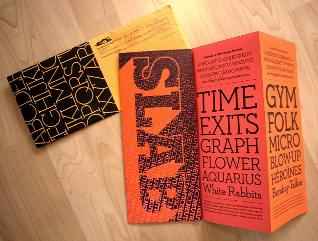
Here is House Industries’ latest mailing, on Neutraface Slab:
(Sent, incidentally, from Zurich.)
House Industries (q.v.) is an entirely independent typefoundry and design shop located just off the highway from the middle of nowhere in Delaware. It was founded by, and is run by, a bunch of cool dudes. It is a very guyish shop, but these are painstaking and exacting kinds of guys, not slobs. (They’ve hired a few women over the years. But this is not a female æsthetic in any sense.)
I’m not sure it is possible to name a design operation with higher standards, at least if we’re considering shops smaller than Pentagram. Even though half its typographic output harkens back to hot rods and Planet of the Apes and cheesecake calendars, this is a first-class operation all the way. There is no such thing as a half-assed House Industries product. (Unless you look at the codebase of their site. But I am referring to graphic standards, not Web standards.) They put their money where their taste is; even their specimen sheets cost them a fortune.
At a certain point you run out of ways to quantify or even explain House’s thoroughgoing and relentless pursuit of quality and high standards. The needle hits 100% and keeps trying to push through the top of the gauge. How do they manage to care so much?
There was some concern from the old farts in the type business, the kind who still pine for Poliphilus and Blado in original Monotype hot metal, when House Industries bought the entire inventory of Photo-Lettering Inc. in 2003. Photo-Lettering was a sui generis typesetting house in New York in the ’70s and ’80s, an era when such houses were actually possible (cf. Spectrum, Mono Lino, Cooper & Beatty). Photo-Lettering offered hundreds, really hundreds, of unique, unduplicated, irreplaceable display typefaces, which Mad. Ave. plundered for commercial advertising. (Or just never used – hundreds, really hundreds, never left the shop.)
As a youngster I remember writing to, then calling up, Photo-Lettering and demanding they send along every scrap of type specimen they had in the place. Such demands were greeted with all the charm you’d expect from Manhattan in 1980. Besides, there barely were any specimens. In a fractal replication of itself, Photo-Lettering’s wares were sui generis. You want something bold with a tall x-height and a really weird swash R? Listen, flip through this binder of photostats and pick something. I got work to do here.
House Industries now owns the Photo-Lettering library lock, stock and barrel and it could not possibly be in better hands. They aren’t acting dumb as a mule and just “digitizing” every face that was illustrated, sometimes solely in one-liner settings, in the myriad books (and tons, literally tons, of film and plates). They’re taking krazy old shit and adapting it to krazy new shit, with OpenType features like you wouldn’t believe. Some of these fonts require more programming than the Apollo 11 mission.
It’s taking them a while. But when they’re done, the genetics of the vast herd of Photo-Lettering fonts will be distilled and transcribed into new outline fonts with a mind of their own. It will be worth the wait. Everything they do is worth the wait.
Now let’s talk about Ascender
They do “independent” type work that is largely, though probably not mostly, for and at the behest of Microsoft. Ascender is where you buy the Microsoft C-fonts if you don’t have them already. They do a few other things. They were the ones who paid me not a lot of money to write a report on screenfonts for captioning in 2006, though the intended audience was of course Microsoft all along. Nothing came of it.
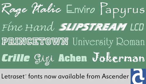
Somehow now Ascender is selling the old Letraset collection. Though hardly as storied as the Photo-Lettering inventory, it’s another thing I grew up on. I still have old Letraset catalogues and they are still useful. (If you want a historically pure Helvetica, the one with very thin crossout strokes in $ and £, look no further.) There was a press release that got cut and pasted up on Typophile (a shovelware habit that is one of that site’s many deficiencies). And it included this graphic, apparently thrown together in Microsoft Paint:
Apart from picking some seriously tacky typefaces to show (and not tacky in a good way), the problem here is that two of the font names are misspelled, as even Ascender’s own E-commerce site will verify.
Crille is actually Crillee (tied with Serpentine in frequency of use for action movies, “mixed martial arts” fight posters, and techno albums).
The distinctions to be drawn between House and Ascender mostly have to do with personal skill. These companies are what their people are. But Ascender is what it is because it draws from the tainted well of Microsoft. Just as Microsoft users are the most likely to top-post, pretend that Arial is really a typeface, or be unable to typeset a quotation mark, Microsoft’s arm’s-length type vendor is the most likely to get the names of somebody else’s fonts wrong.
Select a category to see additional posts. Add feed/ to a category to subscribe via RSS
The foregoing posting appeared on Joe Clark’s personal Weblog on 2009.08.13 13:41. This presentation was designed for printing and omits components that make sense only onscreen. (If you are seeing this on a screen, then the page stylesheet was not loaded or not loaded properly.) The permanent link is: https://blog.fawny.org/2009/08/13/ascenderhouse/
You don’t agree? You must be one of the site’s acolytes. Design Observer can do no wrong, they believe. That kind of unfettered endorsement is curiously similar to Design Observer’s own Michael Bierut and his treatment of his sainted, perfect New Yorker, a failure of critical faculties that was easily torn apart.
The pro-D.O. contingent thanks their lucky stars they got out of their podunk towns in time, made it through art (or “design”) school, and got some kind of job in the field. They are intellectuals and they need, nay, demand an intellectual blog covering their field.
What they actually got, as I have described here at length, is an electronic recapitulation of a failed and dying industry of longform graphic-design criticism in print. And most of it is even written by the same authors. Blogs revealed design magazines for what they were: Wasteful, bloated, turgid. (And a fraud – contra deals and advertising were all that keep them afloat, and half their feature articles are puff profiles of individual design studios.)
People who defend Design Observer think it’s a smart site (impenetrable means smart) and they sure as hell aren’t gonna sit there and let people take potshots at a site that makes them look smart by association.
Well, leap out of your Ærons and grab your pitchforks, junior designers at midlevel ad agencies in the Midwest, for the mockery starts now.
Who designed it?
Not Pentagram – Jessica Helfand and Ruby Studio, Michael Bierut tells me. Here’s the entire code on Ruby Studio’s homepage:
So now we know why the codebase sucks so badly. I’ll be getting back to that topic later. But for now, try printing any item on the site. Just try that and get back to me. Now try just printing the homepage.
Was it a rush job?
I doubt it, since the new Martha Stewart Living Omnimedia wannabe, Observer Omnimedia, was incorporated in Connecticut on 2009.02.27. Bill Drenttel is listed as a principal. Deciding to incorporate, then actually doing it, takes a while. Conservatively, the D.O. gang had eight months to get its act together.
So why didn’t it? Fundamentally, they don’t understand the Web. (Or particularly like it, I suspect.) Design Observer exhibits exactly the level of quality one would expect from, say, a daily-newspaper site, and the reasons for that quality level are exactly the same: Previously comfortable and unassailed print-media people got an inkling of a future in which they were irrelevant and decided to do something about it.
What they decided to do was the same sort of thing they did in print. Espying laser beams in the distance, they viewed the problem as a nail that needed hammering. They produced, in effect, a shovelware site. With, in this case, lousy code and – ironically – a design that is not merely ugly but dysfunctional.
So what did they do wrong?
Let’s spend the week going down the list one item at a time, shall we?
But before that, a prediction. The incumbent graphic-design press, and its new omnimedia expansions online, simply are not interested in discussing themselves. (There is no MetaTalk for Design Observer.) It’s so much easier to just call up Steve Heller and ask for another couple of articles for the next issue<slash>posting. I am the only known critic of Eye and one of two known critics of design criticism. So far there’s been no engagement whatsoever: These people act like I’m not here.
But I am here and I keep popping up in Google searches. Was that not also true of Craigslist, or of any number of initially-irrelevant-seeming gnats alighting on the leathery hide of the old beast?
I like Michael Bierut a lot, but does he really think the baby he’s coparenting with a bevy of Usual Suspects is really going to ignore or outlast or defy criticism forever? How well has that been working out for, say, newspapermen?
Select a category to see additional posts. Add feed/ to a category to subscribe via RSS
The foregoing posting appeared on Joe Clark’s personal Weblog on 2009.08.12 15:09. This presentation was designed for printing and omits components that make sense only onscreen. (If you are seeing this on a screen, then the page stylesheet was not loaded or not loaded properly.) The permanent link is: https://blog.fawny.org/2009/08/12/mock-do-1/
Select a category to see additional posts. Add feed/ to a category to subscribe via RSS
The foregoing posting appeared on Joe Clark’s personal Weblog on 2009.08.11 13:07. This presentation was designed for printing and omits components that make sense only onscreen. (If you are seeing this on a screen, then the page stylesheet was not loaded or not loaded properly.) The permanent link is: https://blog.fawny.org/2009/08/11/g3lint/
A less-self-contradictory and ‑limiting and ‑undermining issue than usual. It goes without saying that the URL for this issue 72 calls it issue 169.
Bantjesism
Darling of the design press Marian Bantjes gets a giant interview at the head of the feature well. It was obviously done by E-mail, what with the mannered, overdetermined responses, but here Bantjes made it work. And how.
First of all, how did Bantjes become a media darling? By being ignored for years and by chipping away at the Long Tail on blogs:
In 2003, I started spending a lo of time on Speak Up, and was made an Author [sic] in November….I was sending out packages of this ornamental stuff I was making, but I was getting very little response. But after “Poster Nº 1,” I started to get notice, and a lot of praise. I lived on praise for over a year, because I earned absolutely nothing until late 2004.
Later, she admits “I also respond very well to praise.”
It wasn’t until the end of 2005 that I realized I was actually making a living doing what I wanted to do….
I was sending things (prints, posters) out about four times a year, but without much response. I sent stuff to Paula Scher; no reply (she later read me on Speak Up, then went on to see my work on my Web site)… [I]t wasn’t until I met Noreen Morioka at a conference… that she paid any attention to me…. People were reading me on Speak Up, and then they put it together with the mailings.
Assault on Canadian mediocrity
Here Bantjes more or less converted me into a lifelong fan:
The majority of the Canadian design establishment doesn’t get it at all. I’m terrified of the hordes (of mostly young women) who love unicorns and fairies and hearts and… my work. But there are designers who embrace me and the work completely. For this reason, I was overjoyed to be made a member of the Alliance graphique internationale last year. This was a huge validation to me that there is something to get in my work. And my big fuck-you to the Canadians.
How much do you charge?
People often ask me for a quote, and I tell them “Pay me as much money as you possibly can.”
I think that’s fair. I hate it when you have to do this fucking dance where they say they don’t know the budget, so I come up with some number, and then they say they don’t have that much…. If they want something really great from me, dig to the bottom of the money barrel, give me the number that hurts but is still doable, be nice to me, trust me, and I’ll be nice back, and we’ll have a great relationship and do some great work.
Blog posts aren’t book chapters
Many of the pieces in my book were written originally for Speak Up, and when the time came to edit them for the book, I was surprised how unbookish they felt.
Bantjes separately noted that the full E-interview ran 13,000 words. I see it has occurred neither to Bantjes nor to Eye to run the whole thing. [continue with: ‘Eye’ 72 →]
Select a category to see additional posts. Add feed/ to a category to subscribe via RSS
The foregoing posting appeared on Joe Clark’s personal Weblog on 2009.08.09 13:26. This presentation was designed for printing and omits components that make sense only onscreen. (If you are seeing this on a screen, then the page stylesheet was not loaded or not loaded properly.) The permanent link is: https://blog.fawny.org/2009/08/09/eye72/
If you can’t make it to a conference or a presentation, you used to be able to rely on one or two people in the audience to summarize what was said, more or less in real time. This liveblog often amounted to the only record of the event, which is one reason to forge ahead and do it even if ninnies don’t like the sound of a keyboard in use. Nobody does it better than I do.
Now, if we are to believe certain journalists, the hot new cyberbullying medium called Twitter is the hot new way to cover a conference. Just how well can you précis real-time speech in 140 characters, one-fifth of which are taken up by hashtags?
How can you the reader actually comprehend a reverse-chronological list of 120-character snippets? Especially from more than one person at a time?
Is it not entirely possible that a full thought or sentence requires more than 120 characters?
Worse, if you use some half-assed system like CoverItLive, which doesn’t even exist on your own blog but is hived off somewhere else, what happens when their hoped-for next round of VC funding goes south and they shut down the whole service?
How, incidentally, do you Google these Twits or CoverItLive Flash applications? How do you piece HumptyDumptyCon back together again from his shattered, intermingled, incoherent component parts?
Rather like top-posting, if you think Twittering or CoveringItLive is a responsible and effective way to document a presentation, are you merely demonstrating your own ignorance, unsophistication, and denial of settled history? (UPDATE [2010.01.06]: Shel Israel makes a similar point amusingly.)
Select a category to see additional posts. Add feed/ to a category to subscribe via RSS
The foregoing posting appeared on Joe Clark’s personal Weblog on 2009.08.07 15:27. This presentation was designed for printing and omits components that make sense only onscreen. (If you are seeing this on a screen, then the page stylesheet was not loaded or not loaded properly.) The permanent link is: https://blog.fawny.org/2009/08/07/twits-v-liveblogs/
Despite the acute accent in his name. Rick Bébout was American. He came to Canada after the Vietnam War, worked at The Body Politic, and was a lifelong observer of the gay community. He died last month.
His site, rbebout.com, is a major repository of Toronto gay cultural history – particularly of the Bar, a Platonic entity that was, in his view, the core of urban gay culture no matter what the currently fashionable bar of the moment might happen to have been.
Bébout put out a lot of “content” on his site well before such was fashionable, and in long form, too. At a technical level, he did what he could with the knowledge he (and most of us) had at the time. As the homepage states: “Notes on style: This site has no font style tags, so will display in the default font you have set in your own browser program. (But it does look pretty in Palatino, point size 14, on Internet Explorer; that’s how I designed it.)” That was outdated even when he wrote it.
I don’t know who has the rights to the site now that Bébout is dead, but presumably they’ll pony up for 10 or 20 years’ worth of domain-registration and hosting fees and keep the site up more or less indefinitely. (The cost is peanuts.) The site will continue to work as is for all that time, though, as is always the case with ill-crafted sites, it works only because browsers are custom-engineered to work around lousy code. But if we want to adapt Bébout’s work to other platforms (the site explicitly authorizes such adaptations), it would help to have a better codebase.
So I am pretty much volunteering to be one of the people who converts the site to full standards compliance. We won’t change any of the copy, just upgrade the code – no more tables for layout, neutral quotation marks, fake dashes, and other abominations. We’ll add a real print stylesheet. Copy could then be rather easily converted to ePub and, with not much more difficulty, to a printed book. (A workflow of valid HTML → Word → InDesign is not uncommonly used in structured-document creation.)
Of course we’ll retain the original version (easily done), perhaps at a subdomain like old.rbebout.com. (Or invert that arrangement and have the new site at new.rbebout.com.) Historians need not worry that we’ve destroyed the original copy in transcribing it. We’ll need a set of legacy and obituary pages, or at the very least some notation that the author of the site has died.
Select a category to see additional posts. Add feed/ to a category to subscribe via RSS
The foregoing posting appeared on Joe Clark’s personal Weblog on 2009.08.07 14:40. This presentation was designed for printing and omits components that make sense only onscreen. (If you are seeing this on a screen, then the page stylesheet was not loaded or not loaded properly.) The permanent link is: https://blog.fawny.org/2009/08/07/rbebout/
 You don’t agree? You must be one of the site’s acolytes. Design Observer can do no wrong, they believe. That kind of unfettered endorsement is curiously similar to Design Observer’s own Michael Bierut and his treatment of his sainted, perfect New Yorker, a failure of critical faculties that was
 A less-self-contradictory and ‑limiting and ‑undermining issue than usual. It goes without saying that the URL for this issue 72 calls it