Audio and video are now posted from my appearance last week on The Agenda with Steve Paikin, which you probably missed because I mentioned it everywhere but here. Well, relive the magic.
Select a category to see additional posts. Add feed/ to a category to subscribe via RSS
The foregoing posting appeared on Joe Clark’s personal Weblog on 2009.02.02 17:58. This presentation was designed for printing and omits components that make sense only onscreen. (If you are seeing this on a screen, then the page stylesheet was not loaded or not loaded properly.) The permanent link is: https://blog.fawny.org/2009/02/02/paikinized/
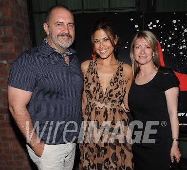
Tad Friend (no relation) writes about film marketer Tim Palen in the Nouveau-Yorkais:
Palen, who is 47, has a shaved head, a graying beard, and the bulging, tattooed arms of a steamfitter.
Straight people and their alternate universe. (A basket is a “package”; a fuckbuddy is a “friend with benefits.”) Show a straight writer an old guy who doesn’t play football and who’s built like a brick shithouse and the writer has to stretch all the way back to the Industrial Revolution to explain him away.
Here’s Tim Palen, as shot by Dimitrios Kambouris for WireImage (detail):
Palen helped us out in this photo by wearing a nice skin-tight polo shirt. Do you see any steamfitting going on here?
Tim Palen is plainly a musclebear. In a small way, articles like this one – though it states Palen is gay and names his longtime lover – efface the facts of our lives. Incidentally, I ran this whole business by Palen via E-mail, but he did not respond.
“I told you so” alert
Posters are intended to tell you the film’s genre at a glance, then make you look more closely. Horror posters, for instance, have dark backgrounds; comedies have white backgrounds with the title and copy line in red.
Select a category to see additional posts. Add feed/ to a category to subscribe via RSS
The foregoing posting appeared on Joe Clark’s personal Weblog on 2009.01.29 15:24. This presentation was designed for printing and omits components that make sense only onscreen. (If you are seeing this on a screen, then the page stylesheet was not loaded or not loaded properly.) The permanent link is: https://blog.fawny.org/2009/01/29/steamfitting/
Select a category to see additional posts. Add feed/ to a category to subscribe via RSS
The foregoing posting appeared on Joe Clark’s personal Weblog on 2009.01.26 16:36. This presentation was designed for printing and omits components that make sense only onscreen. (If you are seeing this on a screen, then the page stylesheet was not loaded or not loaded properly.) The permanent link is: https://blog.fawny.org/2009/01/26/icedoor/
Detail from Steve MacIsaac’s Shirtlifter 3. (He’s from Nova Scotia, incidentally, and put in time as a gaijin in Japan.) The dude with the hi-’n’-tite haircut and individually discernible hairs on his giant forearm, Matt, co-owns a graphic-design firm in Vancouver with his business partner, a woman who is, curiously enough, Japanese.
Now, where Matt finds time to compete in Olympic powerlifting events or do plyometrics training for the Canada 2 bobsleigh team remains unstated, but the important thing here is to recognize he is purely aspirational. As I, and only I, keep reminding you, barely any graphic designers are homosexualist males. Typically, designers are trim, handsome, nicely dressed and generally well-turned-out liberal heterosexualists – like the lovely Michael Surtees or the prototypical graphic designer, Doug Bowman. Wymmynz? Yes, there are wymmynz designers, I suppose. I’m sure they’re fine – and grievously underappreciated, a problem that might disappear if Heller didn’t write one-third of all “design criticism.”
Of homosexualist graphic designers, one is an epitome of men’s fashion (Roger Black), one has pink hair (Patric[k] King), and one is Dutch. There are a couple of others. None is a musclebear, none weighs over 200 pounds with under-10% bodyfat, none has pointillistically distributed body hair, none doubles for a Colt pinup, none has an ass so large his suit jacket needs a vent below the waist so it won’t bunch up, and none would be unironically heralded as a stunning specimen of manhood even by construction workers, Mike Rowe, or other graphic designers. MacIsaac likes musclebears and graphic design; obviously peanut butter and chocolate need to be reunited.
As with so much in the world of comix, Matt is a fantasy. After the manner of J.D.s, which posited that dull Toronto was overrun with queer punks in braces, tight distressed jeans, and 14-hole Docs, Shirtlifter imagines a future in which the only realm of the visual arts not overrun by homosexualists finally gets colonized. And Japan, despite its distance, will never be far away.
Select a category to see additional posts. Add feed/ to a category to subscribe via RSS
The foregoing posting appeared on Joe Clark’s personal Weblog on 2009.01.24 14:11. This presentation was designed for printing and omits components that make sense only onscreen. (If you are seeing this on a screen, then the page stylesheet was not loaded or not loaded properly.) The permanent link is: https://blog.fawny.org/2009/01/24/shirtlifting/
TypeCon 2009 will take place in Atlanta. I almost certainly won’t be able to go. I couldn’t even manage a trip to Buffalo last year, where my proposed sessions were as follows:
True or false: Fonts will solve your signage problem
Designing a new (“better,” “ideal”) font for signage applications is a student’s rite of passage. Everyone’s got their opinions on what fonts work for signage, usually clustering around a narrow range of typefaces. Others may have test results to back up their opinions. But a sign is a physical object in an indoor or outdoor space that is viewed by a living people. Have designers and the type industry put too much emphasis on typeface selection and designing new fonts? In deciding what makes signage work, what else has been overlooked? Especial discussion of accepted wisdom, common myths, and accessibility.
Neither a panel nor a presentation, but more of a moderated lightning round–cum–game show (I’m the moderator). An invited set of panellists, and then also anyone in the audience, has exactly 90 seconds to nominate a font they hate and convince us why they’re right. Bonus complication: The words “Arial,” “Comic Sans,” “Souvenir,” “Cooper Black,” and “Rotis” are all banned, with penalties imposed for any utterance of them. Homework assignment: Attending design students may be tasked with designing viable layouts or other uses of some of the nominated fonts, for later posting [online].
Chasing Cursive & Casual
What does the HDTV captioning standard mean by “cursive” and “casual” fonts? Are these merely joke categories – excuses to include whatever second-rate fonts with zero-cost licences (like Ashley Script or Coronet) on the assumption that no one will ever use them? (Research doesn’t bear that out: If the fonts are there, people will pick ’em.) This presentation walks through the morphology of casual (“fun”) and cursive (“handwritten”) fonts, with an emphasis on mid-20th-century forms. It will nominate viable existing faces and articulate design principles for new fonts that work in the context of TV viewing.
Select a category to see additional posts. Add feed/ to a category to subscribe via RSS
The foregoing posting appeared on Joe Clark’s personal Weblog on 2009.01.22 13:36. This presentation was designed for printing and omits components that make sense only onscreen. (If you are seeing this on a screen, then the page stylesheet was not loaded or not loaded properly.) The permanent link is: https://blog.fawny.org/2009/01/22/typecon08/
We were asked how we managed to get invited to an A-list non-heterosexual New Year’s Eve party, and we realized that it was because we were unknown in Stockholm, so our non-heterosexual caste was unable to be properly identified.
Select a category to see additional posts. Add feed/ to a category to subscribe via RSS
The foregoing posting appeared on Joe Clark’s personal Weblog on 2009.01.22 13:26. This presentation was designed for printing and omits components that make sense only onscreen. (If you are seeing this on a screen, then the page stylesheet was not loaded or not loaded properly.) The permanent link is: https://blog.fawny.org/2009/01/22/caste/
Creative Review getting it wrong about graphic designers’ personal work:
The fact that Felton is now extending his ideas online comes as little surprise – it’s here that an up-and-coming designer, or blogger (or both) can grab their moment of fame.
No, it is online where, for the first time, graphic designers can actually publish their own personal work. Painters and photographers could always do so, as their work product is a painting or a print or slide. The work product of a graphic designer once required expensive printing. Now printing isn’t expensive, but printing enough copies so your work actually gets noticed is.
Online publication, free of marginal cost, made designers’ personal work possible for the first time. This fact was camouflaged by designers like Saville and Carson, whose client-indulged and -funded peccadilloes were misinterpreted as personal work. These new designers’ work has no client; the Web has decoupled graphic design from business.
Select a category to see additional posts. Add feed/ to a category to subscribe via RSS
The foregoing posting appeared on Joe Clark’s personal Weblog on 2009.01.22 13:25. This presentation was designed for printing and omits components that make sense only onscreen. (If you are seeing this on a screen, then the page stylesheet was not loaded or not loaded properly.) The permanent link is: https://blog.fawny.org/2009/01/22/memyselfi/
“BBC Alba shows power of Gaelic lobby” essentially argues for cultural genocide in the form of the forced extinction of a minority language that apparently isn’t a language anyway.
The Gaelic community in Scotland is infamously small; 50,000 is a healthy estimate…. What it lacks in numbers, though, it compensates for in avidity…. Education authorities, broadcasters, government and cultural apparatchiks have been harried and chivvied relentlessly, hustled into acknowledging, accommodating — and, ideally, cheerleading — a language that is really little more than a geographical and historical vestige, a linguistic comfort blanket for a hard-pressed, marginal community.
I say language but Gaelic isn’t one, not really. Its vocabulary is tiny, with no form of saying yes or no and attuned to a distant, pre-technological world. It’s essentially a kind of rural patois, a bonsai idiolect; a way of specifying concepts central to a particular, highly codified way of life. […]
“The Gaelic lobby is powerful in Scotland because there are a lot of fairy tales about the suppression of the culture and how terribly fascist it all was,” says historian and author Michael Fry[,]
fascistically attempting to suppress the culture.
“The channel is a waste of money,” adds Fry. “The entire Gaelic population of Scotland can speak English perfectly well, so there is no problem with communication, which is the central issue of linguistics.”
Apparently as soon as people who speak an unpopular language dare to become bilingual, the unpopular language must be wiped off the face of the earth. Perhaps your firstborn should be smothered in his sleep the day your second child is born?
Articles like these prove why BBC Alba needs to exist. Keeping languages alive costs – in time, effort, money, and, apparently, in blood, toil, tears, and sweat. If Fry has such an easy time of communication with English-speaking Scots, why is he worried about what Gaelic-speaking Scots wish to do? He isn’t talking to them.
Select a category to see additional posts. Add feed/ to a category to subscribe via RSS
The foregoing posting appeared on Joe Clark’s personal Weblog on 2009.01.22 13:24. This presentation was designed for printing and omits components that make sense only onscreen. (If you are seeing this on a screen, then the page stylesheet was not loaded or not loaded properly.) The permanent link is: https://blog.fawny.org/2009/01/22/pro-alba/
Select a category to see additional posts. Add feed/ to a category to subscribe via RSS
The foregoing posting appeared on Joe Clark’s personal Weblog on 2009.01.22 13:22. This presentation was designed for printing and omits components that make sense only onscreen. (If you are seeing this on a screen, then the page stylesheet was not loaded or not loaded properly.) The permanent link is: https://blog.fawny.org/2009/01/22/relative-readability/