This would almost be a Randy Gunz scenario were it not for the fact that his MySpace page, which imprudently reuses his old BigMuscleBears “handle,” states that the pocket rocket can squeeze himself into a boyish size 7 shoe. I’d say we’re comparing apples to oranges.
With very little effort, you can find a LinkedIn profile that reveals his real name. Was all that key money he charged for 550 square feet in DUMBO worth it after all?
Select a category to see additional posts. Add feed/ to a category to subscribe via RSS
The foregoing posting appeared on Joe Clark’s personal Weblog on 2009.02.22 13:15. This presentation was designed for printing and omits components that make sense only onscreen. (If you are seeing this on a screen, then the page stylesheet was not loaded or not loaded properly.) The permanent link is: https://blog.fawny.org/2009/02/22/bklynmike/
Google now has a contest in which kiddies may doodle their own Google logo. The prize? They run your doodle for a day, plus you get a computer and a T-shirt. Your middle-class parents could probably afford those anyway. (And exactly one school district gets 10 grand in cash.)
By participating in this [c]ontest, you agree and hereby grant Google permission to use, copy, modify and make available your submissions to the public (with or without attribution to you) for any purpose, such as, but not limited to, press and media communications, without further compensation to you…. If you are a winner, you agree that Google may use your name and likeness to administer and promote the Contest and to conduct media interviews and promotional events.
That means Google can change your doodle any way it wants (as by adding a swastika), remove your name from it, use it as Google’s permanent logo, turn it into a favicon that at least won’t be as ugly as the current one, attach somebody else’s name to it (even Osama bin Laden’s name), sell it at a profit, and talk about you to the press behind your back.
Do you want a computer and a T-shirt quite that badly? Do your hovercraft parents want that? Because they’re the ones who’ll be signing the consent forms for you, and – I guarantee you – they won’t have read the rules.
Select a category to see additional posts. Add feed/ to a category to subscribe via RSS
The foregoing posting appeared on Joe Clark’s personal Weblog on 2009.02.22 12:58. This presentation was designed for printing and omits components that make sense only onscreen. (If you are seeing this on a screen, then the page stylesheet was not loaded or not loaded properly.) The permanent link is: https://blog.fawny.org/2009/02/22/doodle4google/
The next Steven Heller: A concept as risible as the next David Spade? Well, that’s what the School of Visual Arts is trying to deliver. And of course “the design press” is busily engaged in midwifery. The design press is, of course, the problem, so this is the very definition of self-serving. Also self-parody.
Anyway, Dan Rubinstein kills some trees in Surface (do you read Surface? had you ever heard of it?) to extol the SVA D-Crit program. Rubinstein wouldn’t make much of a poker player, by the looks of it – the title of the piece, “The Arbiters,” is a bit too much of a tell.
MoMA’s Senior Curator of Architecture and Design, Paola Antonelli…, commented on the dire need for writers who are not only able to write about design itself but act as interpreters so the public can appreciate its wide-ranging implications.
In other words, we need sahibs to tell the Indians about themselves. Design isn’t art; it’s practical. Your designed object, including layouts and Web sites, either works or it doesn’t. One way to gauge whether or not it works is through sales. If the public needs reëducation on your design object, it never “worked” in the first place.
Mass appeal?
“We need to raise the quality of writing in design magazines, but also in the mass media,” [the inevitable Alice] Twemlow says, “for it to be talked about in an intelligent way.”
Yes, let’s talk intelligently to the masses. Because obviously they wouldn’t be masses if they weren’t already intelligent. (If they’re that smart, can’t they talk among themselves? Do they need a lecture? Aren’t they all grabbing at Malibu Stacey dolls down at the Tarzhay?)
Design rags are vertical-market magazines. Here, “vertical market” equates to “niche” and “elitist.” This isn’t like the Walkman, which we didn’t know we needed till it was invented; elitist design intellectuals like Twemlow and Antonelli are not going to create a mass demand for design criticism just by flooding the market with it.
(Antonelli: “It’s outrageous that nearly all major U.S. publications have a critic for just about everything – art, theater, television – except design! The world doesn’t understand design because,” unbeknownst to Antonelli, design isn’t something to be understood, it’s something to be used.)
None of this is going to happen anyway, of course. Take it from a guy who wrote a design column for a daily newspaper. Antonelli can’t even manage that with the Times, where she holds more sway than any elitist design intellectual in the world.
Twemlow: “[W]e’re just arming them with a set of tools and a platinum Rolodex.” That’ll surely come in handy as a tool to bludgeon the masses.
Design blogs?
They’re a blessing and a curse, we’re told. Each and every twee elitist intellectual D-Crit graduate will start their own, write for all the other blogs that pass for big names in the field, and, ultimately, earn not a red cent in the process. How’s that student loan looking now, kids? (Better flush left in Helvetica on a Swiss grid? Quick, use this as a teachable moment – tell the masses what they’d always needed to know about Müller-Brockmann!)
Kwick kwestion for the Krit Kidz: Do you think you’ll eke out a living writing for the design rags? (Like Surface?) They’re owned by an oligopoly, they pay peanuts, and they extort your copyright. Anyway, go ask one of your contemporaries – the lovely and talented (but lousy-at-HTML) Michael Surtees – just how much moral authority design magazines still have.
Krit Kidz, let me be the first to tell you that you and your program are unneeded and unwanted. One more snob is one too many more.
Select a category to see additional posts. Add feed/ to a category to subscribe via RSS
The foregoing posting appeared on Joe Clark’s personal Weblog on 2009.02.21 15:41. This presentation was designed for printing and omits components that make sense only onscreen. (If you are seeing this on a screen, then the page stylesheet was not loaded or not loaded properly.) The permanent link is: https://blog.fawny.org/2009/02/21/kritkidz/
You spent $34 per issue. I just borrowed them from the library. Surprisingly, while Eye’s nighttime still burns bright with the light of a fiery approaching asteroid, the T-Rex is putting its faggy little hands to better use than regurgitating unwanted theory.
Nº 69
“GTF has an unforced ‘style’ that is impossible to copy,” reads the dek for a hagiographic piece on Graphic Thought Facility by Eye editor-for-life John L. Walters. Now, I like their stuff, and I don’t dispute the evidence (some of it in this article) that “GTF” does shitloads of research. I am in favour of graphic-design research.
But I don’t think their use of stencil typefaces (as in the Design Cities exhibition) is all that shocking, nor does it show an “easy command of two-dimensional graphics for three-dimensional space.” (Stencil type on big hanging boxes is 3D.)
Tangled neon signs are just abstract art, not the result of an immediately apprehensible research process.
In a superb piece, the reliably reliable Véronique Vienne asks why posters continue to exist, or, more accurately, why they win so many awards. And guess what? Just like “GTF,” Vienne does actual research.
I do not speak Polish, Dutch, Flemish, German, Czech, Hungarian, Turkish, Portuguese, Japanese, Korean or Russian. Neither did the editors of the Chaumont catalogues, whose captions did not translate any of the information on the posters. Scrutini[z]ing the reproductions with a magnifying glass, I spotted the same words over and over: teatro, teater, teatru, teatr… about as often as muzej, museo, musen, or muzeum.
Adding up all the entries for theatres, concerts, museums, conferences and festivals, I calculated that more than three-quarters of the posters selected had been made for cultural institutions. The number of posters addressing a public interest issue or supporting a social cause would vary from year to year. Work by advertising agencies was sorely missing, revealing the bias of the festival organisers.
Deciphering the content of the posters was strenuous at first, but after about 300 posters, I got the hang of it and was able to tell, at a glance, without scrutini[z]ing [echo sic] the small type, what was going on. It was easy: As a rule, theatre playbills were about ten times more interesting, more gripping and more moving than posters promoting festivals, conferences, museum exhibitions or gallery shows. It was shocking. I had assumed that all cultural institutions were essentially the same – that they all brought out the best in graphic designers – and suddenly I had to challenge this notion.
(Additionally, anti-billboard activists will be interested in this piece, as it tears a strip of JC Decaux in an entirely genteel way.)
But Walters then undercuts Vienne by following up her article with six pages of bang-up poster designs. Many of them I’ve seen before and liked, but really, John, don’t kneecap your own writers.
An overlong piece on redaction or elision in graphic design (by David Crowley) only went to show that images with words crossed out all tend to look like greasy smudges.
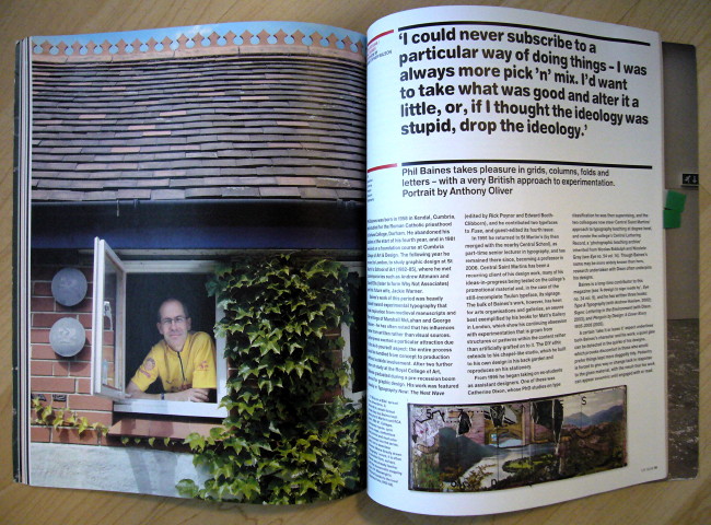
I was rather impressed by Christopher Wilson’s interview with Phil Baines, who looks Jewish but tries to act (i.e., design) as British as possible.
Baines is of course the design writer of long standing (Cf. Signs: Lettering in the Environment by Baines and Dixon), but he’s also a design professor and working designer.
Put those three together and you get a MUST TO AVOID? Not this time.
I was very frustrated with our cultural studies education…, which depended entirely on Russian Constructivism and the Bauhaus. It ignored anything postwar and anything that happened in Britain between the wars, and it didn’t even really talk about the Arts and Crafts movement, which had helped influence the Deutsche Werkbund and eventually the Bauhaus. There seemed to be a lot of interesting things that we were not told about. This became part of the “sense of England.” […]
Also, he defines “vernacular” as “non-taught tradition, which, once you have building regulations, ceases to exist, because you lose handmade exploration and local variations.” For “handmade exploration” here, read “TTC subway font.”
Bylines by Steven Heller? Two. Books by Steven Heller reviewed by someone else? One.
Nº 70
I know I’m supposed to be impressed by letters stuck onto the side of a chapel, but not if they’re all in upper case of various sizes and made out of MDF and “sand paint.”
According to David Crow (no relation), the computer enables a certain kind of craft, which appears to mean “random variability.” So does flinging paint at a wall. Anyway, we seem to have come full circle from mid-’90s veneration of Me Company–style extruded graphics that took two days to render to vague little blobs that take two days to render.
This is all part of the issue’s exploration of “authenticity,” which made sense in at least one case.
I wasn’t sold on the juvenile and rudimentary type designs of Norm, last seen in the Helvetica documentary. Smacks a little much of “engineer” type, and if not that, then of DINmania. Of course they’re Swiss.
For some reason, the numerous illustrations of DixonBaxi’s work for the Five network in Britain all remind me of R.E.M. Out of Time – a sharp object hovering unexplained over a picture (like a hyperrational alien imposing order on human disorder). I might not have stuck with this interpretation had some of the other illustrations not shown, say, a dog covering a man’s face, with a face in an MTV logo floating over the dog’s shoulder.
Incidentally, when you see the lexeme DixonBaxi, do you not immediately think “Albanian”?
Did you know that, according to Anthony Oliver, “[d]igital B&W images often have almost too fine a tonal range, making them slightly sterile, sometimes too hyperreal. Moving one’s hands under an enlarger [has] no equivalent in digital black-and-white printing.” May I suggest shooting in Agfa Scala B&W slide film (Cf. Flickr) and scanning it?
When was I going to steer this posting back to my not-atypical derision of graphic-design criticism? How about now? A review of a book about Barney Bubbles (no relation) states:
As the discipline of graphic design history emerged[, unwanted,] in the 1980s, his name barely registered.
In other words, he was written out of history. Funny how that happens. But would you like to read another chapter on Swiss posters?
Julia Thrift’s 1992 article for Eye… lavished sixteen pages on his work…. Richard Hollis’s Graphic Design: A Concise History… describes him as “the most original talent” of the New Wave. A mention in Eye Nº 68 provoked calls for republication of Thrift’s piece…. Online chatter about Bubbles’ legacy has been growing[,]
forcing the T-Rex of the design dinosaurs to mention him again.
Select a category to see additional posts. Add feed/ to a category to subscribe via RSS
The foregoing posting appeared on Joe Clark’s personal Weblog on 2009.02.19 21:26. This presentation was designed for printing and omits components that make sense only onscreen. (If you are seeing this on a screen, then the page stylesheet was not loaded or not loaded properly.) The permanent link is: https://blog.fawny.org/2009/02/19/69-70/
Select a category to see additional posts. Add feed/ to a category to subscribe via RSS
The foregoing posting appeared on Joe Clark’s personal Weblog on 2009.02.15 16:06. This presentation was designed for printing and omits components that make sense only onscreen. (If you are seeing this on a screen, then the page stylesheet was not loaded or not loaded properly.) The permanent link is: https://blog.fawny.org/2009/02/15/blowout/
A while ago, I received an unsolicited snatchmail from an editor at Xtra, the homosexualist fortnightly that is the flagship of the “nonprofit” empire that runs almost all the gay media in this country. The empire, which also includes several (“nonprofit”) “hookup” services, is run by one man, unemployable anywhere else, who is an occasional source quoted in “journalistic” articles in his own papers. We won’t get rid of him till he is forced to retire or croaks.
The editor wrote to say that I was a former contributor to Xtra (an understatement: I was a columnist for years and writer of many feature articles, including cover stories) and frequent writer of letters to the editor. He wanted to meet.
I wrote back saying “I smell an offer of a column.” I assumed that, despite access to every tendril of official homosexualist culture (they are that culture), Xtra couldn’t find a contrarian or oppositional voice. They believed I was such a voice. I surmised that someone noted my coinage of the term maladaptive and figured I was some kind of Log Cabin Republican who could be wheeled out every second issue to write articles deriding trannies and championing gun ownership among the “castrated effeminate population.”
In effect, somebody wanted me to be Xtra’s house nigger.
But what happened? Nothing. The editor refused to meet anywhere but a coffeeshop in the ghetto. I told him I didn’t want to end up at the Senior Citizen’s Timothy’s with grizzled positoids and pensioners overhearing our conversation. (I often retell this story by adding “and blogging it on their LiveJournal,” but these people cannot run a computer. Or afford one.) I suggested neutral territory, like Balzac’s. No dice.
Little did he know that, while I could write an oppositional or contrarian gay column, it would not oppose or be contrary to what he expected. And anyway, I had since decided I wanted to write “Fagonomics,” a column on gays in unusual professions. (You can’t handlethe truth!) I would like to write this anyway, in fact, but I have enough unpaid work on my plate.
Select a category to see additional posts. Add feed/ to a category to subscribe via RSS
The foregoing posting appeared on Joe Clark’s personal Weblog on 2009.02.10 23:04. This presentation was designed for printing and omits components that make sense only onscreen. (If you are seeing this on a screen, then the page stylesheet was not loaded or not loaded properly.) The permanent link is: https://blog.fawny.org/2009/02/10/oppositional/
Mikita Brottman wrote The Solitary Vice: Against Reading, a book that argues against reading books. Easy to mock? Not quite. Her argument revolves around the duty to read books. One should read for pleasure, but not out of compulsion or because your English teacher assigned a book. Indeed, she tells us that canonical classics are often hard to read or are just overrated, were stitched together from serialized forms during their day, and were given to us when we’re too young to understand them.
She spends a great deal of time, perhaps too much, championing the true-crime genre as one that can actually reap rewards. I don’t think I’ve ever read anyone state outright that film adaptations of the classics are often better than the books. But I just didn’t buy her conclusion about why one would choose to read literature – that it slowly and painfully forces us to confront discomfiting reality.
She’s using a smooth, user-friendly style; it reads well. But the actually bothersome thing about this book that lobbies against reading books is its form. The Solitary Vice breaks with 20th-century convention and actually features illustrations. But they aren’t very good illustrations, and close-ups of early pulp novels’ covers are a bit much after a while. (They are reproduced too large, and their lurid original colours are lost. Cf. Queer Pulp.) Type is dreadful, with too-small margins, a lousy version of Baskerville, no ligatures, fake small capitals, and a bizarre insistence on SCREAMING IN USENET CAPS instead of using italics for emphasis.
And oddly, her Web site has no apparent page for a book she herself wrote.
On pp. 201–203, Brottman notes:
At the art college where I teach, students in their freshman year take a course called Critical Inquiry…. A lot of the students are multiskilled, talented as both artists and writers. Others are highly visual thinkers, who find reading difficult and sometimes have trouble expressing themselves in words…. [T]hrough the art they produce, these students have shown me again and again what a firm grasp they have of complex theoretical issues – an understanding they’re often quite incapable of putting into words….
Clearly, this is a disadvantage in our language-based, word-centred culture, and something that Critical Inquiry – and courses like it – attempt to address, if only to give students a sense of the different kinds of writing out there.
This is the same lesson I’ve read many times from Camille Paglia, whose art-school students have many different approaches to literature, some of them indistinguishable from illiteracy or dyslexia. I fully support Brottman’s methods, in which students can paint a picture or perform an art piece in response to a literary work.
But to return to one of my themes here, the same phenomenon partly explains why the Web works so well for graphic designers. They aren’t illiterate; they’re working with the written word. But they usually aren’t very literate and they give up quickly when confronted with masses of text. That’s why design criticism doesn’t work; it’s too long and turgid. (And if design could be summed up in 10,000 words, it wouldn’t be design.) Why are so many “design books” just printed showcases of nice slides of designers’ work? Because you don’t really have to read those books, whose function, I insist, is to be flipped through the way an admin assistant devours the September Vogue.
Design writers are writers interested in design; even if they run successful design practices, they’re mostly writers. Adrian Shaughnessy is a now-standard example.
The phenomenon explains why designers are either atrocious at HTML or geniuses at Flash – in the former case, it’s all Greek to them, while in the latter, it’s nothing but a paralinguisic symbol language to be shuffled around like Tetris. It also explains why fonts whose names begin with the letters A through H (let’s say) are so overused: They come first in the Font menu and designers just can’t deal with all that text pushing up from below.
The Web offers a low- or zero-cost option to publish type treatments, layouts, photos and illustrations, and a few paragraphs of hunted-and-pecked text. It’s perfect for people who, rather like housecats, enjoy being near the objects of their affection without burying their noses in them.
Select a category to see additional posts. Add feed/ to a category to subscribe via RSS
The foregoing posting appeared on Joe Clark’s personal Weblog on 2009.02.09 16:14. This presentation was designed for printing and omits components that make sense only onscreen. (If you are seeing this on a screen, then the page stylesheet was not loaded or not loaded properly.) The permanent link is: https://blog.fawny.org/2009/02/09/brottman/
He is. And his project is not, as it seems, a fulsome discussion of text typography and book design; his project is one of beating you over the head with the glories of aboriginals and their languages. (When will people learn?) That is all he’s about; everything else is like a magician’s diversion.
The prologue to Bringhurst’s latest doorstopper, The Surface of Meaning: Books and Book Design in Canada, baldly states:
[W]hat is a book? Most of us think of books as physical objects…. In oral cultures, books are indeed invisible – but in every healthy and mature oral culture, books are present.
Actually, “most of us think of books” as involving the written word. And we’re right. Oral histories are not books. Blue is not green.
Bringhurst attempts to distract us by claiming that, “[i]n electronic cultures, books can… flash across a screen, in a fleeting and unstable imitation of the printed page. It remains to be seen whether books in this form can interact as fruitfully with human attention and memory.” So an Indian tribe’s tall tale is still a book even if nobody remembers it, but an E-book might not be a book because it’s an unmemorable “imitation”? (Which of those was written down?)
And if we’ve spent all this time ignoring the glory of aboriginal languages, culture, and stories, why were there so many books of aboriginal-language transcription published in the 19th and 20th centuries that just Bringhurst’s excerpts of them run for 21 pages?
Confronted with 180 further pages of beauty shots of other (“real”) Canadian books, I did the obvious thing: I flipped through them the way an admin assistant flips through an issue of Vogue.
Select a category to see additional posts. Add feed/ to a category to subscribe via RSS
The foregoing posting appeared on Joe Clark’s personal Weblog on 2009.02.06 14:55. This presentation was designed for printing and omits components that make sense only onscreen. (If you are seeing this on a screen, then the page stylesheet was not loaded or not loaded properly.) The permanent link is: https://blog.fawny.org/2009/02/06/invisible-books/
From a Craigslist posting late last year, fittingly entitled “Tough Fuck”:
I’m looking for a guy who is not a vegan Buddhist hippie pussy. I happen to like violence and aggression. I don’t see what’s wrong with liking violence as long as only the people who are supposed to get hurt. My first career goal was to be a NHL player like my hero Tie Domi. I made it to the juniors but that didn’t work out now I’m training to be a cage fighter and it fuckin’ rocks. I get to beat the shit out of dudes and get paid for it… it’s a wonderful world.
In the meantime I’m working as a bus driver for the TTC… it pays the bills but I make sure all the loud people shut the fuck up and the riders know not to start shit cause it will be dealt with harshly. I like to go to punk and metal shows. My past dates have said I’m a little evil and demented but I’m also friendly, funny, caring, loyal, and loving once I get to know you. I like to give kisses and hard headbutts. If I’m interesting let me know. You’ll have a great friend, lover, and protector – if anybody ever hurt you I probably couldn’t see you in the hospital cause Id be in prison from going apeshit and tracking the motherfucker down and kicking his face in.
Needless to say, I edited his copy. Oh, and he lives in the 905.
Anyway, to paraphrase John Waters: “The perfect boyfriend: He’s young, he’s cute, and he kills whoever gets on your nerves.”
Select a category to see additional posts. Add feed/ to a category to subscribe via RSS
The foregoing posting appeared on Joe Clark’s personal Weblog on 2009.02.05 22:12. This presentation was designed for printing and omits components that make sense only onscreen. (If you are seeing this on a screen, then the page stylesheet was not loaded or not loaded properly.) The permanent link is: https://blog.fawny.org/2009/02/05/toughfuck/

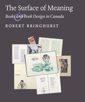 The prologue to Bringhurst’s latest doorstopper, The Surface of Meaning: Books and Book Design in Canada, baldly states: