In case you missed it, Clark’s Law of the New York Times states that Any media organization that doesn’t act as though it is about to be replaced by the Internet will be.
Clark’s Law of the ‘New York Times’
The foregoing posting appeared on Joe Clark’s personal Weblog on 2008.07.24 13:04. This presentation was designed for printing and omits components that make sense only onscreen. The permanent link is: https://blog.fawny.org/2008/07/24/nyt-law/
How not to advance the discussion of Web fonts
Bill Hill has a post up a the IE blog entitled “Font Embedding and the Web.” It’s a textbook example of how not to attract doubters to your cause.
-
It starts from a premise that not everybody accepts, then contradicts the premise. Quite simply, there is no broad clamour among Web designers to use any font they want. It may be technically possible to give them that power and they may use it once they get it, but there simply isn’t a groundswell of support for “the good fight to make typography on the Web as good as we’re used to seeing in print.” The post later states that “[b]uilding fonts that work for text at normal reading sizes of 11 and 12 points requires a lot of work,” which rather negates the premise that designers should be able to use any (print) font they want.
-
It shills for a vendor. It calls Ascender “prestigious” and otherwise name-drops Ascender 11 times. That’s a conflict of interest, and it doesn’t go away because Monotype is also described as having “prestige.” (Ages ago, I did a bit of work for Ascender.)
-
It wastes our time. The post links to a new site by Ascender, then spends an entire printed page (I printed it out) recapping what that page says. New to the concept of hyperlinks? We can go and read it ourselves.
-
It talks about standards in an IE-only ecosystem. Yes, he name-drops the W3C almost as often as he does Ascender, but unless and until the W3C publishes a standard for Web fonts, this is really an IE-only topic that’s being pushed pretty much exclusively by Microsoft.
Of course it’s the IE blog and I shouldn’t be surprised, but all the examples given talk about the use of Internet Explorer. IE users are the last ones who will really want or need custom fonts, since Web designers are Macintosh supremacists across the board and only use IE to double-check page rendering.
Everything is about IE here – sort of like trying to have a conversation with an Objectivist, who begins every sentence with the words “The only role of government is.”
-
It spits out a dog’s breakfast of code. Bill Hill apologizes for the shitty HTML on his example page, grandly named the Future of Reading. He shouldn’t have to apologize; it should never have seen the light of day until it was perfect. Frankly, the code looks like it came out of FrontPage. Even Dreamweaver would have been better.
Hill wastes Chris Wilson’s time by recruiting him to fix his code. While this implies that only the head of the browser team knows what valid HTML is at Microsoft, surely there’s somebody at a lower level who could do this kind of gruntwork. I guess Bill only deals with program managers.
I don’t know how many times I have to say this: The only people who are going to want to use Web fonts are Macintosh standardistas, and they’ll demand good code. A half-assed attempt like this just proves how much Bill Hill is not the target market he’s trying to convince. It’s offputting to the point of repugnance.
-
It acts like Web design is a poor cousin of print design. There’s some nonsense about what a page would look like if it were “designed for readability.” Then what he gives us is a three-column magazine mockup complete with callouts. The 20th century called; it wants its layouts back.
Hill seems to want to turn the Web into print. Worse, the site commits the cardinal sin of assuming a fixed resolution, and a very weird one at that – 1400 × 900. In effect, he designed a page just for his own computer and foisted it on the world as an example of the brave new world of Web fonts.
I just don’t see where people in the real world want any of this shit. We certainly don’t want it if it shills for Microsoft and its vendor and works on only one man’s computer. As the kids no longer say, FAIL.
The foregoing posting appeared on Joe Clark’s personal Weblog on 2008.07.22 12:46. This presentation was designed for printing and omits components that make sense only onscreen. The permanent link is: https://blog.fawny.org/2008/07/22/billhillsite/
I fail to understand these photographs
Athlete/Warrior (2006) is a book of large-format photography by Jonathan Anderson and Edwin Low. The subjects are U.S. military cadets who also play sports for their academies. There are a couple of girls tossed in as ringers, but this is homoeroticism plainly descended from Riefenstahl’s Olympia. In a previous era, I was going to write a book on a related subject, so believe me when I say the most stunning photographs in Athlete/Warrior are of the academy buildings. Anderson and Low are superb architectural photographers and may not even know it.
A noticeably high proportion of photographs centre around aquatics, gymnastics, and wrestling. (And noticeably few depict football players clad helmet to cleat in the red-blooded-American version of the burqa.)
I could not figure out what is happening in these photographs of water-polo players:
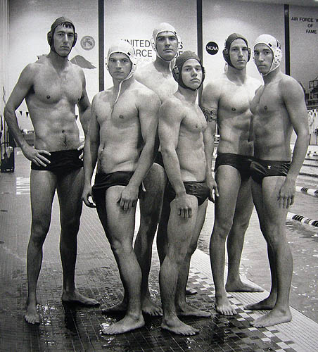
Look not too very closely. I know that water polo, despite its twee little name, is a vicious sport that requires nearly unparallelled cardiovascular ability. They beat the shit out of each other underneath the water’s surface, and common is the lore that everyone wears more than one swimsuit just in case. I fondly remember walking alongside the pool at Gay Games IV inches away from an active water-polo game. I feel I am not totally ignorant of the actual practice of the sport.
But: Tell me those guys don’t have stiffies. Or that this guy doesn’t (also seen in Anderson and Lowe’s Flash portfolio).
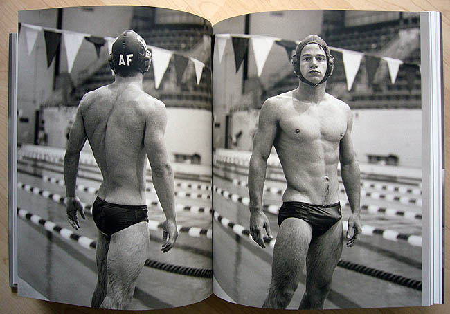
The volume and angles just are not consistent with multiple Speedos or even a reinforced cup under there. I’ve tried every other innocent explanation and nothing works.
I wasn’t going to just make an assumption. I contacted the photographers and two of the athletes in the photographs. The photographers refused to respond, and one of the players provided the following impassioned denunciation:
No, we don’t have stiffies. We’re water-polo players and respectable servicemen. There was nothing odd about the thing, we’ve already lost a teammate and my best friend in the war in Iraq and I’d appreciate a little more respect than to ask us if this was some f’d up sexual thing. That you guys put this on some blog and make disgusting comments about us pisses us off – it’s not flattering… It was one of our prouder moments to think that Anderson and Lowe were interested in promoting military athletes and you guys have… ruined Anderson and Lowe’s respectability by suggesting it was somehow sexual.
I don’t know, guy. You’re the one with what looks very much like a hard-on in the picture. It’s not “sexual.” I’m sure it was purely accidental that the photographers ended up with a book full of semiclothed guys. Obviously it just turned out that way, since elite athletes lose their shirts when photographed for publication.
Inexplicable, unless one goes with the obvious explanation.
The foregoing posting appeared on Joe Clark’s personal Weblog on 2008.07.19 11:45. This presentation was designed for printing and omits components that make sense only onscreen. The permanent link is: https://blog.fawny.org/2008/07/19/respectable-servicemen/
Lubalin Lumber
The foregoing posting appeared on Joe Clark’s personal Weblog on 2008.07.19 07:23. This presentation was designed for printing and omits components that make sense only onscreen. The permanent link is: https://blog.fawny.org/2008/07/19/newlubalin/
Designed by white people in California
Christian Lander (q.v.), explaining (via the linked podcast) why “Apple products” are something white people like, hypocritically:
The reason why I say “Apple products” is I always say: What’s the point of having an Apple if people can’t see that you have an Apple? But the people really like to hold up the Apple corporation as being this perfect, fantastic company – in spite of the fact that they make all of their products in China, just like Wal-Mart does. They are a publicly traded company, you know? They’re run by a bottom line. That’s why – it’s the most pretentious thing in the world when you get one of their products and it says “Designed in California” – and then, underneath, “Made in China.” [Actually, “Designed by Apple in California” and “Assembled in China.”]
And it’s amazing that people just want to completely ignore this contradiction – that, you know, they’re contributing – I mean, Apple’s products create huge environmental waste and trouble, you know, for the nation of China, and people prefer to ignore it because Apple has good industrial design. And the same thing happens with Target.
The foregoing posting appeared on Joe Clark’s personal Weblog on 2008.07.15 23:32. This presentation was designed for printing and omits components that make sense only onscreen. The permanent link is: https://blog.fawny.org/2008/07/15/appleproducts/
‘The Prodigal Tongue’
The first and only time I met Mark Abley, he acted like I was some kind of deranged fanboy. I guess he isn’t used to having fans. Am I still one of them? I don’t know anymore. Probably, but only just.
I spotted Abley’s new book, The Prodigal Tongue, at the library and pulled it to my bosom without a first thought, let alone a second. The subtitle, Dispatches from the Future of English, turns out to be aspirational rather than strictly accurate, as the book is a world tour of national or regional Englishes, plus quite a bit of discussion of cyberspace. (That latter is the most retrospective topic in the book, since Abley goes all the way back to the dawn of cyberpunk.) [continue with: ‘The Prodigal Tongue’ →]
The foregoing posting appeared on Joe Clark’s personal Weblog on 2008.07.13 16:37. This presentation was designed for printing and omits components that make sense only onscreen. The permanent link is: https://blog.fawny.org/2008/07/13/prodigal/
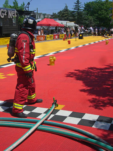
A maladaptive-free zone
As you have inferred from recent Splorpist photographs and from my Flickr set (actually two), last week I attended one of those firefit competitions through which one would ordinarily channel-surf on TV.
The strange thing was that my bike is out of commission (I am an engineering graduate who can’t change a flat tire), otherwise I would have spontaneously ridden past it in the Beach on Saturday AND TOTALLY PLOTZED. I found out about it the old-fashioned way (I saw it on the news) and, by gar, I was so there the next day.
I knew I’d be surrounded by college or university graduates who have all sorts of practical skills, many of which involve saving your life. (I go to the fire academy’s open house every year.) As this is a fitness competition, only the crème de la crème would be there, and very few of them would be girls. (Yes, wymmynz in firefighting. Terribly important. I talk to every one of them I meet. I maintained a file on the issue in the 1990s. I know all about it. Terribly important. Just not relevant to my day at the firefit competition.)
Running an obstacle course in full gear on a fine summer afternoon (your second consecutive day in most cases) is sure to evoke the line “Whew! Sure is hot out here!” So there’d be lots of jolly competent fit firemens wandering around unabashedly, Mike Rowe–style, in sodden T-shirts, or none. What’s not to like?
None of that is the best part. The best part is the complete lack of maladaptives in that environment. Nobody studied fine art, nobody back in high school had a crush on the boys who went on to become firemen, nobody assibilates. Nobody’s skinny and really expressive with their hands. Nobody was first in line to see Sex and the City: le film. Nobody knows what a best-chest or best-legs contest is, despite the fact any of them could win one. Since Keith Maidment wasn’t there, I know for a fact there wasn’t a single out gay fireman on the Toronto team, nor was there observably another one anywhere. I was the only gay in the village, and boy-oh-boy was that a great place to be.
It takes an engineer who can’t change a tire to tell you there actually is such a thing as a real man.
The foregoing posting appeared on Joe Clark’s personal Weblog on 2008.07.12 13:58. This presentation was designed for printing and omits components that make sense only onscreen. The permanent link is: https://blog.fawny.org/2008/07/12/firefit-maladaptiveless/
Firefit: They also serve who only stand and wait
The foregoing posting appeared on Joe Clark’s personal Weblog on 2008.07.12 07:50. This presentation was designed for printing and omits components that make sense only onscreen. The permanent link is: https://blog.fawny.org/2008/07/12/firefit-fireman/
Firefit: Checkerboard

The foregoing posting appeared on Joe Clark’s personal Weblog on 2008.07.11 12:46. This presentation was designed for printing and omits components that make sense only onscreen. The permanent link is: https://blog.fawny.org/2008/07/11/firefit-checker/