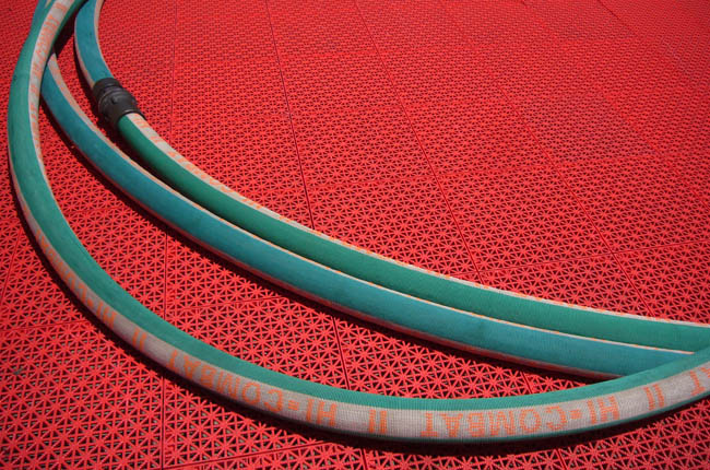
Firefit: Hose
The foregoing posting appeared on Joe Clark’s personal Weblog on 2008.07.10 14:52. This presentation was designed for printing and omits components that make sense only onscreen. The permanent link is: https://blog.fawny.org/2008/07/10/firefit-hose/
Firefit: Yellow mesh
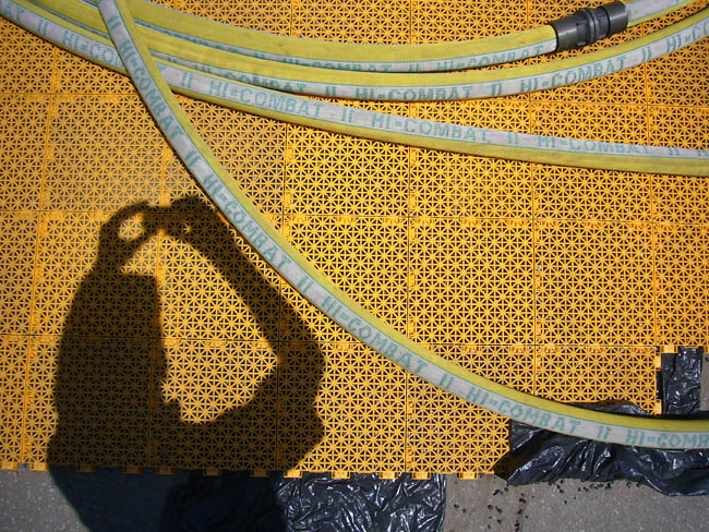
The foregoing posting appeared on Joe Clark’s personal Weblog on 2008.07.09 12:43. This presentation was designed for printing and omits components that make sense only onscreen. The permanent link is: https://blog.fawny.org/2008/07/09/firefit-mesh/
Firefit: Finish line
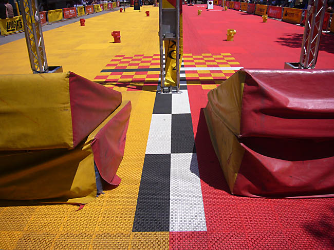
The foregoing posting appeared on Joe Clark’s personal Weblog on 2008.07.08 12:12. This presentation was designed for printing and omits components that make sense only onscreen. The permanent link is: https://blog.fawny.org/2008/07/08/firefit-finish/
Firefit: Mannequins
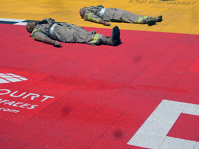
The foregoing posting appeared on Joe Clark’s personal Weblog on 2008.07.07 14:36. This presentation was designed for printing and omits components that make sense only onscreen. The permanent link is: https://blog.fawny.org/2008/07/07/firefit-dummies/
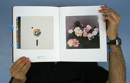
Obverse

The foregoing posting appeared on Joe Clark’s personal Weblog on 2008.07.02 14:09. This presentation was designed for printing and omits components that make sense only onscreen. The permanent link is: https://blog.fawny.org/2008/07/02/not-calliope/
ГУМ

The foregoing posting appeared on Joe Clark’s personal Weblog on 2008.07.01 15:17. This presentation was designed for printing and omits components that make sense only onscreen. The permanent link is: https://blog.fawny.org/2008/07/01/neo-gum/
Further in Saville hagiography
Designed by Peter Saville, Emily King, ed.:
-
I saw the Roxy covers as an exercise in communication through styling. They’re not about literally what’s on them; it’s the subtext that they open up and the place where they put the music…. [Led Zeppelin’s House of the Holy, 1975] is just pseudomythology, whereas a Roxy cover proposed an idealized – but achievable – vision of the world. Girls can look like that. You can stand by that swimming pool with some chi-chi people lounging in the background. We have a magazine full of it now, called Wallpaper[asterisk]…. Roxy inspired a generation of creatives to make it happen…. Bryan was kind of a bridge; it could be done within the terms of an existence that you could have.
-
They were trying to teach graphics as epitomized by the recognized practitioners of the time – a Milton Glaser or a Pentagram. But they’d lost their grasp of the moment. The agenda was how to find witty visual puns to summarize a situation: A logo for a restaurant could be a bite out of a plate. Well, to a young person growing up on Roxy Music, that was utterly banal…. So forget about the bite out of the plate. The choice of type alone will tell you what kind of restaurant this is…. It’s the language of semiotics, not of puns.
Cf. M&Co./Florent.
-
His graphics are, in effect, fashion designs filtered through the medium he found himself using.
My covers were fashion statements. Power, Corruption & Lies is a neo-’60s floral techno collection [sic]; Low-life is an existential black-polo-neck collection. As cardboard and ink, my collections were enigmas. On a runway they would have looked quite self-evident.
-
With Game Over [a catalogue for Yamamoto], there was a statement of transparency…. What we’ve seen since is pseudorealism: “Let’s make it out of MDF and not paint it. Let’s design a stencil typeface on the computer.” Decoration by undesign is an even worse state.
-
What is Manchester? I hadn’t lived there for 20 years, and I didn’t know…. “GUNS, DRUGS & NO MONEY.” That’s an idea. A similar piece that I learned about at the time was Uwe Loesch’s proposal for the city of Leipzig. The city’s colours were blue and yellow, and Loesch proposed that on any communications material, a yellow space would be left. The user could put then any image they wanted there – if this person works in Leipzig, they can represent the city however they want.
-
Peter York: “[Y]ou don’t need to reach all the people, just the ones who’ll matter in the next generation.”
-
Christopher Wilson:
[T]he basic plan was to take a boxful of archive highlights – press cuttings, printouts, rejected versions of old work – and create a screen-printed facsimile “in a hundred copies, and we’ll sell them for a thousand each…. Wouldn’t you want to buy Andy Warhol’s box?” The idea was rooted in a particularly Saville kind of despair: Still faced with the frustration at the lack of a post-Factory “autonomous zone” in which to function, and with the shadow of potential bankruptcy stalking his every move, he was now imagining one strand of his future built from the debris of his past.
King: “[I]n his two-year trial period [at Pentagram], Saville’s team never pulled in more than £250,000 a year.” Later, in L.A.: “In spite of living in a now-well-furnished Hollywood Hills house with panoramic views, each day he struggled to find cash for food and petrol.” FAMILIAR?
The foregoing posting appeared on Joe Clark’s personal Weblog on 2008.07.01 15:12. This presentation was designed for printing and omits components that make sense only onscreen. The permanent link is: https://blog.fawny.org/2008/07/01/throughstyling/
An Odyssey of apples
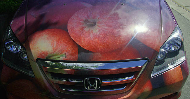
The foregoing posting appeared on Joe Clark’s personal Weblog on 2008.06.30 14:07. This presentation was designed for printing and omits components that make sense only onscreen. The permanent link is: https://blog.fawny.org/2008/06/30/odyssey/
The black rose of ‘men’s magazines’
Sean Avery is an ugly goon instigator with a great body and more self-confidence than any man on the planet.
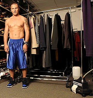
S. Avery (detail)
Ostensibly credited to Hannah Thomson of Vogue,
but neither this photo nor a similar one appears there
He’ll stand in front of you at net and wave his arms for 15 minutes. When out of skates, he dresses like a model. Avery adores fashion so much he worked a celebrity internship at Vogue and Men’s Vogue (Cf. sports and women’s sports). I’m not sure it is possible to be straighter than Sean Avery is. Maybe Shanahan – I dunno.
As such, Sean Avery is the first viable progeny of a generations-long eugenics experiment by heteronormative “men’s magazines” – Esquire, GQ, Details (“for men”). Like endless cloning of sheep that only ever produced a Dolly, for decades the men’s magazines insisted, in an inverse J.D.s manner, that a tribe of indisputably heterosexualist males obsessed with hair, “grooming,” and above all clothes! clothes! clothes! was visible to the naked eye in upper-echelon white-collar offices throughout the civilized world. As with brutish right-wing talking points, this twee left-wing talking point, if repeated often enough, eventually had to come true.
It did. Once. Only. In Sean Avery. He illustrates the limits of cultural gene-splicing. Readers of men’s magazines are female and gay, and the men who dress like the models in those pages are effeminate and gay or Sean Avery. There really are no other categories.
Should you be interested in engaging in a discourse with Avery over his position in the masculinist-fashionisto continuum, I would suggest visiting the beach, where he will manfully defy the phalliban by “rocking a straight Speedo all summer.”
RELATED: I recently disposed of nearly 200 unwanted issues of “men’s magazines.” That experiment is over, too.
The foregoing posting appeared on Joe Clark’s personal Weblog on 2008.06.30 13:52. This presentation was designed for printing and omits components that make sense only onscreen. The permanent link is: https://blog.fawny.org/2008/06/30/averyism/