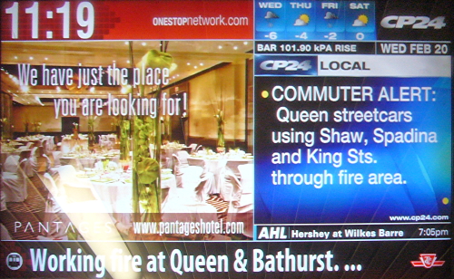
I don’t want to have to put a lot of work into this, because fundamentally it isn’t really my “issue,” but: The OneStop video panels in the subway, which are mere vehicles for blinking, flickering, distracting advertising, are supposedly overridable during an emergency. The panels would then tell you all about the emergency in nice big comprehensible letters. (Unless you’re blind, of course; if this were really about information, the panels wouldn’t have been installed without audio transmitters. The panels aren’t about information.)
Anyway, I took lots of photographs proving that, in the most recent TTC emergencies (derailment at Kennedy; Queen West fire diverts numerous streetcars), the OneStop ad panels told you nothing, or, later, barely anything.
At no time did they go fullscreen or widescreen to tell you not to bother going to Kennedy station, for example. But they do go widescreen for a MasterCard ad, I saw on another day.
During this fishy deal, we were promised there’d be tons of screen real estate for TTC emergencies. This turned out to be false, as I have shown. OneStop is in apparent breach of contract. [continue with: TTC OneStop: A failure to communicate →]
Select a category to see additional posts. Add feed/ to a category to subscribe via RSS
The foregoing posting appeared on Joe Clark’s personal Weblog on 2008.02.27 17:29. This presentation was designed for printing and omits components that make sense only onscreen. (If you are seeing this on a screen, then the page stylesheet was not loaded or not loaded properly.) The permanent link is: https://blog.fawny.org/2008/02/27/onestop-fail/
Select a category to see additional posts. Add feed/ to a category to subscribe via RSS
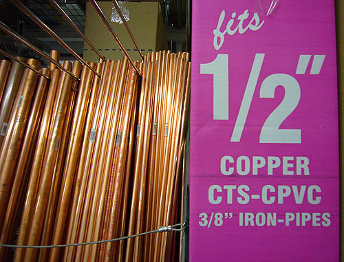
The foregoing posting appeared on Joe Clark’s personal Weblog on 2008.02.26 16:13. This presentation was designed for printing and omits components that make sense only onscreen. (If you are seeing this on a screen, then the page stylesheet was not loaded or not loaded properly.) The permanent link is: https://blog.fawny.org/2008/02/26/fits-half/
I’m fine with all this. I don’t like the Union artwork much, though I do like the Vic Park design. Neither of those opinions matters.
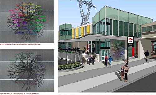
However, both these works intend to incorporate typography. Reid’s will include “typeset text pieces” (the illustration shows handwriting). Meszaros’s will use the following:
Text by the artist [single quotes sic – this isn’t England], ‘Toronto, a city where those with diverse roots can grow and intermingle into a complex and exciting multicultural garden,’ will be sandblasted into the existing ceramic glazed block…. The words ‘community’ [again sic] in different languages are layered on top of the root patterns…. A layer of the word ‘Roots’ [again], translated into various languages on top of the image, subtly changes colours throughout the day and seasons depending on the outside weather.
I see a few dangers here:
Wrong fonts. Exactly what the right fonts are is open to discussion. But let me tell you right now that Arial and Times (“New Roman”) aren’t gonna cut it.
Wrong weight, size, and spacing. If you’re going to be sandblasting, you need just the right weight and size. Spacing has to be very carefully determined and is certainly not going to be the default spacing of the typeface, because the words have to be readable from a distance. (Even standing distance is still “a distance.”) Pay too little attention to spacing and you end up with Museum (or Sheppard).
Windows-style abominations like fake italics, Microsoft Word or CorelDraw default spacing (the culprit at Sheppard), and neutral apostrophes.
Permanent copy errors, of the sort seen in memorial plaques. (You really don’t want to use British quotation marks on something that will stay in place for 50 years.)
I note that TTC considers sandblasting a public artwork into the living tile OK, but every other sign in the system has to use fake Helvetica on a plastic panel.
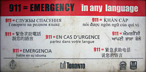
Additionally, what are the “various languages” going to be, and how will their different scripts be balanced? Contrary to popular belief, it is possible to put Latin alongside Arabic alongside Chinese and not have them clash, though the city of Toronto, and the TTC specifically, have a piss-poor record in this regard. The city and the TTC believe that each language needs its own font even if all of them are written in the same script and even if the same font is available in multiple scripts:
Here the Russian, Vietnamese, French (a pointless exercise in political correctness in Toronto), and Spanish all could use the same font.
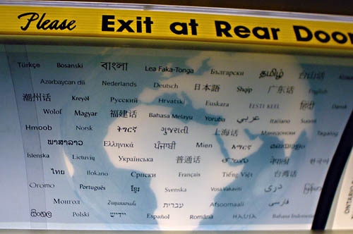
Here at least 45 of the language names (very much including Hausa, bottom line) could all use the same font. (I’m blanking on only about a dozen of those names without looking them up. I’m lousy at Indic scripts.)
Select a category to see additional posts. Add feed/ to a category to subscribe via RSS
The foregoing posting appeared on Joe Clark’s personal Weblog on 2008.02.26 15:53. This presentation was designed for printing and omits components that make sense only onscreen. (If you are seeing this on a screen, then the page stylesheet was not loaded or not loaded properly.) The permanent link is: https://blog.fawny.org/2008/02/26/roots-immersion/
Project X is a new CBC science program. It has its own microsite and blog. We would tend to expect that in this day and age.
Except:
Why is all the content on the microsite homepage delivered in Flash? (Using Arial type, no less?) I have no way of checking its accessibility features, if any, but it is always safe to assume they don’t exist. (To this day, almost no Flash developers have serious knowledge of the black art of Flash accessibility.)
And here’s how it is rendered in Lynx, a somewhat unfair comparison:
If you see thismessage, you need to download the latest version of Flash to view this content.
Here, “this content” means “your entire purpose for coming here.” All you can read without Flash is the CBC boilerplate surrounding the real content.
Why is the navigation on the blog also in Flash? (Actually, you can’t even link from the homepage to the blog without Flash. You could just add blog/ to the URL. That would be a fair guess, and it’s certainly one of the available options for rational URLs, but how are you to know that in the first place?) Basic blog navigation is in HTML. (They’re running TypePad.)
Now:
I have heard a little susurrus of complaint that I failed to “give props,” as no one says anymore, to CBC for producing mostly-standards-compliant relaunches of its Sports and News sites, among others. What a Canadian thing to expect. My response is I’m not here to give you a pat on your back for being competent. I am, however, here to point out standards noncompliance when a prevailing design norm of standards compliance has been brought to fruition.
So what the hell is going on with the Project X site? CBC developers – at least the ones not hired en masse from Blast Radius, a mistake that will come back to haunt the organization – simply aren’t incompetent enough to do something like this. They must have had outside help. But, after mailing over a question for attribution, Mark Smyka of Cossette Communications refused to confirm or deny that his firm had anything to do with the site.
Nonetheless, the site remains CBC’s problem. How much did it cost again?
Select a category to see additional posts. Add feed/ to a category to subscribe via RSS
The foregoing posting appeared on Joe Clark’s personal Weblog on 2008.02.26 14:25. This presentation was designed for printing and omits components that make sense only onscreen. (If you are seeing this on a screen, then the page stylesheet was not loaded or not loaded properly.) The permanent link is: https://blog.fawny.org/2008/02/26/project-hex/
Select a category to see additional posts. Add feed/ to a category to subscribe via RSS
The foregoing posting appeared on Joe Clark’s personal Weblog on 2008.02.25 16:19. This presentation was designed for printing and omits components that make sense only onscreen. (If you are seeing this on a screen, then the page stylesheet was not loaded or not loaded properly.) The permanent link is: https://blog.fawny.org/2008/02/25/cracked-tile/
Select a category to see additional posts. Add feed/ to a category to subscribe via RSS
The foregoing posting appeared on Joe Clark’s personal Weblog on 2008.02.24 15:24. This presentation was designed for printing and omits components that make sense only onscreen. (If you are seeing this on a screen, then the page stylesheet was not loaded or not loaded properly.) The permanent link is: https://blog.fawny.org/2008/02/24/carburations/
Select a category to see additional posts. Add feed/ to a category to subscribe via RSS
The foregoing posting appeared on Joe Clark’s personal Weblog on 2008.02.23 14:43. This presentation was designed for printing and omits components that make sense only onscreen. (If you are seeing this on a screen, then the page stylesheet was not loaded or not loaded properly.) The permanent link is: https://blog.fawny.org/2008/02/23/with-horns/
Design sites still don’t do Web standards. Armin Vit: “One of these days I’ll implement a print stylesheet.” Hint – it’s one-time-only and requires ten consecutive minutes’ effort.
Select a category to see additional posts. Add feed/ to a category to subscribe via RSS
The foregoing posting appeared on Joe Clark’s personal Weblog on 2008.02.21 12:56. This presentation was designed for printing and omits components that make sense only onscreen. (If you are seeing this on a screen, then the page stylesheet was not loaded or not loaded properly.) The permanent link is: https://blog.fawny.org/2008/02/21/someday-css/
Listen, can everybody cut the crap and cease reiteration of the received wisdom that the New Yorker is the best magazine there is? That’s like saying the British Empire is the best empire there ever was. It’s a shibboleth, a myth about an imaginary upper-crust past, a form of status anxiety.
The New Yorker is a corporate sibling of Wired, Elegant Bride, Teen Vogue, and Condé Nast Traveller. It’s pretentiously written, using even more archaisms than I do (“reëvaluated”; all numbers written as words; all artwork names in quotation marks). Its Web site is an atrocity – but surely a Web site is antithetical to such an august journal. It’s only barely illustrated. And, if you were truthful for half a second, you’d admit you have scarcely read a single article all the way through in even one out of last four issues you held in your hands. (The punishing typography, using an overregularized Caslon knockoff, and grey page layout conspire to prevent you from reading all the way through. Contrary to the expected bierutism, the book needs a redesign.)
Khoi Vinh, blogging isn’t stopping you from writing in any sense. Blogging is writing. It isn’t writing like the New Yorker, but who the hell wants that anyway? The English language contains multitudes.
The NYRB – an anachronism itself – has the right attitude.
Writing like this might seem easy, but just try it. Geoffrey Nunberg, a linguist at Stanford who writes for newspapers and radio and sometimes contributes to the blog Language Log, admitted on NPR back in 2004, “I don’t quite have the hang of the form.” And, he added, many journalists who get called upon by their editors to keep blogs are similarly stumped: “They fashion engaging ledes, they develop their arguments methodically, they give context and background, and tack helpful IDs onto the names they introduce.” Guess what? They read like journalists, not bloggers.
Bloggers are golden when they’re at the bottom of the heap, kicking up. Give them a salary, a book contract, or a press credential, though, and it just isn’t the same. (And this includes, for the most part, the blogs set up by magazines, companies, and newspapers.) Why? When you write for pay, you worry about lawsuits, sentence structure, and word choice. You worry about your boss, your publisher, your mother, and your superego looking over your shoulder. And that’s no way to blog.
Select a category to see additional posts. Add feed/ to a category to subscribe via RSS
The foregoing posting appeared on Joe Clark’s personal Weblog on 2008.02.19 13:25. This presentation was designed for printing and omits components that make sense only onscreen. (If you are seeing this on a screen, then the page stylesheet was not loaded or not loaded properly.) The permanent link is: https://blog.fawny.org/2008/02/19/new-blogger/