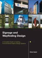
 I have again spent money, again foolishly, on one of the pretended guides to signage design, this time with a baldfaced title that promises a lot – Signage and Wayfinding Design: A Complete Guide to Creating Environmental Graphic Design Systems by (Ms) Chris Calori. And, like Craig Berger’s ostensibly complete manual, there just isn’t enough genuine information to learn from and use here. [continue with: Overpromised, underdelivered →]
Overpromised, underdelivered
The foregoing posting appeared on Joe Clark’s personal Weblog on 2007.08.19 12:52. This presentation was designed for printing and omits components that make sense only onscreen. The permanent link is: https://blog.fawny.org/2007/08/19/caloric/
Three cherrypickers

The foregoing posting appeared on Joe Clark’s personal Weblog on 2007.08.15 15:22. This presentation was designed for printing and omits components that make sense only onscreen. The permanent link is: https://blog.fawny.org/2007/08/15/3cerises/
‘Helvetica’ accessibility manifesto
I am making a public appeal to the producers of Helvetica, the acclaimed documentary of which I wrote the best review, to live up to the standards of the film itself and not blow it when it comes to captioning and description.
Helvetica director Gary Hustwit assured me to my face, and later in E-mail, that we would discuss making the movie accessible properly. I am, after all, the expert. My interest in accessibility started with captioning, which also started my interest in typography; the two coevolved. (My typewriter camouflaged my age when, in my mid-teens, I wrote the Caption Center at WGBH and asked them why their w was taller than the other letters and why their quotation mark was merely two dots.)
I’m going to give Hustwit concrete – and free – advice, in public, and I’m also going to blow a few objections out of the water. [continue with: ‘Helvetica’ accessibility manifesto →]
The foregoing posting appeared on Joe Clark’s personal Weblog on 2007.08.14 13:05. This presentation was designed for printing and omits components that make sense only onscreen. The permanent link is: https://blog.fawny.org/2007/08/14/helvetifesto/
FAC 461
FAC 461 is Factory Records: The Complete Graphic Album, by Matthew Robertson. It isn’t actually “complete”; an appendix lists 124 items not illustrated. What it also isn’t is consistent, or simply the work of Peter Saville.
The foundation of graphic design at Factory Records had two parts: Tony Wilson’s belief that quality should almost never be compromised and the simple rigour of numbering everything. The original poster for the first “Factory club” show was FAC 1; the first record was FAC 2. And not the other way around, because the poster came first. I was shocked at the consistency. They numbered the Haçienda (FAC51), displaying it in a granite panel.
Design rigour lets you do anything while knowing you are consistent. Just going right ahead and doing anything merely leaves you with unrelated objects. Aligning everything to a grid is high-order rigour; believing in the future and numbering everything you produce is low-order, and that’s all you need.
I thought a couple of things while reading the book. I don’t know how many years I’ve been struggling to get this business of rigour and standards across. Canada is simply the wrong place for it. We’re too goddamned mediocre. There are any number of explanations, but the truest is “Nobody wants to be corrected.” Do you think anybody will ever write a book about the graphic design of, say, Nettwerk Records? Factory did not waste money on design; it was “an investment in mystique.”
I thought: Isn’t Sheffield the new Manchester? Or am I the victim of Designers(’) Republic propaganda?
Design at, and the design of, Factory Records was not twee. It wasn’t artfags insisting that “design” means interior decoration or a darling little side table or Mummy’s china cabinet. It was design in the service of something else. It would take Peter Saville decades to angrily realize he had chosen a field that worked at odds with self-expression. It isn’t completely true, as he admits.
We’re going to have to come up with some other model than Factory Records’, because Tony Wilson is now dead (FAC ∞).
The foregoing posting appeared on Joe Clark’s personal Weblog on 2007.08.12 18:17. This presentation was designed for printing and omits components that make sense only onscreen. The permanent link is: https://blog.fawny.org/2007/08/12/fac461/
M.M ≅ C and C
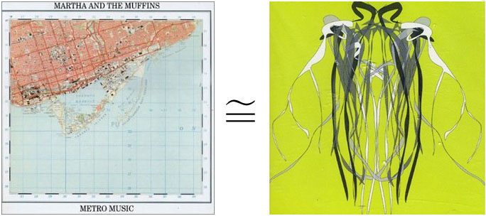
The foregoing posting appeared on Joe Clark’s personal Weblog on 2007.08.11 16:50. This presentation was designed for printing and omits components that make sense only onscreen. The permanent link is: https://blog.fawny.org/2007/08/11/metro-history/
Stealth cruiser through streetcar window, Caribana
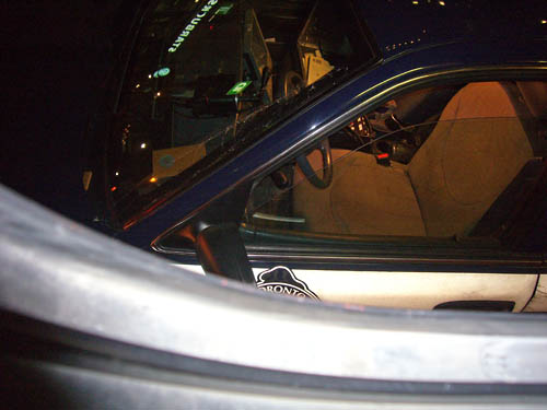
The foregoing posting appeared on Joe Clark’s personal Weblog on 2007.08.10 18:34. This presentation was designed for printing and omits components that make sense only onscreen. The permanent link is: https://blog.fawny.org/2007/08/10/stealthibana/
Another way in which to fail at ‘monetizing one’s intelligence’
When my colleagues meet these days, it seems to be more and more in order to discuss some kind of business scheme…. There has to be some way of extracting more money out of this thing.
The meetings devolve into bitchfests. How is it possible that we have each published a handful of books and won awards and have entries in encyclopedias and get asked to appear on radio shows and TV shows as experts twice a week and get asked to come and talk at universities once a month and no one wants to pay us anything for it?
The foregoing posting appeared on Joe Clark’s personal Weblog on 2007.08.09 21:27. This presentation was designed for printing and omits components that make sense only onscreen. The permanent link is: https://blog.fawny.org/2007/08/09/monetize2/
What are the gatekeepers of ‘environmental graphic design’ up to these days?
The Society for Environmental Graphic Design, “an international non-profit educational organization providing resources for design specialists in the field of environmental graphic design, architecture, and landscape, interior, and industrial design,” thinks of itself as the professional organization for anyone who designs graphics beyond the page or screen. Craig M. Berger is director of education and professional training.
I am reliably informed that Berger – and maybe some Pentagraphistes or the Canadians they hired like an Indian outsourcing firm – were terribly, terribly hurt when I called bullshit on their little confab at the Snib four months ago. (Berger is the one who promised me press credentials, then reneged. Ethics in design, anyone?) These are people who need to get used to public discussion of their work and fast.
What have Berger and the SEGD been doing since then?
-
Their Web site is still a disaster. The news page still overwrites itself, erasing SEGD’s own history. (It was last updated “07/5/2007.” What day was that?) Yet there is also a Buzz page, which rather confuses the issue.
-
Pictures from some kind of event are served up as an FTP page, complete with username and password given in the clear. I won’t duplicate the link, but I will show you a browser security warning:
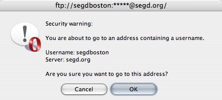
After you load that page, you are confronted with nothing but filenames. The same group that sells audio compact discs of presentations by visual signage designers expects you to hack into their own site to select photographs by filename.
-
There is at least a “Web manager” listed, Paul Trautwein. He’ll have a lot to manage, given the homepage’s 13 layout tables, 3K of JavaScript to “Hide from older Browsers,” and the actual nature of the homepage’s dozen validation errors (the CSS passes).
-
I think the blue-on-ochre text of the 2007 SEGD Awards page reads nicely, and I like the way the pop-up window that shows you winning images cycles effortlessly from the project you really want to look at to another project and another.
These are people who want their profession taken seriously. Of course Web sites are not part of their daily work. But Web sites aren’t part of the daily work of anyone but Web developers and designers; that doesn’t excuse anybody else’s shitty Web presence, and it won’t excuse SEGD’s, either. Why can’t they do what AIGA did and just hire Zeldman?
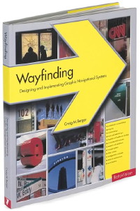 I also paid cash money for Berger’s book, Wayfinding: Designing and Implementing Graphic Navigational Systems. It’s a photo book with cutlines, like dozens of other graphic-design books I’ve read, though here the cutlines occupy a third of a page.
The book offers us the least-representative rendering of the New York subway I’ve ever seen, making the illustrated station look like the terminus of a high-end European rail line. This station’s backlit Helvetica signs were unironically displayed in the chapter entitled “Legibility for users with disabilities.” The chapter spends all the usual time discussing the “American” with Disabilities Act and running photos and cutlines of near-vapourware products like the RaynesRail© (sic).
But a beginner, or even an otherwise-qualified graphic designer faced with an “environmental” problem for the first time, cannot take this book and produce a viable job based on its information. The introduction specifically states that “[t]his book is not a how-to guide or a set of instructions.” The problem is that such a book is exactly what is needed. If the head of the Society of Environmental Graphic Designers can’t write it or sell it to a publisher, who’s gonna?
The foregoing posting appeared on Joe Clark’s personal Weblog on 2007.08.08 16:27. This presentation was designed for printing and omits components that make sense only onscreen. The permanent link is: https://blog.fawny.org/2007/08/08/segd2/
iPhone accessibility redux
Barry Solomon from DeafMac (yes) had a meeting with Apple and AT&T to talk about deaf-related accessibility on the iPhone:
[B]igger font sizes for people with low vision, closed-captioning support, option to make all phone calls go direct to voicemail, making voicemail forwardable as E-mail attachments, iChat, relay-service access, more vibration options/customizable for different applications like ringtones are…. I emphasized that most of those things already existed in certain applications here and there, and would make sense if the same options were offered in all applications…. The bottom line I was telling him that those things need to be available across the board, and he couldn’t dispute this.
We had a good discussion about closed-captioning support. They said they couldn’t know if it would be ported to iPhone after it went live in 10.5 this fall, but said that captioning was one of their priorities, and making [QuickTime] able to read captions was important, so that they could then ask content providers to include captions….
In the nicest possible way I have to call bullshit here for a moment. Yes, Apple announced so-called closed-captioning support in QuickTime, and I’ve been waiting for somebody to figure out what that means. Thus far, nobody has.
- Closed captioning of analogue video signals is transmitted in the vertical blanking interval.
.MOVand other digital-video files do not have a VBI – if I’m not mistaken, encoding starts at Line 23, and the VBI ends one field after Line 21, where NTSC captions reside. Is the assumption that captions would be captured and stored in some other format, like QTtext? How are you going to make sure the video file, this other file, and any wrapper files (like SMIL) all make it from your computer to your iPhone? - Has Apple really understood the variety of captioning formats in use? Just in analogue television, I can think of three (Line 21, “Line 21”/22 PAL, teletext). Digital? There it gets complicated.
- DVD Player ostensibly shows Line 21 captions, but cannot display scrollup captions. (If I could find a disc with pop-on captions, I’d test those. I would expect a failure.) A system that displays only one of three caption types from one system does not “support closed captioning” at all.
- Isn’t there a tiny bit of a font problem? Apple has gotten this wrong before.
- iPhones and iPods don’t have enough screen real estate for out-of-frame captions. I would expect natural superimposed captions. Getting the alignment right is going to be interesting (widescreen vs. fullscreen and proportional vs. monospaced fonts).
I’m sure an established shop like WGBH already has a secret contract to fix this all up. They’re certainly friends.
DeafMac has a number of other posts on the iPhone. It may be interesting to Americans to read that a payment plan that allows nearly unlimited text messages is unavailable on the iPhone. And if Apple could get this thing to work really well with relay services (especially with hearing or voice carryover), think of the convenience.
Of course, since people equate “accessibility” with “blind person using Jaws,” surely none of this matters – and the iPhone, unlike every other screenphone on the market, is flagrantly illegal and a lawsuit waiting to happen.
The foregoing posting appeared on Joe Clark’s personal Weblog on 2007.08.07 14:33. This presentation was designed for printing and omits components that make sense only onscreen. The permanent link is: https://blog.fawny.org/2007/08/07/itty2/