Among other fonts.

White asparagus, sure. But “maroon carrots”?
Among other fonts.

White asparagus, sure. But “maroon carrots”?
The foregoing posting appeared on Joe Clark’s personal Weblog on 2006.04.04 16:33. This presentation was designed for printing and omits components that make sense only onscreen. The permanent link is: https://blog.fawny.org/2006/04/04/maroon/
Right, so the Beaches Business Improvement Area is carrying out an opinion poll on proposed new streetsigns for this neighbourhood – located, if you are unaware, around the extreme east end of Queen St. in Toronto, a single block north of Lake Ontario. The Beach (or is it Beaches?) used to be an ethnic ghetto in earlier decades – vestiges of which can still be found, as in the Beach Hebrew Institute on Kenilworth – and is now a remote upper-middle-class enclave of white parents, Filipino nannies, and Weimaraners. I’m there most days of the week; it’s my auxiliary neighbourhood.
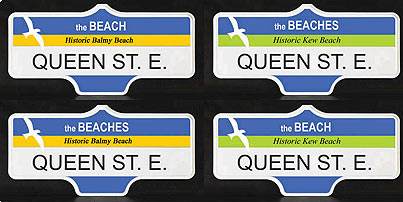
Here’s an edited illustration of the street signs the Beaches BIA is presenting:

It seems the distinctions are between “the BEACH [sic]” and “the BEACHES [sic],” with some variation in the regions of the actual beachfront that might be named (Historic Balmy/Kew/Woodbine/Scarboro Beach) and minor changes to accent colour. I pretty much couldn’t give a shit about any of those variations, except to say the colours look like they came from Microsoft Paint and an uncalibrated 14″ VGA monitor.
The poll buries its lede and does not make very clear the fact that it is actually asking “Beach or Beaches?” The terms have been used in free variation for decades, and you will not find consensus that, e.g., Beach(es) residents prefer one term and outsiders the other. You just won’t. Both terms are equally understood and are, in fact, the same word in singular and plural forms. This is not like Cambodia/Kampuchea or the name of the country usually referred to as Taiwan. It isn’t even like the typical Montreal bilingualism nonsense of Pointe Claire/Pointe-Claire. It’s the same word. Again, who gives a shit?
The poll page provides the weak proviso that the illustrations are “Artist’s concepts. Final signs may be a bit different.” Well, that’s not likely to happen based on my experience. From the standpoints of typography and signage and wayfinding, the mockups have nothing right about them.
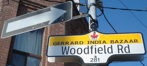
If you’re thinking that the new city standard of (misused) Clearview will take care of all that, think again. What do we see a few blocks north in Little India – or, to call it by the tongue-twisting official name nobody uses, Gerrard India Bazaar?

Yes, that’s Clearview with Verdana. Klassy, huh? And so easy to make on your desktop Windows computer. (It actually gets worse downtown, as the Church St. signs have a complete rainbow effect going on behind the type.) The city, none of whose staff can be considered an expert in typography, permits abominations of and adulterations to what should be a locked-down signage system.
It is dangerous to display mockups with incorrect type, since such type then becomes difficult to replace. It follows that it is irresponsible to let amateur “designers” mock up signs in the first place. They don’t know that they’re doing and their mistakes tend to stick.
If the BIA were actually interested in polling Beach vs. Beaches, then:
The Beaches BIA, whose very name presupposes the answer to the question, needs to accept that typography and signage and wayfinding are not among its areas of expertise.
I would also like to hear from the Spacers. Do they or do they not support wide variations in street signage?
After all, the most that Spacing can come up with on the subject is whining that the little knobs at the tops of the signs are Flatland representations of knobs instead of the real thing (“Mixed Signals,” Spacing, Winter 2006, p. 10). Can’t you just imagine a Spacer standing there, pushing his glasses higher up on his nose and adjusting his beret, uttering a disgusted tsk-tsk at the destruction of old, rusted, too-small, illegible, dark, all-caps street signs with real knobs in favour of new, large, readable, retroreflective, mixed-case street signs with faux knobs?
I mean, think of what we’re losing here, people. For want of a knob, the project collapses?
The foregoing posting appeared on Joe Clark’s personal Weblog on 2006.04.03 13:49. This presentation was designed for printing and omits components that make sense only onscreen. The permanent link is: https://blog.fawny.org/2006/04/03/plages/
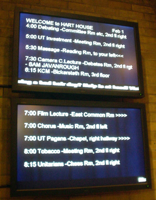
These plasma displays sit high on the wall behind the porters’ desk at Hart House, University of Toronto.

If you get the impression that the whole thing is “typeset” in Arial, with no attention paid to hierarchies of spacing, size, or alignment, with hyphens used for en or em dashes (among other hyphenation problems), with rows of greater-thans used as arrows, and with what appears to be a crawl visible on the bottom of the upper monitor, it’s because all of that is true. (And can you spot the misspelling?)
What you can’t see is that there is no antialiasing whatsoever and every individual jaggie is visible at large size. So I asked what gave. Why, this arrangement was specifically tested with visually-impaired people and is what they preferred, they volunteered.
Compared to what? A sign handwritten on loose leaf in ballpoint thumbtacked onto the wall? Seriously, this presentation could not scream “Windows type illiterate” any louder if you handed it a megaphone. How is it even possible to produce type this bad on monitors this expensive?
Quickie question for Hart House: What if you tested this presentation against something prepared by an actually competent designer? What if you tested it against other options that were not worse, if such is even conceivable?
And if this is truly the preferred presentation, why haven’t you published your methodology and evidence?
The foregoing posting appeared on Joe Clark’s personal Weblog on 2006.04.02 18:45. This presentation was designed for printing and omits components that make sense only onscreen. The permanent link is: https://blog.fawny.org/2006/04/02/harthouseplasma/
This week we enjoyed a visit by Matt Müllenweg (not his real orthography). The esteemed colleague and benefactor of my network of sites was in town for some conference or other. We squired him around to various restaurants, including the Queen Mother, where he was fêted by a motley crew including a 28-year-old father of two, a pair of inverts who are not in fact together, a man in a wheelchair and another man battling an almost-equally-disabling hairstyle, a couple in from the city that CrackBerry bought, and two solo developer types. (Additionally, we found out at the eleventh hour that Matt just missed being lodged at the Gladstone.)
And it was all well and good, but the not-entirely-unshocking realization, after knowing Matt now since he was in his teens, is that he tends to simply view tasks as attainable and then merely attains them. Whereas when I was his age I clutched a useless diploma in engineering in my fingers and could barely tie my shoes. Kids today. “Buck up,” I tell myself.
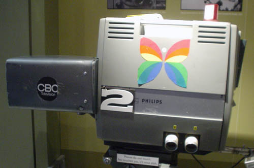
Anyway, obviously the best possible portrait is one that unites Matt and a classic, even textbook use of nobody’s favourite typeface, Arial.

Apparently there’s some big news or other on Monday. Matt’s always got news.
The foregoing posting appeared on Joe Clark’s personal Weblog on 2006.04.01 12:58. This presentation was designed for printing and omits components that make sense only onscreen. The permanent link is: https://blog.fawny.org/2006/04/01/mullenwegism/
Last night (2006.03.30), Michael Geist, the law professor, columnist, and copyright activist with the terrible Web site, delivered the annual Hart House Lecture at, indeed, Hart House, University of Toronto. It carried the title “Our Own Creative Land: Cultural Monopoly & the Trouble with Copyright.”
I was glad I went, but I learned almost nothing new. Geist is a strong, fluent, likable speaker and looks quite boyish – although, speaking from experience, it may be time to go the short-hair route.
My esteemed colleague and I hauled arse across town mindful of the warning that they’d give our tickets away if we weren’t there 15 minutes early. (They didn’t.) A near-capacity crowd sat on Protestant-church-style chairs in the vaulted stone Great Hall and watched a slideshow of unvarnished Creative Commons propaganda, including unreadably dense Arial-typeset information slides and ill-chosen Flickr images. We also listened to Creative Commons–licensed “music,” much of which sounded like a bucktoothed piano student’s attempt to play old Charlie Brown TV special theme songs from memory.
The warden of Hart House, Margaret Hancock, introduced the evening. Mentioned the responsibilities of active citizenship, attracting innovative and emerging thinkers on issues of interest to young people and beyond. In 2005, the student committee selected copyright as an issue for the Lecture. But she worried “the subject might be a little bit too dry or even boring… Sorry, Michael.”
She had a hard time uttering the word “blogosphere” (acting as though each syllable were a separate word) and laughed. “A number of us – well, at least I – are quite illiterate when it comes to Creative Commons.” The book to be available at the end of the lecture (more below) is licensed under Creative Commons. Before the session, organizers held a Creative Commons music-creation contest.
The warden introduced the evening’s moderatrix, the much-unloved Sharon Lewis, standing a proud 4′11″ and glitteringly blinged-out to within an inch of her life. Lewis is the former hostess of CBC Zed, which position she attained by somehow winning a 2003 hosting bake-off over superior candidates like Mio and Nobu Adilman. (It was on that program that she described herself as “a black South Asian woman.” Who knew the true extent of African diaspora?) Hancock told us that Lewis “is living creatively with what I’m talking about.”
Lewis took the stage, but held a wireless mike and did not stand behind the podium “because I’m really short and you won’t see me behind there.” Described herself as a “content creator,” then a “professional artist.” The organizers asked her if it would be OK to Webcast the evening. She said yes; her union said no. “Obviously it’s not a copyright issue” – indeed it isn’t, so why are we talking about it? – “but that really drove home what Michael Geist is doing.” “What Michael Geist leads us to believe is we can be leaders and pioneers in shaping a copyright law” that makes Canada a global leader. [continue with: Geist does Hart House →]
The foregoing posting appeared on Joe Clark’s personal Weblog on 2006.03.31 13:33. This presentation was designed for printing and omits components that make sense only onscreen. The permanent link is: https://blog.fawny.org/2006/03/31/harthouse/
The other night I was flopped on my esteemed colleague’s couch, all alone with the worst kind of television – Saturday post–Battlestar Galactica. I channel-surfed and managed to ID a movie almost on sight even though I’d never seen it before. It had shitty mid-’90s NCI captions (a partially tautological assessment) that I also IDed nearly on sight. I wondered what it would be like to hate what you do for a living yet nonetheless have to slave away on a gem like this.
You probably come home at night and say to your husband, “My job sucks. Today I captioned Flashdance.”
The foregoing posting appeared on Joe Clark’s personal Weblog on 2006.03.29 13:55. This presentation was designed for printing and omits components that make sense only onscreen. The permanent link is: https://blog.fawny.org/2006/03/29/gem/
“If you prick me, do I not blog?”
(™ Joe Clark 2006.)
The foregoing posting appeared on Joe Clark’s personal Weblog on 2006.03.29 13:47. This presentation was designed for printing and omits components that make sense only onscreen. The permanent link is: https://blog.fawny.org/2006/03/29/motto/
The foregoing posting appeared on Joe Clark’s personal Weblog on 2006.03.29 13:06. This presentation was designed for printing and omits components that make sense only onscreen. The permanent link is: https://blog.fawny.org/2006/03/29/pastel/

(Q.v.)
The foregoing posting appeared on Joe Clark’s personal Weblog on 2006.03.28 13:33. This presentation was designed for printing and omits components that make sense only onscreen. The permanent link is: https://blog.fawny.org/2006/03/28/not-cfto/