-
Let’s start with a bang: The justfont “Working Group is chartered to define the ‘font’ top-level media type, as per RFC6838 [§]4.2.7.”
-
ATypI 2015 São Paulo recap: Part 1 ¶ Part 2. One does rather wonder how the interpreters kept up.
-
“Interestingly, there’s no Kickstarter campaign to reissue this particular standards manual, perhaps because it wasn’t created by a famed Italian modernist designer and is typeset in the most basic manner possible.” Here the Transit Maps Tumblère is talking about the Boston MBTA identity guidelines, links to PDFs of which are helpfully given without having to ante up a hundred bucks.
-
“The long, incredibly tortuous, and fascinating process” variously “of creating a Chinese font” or getting a dumpling emoji into Unicode. As the latter is premised upon cultural inclusion and sexism, we’ll never hear the end of it.
-
“Why Are the Terms of Service Agreements We Never Read in All Caps?” And Why Do Online Clickbait Sites Use Only The Upstyle For Headlines Despite The Fact The Times And The Journal Are Almost Alone In Doing That In The Real World?
-
Richard Ishida pickers: Runic and Old Norse; Old English. Still dearly missed is his utility whereby you paste in any string and it lists every Unicode character in that string.
-
Hi! Yes, the Canada 150 logo(type) boondoggle continues to worsen, notwithstanding what Ray Larabie tells us in a different drawer. Ray predicted the press and designers won’t care; in fact this thing gots legs.
This week in type: All Bat-Helvetica breaks out over emoji dumplings (and: Spiekermann)
The foregoing posting appeared on Joe Clark’s personal Weblog on 2016.01.22 14:01. This presentation was designed for printing and omits components that make sense only onscreen. The permanent link is: https://blog.fawny.org/2016/01/22/twit2016a/
‘Cruising the Movies’
Straight to Hell is the storied chapbook/zine, active in the 1980s, that reprinted true-life homosexualist experiences. Its editor, Boyd McDonald, was a cautionary tale yet a model for a legitimately alternative way of life. He lived in what was essentially a fleabag boarding house, on a budget of next to nothing, for years if not decades. Yet McDonald was well known and widely read in high places and low places, which indeed was a theme of his, as we shall see.

Oliver Sacks should have read Straight to Hell
While one can find a few mostly legitimate online reproductions of stories submitted, I own not quite enough actual back issues of Straight to Hell. They are perfect bedside reading for any eldergay who thinks bodies are real and so is gay. Though in fact McDonald objected to “gay” as it was commonly expressed, and departed from house style at one point to publish an infamous editorial (Nº 48), complete with cartoon, denouncing the “Wax Fruit.” He and I certainly would have agreed that nothing is worse than a gay intellectual with a big dick.
Now we have Cruising the Movies: A Sexual Guide to Oldies on TV, reprinted by the preposterously named Semiotext(e) from the 1985 original. This thing was half-assedly OCRed, with errors all over the place (“annpits” for armpits, “peekers” for peckers), and contains an actual design credit (Hedi El Khoulti) despite looking like a Word for Windows printout in Adobe Garamond with no ligatures.
Rather in the vein of Mr. CRISP, who spent a lifetime in the “forgetting chamber” and would write about same for Christopher Street, McDonald would watch old movies as reruns on a black-and-white TV and bang something out on a typewriter for that same magazine. Both cinéastes understood that a star’s role is to be larger than life, unattainable, and in no respect a mere actor (or, worse, an “actress”). McDonald further posits that the function of cinema is to depict women. (The role of the actress is to look pretty.) Men, being pieces of meat (“eating stuff”), are strictly optional, and have value to Boyd only insofar as his imagination of their rods and bungholes took him. [continue with: ‘Cruising the Movies’ →]
The foregoing posting appeared on Joe Clark’s personal Weblog on 2016.01.18 16:05. This presentation was designed for printing and omits components that make sense only onscreen. The permanent link is: https://blog.fawny.org/2016/01/18/cruisingthemovies/
- ☟
Fraser Muggeridge (no relation):
If you’re sending an invite or making a flyer, it used to be just about the information you needed to communicate. Now you get all that stuff from an E‑mail or the Web site, so the printed matter is about what you communicate subconsciously.
Worst gender politics of the year, wheelchair division
I’m accustomed to my esteemed colleague Jeff labelling himself a transgender ally (immediately repudiated by a tranny), but Bo Hedges takes the fucking cake.
I don’t train to be sexier; I train for greater functionality on the court and in everyday life. I’m also very aware that spinal-cord injury is one of the more heteronormative-looking disabilities you can have, especially since only the lower portions of my body are affected.
So let’s not talk about your cock, I guess, Bo. Or the naked picture you posed for in the article.
It’s very easy to make an athletic white male like me representative of disability and call it diversity.
He’s reaching for the word “supercrip” but is too young and brainwashed to know it.
Frankly, I’d prefer an outright homophobe, not that they exist any longer in sport at his age level.
The foregoing posting appeared on Joe Clark’s personal Weblog on 2016.01.09 12:42. This presentation was designed for printing and omits components that make sense only onscreen. The permanent link is: https://blog.fawny.org/2016/01/09/bohedges/
Not Russell Tovey’s bulldog
Mr. SICHA (q.v.) profiles Mr. TOVEY (q.v.) for the Times.
-
When Mr. SICHA writes that Tovey has “gay indie cred from HBO’s terrific Looking,” he means the opposite of the penultimate word. (He insists otherwise and I don’t believe him. Times style still pretends titles of artworks go in quotes. Good thing I’m here to correct them.)
-
Seated next to Stephen Fry, Tovey bombed epically on Just a Minute. Tovey alongside Fry (on the same panel as Julian Clary) gave the starkest proof Tovey has no relation to gay culture. I guess this is the future.
-
Tovey collects art, for the not uncommon reason that it makes up for something. And as an investment. Just a Minute:
FRY: Funny thing is, if anyone in this room knows about Damien Hirst’s technique, it’s Russell Tovey. He owns quite a few of them, don’t you? You’re a big collector.
TOVEY: No, I don’t – Hirst. But I collect art. Yeah, I wish I did have a Damien Hirst…. No, I wish I’d got in on.
“I wish I’d gotten in on that” as opposed to “I like it.” Where the hell is Jerry Saltz when we need him, I ask without a question mark.
-
Tovey’s French bulldog, like all those lamentable creatures, is an abomi·fucking·nation. Which is worse pandering: Instagram photos of that snoutless hound or Mr. TOVEY shirtless?
The foregoing posting appeared on Joe Clark’s personal Weblog on 2016.01.09 11:43. This presentation was designed for printing and omits components that make sense only onscreen. The permanent link is: https://blog.fawny.org/2016/01/09/art-tovey-hound/
Book of the year
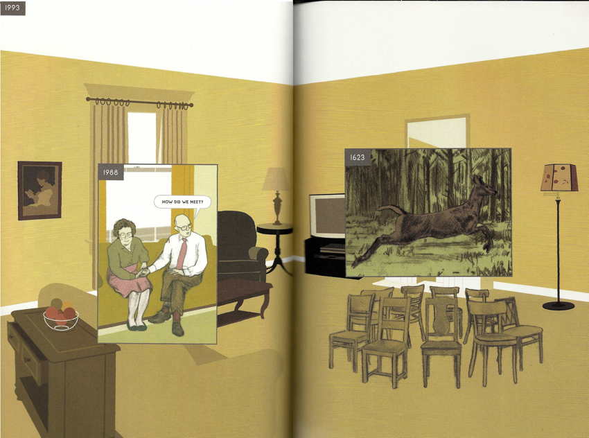
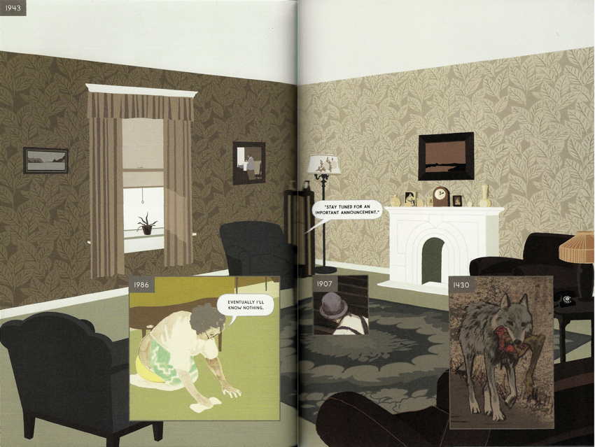
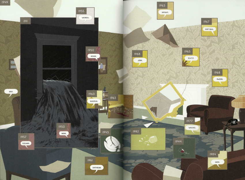
Here by Richard McGuire, an update of an old chapter in Raw that I don’t remember, takes its second shot at a new graphic form and hits the bullseye dead centre.
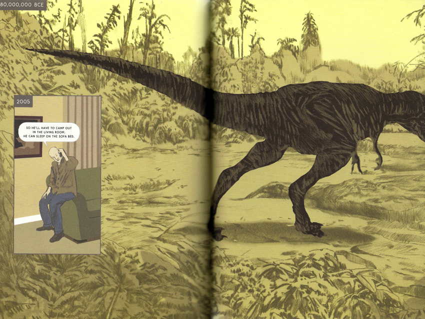
We are situated at a fixed point on the earth; each spread shows a different year, with inset boxes on each spread showing other years. A simple, powerful concept. And now no one, not even McGuire, will be able to do this again without coming off as derivative.
The book’s typography is poor, and the aboriginal language shown (with diacritics) is surely a simulation. But you don’t need to read this book, merely look at it, and its lesson is profound.
-
We are shown the earth billions of years ago and thousands of years into the future, which by implication means the entire lifespan of the planet. We see the planet when it was barely more than a lake.
-
One way or another, everyone, and every being, portrayed in Here’s pages will die. Even beings in the future will die.
-
Observed from this timeless vantage point (perhaps not located on solid ground in the first place, adding to the noncorporeal godlike sense), one comes to understand that, however important life and death are, the only response is one of acceptance, of equanimity bounded only by the creation and destruction of the world.
-
Even after the earth is destroyed, the same vantage point will still exist. What will we observe then?
The lessons of Here are as grand, cosmic, and profound as I make them appear. Reading it, which can and should be done in one sitting, radically recalibrated my sense of time. “We’ll see how long that lasts” is the obvious cynical reaction, but I get the impression the answer is “forever.”
Runner-up
Second greatest surprise of the year was provided by Norwegian Wood, which really is about chopping down firewood in the Islamic Republic of Norway. The English version is a beautifully designed object and is only slightly overlong.
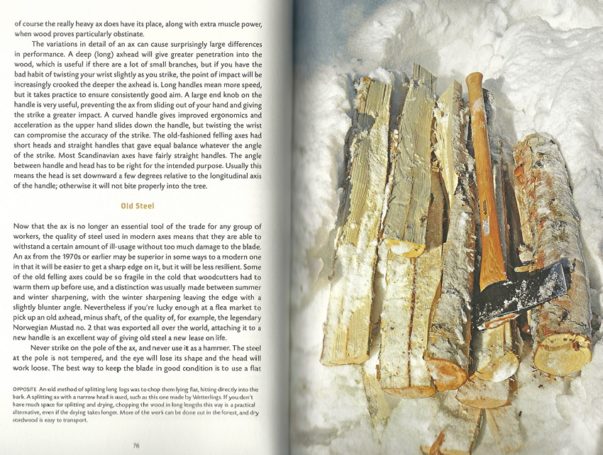
I now have a bizarre and counterfactual inkling to wield an axe.
The foregoing posting appeared on Joe Clark’s personal Weblog on 2016.01.04 14:20. This presentation was designed for printing and omits components that make sense only onscreen. The permanent link is: https://blog.fawny.org/2016/01/04/here/
“Stefonknee units”
Among those who choose a public profile, hence open themselves up to fair, if harsh, criticism, each month seems to bring us a new Worst Transgender. But I’m pretty sure Paul Wolscht, who calls himself Stefonknee, will wear that crown much longer than a month. How could any tranny be worse?
For simplicity, I’ll call him by his actual name, Paul, and certainly not by the pedophilic bastardization of “Stefanie” he prefers to use. “Stefonknee” suggests a little girl bouncing on daddy’s or Santa’s knee. But what a coïncidence! This 6′2″ overweight male, a deadbeat dad of seven kids, doesn’t just “identify as a woman” but identifies as a six-year-old girl.
To again paraphrase Quentin Crisp, which in turn will again prompt the same question from queers, trannies, and LGBTs (namely “Who?”), if this is a free society then Paul Wolscht has the right to dress up like a linebacker in drag. He can call himself any number of things. Outside the arenas where rights are protected, though, we don’t have to go along with any of that. To paraphrase someone else (Ray Blanchard), once you decide to call yourself transgender you’re recruiting everybody else to star in your own private movie. And in Paul Wolscht’s case, that movie is not exactly kiddie porn but halfway to that point.
Everyone’s entitled to consensual adult sexual relations, but once you go to this much trouble to talk about it in public, we get to talk back. And while I am pleased to carry a Black Eagle Kennel Klub membership card and I bemusedly repost unintentionally humorous photos of dudes in pup hoods over on Facebook, I’m going to suggest that what Wolscht is doing, all of it out in public, doesn’t just make criticism possible but invites same. Let’s give this creep enough knee sox to hang himself with, metaphorically speaking. [continue with: “Stefonknee units” →]
The foregoing posting appeared on Joe Clark’s personal Weblog on 2015.12.28 09:04. This presentation was designed for printing and omits components that make sense only onscreen. The permanent link is: https://blog.fawny.org/2015/12/28/wolscht/
This week in type: ä 4 SVG
-
As sure as there’s an X in Christmas, you the typophile, or you the typedrawer, will want a Neue Haas Unica mug bearing the letter ä.
-
Colour SVG fonts in Firefox will light up your “holiday tree,” or would have done so 14 months ago when they were demoed.
-
Speaking of those, I’m not sure I understand Tim Brown’s Universal Typography or how it differs from many other such demos I have bookmarked over the centuries, including a previous project by Brown discussed in these drawers. Or look at this one: “FontReach scans the top million sites to show font usage across the [W]eb.” (Lexicon? “No matches found.”)
-
“Which piece of work from the last year do you feel has been most significant to your portfolio/career?” Neville Brody: “The Channel 4 font.” (Slash in original!) Compare Sawdust Studio’s numerals for Wired UK (Twitter; Instagram [start with 9]).
-
Sawdust has allegedly “carved a niche in the bespoke-typeface business mostly working with editorial clients,” though what we’re talking about here are custom fonts for basketball players that have the feel of techno music blasted at an NBA game. (“Y’all ready for this?”) Let’s not forget what was also allegedly the first NHL team to include accented letters on player jerseys, the Habs.
-
This is really just a seriously terrible article, dutifully copied by clickbait kidz, about what clearly is not “Canada’s new typeface” in any guise. (“Canada 150 is among a handful of typefaces to bridge multiple languages.” Then why can I already buy a coffee mug with an ä on it?)
-
“Now Carter & Cone and Font Bureau are releasing an expanded family of this typeface.”
-
“Why Proxima Nova Is Everywhere” fails to account for the obvious explanation that “Proxima Nova” is a beautifully evocative and memorable locution that works in essentially every language spoken by Web designers and art directors. Further, it makes you feel like you’ve got one up on the competition because you’re using the new-hotness Nova version of Proxima, not whatever old-and-busted Proxima your grampappy used.
-
Our type-designer colleague with the most multilingual name, Joachim Müller-Lancé, surely cannot claim to have a coffee mug with ü or é on it but did just release a Lego-like blackletter typeface. Blackletter, the folk music of type classifications, can be and is used for basically everything, from Vietnamese book covers to skin illustrations to dummy Swiss newspaper layouts. I’m a fan.
The foregoing posting appeared on Joe Clark’s personal Weblog on 2015.12.21 14:00. This presentation was designed for printing and omits components that make sense only onscreen. The permanent link is: https://blog.fawny.org/2015/12/21/twit2015c/
“A Visit to the Alpha Room”
Dan Rhatigan finally republishes evidence of a dream come true: Visiting an accurate replica of the Space: 1999 Command Centre.

The foregoing posting appeared on Joe Clark’s personal Weblog on 2015.12.19 12:15. This presentation was designed for printing and omits components that make sense only onscreen. The permanent link is: https://blog.fawny.org/2015/12/19/sparky1999/
