 Chronicling of the already-chronicled, plus intentional misrepresentation of history. It’s another issue of Eye.
Rick Poynor, once again defining the “neglected”
Who won this issue’s Eye Hagiography Sweepstakes? Eduardo Paolozzi. He was a Scottish collagist whom Rick Poynor (inevitably) describes as “neglected.” Except for the fact that Poynor wrote the copy for this double-pager about him that is itself tied to the news hook of a gallery showing, complete with published monograph. Then there’s the additional touring exhibition. And Paolozzi was knighted by Her Majesty. So yes, “neglected.”
Poynor’s confusion hypocrisy is summed up well in this Orwellian sentence fragment: “despite his knighthood in 1988 – or maybe, in some way, because of the establishment’s embrace – Paolozzi had become a critically neglected figure.” I guess “critically neglected” means “It took the only critic that matters till Eye 86 to write about him.” Except it doesn’t even mean that, because there’s a second book in production about Paolozzi, Poynor admits, “for which I have written the introduction.”
And (can you believe we aren’t done yet?) how can Paolozzi be “neglected” if a “presentation” of his collages “to members of the Independent Group at the ICA in London, in 1952, was a defining moment of what would later be named Pop Art”?
Where’s the neglect?
I’ve been reading nonsense like this since I was a teenager. I still don’t know why I am expected to care about every jot and tittle from design history when we have giants like Poynor and Heller ready to remember it for us wholesale. I appreciate that these “rediscoveries” at least puncture holes in the inviolable timeline of design history (Lascaux ultimately leads to the Bauhaus), but that is less an example of heeding Natalia Ilyin’s warnings than of letting Poynor and Heller portray themselves as smarter and better-informed than everybody else.
I still recall trying to figure out, reading U&lc at about the age of 16, why I should care about the Victorian magazine Simplicissimus. (Worse, its name is a test of reverse fixations and saccades. Say it right on the first try, I dare you.) If everything old is neglected but actually very well documented, isn’t Eye crying wolf?
David Wojnarowicz is jiggling like a blood-filled egg in his grave as he reads the following over my shoulder: Paolozzi’s “brilliant body of work offers lessons in how to use collage thinking and techniques as a form of penetrating cultural inquiry.” (But of course Wojnarowicz will not be accepted as having practised graphic design until Heller and/or Poynor says so in Eye, so my comparison is invalid on its face.)
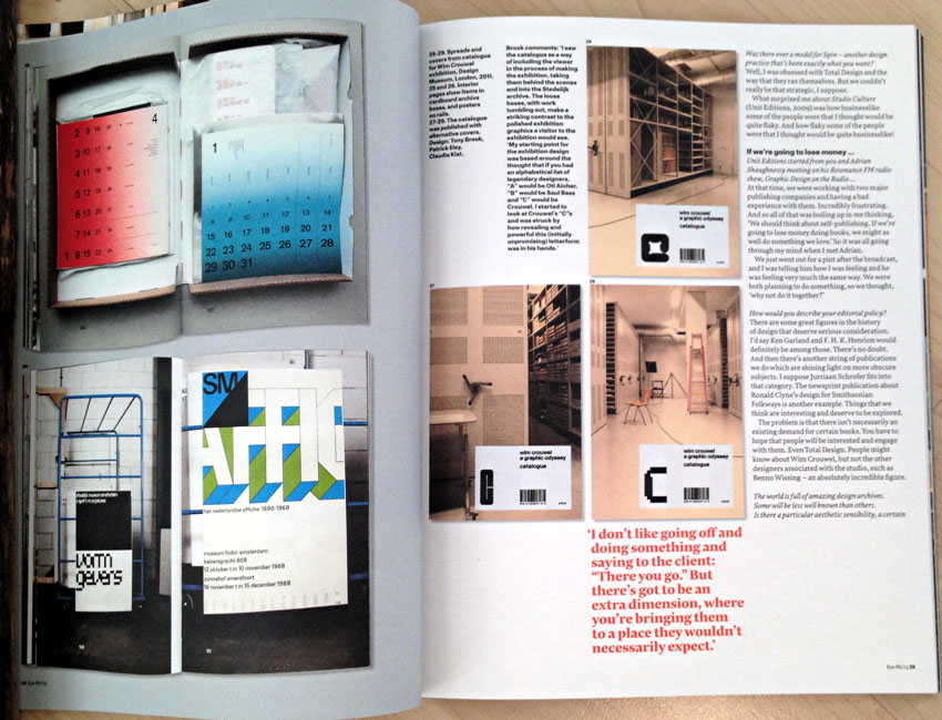
Tony Brook
Can you read this pullquote? I barely can. (Nor can I really get through the endless cutlines set in black weight.)
![Giant full-page pullquote: ‘What other profession do you end up in where you learn so much about other people’s businesses than graphic design’ [continues]](https://fawny.org/blogimagery/Eye86a/Eye86TonyBrookpullquote.jpg)
Here we have yet another E-mail interview that reads like one: “I then moved to a place called Icon (later Sonicon) which did record sleeves as well.” “Trish had studied fashion management – transferable skills! – and was involved in PR and hated it.” Nobody talks like that.
Tony Brook is pretty famous already, meaning he represents the converse of the Paolozzi scenario: Instead of making you feel stupid for never having heard of a designer of yore, Eye makes you wonder why somebody this successful needs ten pages of coverage.
Really, we’ve been here before. Celebrity profiles are a stock in trade of design magazines.
I do find it interesting, though, that no less grise an éminence than John L. Walters at least admits the possibility of waning influence: “Since [about 1992], Spin has expanded and contracted in size, influence[,] and prosperity throughout a turbulent time for graphic design.” You know what article I would love to read? A compendium of testimonials from graphic designers, small and large, on how they dealt with fallow periods and outright failure. (Start here: Where are Designers Republic now?)
Walters misses one chance after another to follow up on this topic. Brook’s anecdote about a 16 mm film they created for a client: “There was a monetary cost[,] and we didn’t even count the studio cost, or the salary cost. Just stupid. But it wouldn’t have been stupid had we… become more motivated to become directors. But we didn’t, so it became this white elephant.”
Can somebody hire a real journalist to conduct these interviews? (Design does not really want “journalism.”)
-
Walters’ intro (seven full grafs) reads as dull as one delivered before a conference presentation. And as someone who has had the wrong speaker’s biography read out loud before my own presentation, I’m sensitive to this sort of thing.
-
What, incidentally, is neo-Modernism?
-
Formative experience:
When I was in junior school [which I guess means elementary school], my teacher said “You’re not going to be a mathematician,” and he used to send me out to the playground during math [class] to draw because he thought I was quite gifted technically. He explained the rules of composition. It made a huge impact on me. He told me that if you’re drawing hills that are surrounded with things, if you put the hills toward the top of the picture, it’s going to feel more monumental, and if you put them at the bottom, then you’ve got the sky. So just the notion of where you could put the line to make an impact was really exciting.
-
Brook talks about a book by Dunbar that influenced him. “It was a black-and-white book cover, with tiny, spaced-out type.” A design magazine is just so much more trenchant when it uses verbal descriptions of graphic design rather than just showing us a fucking picture. (Michael Bierut, you made the same mistake, though you know I love you.) Brook keeps on talking about that book cover, actually. If only it were technically possible to show us what it looked like.
-
And should we possibly maybe perhaps have asked follow-up questions here?
-
“Then we did this thing that still scares me to think about to this day. We resigned all the accounts I hated.” Like whom? How many? What were the billings? How did these “accounts” respond? (Later, Walters “asks”: “Bad clients don’t get you good clients.” Brook: “That’s absolutely true, and we had some stinkers.” Like whom?)
-
“So in 1996 I made a decision about where I wanted to go. I just wanted to head in a different direction – it was an epiphany.” And that direction was…? (Then he talks about shitcanning employees. Why can’t we have a whole article on that?)
-
I want to know more about Brook’s self-initiated projects. “One was a CD-ROM,” he says. Well, is this not further evidence of my aperçu that desktop publishing and the Internet made it possible for graphic designers to create personal work for the very first time? You could do it for a dollar cost of zero, as opposed to pasting up typesetting you would have had to pay for.
-
What did the “ridiculously expensive, self-indulgent… short film on table footballers” actually cost, other than “a fortune”?
-
-
Now, then. Let’s consider the design maxim that one should never ever show a client two options. Because all they’ll do is ask for a little from Column A and a little from Column B. Consider further Bierut’s maxim that the secret to his success is really listening to the client. Tony Brook:
There’s always got to be an extra dimension to the conversation with a client, where you’re bringing them to a place where they wouldn’t necessarily expect to turn up. I never have a problem talking with clients. But I don’t like the idea of just going off and doing something and coming back and saying “There you go, and that’s what I’ve done.”
Worked out fine for Paul Rand.
I think the conclusion here is that you can in fact go off and, in splendid isolation, produce exactly one solution that the client must accept. Or you may continuously communicate with the client. But let’s not budge on the issue of showing more than one option. Do not.
-
Brook brags of bringing in “more than 20 new members” to the Alliance graphique internationale. Even if that number refers solely to institutional or corporate members, it’s not very many.
-
Brook talks a lot about intending to communicate, but every example displayed in this panegyric works great as a thumbnail. Of course that’s a systemic failure of graphic-design “criticism” and especially of Eye. But doesn’t it prove Brook intends to shout rather than communicate? Is he capable of communicating in a page of 11-point type?
Quick question for Tony Brook
You want me to write a Unit Editions book on Paul Arthur? I’ll need cash up front.
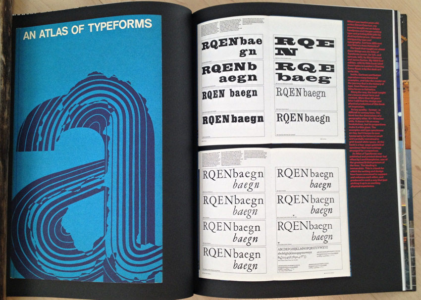
Alan Bartram
Eye’s shockingly half-assed feature on Alan Bartram, one of the few (perhaps three) experts on architectural lettering, was written by none other than Catherine Dixon. It reads like a Wikipedia entry. It’s a dull boilerplate listing of Bartram’s accomplishments. But he’s still alive and he could and should have been interviewed.
-
Dixon runs a quote (unattributed) about Bartram’s Atlas of Typeforms in which he goes into some length about the book’s physical format. We waste a full page on a photo of the book’s cover, then show thumbnails of two spreads. Where is the photo that illustrates the book’s dimensions, as by having Bartram hold it open?
-
If the architectural typography Bartram documented is so monumental, why scrunch them into one-third-page thumbnails? (On Eye’s matte stock, photos look dreadful.)
My own simple post on the three core books on architectural lettering was and is better coverage than this banality.
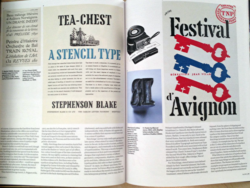
Stencil type
Eric Kindel’s feature on stencil typefaces begins inauspiciously: “Over the past decade or so, stencil letters have attracted the attention of growing numbers of typeface designers.” Yes, I’m sure the numbers have grown, but Kindel’s point is that stencil typefaces never disappeared even after the technical imperative for them vanished.
-
Here Eye continues its tradition of documenting graphic design for the upper classes. Nowhere in this 18-page article do we hear about lettering on the sides of army foot lockers. (Tea chests [including the early typeface called that] and “shipping and packing crates,” yes.)
Where are the opening credits of MASH (perverse official orthography: M*A*S*H), whose custom Cooper Black Stencil imprinted itself onto the memory of every typographer now over 40? (Also imprinted: Mary Tyler Moore’s Peignot.)
-
 You know what else there’s no mention of? Stencil fonts in gay porn.
-
There’s a lot of discussion of knives vs. scissors vs. chisels to form the letters but nowhere at all do we read about spray paint. Fundamentally I don’t understand why we’re talking about “fine” stencil type when it’s really an industrial or street-punk medium. (I guess sort of like Letraset. I guess?)
-
Explain to me what this means:
[I]n some early stencilled books, roman and italic letters are left uncompleted, and the proportion of books where this occurs increases over time.
-
One-liner typeface showings, a term of art kids today do not know, are headlined by made-up category names. “Architects & designers” is a category. Nowhere in the documentation for “Constructed-geometric” do I read the word “Fontstruct.”
-
If a stencil is “derived from an existing non-stencil version of Bodoni,” isn’t it derived from Bodoni? (This terminology is like calling your girlfriend a “cis woman.” Bodoni is “existing” and always was “non-stencil.”)
-
One of my actual notes: “We’re at p. 54 and this fucker still isn’t over yet.”
-
What does this mean?
Some typefaces that may at first seem peripheral to the mainstream of stencil[‑]typeface design are either central to it historically
I see someone has studied at the feet of Steven Heller.
or suggestive of areas where more typefaces would be welcome.
-
Kindel’s discussion of non-Latin stencil fonts rather overlooks Cyrillic and Greek, but in any event misses an opportunity to examine which Latin transformations are errantly used in other scripts. (Which way should “italics” slant in Hebrew? Ever seen outline Arabic type?)
Fowle Bubblesed
Just as Eye rehabilitated Barney Bubbles, so now it does the same to, for, and with Fred Fowle, “the U.K.’s foremost fairground artist.” Design snobs have now been retrospectively authorized to say they actually like all the gaudy business painted on the sides of the circus attractions that remind snobs of their mortifying working-class upbringings.
“The name Fred Fowle may not be widely known in design circles,” but it’s our job here at Eye to remedy that for you. (Right on cue: There’s already a book about Fowle. These twats can’t even pick somebody really obscure to canonize.)
The photos are great – because they’re on coated stock.
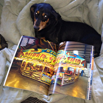
I am not remotely interested in a Hellerian lecture (here by Caroline Roberts) on why I was too stupid to know this guy was important. At least we here knew all along that Honest Ed’s handlettering was and is special.
So then: Letraset
Ask any gay typographer over the age of 40 (again I make this distinction) how they got started in type and you’ll get two answers: U&lc and Letraset.
I had and still have a vintage U.K. Letraset catalogue and always got the new Canadian catalogue every year. I studied and studied those things. Letraset was a formative experience – not just to me but to the history of typesetting.
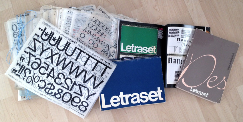
That’s why it’s somewhat insulting for Eye to present Letraset as being on the same plane as obscure Polish poster designers and whoever else gets anointed in whatever issue of the magazine. Letraset is simply much more important, and was much more prevalent, than suggested by any structurally comparable feature article in Eye.
-
Insult turns to injury when Jane Lamacraft goes insider and quotes guess who:
And yet the Letraset story – squeezed into what Steven Heller has called the “interregnum between hot and cold type, and between photo‑ and digital composition” – is by and large overlooked in design histories.
Thank God we’ve got Eye, which writes the history.
-
I only dimly recall that Letragraphica was a subscription service. I certainly know for a fact you could buy sheets individually, even in Moncton.
-
Lamacraft somehow thinks it’s notable that “punk… got its anarchic hands on Letraset…, the rub-down letters’ tendency to break and crinkle suiting the movement’s rampageous, in-yer-face æsthetic” (sic throughout). I guess for a discipline that thinks graphic design really got started with clinically “clean” Bauhaus it makes sense that dirtying up your own layouts would be forgotten. How déclassé. But, FFS, House Industries invented new methods of making digital type look antique: “Andy never liked how clean the digital Futura Bold looked, so we printed all body text at 200%, shrunk it down on the copier and scanned it as art.”
-
I guess everyone online is just a “blogger” whom one can quote without naming him or, in this case, her (Gabriela Curraleira).
-
We’re just not going to talk about Letraset’s early efforts in digital typefaces. Lamacraft surely knows nothing about that. It’s almost been forgotten, but obviously, since you’re reading this paragraph, not completely so. I would wager that Splorp has a significant collection of original packaging. (I asked: He does.)
-
Can you understand this sentence?
Letraset occupies another parallel universe, a “game-changing” technology that came and went in a generation, but left a cultural impact – and a long-lasting affection for its typefaces – revealed by the turn-out [hyphenation sic] for our recent Type Tuesday evening in London.
(Also: How “recent”?)
Steampunk (I shit you not)
 You cannot be fucking serious about this article – body copy printed on a darling half-width insert – about steampunk. (You got Cory Doctorow in my Eye.)
The opening sentence sets a record for disingenuousness: “Less than a decade ago, the idea of turning an unprejudiced eye on the abandoned design practices of an earlier century” was in fact the entire modus operandi of the design press. Eye is more than “less than a decade” old and that quote sums up its purpose. I’m not even going to bother typing out the rest of the sentence, which actually name-drops a Design Observer post by title and date.
“[C]osplaying” – I’d say “You lost me right there,” but every page of this rag gives you a reason to stop reading – “at SF conventions… tends to be restricted to copying characters from mass media.” Sherlock Holmes isn’t mass media? And anyway, how ’bout a They Live Hooters waitress?
How do you make something postmodern? Stick a pyramid on it. How do you make something steampunk? Stick “dismantled gears or clock mechanisms” on it.
Reviews
As trite and clubby as ever.
-
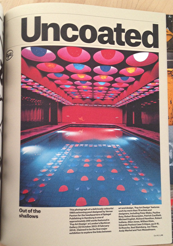
An unbylined squib on the book Pop Art Design has a bang-up photograph, but wastes one of its two brief columns pasting in 15 names of the “more than 70” covered in the book.
-
Linda Kwon wastes two pages dully explaining how great the AGI Open is. I read this news-free article, written and printed months in the past, while the Open was actually happening, revealing the impotency of a print magazine in covering design conferences. (Even the Reflex Blue boys could handle it better than print could.) Don’t blow smoke up asses.
Since I seem to be the only person who ever reads Eye cover to cover, I am wondering why nobody on the crack editorial team noticed that the subject of one of its features, Tony Brook, designed the AGI Open logotype. Then I would ask why nobody put two and two together and linked that logotype to the book entitled The ABCs of ▴■●: The Bauhaus and Design Theory, edited by approved personages Lupton and Miller. I asked this already.
-
Andrew Missingham’s review of Dynamic Identities – logos and suchlike made up from kits of parts – missed an obvious reference point: ITV idents. (And the FontShop logo[type].)
-
This issues’s biggest lie comes from Alex Coles, reviewing Hello[,] World by Alice Rawsthorn. He didn’t write a specific untruth. It’s just that the entire review is a lie. I held this abomination of a book in my hands and tried to read it. I couldn’t. Like too many design books, this thing is illegible. Not a single page of type is readable. How designery.
Yet Coles has the gall to call this a rare example of a book “about design [that is] aimed at a relatively broad audience [and is] historically informed and critically acute.” There are no design books aimed at a broad audience! Design is obscure. (So are books, aren’t they?)
Here is the full purpose and function of Hello[,] World: It is a book of design criticism that allows fellow design critics to nod their heads knowingly at all the references. It certainly can’t be a general-readership book because nobody can actually read it and isn’t aimed at anything or anyone general.
This is how Rawsthorn ostensibly writes for the common man: Philippe Starck is “a burly, mal barbu figure who bears a distinct resemblance to Deperate Dan, the pie-scoffing hero of a cartoon strip” that is actually the Dandy and is 70 years old, but mentioning any of that would just be too painfully obvious. Also, “scoffing” means “scarfing” not “lampooning.” So yeah, “aimed at a relatively broad audience.”
Coles:
[T]he museumgoers who ceased visiting London’s Design Museum in 2006 when Rawsthorn left – and they are legion – wish she would also occasionally step off the page and into the museum again.
We miss you, Dear Leader.
Now get that fucking hair out of your eyelash, Alice.
-
Peter Jones reviews a plainly awful book about terrorist logos and name-drops Steven Heller (inevitably), who wrote the foreword. What Heller also wrote is an entire book about the swastika that might possibly be relevant here.
“Branding Terror is informative, but who will buy it?” Jones asks, broaching a taboo question. (Don’t reviews exist solely to “drive sales”?) I haven’t run into self-righteous hand-wringing like this since I.D.’s cover story on guns (“Design for Killing,” William Owen, 1996).
Anyway, you designers should be left-wing enough to handle this shit.
-
Another book on Japanese kawai (here, kawaii) ignores Fruits and Happy Kitty Bunny Pony: A Saccharine Mouthful of Super Cute, inter alia.
-
Look at page 100. Tell me if you have any interest in it at all. Don’t lie to me.
-
It’s been years since I’ve had to lambaste the (British) design press for writing the acronym “CND” as though everyone naturally understands it. The book reviewed here, Signs for Peace, essentially reproduces screenshots at screen resolution, we are not quite honestly told.
-
Remember steampunk? How could you forget? You just read about it 40 pages back. Well, clearly the best kind of steampunk is the kind with two Žs in its name, like Brooklyn Babylon, “a multimedia spectacular by Daniel Žeželi and ‘steampunk’ jazz composer Darcy James Argue.”
-
Steven Heller, the squarest gentile in Manhattan, reviews a book of groovy psychedelic drawings by John Van Hamersveld. (Foreword by millionaire plagiarist Shepard Fairey.) Heller calls it a “romp.”
-
Turn the page and it’s another review by Heller of another bit of political marginalia. He at least admits that Geoff Kaplan’s Power to the People includes a few zines Heller had “never seen before.” Full marks to you, Geoff, for stumping Rumpelstiltskin. But not a one of these underground pamphlets was “designed.”
-
What looks like a beautiful book, Dixonary, is all about and is written by Tom Dixon. (Andrew Robertson says the opposite in graf 1 of his review: “The new book Dixionary is a remarkable collaboration between [actually among] author Tom Dixon, publisher Robert Violette, and graphic designer Matt Willey.”) Next graf: “Dixon is a self-taught product designer.” Next graf after that: “Violette’s company Violette Editions…. speciali[z]es in what he calls ‘individualistic books.’ ”
All well and good, but who the hell is this guy, why should we care, and why does he deserve a book like this? He reminds me of musician and producer Mark Ronson, who acquired countless friends in high places behind the scenes, which fact supposedly makes him a star in his own right.
Miscelleanea
-
More tedious boilerplate, this time about the Type Directors Club. Since TDC has its own exhibit and book, what is this article for?
-
Echt-British English on p. 1: paralleled, moveable, skips (garbage heaps).
-
Comma before parenthesis was a nice touch at one point.
-
I always enjoy learning about tuscan (sic) and ionic / clarendon (sic) typefaces.
-
Hyphenation and column breaks conspire in machine [COLUMN BREAK] age architecture.
-
“Arms-length” is not written thus.
-
How many times and in how many articles in this issue is F.H.K. Henrion mentioned? (And mistypeset as F. H. K.?)
Did anyone notice that Tony Brook not only designed the AGI Open logo but has a book coming out on F.H.K. Henrion? Can’t anyone connect the dots?
-
When you were young and British, as you surely once were, did you enjoy “footling around” with Letraset?