Using the OED’s new interface, I searched for all terms with national origin of Canada. (You may need to log in and search via your public library.) In ascending chronological order (i.e., only the last 20 or so are recent), here are all “573” (actually 458) headwords, many of them generic terms with Canadian senses. [continue with: All the allegedly Canadian words in the OED →]
All the allegedly Canadian words in the OED
The foregoing posting appeared on Joe Clark’s personal Weblog on 2010.12.10 15:35. This presentation was designed for printing and omits components that make sense only onscreen. The permanent link is: https://blog.fawny.org/2010/12/10/oed-canadian/
Tell Roger Ebert and Pat Bowes about HCO
I have read many of Roger Ebert’s columns, and many articles about him, that discuss the legitimate challenges – a word I am not using euphemistically – in communicating. He can’t speak, so he relies on a patchwork of techniques from writing notes to typing on his Macintosh to gesturing. His recent column includes a guest post by Pat Bowes, another non-speaking person.
I get the impression Ebert and Bowes are unaware that someone who can hear but not speak can still use a normal voice telephone through the relay service. If you know anything about relay services at all, you assume they let TTY users call voice users and vice-versa. But there are other modes available.
-
In voice carryover or VCO, if you’re deaf but can still speak you can call anyone using the relay service. You talk and the person you’re calling hears you normally; when they speak, the relay operator types it and you read it on your VCO phone (example).
-
If you’re Ebert or Bowes or someone else who can’t speak, you use hearing carryover or HCO mode. The person you’re talking to speaks normally, but when it’s your turn in the conversation you type on a TTY keyboard and the relay operator reads it out loud. There are not many HCO phones (Clarity; Uniphone). There isn’t much, or anything, in the way of Macintosh software (apart from the old SoftTTY).
Using HCO, you can call anyone you like and anyone can call you (through the relay service first).
Doing some checking, most, if not all, state relay services (most, if not all, of which are actually subcontracted to Verizon, Sprint, and AT&T) provide HCO. Even Illinois Relay does, I confirmed, despite the lack of mention on its Web site. For out-of-state calls, you can use one of those three providers’ relay services directly (e.g., AT&T HCO).
Using the relay service is merely an option. For a fast typist like Ebert, it is possibly a useful option. And the many times I have tried to get this message across to Ebert I have failed, so let’s see if he gets the message this time.
The foregoing posting appeared on Joe Clark’s personal Weblog on 2010.12.10 13:06. This presentation was designed for printing and omits components that make sense only onscreen. The permanent link is: https://blog.fawny.org/2010/12/10/ebert-hco/
Magazine editor thinks like magazine editor
Virginia Heffernan, the American who in July told an Ontario government funding agency’s audience “Maybe E-readers work better than books… Text works so beautifully in electronic form,” tried out the Vanity Far iPad app with what turned out to be naïve optimism.
I love the idea of Vanity Fair, and God knows I love an iPad app, but I’m tired of shelling out to feel poor, dumb, drunk, craven and wrong….
I asked Vanity Fair what was up with the buggy app…. A spokeswoman for the magazine assured me that Condé Nast, which publishes Vanity Fair, plans to introduce “digital replica editions” of its magazines using Adobe software, and this will improve the reading experience….
I put a version of this question to Graydon Carter – actually I just asked about the app glitches through a spokeswoman – and Carter himself set me straight by E-mail: “The actual reading experience is superb on our app, which is what matters to us most.”
[…] You think the Vanity Fair app is buggy? Well, Vanity Fair is superb.
The foregoing posting appeared on Joe Clark’s personal Weblog on 2010.12.09 15:26. This presentation was designed for printing and omits components that make sense only onscreen. The permanent link is: https://blog.fawny.org/2010/12/09/heffernan-vf/
‘Mad Men Unbuttoned’: Sometimes blogs should stay blogs
Mad Men Unbuttoned (blog) is Natasha Vargas-Cooper’s expansion of her morning-after columns for the Awl, which were just concise enough to work in that medium.
The first warning sign is Vargas-Cooper’s agent, Kate Lee, who rocketed to blogger-like microfame after the New Yorker treated the subject of blogs-to-books six excruciating years ago. In my direct experience, the snippy, dismissive Lee early on manifested what became the inescapable rule: “Bloggers” with no experience writing for print got the book deals, while any writer who merely ran a blog was deemed overqualified. As with the cyberbullying medium known as Tumblr, “[i]t’s gotten to the point where the stupider you are, the farther away from real writers you situate yourself on the career axis, the likelier you are to score a book contract.”
The authoress is in no way stupid and surely knows a lot of print journos. With the project’s high-end-pop-culture hook unsullied by cheezburger juvenilia, surely “expanding” the Awl postings into a book was a no-brainer. But as we’ve found with so many other blogs-to-books, new wine tastes sour in old bottles. [continue with: ‘Mad Men Unbuttoned’: Sometimes blogs should stay blogs →]
The foregoing posting appeared on Joe Clark’s personal Weblog on 2010.12.08 12:12. This presentation was designed for printing and omits components that make sense only onscreen. The permanent link is: https://blog.fawny.org/2010/12/08/madmenunbuttoned/
Brûlé’s ‘Monocle on Bloomberg’: ‘The Desk’ manqué
Tyler Brûlé, whose dad never did play “soccer,” hence was never “a soccer star,” will host a television program. Amy Larocca managed to get at least this detail right. To quote one of New York’s atrocious print-hostile pages:
It’s a weekly hour of what Brûlé describes as “gentle, good, informative viewing.” […] The show will feature magazine-style reports from Monocle’s correspondents that are unhurried in tone…. “I hope it will be a return to more elegant television.”
Brûlé TV as a brand is familiar to a small number of viewers of BBC Four and Newsworld circa 2005, when Brûlé hosted a current-affairs chat show entitled The Desk. (BBC still has a homepage for the show!)
It was known mainly for the natural materials used to construct its set. (No “cheap veneers and varnishes.”) I recall (and just looked up and verified) brief coverage by Antonia Zerbisias in the Toronto Star; I also remember a TV segment, perhaps on MediaTelevision, in which the show’s host and Brûlé agreed the set smelled nice.
I taped and watched The Desk every week while doing the ironing. Its tone was as dull as Monocle’s is; Wallpaper<asterisk>’s verve had long since dissipated, it seemed.
I do hope the program will be an improvement on the glorified slideshows of the Monocle video podcast. One of the upstart news networks, perhaps BNN, could carry it here, but of course won’t.
The foregoing posting appeared on Joe Clark’s personal Weblog on 2010.12.07 14:32. This presentation was designed for printing and omits components that make sense only onscreen. The permanent link is: https://blog.fawny.org/2010/12/07/brule-bloomberg/
The crisis in book design (for once, averted)
After waiting already too much time to get a copy in my hands that I could inspect in detail, I gave up and just flipped through the Douglas & McIntyre edition of The Sentimentalists at the worst chain bookstore I could find, Coles. Johanna Skibsrud infuriated the Family Compact of Toronto literature by taking the Giller Prize with her novel, published by the artisanal Gaspereau Press in Kentville (blog).
This was already a violation of the natural order, in which an author’s or a publisher’s proximity to Yonge and Bloor correlates directly with credibility and “success.” The Family Compact lost its shit altogether when it became apparent that Gaspereau wasn’t about to be rushed into doing what it “should” – banging out thousands of offset copies. (Irrespective of what prize a book may win, it is not your “right” to read a copy. Nothing in the universe is infinite, copies of corporeal objets like books least among them.)
Recurrent in Upper Canada’s scorn for the ass-backward ways of this country-bumpkin “publisher” was an implication that every molecule of the book is made by hand. (Shades of “Martha Stuart” making her own water and dirt.) Actually, only the letterpress cover and the binding are “artisanal.” Inside pages are printed offset. How do I know? I bothered to ask.
But let’s start at the beginning.
Noah Richler, who has never quite explained why he ran back to Canada from the pinnacle of world-class media, the BBC, quoted a Family Compact publishing executive:
Tim Rostron, an editor at Doubleday Canada working in the same Random House building[,] wrote: “Hasn’t the physical beauty of this book been overstated? I’d feel disappointed if I’d waited weeks for what turned out to be a paperback – this is a paperback we’re talking about – with a cover featuring touchingly poor dra[f]tsmanship. Am I missing something? We corporate whores do from time to time produce handsome, sturdy volumes.”
No, you don’t, Timbo, and neither do your competitors. I can prove it, but won’t bother for now apart from directing you to my Flickr set of shitty typesetting.
Then the Star sent Kentville what might be its first-ever Chinese-Canadian reporter, Andrew Chung, who described Gaspereau’s methods:
The paper used, Rolland’s Zephyr Antique Laid, they describe as “creamy, sensual.” The sheets are bound and sewn, a process that makes them almost indestructible. And the unlaminated jackets get hand-cranked letterpress treatment.
The end result feels less processed, as if closer to the trees that made its parts. But it’s also slow. Just one example? The sewn books are too fat and must be compressed using a kind of slotted vice. Each and every book must sit in that vice for at least 15 minutes.
Yes, indeed. “[E]very book must sit in that vice” (sic). This is the level of copy quality Canada’s biggest newspaper uses to discuss artisanal book production. (Cf. shitty newspaper typesetting. Chung didn’t respond to a question about this error.)
At this point, and at every other point in the recent past, the Upper Compact intelligentsia has little or no moral standing to justify its paternalism and belittlement of the small-town press that beat them at their own game.
Shitty typesetting: The Sentimentalists version?
Now, here’s what I worried about when I read that Douglas & McIntyre were about to issue a mass-market version of The Sentimentalists. They’d get their hands on some kind of ass-backwards “file” of the book copy, “typeset” it, in Quark, on Windows, in whatever PostScript typeface came free with Photoshop five years ago (inevitably Minion, with no f-ligatures or at most fi and fl) and call it a job well done. A “handsome, sturdy volume,” even.
I mailed a couple of people, including Scott McIntyre, trying to get to the bottom of this theory. No response. I was going to step it up a notch – to a fax-o-gram or an actual hardcopy letter – but then I remembered just how nasty one of its editors was to me last year. And it occurred to me that an artisanal letterpress shop would be exactly the sort of place that really keeps on top of its E-mail (not a contradiction). Thus Andrew Steeves of Gaspereau Press was happy to fill me in on all the details, never top-posting even without being asked not to (a source of that other editor’s anger).
Here, then, is a complete scoop regarding the typography and production of The Sentimentalists. You heard it here first, Upper Canada.
The Gaspereau version of The Sentimentalists was set in a digital revival (Monotype’s) of Eric Gill’s Joanna, but not an off-the-shelf version. I took Type 1 fonts and created OpenType versions [in FontLab], tweaking kerning [and] adding missing ligatures and an additional set of larger caps like the ones Gill had made by the Caslon foundry and used in his Essay on Typography. The sheets are printed offset, but Joanna holds up pretty well in offset if the paper is warm in colour and you keep the inks up.
(Unlike, say, in my first book [also set in Joanna], whose printing was among many issues completely botched by New Riders. Authors shouldn’t trust them with so much as their bus fare.)
On our jackets, the types are also Joanna and printed letterpress from polymer plates, a printing method where they look even more at home.
D&M’s edition is on a different paper, but the plates are produced from my typeset files. Peter Cocking at D&M (who is an excellent typographer) fixed one widow I missed and reset the title and copyright pages, but other than that the type inside is identical. I’ve only seen PDFs so far, so I can’t comment on the result.
With my blessing and encouragement, D&M did change the cover significantly, introducing a sansserif font (four weights of Akzidenz-Grotesk) alongside the Joanna, and reproducing the Wes Bates image in a completely different way. I’ve basically been letterpress-printing a distressed, faded version of the Bates image, letting the laid-lines of the paper frig with the image, because it suits the imagery I’m after – faded and distressed memory, a shadowy and uncertain past. The D&M image is crisp and clear, and tinted, and feels more like a graphic-novel illustration.
It’s interesting to me how this change in materials and techniques changes the tone and meaning of the illustration, and amusing to hear people tell me that I didn’t do a very good job printing the image when – well, thanks, but I did it that way for a reason. Anyway, I wanted the cover to look like a D&M cover, not a poor reproduction of our letterpress jacket.
My sense is that, while different, their edition will be every good as ours in all but one way – the binding. Ours are sewn books, and that’s simply better than regular perfect binding. But on the whole I went to D&M because I knew they valued many of the same things I value, and that they are good at achieving many of the same things I worked to achieve, yet at a high volume. It was the best solution for this unique situation, and it let me get back to doing what I’m supposed to be doing – setting type and making books at modest volume.
So you repair your own fonts, do you, Andrew? How artisanal.
I’ve been gradually taking faces I use frequently and making my own OpenType versions, scripting and fixing as necessary. I’m often adding parts that got dropped in early film or digital versions. The foundries were sometimes very lazy, keeping oddities adopted to answer the shortcomings of earlier technologies even after new technologies eliminated those limitations.
So we get digital letterforms modified to fit the Monotype grid or italics and romans with the same set width because they were designed for… Linotype mats. Yeah, some of that stuff is quaint and worth preserving in some form (especially if you are going to print letterpress from photopolymer), but sometimes it is better to return to the original source and honour it with all the present technology can offer.
There are times when one wishes the Family Canada oligopoly of publishers would go fuck themselves. (No, actually, ligatures are not a luxury and you need at least five of them. My first book was about computers and we used seven. “We’ve upped our standards. Up yours.”)
Andrew Steeves is my kinda guy. The fact he isn’t their kinda guy tells us rather a lot.
Now, is the book any good? Well, is that what we’re talking about?
The foregoing posting appeared on Joe Clark’s personal Weblog on 2010.12.03 14:33. This presentation was designed for printing and omits components that make sense only onscreen. The permanent link is: https://blog.fawny.org/2010/12/03/sentimentalists/
Canada’s national newspaper covers the pressing issue of ‘diary subsidies’
There is no central copy or readback desk at the Globe and Mail, publisher Philip Crawley told me. He told me this after I sent along a link to the many hundreds of copy errors and other kinds of shitty typesetting in his newspaper. (As of today, I’ve photographed over 400 examples all told, including 31 from the very first issues of the relaunched paper.)
And yesterday, in a flagship opinion column, here we see just what happens when you invest a billion bucks in a printing press and zero in training your staff how to write, spell, punctuate, capitalize, proofread, and – in particular – detect errors that also happen to be correctly-spelled words.
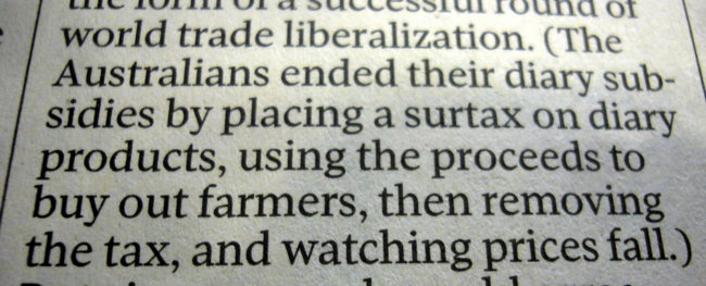
The Toronto Globe and Mail: Your source for breaking news on diary subsidies.
So tell me something: What are they going to do about it? Carl Wilson, feel free to chime in.
The foregoing posting appeared on Joe Clark’s personal Weblog on 2010.11.28 15:22. This presentation was designed for printing and omits components that make sense only onscreen. The permanent link is: https://blog.fawny.org/2010/11/28/diarysubsidies/
Newspaper sites are so bad they require ‘public integrity’ to rescue them
Let’s accept that newspapers do not understand the Web. Why, though, do they not even understand HTML? Why do they need a so-called Center for Public Integrity to ride into their newsrooms on the white stallion of a white-label version of Treesaver? What this yet-unnamed beast is called – an “HTML5 product” – tells us a lot about the newspaper industry’s susceptibility to magic words.
-
Treesaver isn’t a product. It’s a Web browser that uses CSS to lay out documents in columns. You don’t need an iPad to do that; the CSS3 columns module was finalized (went to Candidate Recommendation) almost a year ago. (Treesaver’s CTO notes that this glorified browser uses custom JavaScript libraries, which are not the same as black magic and are functionally reproducible.)
-
“HTML5” is not some kind of new technology different from old technologies. It is merely HTML. For newspaper usage, nothing can be done in HTML5 that cannot be done in HTML 4.01. (I mean that as written – audio and video are both readily achievable, and no newspaper will ever, at any time, use new elements like
ARTICLEandASIDE.)
The unnamed product isn’t a for-profit venture, so the following comparison is imperfect, but its existence and implied reason for being remind me of the hucksterism involved in persuading corporations that they need to pay for Web-server software (namely IIS) – which, it turns out, always works worse than installing Apache at zero cost. The only kind of software that corporations understand is software you pay for. The only kind of “Web solution” that newspapers understand is a solution wrapped in buzzwords that claims to be different from the actual Web. Newspapers are different from the Web; the Web threatens newspapers; hence a third different thing seems like just the ticket to rescue newspapers from the threat of the Web.
“We think we’ve created a better way to consume investigative reporting,” John Solomon, the chief digital officer, [said], and at a much lower cost than developing apps for different devices.
To the bifocal-wearing computerphobes who run newspapers, that sounds like a solution to a real problem. To a legitimate Web developer, that sounds like a failure of CSS; to a legitimate Web designer, it sounds like a failure of graphic design and typography. Legitimate developers and designers could remedy both failures without an “HTML5 product” if only newspapers would bother to hire them and let them do their work.
The existence of this “product” demonstrates that newspaper editors never knew they were even using HTML on their Web sites. Nor did they realize their Web sites did not actually have to look like a single column of article copy with advertising down the side.
The foregoing posting appeared on Joe Clark’s personal Weblog on 2010.11.28 13:08. This presentation was designed for printing and omits components that make sense only onscreen. The permanent link is: https://blog.fawny.org/2010/11/28/html5-product/
Even Paul Rand cannot overcome the influence of a medium
Mitch Goldstein ran the Angry Paul Rand account on the Twitters. Now, the real Paul Rand (q.v.) would yell at students and suffered no fools; maybe that was his intrinsic personality. But Goldstein found the intrinsic nature of the Twitters altered his.
So why did I close the account? Simple – it became something bad and negative…. I was also starting to get more and more negative comments about what I was saying. I think critique is great. Critique is the cornerstone of improvement for a designer. But you cannot critique in 140-character anonymous tweets on the Internet. That is not critique; it is just negative, pissy soundbites.
What was slowly dawning on me is that Angry Paul Rand was equally guilty of this, too. My snarky aphorisms where just as bad as people telling me how unlike Paul Rand I was, or how full of shit my tweets were, or how elitist and ridiculous I was sounding. I was doing the same thing, but with a lot more followers. Then on September 13th I tweeted “Being a designer is not just a job, it’s a calling.” This is something I truly believe, but I received a tremendous amount of negative commentary from that tweet. I took it personally, and insulted a couple of people right back. To those individuals I am tremendously sorry – it was uncalled for and really not the kind of person I am.
You don’t have to be Andrew Keen to recognize that each medium has his own biases and changes the way you communicate. If you still somehow doubt this, let me ask you something: Have you really never yelled into a cellphone, or never seen anyone do that?
The foregoing posting appeared on Joe Clark’s personal Weblog on 2010.11.27 16:39. This presentation was designed for printing and omits components that make sense only onscreen. The permanent link is: https://blog.fawny.org/2010/11/27/angrypaulrand/