The magazine may have jumped the shark, what with featuring one of its own grizzled photographers as a cover model. Sibling publication Butt is in trouble. (That may simply mean we are overdue for a sequel to the Butt Book. Perhaps publish that, then pack it in?)
Nonetheless, I thought highly enough of Fantastic Man to have submitted several solicited article pitches.
Toe-mangling by Mr. FLUEVOG
Mr. JOHN FLUEVOG, a resident of Vancouver before European skiers ever heard of it in the context of an athletic competition, is known for just-barely-avant-garde footwear that members of the cultural elite can wear to attract discreet amounts of attention. While Fluevog soles are, famously, SATAN-RESISTANT, it seems the toe box also exerts its own resistance. My Angel model, its stitching slightly irregular on the right side, has diabolically crushed my great toenail. It is not only women whose feet suffer for fashion.
The ladies’ sweater
In the way that small-statured men – lower-percentile fellows the size of ginger American comedic actor Mr. SETH GREEN – can save a fortune by buying teens’ and boys’ sizes, the man of any size can exploit an advantage of a garment that serves either gender equally well. The sweater may accommodate the bosom, but unlike the blouse it is not equipped with darts, fabric, and shape to do so.
Hence the bosomless man may profit from an excursion into the territory of the ladies’ sweater. My handmade wool sweater, described in the press as “patchwork,” was found for a reasonable $70 at a local artisanal boutique. This shopping technique can be readily replicated by any man worldwide who feels a chill.
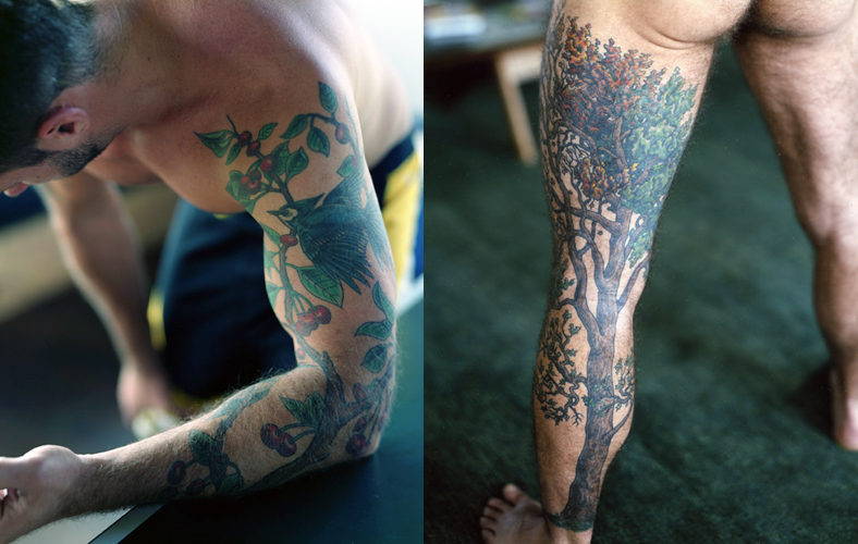
Consumed by flora
The acquisition of the tattoo is to not to be undertaken lightly. The skin illustration (pace Mr. BRADBURY) only occasionally can escape its connotations of branding and permanent regret and attain the level of fashion or creditable statement of individualism. A possibility exists in this regard: The floral tattoo, in which the body, consistent with the mythology of ashes and dust, comes to be consumed by flora. Mr. HUGH JACKMAN experienced complete consumption in Mr. DARREN ARONOFSKY’s overlooked science-fiction romance The Fountain. Meanwhile, accomplished photographer Mr. RICHARD RENALDI gives over his substantial form – leg first – to a creeping and encompassing vine.
In this way, man the animal can affirm allegiance with nature without ever having reference to mother. When exposed via short sleeve or pantalon, such skin illustrations complete, rather than undermine, an ensemble.
The impermeable hat
In the eternal quest to deflect precipitation without resembling a manchild in poncho and galoshes, there are occasions when an umbrella will not suffice. In gentle rain, yes. In a lashing storm or in snowfall, no. Here, to fight nature, one must reject natural materials. The impermeable hat, made of Gore-Tex (or, now that its patent is long expired, an analogue), can match any outerwear. In this regard the Seattle Sombrero must be recommended.
Waterproof, crushable, warm, and, in black-on-black model, functionally invisible despite its brims fore and aft, the Sombrero calls into question the fashionable man’s fealty to previous-century styles like the fedora and laughs at contemporary affectations like the porkpie. Both soggy messes become consigned to the trash bin when confronted with traversing the real world from A to B in other-than-fashion-shoot weather. Additionally, the Sombrero has the advantage of manifestly not being a Tilley Endurables hat, favourite accessory of retiree tourists.
Duckboots, even for Europeans
Along with seriously large washing machines and genuine dryers, surely the most perplexing lacuna in European culture is the foul-weather boot. At the opposite end of the body from the ruined fedora are the shoes ruined from walking, Miss GRACE JONES–style, in the rain. Here again we must concede American superiority in the form of the duckboot, so named because of the rounded toe edge with top flutes that resemble the foot of a duck. These discreet, well-shaped boots look like one is wearing something waterproof without invalidating the rest of an outfit, especially any pantalon breaking on the duckboot. While we are not willing to endure violated feet for fashion, we are equally unwilling to endure violated fashion for dry feet.
For 2010, a reliable duckboot source, L.L. Bean of the state of Maine, has rediscovered its own history through its Signature line of reinvented classics, including a high-top variant that may suit the more rugged among us.
In the style of inexperienced editors everywhere, Fantastic Man failed to respond. They had their chance.
Select a category to see additional posts. Add feed/ to a category to subscribe via RSS
The foregoing posting appeared on Joe Clark’s personal Weblog on 2010.06.09 15:32. This presentation was designed for printing and omits components that make sense only onscreen. (If you are seeing this on a screen, then the page stylesheet was not loaded or not loaded properly.) The permanent link is: https://blog.fawny.org/2010/06/09/fantasticpitch/
Call-centre operators, apparently, if Erik Granered, author of Global Call Cent[re]s, is to be believed. Pp. 155–156:
It may be tempting to just skip Canada and say that its culture is similar to American culture…. Canada is slightly more feminine than the United States, as exemplified by more progressive social policies.
He’s using the definition of Geert Hofstede (no relation), who actually ranks us at just over 50% on the masculinity index.
Canadians are also very secure in their identity.
Red Rose tea comes shooting out of nose at this point, but we continue.
A recent beer commercial depicts a young man on stage going on in a frantic monologue about how he is Canadian, not an American. The popularity of this commercial might make you think this would indicate a certain level of identity crisis. On the contrary – because Canadians are so clear about their own identity, they are frustrated with the rest of the world[’s] not being able to differentiate them from their neighbo[u]r to the south.
So what is this Canadian identity, and what makes it different from the pervasive American culture that is also part of their everyday live [sic]? The astute visitor to Canadian cities can sense a difference in atmosphere. The electricity and danger of “anything is possible” that one feels in New York or Detroit is gone. It is replaced with a much more casual stride combined with a certain flair and ease – not just in French-speaking cities of Québec [sic] and Montreal, but also in Toronto and elsewhere. […]
Canadians… know that they are different and they want you to know that they are different. Perhaps the best way to do this is to acknowledge your awareness of the customer[’s] being Canadian as opposed to American. Instruct agents to simply say “I see you are located in Vancouver, Canada. Very nice!” That will suffice as recognition that you know Vancouver is not a suburb of Seattle
but also that you don’t know that we absolutely loathe being referred to by city and country. Ignorant Americans do that, and it drives us nuts. You have to name the province or territory, never the country, and for big cities never either.
Select a category to see additional posts. Add feed/ to a category to subscribe via RSS
The foregoing posting appeared on Joe Clark’s personal Weblog on 2010.06.08 11:13. This presentation was designed for printing and omits components that make sense only onscreen. (If you are seeing this on a screen, then the page stylesheet was not loaded or not loaded properly.) The permanent link is: https://blog.fawny.org/2010/06/08/erikgranered/
Last night (2010.06.07), authoress/autobiographeuse, apostate, defender of freedom, fashion plate, and polyglot Ayaan Hirsi Ali visited Toronto on her book tour. She was observable in her natural state – surrounded by protection from Muslims who want her dead.
During Q&A, I asked: “I have read of violent anti-gay attacks, allegedly by recent Islamic immigrants, in countries like the Netherlands and Norway.” She was looking right at me. She looks right at everyone she talks to no matter who they are or what they think of her. Nerves of steel. “In Canada and the United States, in your opinion under what circumstances should a gay or lesbian person support Muslims or Islam?” I asked, using the pluperfect pronunciation of “Muslims.”
A gay or lesbian person should never support Islam, she said immediately, because it is anti-gay. But such a person should support gay or lesbian Muslims, to “ease them” into civil society. Islam is opposed to homosexuality, she continued. The Koranic admonition to throw a homosexual off the top of the tallest building was one thing in Mohammed’s time when that was only a few feet, “but now we have the Sears Tower. So that is obviously a dealbreaker,” Ali said to chuckles and applause from the crowd.
I gave her a little bow of the head – in the Orientalist style, to use the term in various senses. It is pleasing to be treated like royalty by someone who, in a just universe, actually would be.
Select a category to see additional posts. Add feed/ to a category to subscribe via RSS
The foregoing posting appeared on Joe Clark’s personal Weblog on 2010.06.08 10:50. This presentation was designed for printing and omits components that make sense only onscreen. (If you are seeing this on a screen, then the page stylesheet was not loaded or not loaded properly.) The permanent link is: https://blog.fawny.org/2010/06/08/ali/
Select a category to see additional posts. Add feed/ to a category to subscribe via RSS
The foregoing posting appeared on Joe Clark’s personal Weblog on 2010.06.08 10:48. This presentation was designed for printing and omits components that make sense only onscreen. (If you are seeing this on a screen, then the page stylesheet was not loaded or not loaded properly.) The permanent link is: https://blog.fawny.org/2010/06/08/buzzmounted/
Credit for Wired’s design triumphs goes first to the smartest designer on the West Coast, dapper Mr. SCOTT DADICH (video), and a flotilla of designers who should really be as famous as Dadich.
Online early, atrocious always
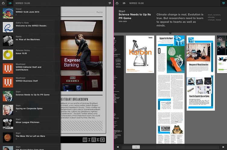
Wired was online very early with a gopher site (≈1993–1996), then with many instantiations of Web sites. The magazine has always blown it when it comes to Web design, as esteemed colleague Jason Santa Maria has previously detailed. (Other magazines have made the same mistakes.) Now Wired has blown it in a completely new way with its iPad app. (I haven’t seen or used it, largely because I seem to be the only person on my peer group with no definable use case for an iPad. I have to rely on firsthand accounts and Wired’s own announcement.)
Critics wonder if book and magazine iApps will become the CD‑ROM of the Aughties
What they should really be wondering is why the Wired app has already become a Web site from the Nineties. Well before Web standards and Webfonts retrained design thinking, print designers who begrudgingly worked on the Web demanded absolute control over typography. That’s something they can’t have, a lesson some refuse to learn even today. But a decade ago, the more famous and self-impressed the designer, the more likely the Web site to be rendered as a picture of text. (That trend was later usurped by Flashturbation.)
A good example was that of Bureau Mijksenaar, the Dutch house that does a lot of work in signage. Circa 2001, its homepage really was a picture of text.
While the current site doesn’t have the best code in the world and uses Flash graphics here and there, it at least reads as a Web site in more than one sense.
Wired.app does not read
Even the Wired Web site circa 2001 wasn’t as bad as that design firm’s. But its iApp today really is worse, isn’t it? There’s so-called “interactivity” wheatpasted on top like graffiti fingered onto a dirty hatchback, but everything you’re looking it is a picture of text. A picture of beautifully typeset text, but a picture nonetheless.
There’s no live text, meaning there’s no search. It also means there’s no accessibility on the first computers that are accessible by default if you the developer do no extra work at all. (Follow the spec exactly and your app is accessible right away.) Think of how much effort it takes to blow an opportunity like that.
Jonathan Hoefler designed the typeface and gamely sticks up for his client, but surely he realizes he’s defending a turd. Anyone with a copy of InDesign and good type skills, which admittedly take a decade to acquire, can produce a PNG export of type that is set as nicely as Wired.app’s. But it’s still a picture.
Now Adobe wants to monetize this nonsense
Using a Microsoft-like facility for descriptive yet forgettable product names, its “Digital Viewer technology” creates “a digital magazine format” made up of pictures. Twice I asked publicist Russell Brady how this output differs from exporting a PNG from Acrobat, and twice Brady refused to answer. (He didn’t ignore the question. He just didn’t answer it.)
If you want to “publish” a “magazine” as an “app” consisting solely of flat image files, you can already do that quite handily right now with a copy of Acrobat. It won’t have Wired’s cachet, but as we’ve seen, the magazine of the digital revolution does everything wrong when it tries to visually express itself in digital form. Whatever Wired does online and on the iPad, you should do the opposite. Wired.app proves that even a smart magazine with a crackerjack designer has yet to come to grips with what a “digital magazine” really is.
Wired worked night and day and all it did was paint a still life of a magazine. The Wired app is a stag’s head hung over a mantelpiece, a pitiful reminder of a formerly living thing.
Select a category to see additional posts. Add feed/ to a category to subscribe via RSS
The foregoing posting appeared on Joe Clark’s personal Weblog on 2010.06.02 13:01. This presentation was designed for printing and omits components that make sense only onscreen. (If you are seeing this on a screen, then the page stylesheet was not loaded or not loaded properly.) The permanent link is: https://blog.fawny.org/2010/06/02/wired-app/
Select a category to see additional posts. Add feed/ to a category to subscribe via RSS
The foregoing posting appeared on Joe Clark’s personal Weblog on 2010.06.02 10:52. This presentation was designed for printing and omits components that make sense only onscreen. (If you are seeing this on a screen, then the page stylesheet was not loaded or not loaded properly.) The permanent link is: https://blog.fawny.org/2010/06/02/147/
And not “arse.” Robert McCrum’s new Globish: How the English Language Became the World’s Language is the latest in the treatments of the global lingua franca. (Great cover.)
The Globe ran an interview conducted by the man who insists his surname be pronounced the way some poncy Oxbridge graduate living in Boston would, John “Aawlemaawng.” I think something has been edited out of the Q&A, because this passage doesn’t make sense:
And yet you refer, rightly, to the American colonization of Canadian English. Is that a bad thing?
Well, there’s not a lot you can do about it. And yet Canada at the language level strikes me as the rainbow nation. Your policy of allowing every culture to have its own expression is extremely mature and sensible and will yield a very distinctive culture. In Britain, one encounters a real hostility to the idea that the mother tongue is being watered down by immigration, by multiculturalism. But you’ve chosen to be a part of a world community. And if there’s more communication, there might be less misunderstanding.
Spoken Canadian English is American English, though our spelling is unique. It isn’t “colonized”; Loyalist American immigrants gave us our dialect. Foreign-accented English is just as foreign-accented here as it is in Britain. And doing an Amazon search inside the book reveals that Crum does not at all discuss Canadian English as it exists today.
Select a category to see additional posts. Add feed/ to a category to subscribe via RSS
The foregoing posting appeared on Joe Clark’s personal Weblog on 2010.05.31 15:41. This presentation was designed for printing and omits components that make sense only onscreen. (If you are seeing this on a screen, then the page stylesheet was not loaded or not loaded properly.) The permanent link is: https://blog.fawny.org/2010/05/31/globishmyass/
This rapid glossing of street style… is the way of the fashion world, and now “street” editorializes itself…. [O]nly for a little while is each subject “different,” with his or her mix-not-match of high and low, old and new. Then you scroll longer, the pictures blur faster, and suddenly all you see is what Freud called “narcissism of small differences.” […]
[W]e say – as do, invariably, the photobloggers – that we are looking for something unique. But everyone says that. How unique can it be?
And here’s the other thing: We are attracted, biologically and maybe inescapably, to norms. When was the first time you saw Scott Schuman [q.v.], for example, post a “big girl” on his blog? Was it when Glamour ran an unretouched photo of a not-exactly-fat Lizzie Miller in their September 2009 issue? Probably. Schuman blogged it, preempting overdue criticism by saying: “older women and larger size women often say no to my request to shoot them.”
Sure, and how often does he ask? And how often do readers demand? […]
Underneath the colourful bricolage of street style remains the whitest, glossiest, sexiest version of vérité. [Yvan] Rodic has said it before…. He says: “I look for the beautiful normal people.”
Select a category to see additional posts. Add feed/ to a category to subscribe via RSS
The foregoing posting appeared on Joe Clark’s personal Weblog on 2010.05.31 15:40. This presentation was designed for printing and omits components that make sense only onscreen. (If you are seeing this on a screen, then the page stylesheet was not loaded or not loaded properly.) The permanent link is: https://blog.fawny.org/2010/05/31/prickett/
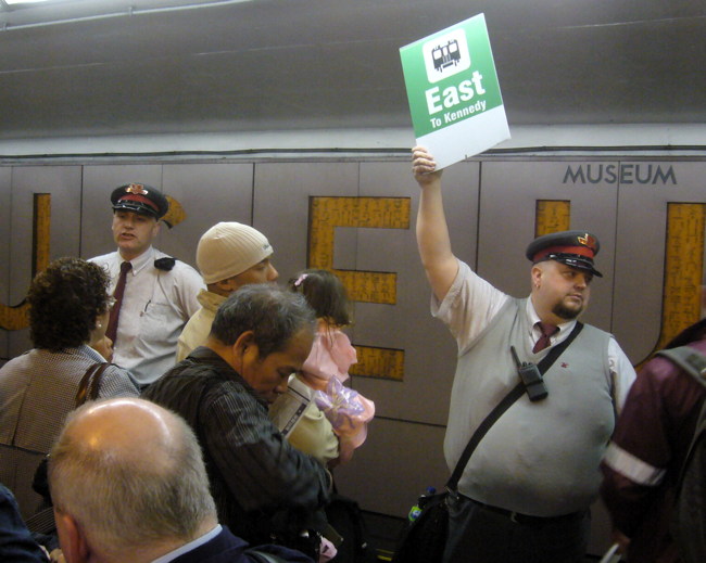
I can exclusively confirm that for the first time ever the TTC took the advice of somebody outside the company.
Last weekend (2010.05.22–24), TTC did track maintenance at Bay station, meaning eastbound and westbound trains had to do a pit stop at Museum station. They tried this once before and it was a nightmare.
On the 19th, I attended a TTC media tour and preview of the diversion. We got on a special train and traced the path everyone else would follow. Adam Giambrone took his sweet time showing up, then did a photo op in clear view of handwritten sign reading PLEASE SHUT GATE. Just as he started talking, an entire classroom of noisy children drowned out his op. To this point, none of the three TTC publicists on staff had bothered to acknowledge me.
We went downstairs and “the lovely Jessica” nicely asked who I was. I introduced myself and handed her my card. Kevin Carrington soon came along and tried to bounce me from the event, but Jessica waved him off. He then picked up a discarded fast-food clamshell from the yellow safety line of the platform. Wouldn’t look good on camera. Realistic, but not good.
The train ride was no big deal, though the special keyhole that can open a door on certain train cars was in heavy use. (There’s also one on the exterior. I’ve seen it used.) “I’d heard of him, but I only got to meet him now” was what I heard Jessica saying to Carrington and Danny Nicholson, head publicist.
Upon arrival, we were reassured by Giambrone and everyone else that there would be plenty of “announcements” and “signage” to tell people which of three possible trains they could take (actually five). TTC was proving itself yet again unable to actually keep records, retain an institutional memory, or – of course – admit they screwed up. Nicholson told me to my face the diversion in 2007 went just fine. I told him to his face it didn’t, and explained why: The “signage” was so half-assed that people brought their own ink-jet-printed replacement signs from home. You couldn’t hear the announcements, because they were shouted through microphones in a noisy environment while trains thundered into an echo chamber with tiled walls.
Nicholson walked away from me halfway through our talk, then spent three-quarters of our remaining time in the station talking to Jessica or other TTC staff. In other words, he left not because he had work to do, but for some other reason. So I explained to Carrington what needed to happen: Staff would have to hold up signs – not handwritten ones – stating which incoming train goes where. Plus audible announcements, of course, which you still wouldn’t be able to hear unless you were standing right alongside.
Since everybody is functionally hearing-impaired in those conditions, actual deaf people and everyone who can see can figure out what train to get on. Blind people have to stand near the hailer to hear what train is coming in. My system is the only one that would work, short of elaborate digital displays and FM-loop systems.
I felt more or less listened to by Carrington, who must have been somewhat sympathetic to what I was saying due to his own visible discomfort with the noise level in the station.
I later sent off what is even by my standards a stern E-mail to Nicholson and Carrington and, whaddya know, TTC did exactly what I told them to do. (I didn’t “ask.”)
The trains I took to Museum station were always claiming to go somewhere they weren’t, but congrats to the TTC for finally, at long last, listening to outside advice. Obviously this was a one-shot deal and it’ll never happen again.
One other fun anecdote: The media-tour train back from Museum was supposed to drop us all off at Broadview. But obviously the train was actually heading back to the Greenwood Yard. So I could have gotten a ride as far as Donlands, which I asked for. The supervisor on board OKed it twice – but then Danny Nicholson, standing outside the train, yelled an order countermanding him – just to be a Little Shit™, it seemed.
I’m just reporting everything that happened, as opposed to everything TTC wants you to think happened.
Select a category to see additional posts. Add feed/ to a category to subscribe via RSS
The foregoing posting appeared on Joe Clark’s personal Weblog on 2010.05.31 12:54. This presentation was designed for printing and omits components that make sense only onscreen. (If you are seeing this on a screen, then the page stylesheet was not loaded or not loaded properly.) The permanent link is: https://blog.fawny.org/2010/05/31/subwaydiversion2010/
The acquisition of the tattoo is to not to be undertaken lightly. The skin illustration (pace Mr. BRADBURY) only occasionally can escape its connotations of branding and permanent regret and attain the level of fashion or creditable statement of individualism. A possibility exists in this regard: The floral tattoo, in which the body, consistent with the mythology of ashes and dust, comes to be consumed by flora. Mr. HUGH JACKMAN experienced complete consumption in Mr. DARREN ARONOFSKY’s overlooked science-fiction romance The Fountain. Meanwhile, accomplished photographer Mr. RICHARD RENALDI gives over his substantial form – leg first – to a creeping and encompassing vine.


![Cover shows title as [Glō·bish]](https://fawny.org/blogimages/Globish-cover.jpg) And not “arse.” Robert McCrum’s new
And not “arse.” Robert McCrum’s new