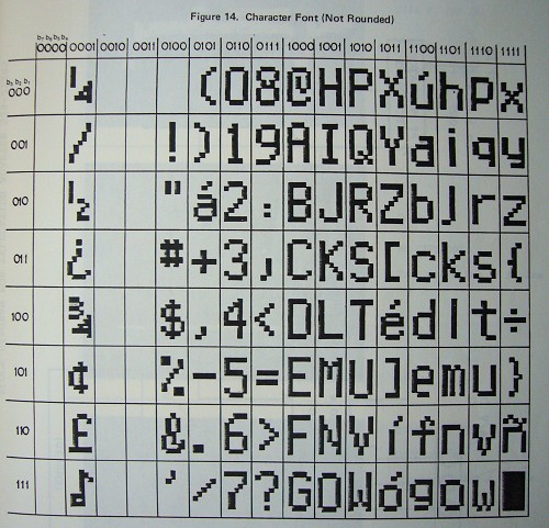
It is a pain in the arse to design typefaces for DVD subpictures for two reasons:
You’re limited to one, two, or four colours, depending on how you read the spec, making it nearly impossible to include antialiasing.
Your pixels are rectangular, not round or square, but they’re rectangles in four different aspect ratios depending on the TV broadcasting system and aspect ratio of the original.
Aspect ratios, expressed as width:height
Resolution
Fullscreen, 4:3
Widescreen, 16:9
NTSC: 720×480 pixels
0.909:1 (10/11)
1.212:1 (303/250)
PAL: 720×576 pixels
1.091:1 (59/54)
1.455:1 (291/200)
Consequently:
All pixels are rectangular, making the task of drawing a circle difficult.
Current DVD subpictures look terrible because we’re using off-the-shelf fonts with rectangular pixels at ill-chosen pixel heights.
One way solve the problem while maintaining design consistency across all variants is to provide fonts of only certain pixel heights – preferably unit multiples of the native pixel dimensions. But that only works in the case of 720×480 4:3 resolution, where the 0.909 aspect ratio can be expressed as 10 pixels wide by 11 tall (10/11). The native pixel heights for the other variants are too large (250, 54, and 200 pixels).
Select a category to see additional posts. Add feed/ to a category to subscribe via RSS
The foregoing posting appeared on Joe Clark’s personal Weblog on 2007.09.03 14:00. This presentation was designed for printing and omits components that make sense only onscreen. (If you are seeing this on a screen, then the page stylesheet was not loaded or not loaded properly.) The permanent link is: https://blog.fawny.org/2007/09/03/14atypi1e-2/
The typeface on the walls of the Toronto subway – or rather, none of the typefaces on any of the walls – is Gill Sans. A common mistake, one that Paul Arthur actually made – and, though he later corrected himself (incorrectly again, as we’ll see), he wanted the entire system to be typeset in actual Gill Sans:
It’s much too light for signage, and the usual difficulty of distinguishing 1, I, and l reaches its apotheosis in Gill Sans, since all those characters are a simple vertical line. Some of Paul Arthur’s drawings show a real 1, others the straight-line (also “real”) 1.
Select a category to see additional posts. Add feed/ to a category to subscribe via RSS
The foregoing posting appeared on Joe Clark’s personal Weblog on 2007.09.03 13:52. This presentation was designed for printing and omits components that make sense only onscreen. (If you are seeing this on a screen, then the page stylesheet was not loaded or not loaded properly.) The permanent link is: https://blog.fawny.org/2007/09/03/14atypi2b/
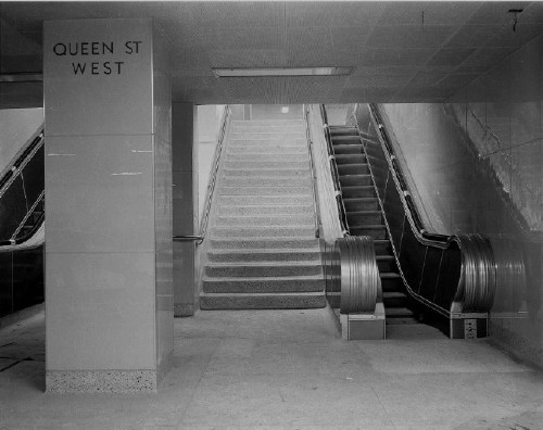
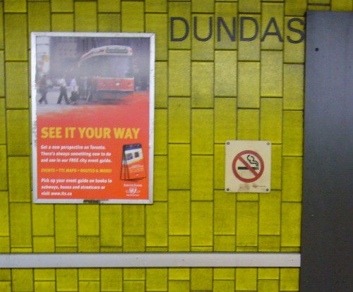
Since my presentation on type in the Toronto subway is entitled “Inscribed in the Living Tile,” let’s take a look at those.
Transit fans adore the old, large-format, ultra-glossy Vitrolite tiles, as seen in this photo of Queen station from the Toronto archives (date untranscribed – it’s there, but even the archivist couldn’t find it again).
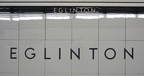
The only surviving usage is at Eglinton:
In the 1970s, the Yonge-line stations, all of which had original Vitrolite tiles, were renovated with new tiles, and rather awful ones at that. Everyone’s favourite: Dundas.
Yes, they really are chartreuse (not puce), and they’re simply vile.
He’s not being upfront about it, because he’s really incapable of being upfront about future plans, but TTC chair Adam Giambrone is among the elite who despise the TTC tile æsthetic. Giambrone has an undeclared war on TTC tiles.
Pape station is to be redone in “artificial stone.” The TTC will always pick something fake over something real, from fonts to wall coverings.
Giambrone essentially admitted that he wants to reënact the Museum station desecration on as many other stations as he can. Maybe one or two “heritage” stations would be retained in original condition.
This ethnic cleansing of Toronto’s actual transit heritage is what Giambrone calls “renovation.” He’s trying to slip all this in under the wire, and I don’t exactly see you up in arms about it.
Select a category to see additional posts. Add feed/ to a category to subscribe via RSS
The foregoing posting appeared on Joe Clark’s personal Weblog on 2007.09.02 15:19. This presentation was designed for printing and omits components that make sense only onscreen. (If you are seeing this on a screen, then the page stylesheet was not loaded or not loaded properly.) The permanent link is: https://blog.fawny.org/2007/09/02/14atypi2a/
Select a category to see additional posts. Add feed/ to a category to subscribe via RSS
The foregoing posting appeared on Joe Clark’s personal Weblog on 2007.09.02 15:02. This presentation was designed for printing and omits components that make sense only onscreen. (If you are seeing this on a screen, then the page stylesheet was not loaded or not loaded properly.) The permanent link is: https://blog.fawny.org/2007/09/02/14atypi1e/
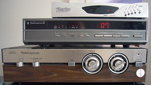
Here we have nearly 30 years’ worth of television caption decoders.
Let’s go from bottom to top, like geological strata.
The original TeleCaption decoder, backformed into the name “TeleCaption 1.” I never had one of these; I was about 15 when they came out circa 1979–1980 and my mother refused to buy one. Note the giant size and the rotary dials. (On the back are VHF/UHF connectors for rabbit ears and a single coaxial jack for output.) Of the same era, it was possible to buy a Sears television with a decoder built in (a good 12 years ahead of its time), and those machines, like current television sets, had access to the colour guns and could produce colour captioning. (Or, more likely, colour Text channels, at that time used to list captioned programming. I saw that colour usage myself.)
I bought this one offa eBay in 2003. It had been hacked by the previous owner to include a single RF cable for video and a male earphone jack – only marginally more useful than the original connectors. And, after a great deal of coaxing yesterday, I got the fucker to work on 21st-century equipment. Not very well or reliably, and with lots of snow on the screen, but I got ’er working. And I’ve got pictures to prove it.
The TeleCaption II, released circa 1986. I bought one of these as soon as I could put the money together upon arriving in Toronto. For the first time ever, I had captioning on demand (i.e., all the time). What we would now call the form factor of this machine misled many visitors to think it was a VCR. It had a wider range of input and output jacks, including a useful open-caption-out feature. Sears dumped its faulty units on Canada; ours didn’t work with videotapes encoded with Macrovision copy protection. And it couldn’t handle stereo audio, meaning you couldn’t watch captioning and audio description on SAP simultaneously without jiggery-pokery.
The TC IIs included new technical features, like transparent spaces that finally made it possible to centre a line of text, and an antialiased font, albeit still without descenders. (Yes.)
Not shown: Built-in decoders, required by U.S. law since 1993. We get the same TV sets, though I did see a single Samsung television exactly once that had no captioning. Caption decoding has now been reduced from a box the size of an early Betamax to half a chip, since decoding is usually on the same chip that displays channels and menus (partly explaining why you can never have both at once).
At the top, the TVGuardian, “The Foul Language Filter®.” Yes, it reads caption text and substitutes nice words for swear words. (Ostensibly.) It’s got a pass-through mode in which it functions like a real decoder, or rather like a real decoder that’s busted and a total piece of shit.
I have specifically opted not to buy a few other outdated decoder models – the TeleCaption 3000 and 4000, the MyCap Jr. – because three relics of the past are quite enough.
You won’t believe the differences in typography among all the decoders mentioned.
Select a category to see additional posts. Add feed/ to a category to subscribe via RSS
The foregoing posting appeared on Joe Clark’s personal Weblog on 2007.09.01 17:11. This presentation was designed for printing and omits components that make sense only onscreen. (If you are seeing this on a screen, then the page stylesheet was not loaded or not loaded properly.) The permanent link is: https://blog.fawny.org/2007/09/01/14atypi1d/
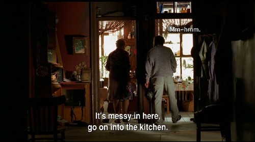
Since captioning and subtitling always have been, are, and always will be two separate things, even in the U.K. and Ireland, it stands to reason that you can have both at once. In fact, you can’t pass off a subtitled production as being accessible to deaf people, because they can’t tell who’s talking, sound effects are left out, and tons of dialogue is omitted or simply unrendered.
An easy example that the intellectuals are hot for is Ночной дозор (Night Watch) by Timur Bekmambetov. The intellectuals are all hot for the picture’s animated subtitles, but they’re too ignorant to notice those subtitles are “typeset” in Arial Narrow, use double hyphens for dashes, and use three different kinds of apostrophes (neutral and curled and, indicating a non-English keyboard, grave accent).
Anyway, it’s a good example of simultaneous captions and subtitles. We can use them for sound effects:
(Note how the actor’s arm covers the subtitles, one of the animated effects the intellectuals are all hot for.)
Select a category to see additional posts. Add feed/ to a category to subscribe via RSS
The foregoing posting appeared on Joe Clark’s personal Weblog on 2007.08.31 13:57. This presentation was designed for printing and omits components that make sense only onscreen. (If you are seeing this on a screen, then the page stylesheet was not loaded or not loaded properly.) The permanent link is: https://blog.fawny.org/2007/08/31/14atypi1c/
Select a category to see additional posts. Add feed/ to a category to subscribe via RSS
The foregoing posting appeared on Joe Clark’s personal Weblog on 2007.08.30 21:45. This presentation was designed for printing and omits components that make sense only onscreen. (If you are seeing this on a screen, then the page stylesheet was not loaded or not loaded properly.) The permanent link is: https://blog.fawny.org/2007/08/30/tortue/
U.K. (and Irish) English and our English may use different words for the same concept, as with lift/elevator. That’s noncontroversial.
U.K. English may have a different sense for some words, like pants (trousers or underwear?). In that case – this is important – you could clear it up by not using the ambiguous word and using two other words (no to pants, yes to trousers or underwear).
U.K. English insists on using one word for two things, subtitling. Unlike the previous case, you cannot clear up the ambiguity by using two other words. Subtitling is subtitling in this dialect, but subtitling is also captioning.
Hence, while it may not be clear whether or not you are wearing “pants,” it is at least possible to specify what you are wearing using other words. A film that is “subtitled” could mean any of several things – captioned or subtitled or both at once.
Hence “How was your Saturday night?” “It was all right. The Missus and I went to the subtitled movie” tells you only that your friend and the Missus went to a movie and there were words on the screen. What kind of words? You don’t know the answer.
Rather despite what Wikipedia says, every country with a captioning infrastructure except the U.K. and Ireland calls captioning captioning (viz Canada, the U.S., Australia, and New Zealand). Countries without such an infrastructure simply do not understand what captioning is (viz India, South Africa, Jamaica) and will flail around for a moment before settling on subtitling. They’ll be just as wrong as the Brits and the Irish, but they will be innocent. And the ambiguity will lead to legislated nonsense like the Irish broadcast regulator’s insistence that “subtitling” levels must increase while also allowing some “captioning.” It’s all captioning, and it’s the only thing you’ve been watching all along.
Our British and Irish friends nonetheless go to elaborate lengths to insist that nobody, at all, ever, misunderstands what is meant by subtitling. While they may claim that, after the manner of the tobacco industry claiming that smoking does not cause cancer, we can actually prove that nobody ever misunderstands captioning and subtitling. The U.K. usage is polysemous but irresolvably ambiguous. That makes it wrong. What makes it different from the previous case is that nobody’s innocent.
Select a category to see additional posts. Add feed/ to a category to subscribe via RSS
The foregoing posting appeared on Joe Clark’s personal Weblog on 2007.08.30 20:14. This presentation was designed for printing and omits components that make sense only onscreen. (If you are seeing this on a screen, then the page stylesheet was not loaded or not loaded properly.) The permanent link is: https://blog.fawny.org/2007/08/30/14atypi1b/
If you watch captioned TV (not “subtitled” TV in any sense) for two hours a night five nights a week for a year, you’ll read over 4 million words. That’s a lot of words. We’ve been putting a lot of working into making the type on office-computer screens more readable (on Windows, mostly). But that isn’t all we’re reading offa screens.
Calculations
Jensema (1996) surveyed reading speeds of many television genres and display forms (scrollup vs. pop-on). Working solely from his reported averages, in words per minute (wpm) and per hour (wph):
Scrollup: 151 wpm = 9,060 wph
Pop-on: 138 wpm = 8,280 wph
Assume 25% of your viewing is scrollup, 75% pop-on. Two hours a night, then, equals:
Over 5 nights a week for 52 weeks, you’re reading 4,407,000 words a year.
If we assumed all scrollup captioning, the figure is 4,711,200. With all pop-on captioning, it’s 4,305,600. So the order of magnitude is the same.
Even if you do the same calculation with the very slowest captioning reported by Jensema (74 wpm), simply an impossible scenario even for young children abandoned in front of the TV by their moms, the order of magnitude is still comparable – 2.3 million. (With the maximum, 231 wpm, it’s 7.2 million.)
That’s a lot of words. While you’re lying on the couch. And relaxing. And not “working.” Now you can see why I think caption fonts are important.
Select a category to see additional posts. Add feed/ to a category to subscribe via RSS
The foregoing posting appeared on Joe Clark’s personal Weblog on 2007.08.29 14:25. This presentation was designed for printing and omits components that make sense only onscreen. (If you are seeing this on a screen, then the page stylesheet was not loaded or not loaded properly.) The permanent link is: https://blog.fawny.org/2007/08/29/14atypi1a/
![Caption reads [ Male Voice Shouting ]](https://fawny.org/blog/images/CCfoto_NightWatch_CCplusST_056-500.jpg)
![Caption at screen top reads [ Man #2 ]](https://fawny.org/blog/images/CCfoto_NightWatch_CCplusST_058-500.jpg)