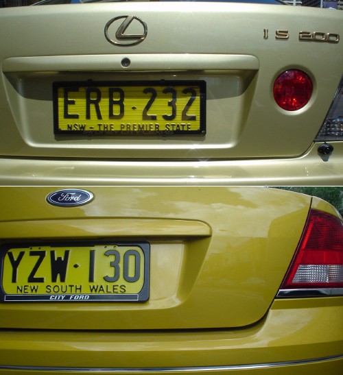
Why is every car in Australia chartreuse?
The foregoing posting appeared on Joe Clark’s personal Weblog on 2004.11.05 14:01. This presentation was designed for printing and omits components that make sense only onscreen. The permanent link is: https://blog.fawny.org/2004/11/05/puce/
Tasteful swash capitals
Twice in two weeks, no less. You usually find tasteful swash capitals maybe twice a decade. I think the HOPESFALL logotype could stand some better optical spacing, but it’s an unexpectedly successful use of all-(swash-)caps.
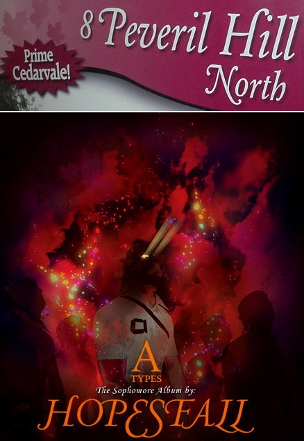
The foregoing posting appeared on Joe Clark’s personal Weblog on 2004.11.03 14:11. This presentation was designed for printing and omits components that make sense only onscreen. The permanent link is: https://blog.fawny.org/2004/11/03/buckling/
Free chromostereopsis with every help session!
Talk about orange. You shouldn’t put blue on orange or vice-versa because the wavelengths resolve at different points on the retina, making the colours look like they’re different distances away. Plus the colours can throb. Not a question of colour deficiency, merely of human vision in general. It’s even worse against a bright blue sky, so lucky you that we have just that kind of background here!
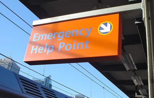
The foregoing posting appeared on Joe Clark’s personal Weblog on 2004.11.02 16:35. This presentation was designed for printing and omits components that make sense only onscreen. The permanent link is: https://blog.fawny.org/2004/11/02/chromostereopsis/
26
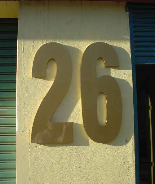
(Cf. crumbly, lapidary Helvetica.)
The foregoing posting appeared on Joe Clark’s personal Weblog on 2004.11.02 16:34. This presentation was designed for printing and omits components that make sense only onscreen. The permanent link is: https://blog.fawny.org/2004/11/02/26/
Broadway Shopping Centre
Located, funnily enough, on “the” Broadway, a terrifying thoroughfare overrun by eight lanes of 60 km/h traffic, all running on the wrong side of the road and replete with buses in the curb lanes. I’ve never gotten so much dust in my eyes in my life.
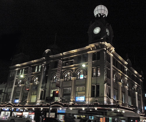
The foregoing posting appeared on Joe Clark’s personal Weblog on 2004.11.02 16:33. This presentation was designed for printing and omits components that make sense only onscreen. The permanent link is: https://blog.fawny.org/2004/11/02/the-broadway/
Matter/antimatter
I couldn’t believe it either: A hastily-made product sign, meant to stand in until a sign that conforms to corporate livery (using Futura) could be printed, typeset in… Benguiat Gothic.
(It’s pronounced “Ben·gat,” for your beginners. He’d probably look at his own font and blurt “What, that piece of shit?”)
The foregoing posting appeared on Joe Clark’s personal Weblog on 2004.11.01 22:37. This presentation was designed for printing and omits components that make sense only onscreen. The permanent link is: https://blog.fawny.org/2004/11/01/benguiat/
B-links, October 28
- Some Standards Thoughts (though the link currently 404s): “What we have in reality is a proximity to standards, a kind of close enough is good enough approach and we as developers and designers allow that because it is an improvement over years gone by. At times it seems like we are almost grateful for small mercies. But be clear this is not a standard, becuase we obtain different results, even though we are using the same codebase.”
- You will probably be aware that Bob Mould writes a Weblog.
- Feeding Fleshbot further.
- Pix MisGoogled: “It turns out that Google pretty [much] ignores the
alttext.” - English-to-English Dictionary: Cute, but it ignores the fact that such a dictionary is necessary (just try to discuss captioning with the British), and also ignores the example from the Grot store in The Fall and Rise of Reginald Perrin (“We have nearly finished work on our Dutch–Dutch dictionary, consisting of every word in the Dutch language alongside its equivalent in Dutch”).
- Make Windows look like X (among many other links I have for this practice
; now, where are they?). Look at AquaXP and MobyDock. (Cf. Nerdvana.) - CSS only now reaching Queensland. You expect us to take you seriously, Al Jury?
- Mystic-State Allusions in Rush Lyrics.
- iPod [Site] Supports Standards: At Web Essentials, Bowman admitted that he developed the sliding-doors technique for Apple. He also explained the true story behind the whole thing, but not to the assembled audience.
- Bootylicious not excludable from Oxford English Dictionary, obviously. Also science-fiction citations.
- “[W]ith its conservative link policy… that only connects the BBC to established brands, it snubs the wider Web.”
- Can’t Find on Google: I have lots of examples, including some of my own pages (also Cf. Google no-shows).
- Exactly the wrong kind of text-only page: “The Week in Pictures… Enjoy the slideshow!” Someday we’ll kill off text-only pages once and for all.
- How to type in Vietnamese. It’s really not our problem if you didn’t see that plainly-obvious International tab in System Preferences. I guess you’re so accustomed to Windows and its decades of punishing you for typing anything beyond US-ASCII that it never occurs to you it’s actually simpler on your superior platform.
- The genitive of euro is…?
- Oppressed Google translators engage in backward-masking.
- One of many copy-editing sites (“I upper-cased K.D. Lang and I liked it,” &c).
- “Best viewed with the same configuration as me, your eyes and some scrolling with your wheelmouse.”
- I’m just going to say that the death of John Peel left me thinking “What are we going to do?!” – which I thought sincerely and also simultaneously imagined Basil Fawlty shouting. For many years I enjoyed listening to his program, usually in better moods or while doing chores. Nobody else would have played the insane underground techno/happy-hardcore single “Identify the Beat,” let alone stated that they’d played it around the office all day already and weren’t done with it. (I approximately recall his saying “We’ve played that some eight times already, and I’m not sure that’s too many.”) He epitomized the concept of catholic taste, and was terrifically adept at off-the-cuff drollery. Am I going to be stuck sitting here listening to interchangeable D&B streams all day? What is that?
- OpenOffice in Kiswahili et al.
- Sure, “mobile video” is great, unless you want it accessible. Of course, we’re not doing this for the cripples, right? Because you and your A-list friends are not, and this is all about people like you.
- Best headline of the year (concerning U2 iPod): “iPod Bloody iPod.”
- Milagro Greenfield War looks splendid these days. Who’s that other fellow?
- Top Ten Best Queer Porn Videos of All Time: Anything with Dred Scott, shurely?!
- JVC HA-G11 and similar models have Braille markings on their L and R earphones. Wait till they find out they’ve actually labeled them l and r. (You need another character to indicate capitals.)
- Canadian English (examples)
- BigMuscleBlog manqué: Nudie gay “dating” profile disses crystal meth and shares fear over cervical-spine surgery. It can happen to anyone, I guess.
- The World’s Longest Alphabetical E-mail Address:
user@abcdefghijklmnopqrstuvwxyz(Cf. longest URL)
abcdefghijklmnopqrstuvwxyz
abcdefghijk.com - Some questions and answers about Meg Hourihan’s cooking. One presumes that her living in Nantucket with nought but her trusted pickup truck indicates she and J. Kottke have not been the A-list–bloggeur power couple for quite some time.
- Saving E-books with Internet Explorer (for Windows).
- Garbage Storage Enclosures in Juneau.
- Rands Management Glossary.
- The still-fabulous Dunstan Orchard, shirtless with his male friend bright and early of a morning. (He doesn’t shave his shoulders; I asked.) Dunstan, moreover, remains tall.
- Lynx for DOS.
- “Thirtysomething, handsome, muscular, intelligent jock. I am… a total JORK (50% jock, 50% dork).”
- DungeonBeds.
- PDF Hacks: Nothing about tagging? Must I remain one of the seven people on the planet capable of creating a tagged accessible PDF forever?
- Yet another variation on the wheelchair logo! (It has an actual name, by the way)
- And, last but not least, BigMuscle photo of the month, if not year: HairyCocksman. It would be quite something to entice a Franco-Ontarian back from the Left Coast, and I doubt I’m quite enough something.
The foregoing posting appeared on Joe Clark’s personal Weblog on 2004.10.28 15:37. This presentation was designed for printing and omits components that make sense only onscreen. The permanent link is: https://blog.fawny.org/2004/10/28/b-links/
How to attain perfect vegetarian-bachelor status
Have nothing, nothing at all, in the fridge save for a case o’ Edensoy and two kinds of ethnic dips.
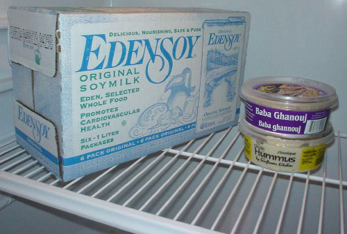
The foregoing posting appeared on Joe Clark’s personal Weblog on 2004.10.26 17:06. This presentation was designed for printing and omits components that make sense only onscreen. The permanent link is: https://blog.fawny.org/2004/10/26/bachelor/
Maple fungus
Maple trees in Toronto are enduring a fungal outbreak (PDF) that stains their leaves black, irrespective of original colour.
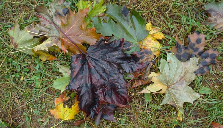
The foregoing posting appeared on Joe Clark’s personal Weblog on 2004.10.25 20:18. This presentation was designed for printing and omits components that make sense only onscreen. The permanent link is: https://blog.fawny.org/2004/10/25/maple-fungus/