(CORRECTED) Urvashi “Urv” Vaid, in her atrociously typeset book Irresistible Revolution (excerpted, echoes noted):
Vassar changed my socioeconomic class status forever – from immigrant working class to upwardly mobile and securely middle class. Attending Northeastern Law School changed it again – to the professionally employable and credentialed managerial class. Working at the Ford Foundation changed it once more – giving me a truly comfortable upper-middle-class life₁, for the first₁ time in my adult life₂, including the first₂ pension plan I ever had. And working to help a billionaire build his foundation changed my status yet again – from comfortably upper middle class to a platinum-card-carrying member of the small group of people that staffs, supports, and serves the ruling elites in this country.
She couldn’t state it any more plainly: Urvashi Vaid is an elite accessory to a billionaire.
The Ford Foundation isn’t the only place that paid her well. Public filings show that, for working just the first half of 2010 at the Arcus Foundation and Arcus Operating Foundation, Vaid was paid $533,282 (not $485,944 as I previously reported). That surely would pay for years of unprofitable stand-up-comedy appearances by Vaid’s missus, Kate Clinton. (Vaid didn’t answer my question about how much the Ford Foundation paid her. I asked the Ford Foundation if they even publish “executive compensation,” and was told about what I knew already – the top five earners are listed on nonprofits’ IRS Form 990. Only the Ford Foundation’s 990s from 2009 through 2011 are available; Vaid was not on those lists. I doubt she would have been in the top five anyway.)
The paragraph following the one excerpted above cheerfully recounts the mock chiding by a friend over Vaid’s socialist bonafides. A cute attempt to pre-empt criticism, but futile. For, elsewhere in the book, this champagne socialist has the gall to lecture the “LGBT” movement thus:
The overall silence of mainstream LGBT policy, legal, and advocacy organizations on bread-and-butter economic-justice and social-welfare issues is noticeable and rather remarkable…. The avoidance of the pressing need for economic security by many parts of the mainstream LGBT movement ignores hard data that now show… large numbers of lesbians with children live in poverty [and] gay men earn less than straight men because of workplace discrimination. [False!]
[T]he LGBT progressive movement will need to find new ways to finance its work. Existing mechanisms of reliance on individual people with money and [on] foundations are not sustainable for groups working for economic security and the rights of poor and economically vulnerable populations. Foundations are dominated by the values of high-income or wealthy people…. Dependence on philanthropy is the antithesis of progressive politics. It invariably requires conformity to ideas, values, and practices that are in the self-interest of the wealthy who fund and control those institutions
and of their executive staff, like Urvashi Vaid.
Tim Gill may be a millionaire, but at least he isn’t an outright hypocrite.
Select a category to see additional posts. Add feed/ to a category to subscribe via RSS
The foregoing posting appeared on Joe Clark’s personal Weblog on 2013.09.25 12:52. This presentation was designed for printing and omits components that make sense only onscreen. (If you are seeing this on a screen, then the page stylesheet was not loaded or not loaded properly.) The permanent link is: https://blog.fawny.org/2013/09/25/urv/
I have tried to no longer define myself this way, but most of my life I defined myself by my failure at filmmaking. So basically, from 25 to 48, when I was clearly a failure in my eyes, the way I was was like: Somebody would say [Jewishly] “Have this cookie. It’s good.” And I’d be like: Is that cookie going to get me success in film? No? Screw it. I don’t want it. And so I just narrowed my life right down.
Select a category to see additional posts. Add feed/ to a category to subscribe via RSS
The foregoing posting appeared on Joe Clark’s personal Weblog on 2013.09.24 14:14. This presentation was designed for printing and omits components that make sense only onscreen. (If you are seeing this on a screen, then the page stylesheet was not loaded or not loaded properly.) The permanent link is: https://blog.fawny.org/2013/09/24/zweigfail/
Every design starts with an instinct: It should look like this, or it should look like that. You can actually test it with data. The humbling thing about that is sometimes the data proves you wrong. So for every change I propose, you know, three out of four, four out of five the data will support the change.
At Yahoo: “Our last move was to tilt the exclamation point by 9°, just to add a bit of whimsy.”
Graphic design cannot be reduced to numbers, a fact that will never be accepted by a high-function autistic like Mayer. (She cannot be described as such in polite company because no female tech CEO could possibly be a high-function autistic.) If all you do is run numbers, it doesn’t add up to hire real type designers; you can just use an in-house “logo[-]design team.”
Mayer smothered designers when she was at Google and now pretends she is one, tilting exclamation points an exact number of degrees and calling it whimsical.
Select a category to see additional posts. Add feed/ to a category to subscribe via RSS
The foregoing posting appeared on Joe Clark’s personal Weblog on 2013.09.05 08:30. This presentation was designed for printing and omits components that make sense only onscreen. (If you are seeing this on a screen, then the page stylesheet was not loaded or not loaded properly.) The permanent link is: https://blog.fawny.org/2013/09/05/9degrees/
Another issue of Eye jam-packed with copied-and-pasted-and-barely-copy-edited E-mail interviews with design luminaries who would have been quite easy to get on the phone. Actually just one, but it’s a lulu.
Poynor targets another electronic medium to Poyntlessly critique in print
It borders on pointless to use a print magazine to critique electronic media. I should know – I covered one such attempt for Eye back dans la journée. Even before design criticism of CD-ROMs and Web sites was attempted, the genre of criticism of motion graphics had long since become a fixture of the design press. Motion graphics means any graphics you see on TV or at the movies. The king of that hill is movie titles. (How ’bout another article on Se7en [sic]?) Number 2 with a bullet is the genre of articles about TV-station branding or “identity.”
ITV rebranded itself. As ITV is a British network watched by the British intellectuals who run Eye, somebody had a brainwave and thought “Let’s get Poynor on this.” And, right on cue, the structural incapacity of printed graphic-design criticism to even display motion graphics manifested itself again. Sometimes it’s a joke when a print publication gets into the video business, but any critique of motion graphics belongs in an online video, not the hallowed pages of Eye.
I watched the introduction videos when the whole thing came out and it works great. Quite a lot of thought went into the mutability of the typography, which changes colour like an octopus would. I think it’s great because it works as motion graphics. It does something new because the thing that moves in the graphics is the colour palette.
Rick Poynor, the éminence grise who shat all over design blogs until he was forced to start writing (for) them, devotes paragraphs of a print-magazine article to the Angry Pyjamas response to the ITV rebranding on Twitter. This seems almost as bad as newsreaders newsreading Twits on the air. Any blithering idiot can paste Twits.
Select a category to see additional posts. Add feed/ to a category to subscribe via RSS
The foregoing posting appeared on Joe Clark’s personal Weblog on 2013.08.28 15:01. This presentation was designed for printing and omits components that make sense only onscreen. (If you are seeing this on a screen, then the page stylesheet was not loaded or not loaded properly.) The permanent link is: https://blog.fawny.org/2013/08/28/eye85/
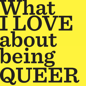
Vivek Shraya’s What I Love About Being Queer (perverse official orthography: What I LOVE about being QUEER) is the companion volume to his home video about the wonderful horrible life of a queer. (And/or a vizmin, as these characteristics border on inseparable, as we shall see.) Its first-person accounts, illustrated by often-self-incriminating photographs, are a user’s manual for “queers” and a manifesto for the queer-supremacist set, which will not be happy until the last gay man is dead. Unfortunately for us, that is going to happen. Queers are doing every single thing they can to hasten our demise. Queer kills gay dead.
These young nonwhite queers consider themselves oppressed and victimized and “racialized” and colonized and discriminated against. That just means that men and women who aren’t queer think these kids are weird and aberrant – true in those observers’ eyes. But what these queers and their apologists aren’t telling you is that they have the upper hand in what gasping vestiges of “the gay community” still exist. The entire gay culture is aligned with queer causes, thinking, philosophy, ideology.
Select a category to see additional posts. Add feed/ to a category to subscribe via RSS
The foregoing posting appeared on Joe Clark’s personal Weblog on 2013.08.23 13:14. This presentation was designed for printing and omits components that make sense only onscreen. (If you are seeing this on a screen, then the page stylesheet was not loaded or not loaded properly.) The permanent link is: https://blog.fawny.org/2013/08/23/wilabq/
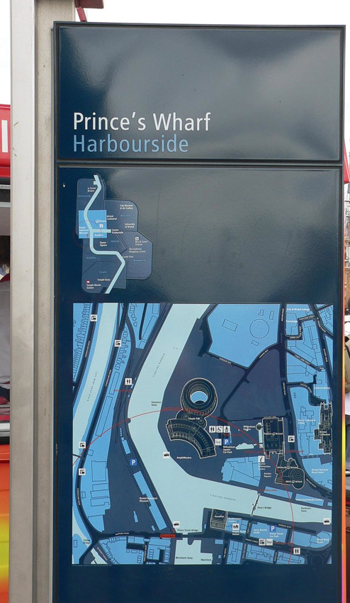
Bristol Legible City was the influential work of Bristol City Council and a range of design firms, chief among them City ID. “Legible Bristol” (not what it’s really called) in every respect set the template for city “wayfinding” projects. (Bureaucrats love to use that term as a classy synonym for what it does not actually mean, signage. Wayfinding is a process of the mind that may or may not involve signage. This distinction is halfway lost, if not more so.)
Here’s what Bristol’s signage looks like (adapting Laurence Penney’s photo): A 2001-like monolithic stela with heads-up directions and overhead diagrams.
It’s also what every city’s signage that came after it looks like. Basically every designer with an interest in “signage and wayfinding” or city informatics knows about Legible Bristol. And lo has it been replicated in city after city. We’re next.
Did you know Toronto has a wayfinding strategy? I didn’t, and I pay attention to these things. Anyway, we’ve been consulted as much as we’re ever going to be, so if, like me, you missed it, you missed it. What is going to happen now is the city will hire a contractor or a consortium of same and install Bristol-compliant stelæ in time for the Pan Am Games (i.e., the Parapan Games). One member of that consortium will be City ID or its competitor, AIG, which is Spiekermann in another guise.
And the built form will be indistinguishable from Bristol’s. Why, the diagrams are already there in the documentation.
I asked the city manager involved and the lead contractor to comment on the inevitability of a Bristol-compliant design and was ignored. But it’s gonna happen. City wayfinding is now a product you assemble from a kit.
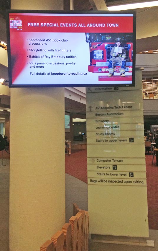
Incidentally, Toronto has exactly one of these stelæ already – at the entrance of the Reference Library, now obscured for months by a flatscreen display the library refuses to move and should never have installed in the first place.
Select a category to see additional posts. Add feed/ to a category to subscribe via RSS
The foregoing posting appeared on Joe Clark’s personal Weblog on 2013.08.17 13:39. This presentation was designed for printing and omits components that make sense only onscreen. (If you are seeing this on a screen, then the page stylesheet was not loaded or not loaded properly.) The permanent link is: https://blog.fawny.org/2013/08/17/bristollegibletoronto/
[Q]uarterback Tony Romo returned to the practice field Thursday for the first time since undergoing surgery to remove a painful ovarian cyst…. “If we had waited any longer, it very well could have spread to his uterus. Hopefully Tony can still have children.”
Select a category to see additional posts. Add feed/ to a category to subscribe via RSS
The foregoing posting appeared on Joe Clark’s personal Weblog on 2013.08.17 12:39. This presentation was designed for printing and omits components that make sense only onscreen. (If you are seeing this on a screen, then the page stylesheet was not loaded or not loaded properly.) The permanent link is: https://blog.fawny.org/2013/08/17/onion-kruger/
 These young nonwhite queers consider themselves oppressed and victimized and “racialized” and colonized and discriminated against. That just means that men and women who aren’t queer think these kids are weird and aberrant – true in those observers’ eyes. But what these queers and their apologists aren’t telling you is that they have the upper hand in what gasping vestiges of “the gay community” still exist. The entire gay culture is aligned with queer causes, thinking, philosophy, ideology.


")