(UPDATED) It borders on impossible. The reasons have been explored at length (really, beaten to death) by academics and intellectuals, and I have no choice but to agree with them.
Camille Paglia (“Women and Magic in Alfred Hitchcock,” Provocations) explains the effect of the female on the male eye.
Hitchcock’s great films of the 1950s and early ’60s show the tension between men’s fear of emotional dependency and their worship of women’s beauty, which floods the eye and enforces an erotic response over which a man has ethical but not conceptual control. Beautiful women are a fascinating conflation of nature and art. They often have an elusive, dreamy apartness, suggesting a remote inner realm to which a man can claim only momentary access.
The voluptuousness of the female body opens up room for ambiguity and creates lines that are actually curves. While the bosom is noticeable, it is plural, hence not a singular point of fixation like male genitalia. Men are parallel lines that converge at the phallus. (Having neither focus nor line, bears photograph atrociously.)
Select a category to see additional posts. Add feed/ to a category to subscribe via RSS
The foregoing posting appeared on Joe Clark’s personal Weblog on 2013.07.09 16:06. This presentation was designed for printing and omits components that make sense only onscreen. (If you are seeing this on a screen, then the page stylesheet was not loaded or not loaded properly.) The permanent link is: https://blog.fawny.org/2013/07/09/malenudes/
Helvetica type in iOS 7 will be darker than in early betas. Helvetica – still wrong for screen usage, as Spiekermann tried to explain to Ive – will not be replaced by another typeface; we’re stuck with it. The myriad adjustments you can make in iOS 7, including to contrast for low-vision readers, are desperate compensations for a font that shouldn’t have been used in the first place. (“What communication design looks like if you give the job to an industrial designer: Helvetica Thin, no diversity, just… style” [via].)
Later I will discuss non-Latin scripts in this context. (You wouldn’t believe the arguments I’ve had with people about the issue of matching, say, Arabic and Latin.) For today, though, let’s recap why designers love masses of grey text.
I covered this before in my now-forgotten posting on the International Compliant Style or IC-Style. I was building on an observation by Aycan Gulez that in turn is so forgotten I had to use the Internet Archive. (Segments reproduced here for posterity.)
Recently another Web-design annoyance has emerged in the form of low-contrast text…. It seems that more and more Web sites, and not just small personal Web sites, are switching from black to gray text. It sounds crazy, doesn’t it? Why would you willingly make your text less readable? After all, black on white is the maximum contrast you can get…. Then why do those Web sites use gray text? Have their designers never heard of contrast? […] Then what is the reason?
The reason is… gray text looks better and more coherent when seen from a distance or as an element of the overall design – but, and this is a big but, it is not meant to be read in these cases. […]
Unfortunately, some visual designers sacrifice readability for a slight increase in visual appeal because they do not really read the text on screen; they treat it as a large block of horizontal lines, and the darker those lines are the uglier they look. So decreasing the contrast a little makes the overall design look nicer but less readable. Poor readability is not the designer’s problem. After all, he will probably never try to use the site he designed. Come on – it is a boring supply-chain-management company Web site!
Select a category to see additional posts. Add feed/ to a category to subscribe via RSS
The foregoing posting appeared on Joe Clark’s personal Weblog on 2013.07.09 15:33. This presentation was designed for printing and omits components that make sense only onscreen. (If you are seeing this on a screen, then the page stylesheet was not loaded or not loaded properly.) The permanent link is: https://blog.fawny.org/2013/07/09/unreadablegrey/
Turn off Flickr’s appalling lightbox “interface” by adding ?details=1 to the end of certain URLs. (Via.Earlier.) For sets, nothing has changed: add /detail/.
The fact that these hacks are circulating, as via samizdat, proves New Flickr is a failure.
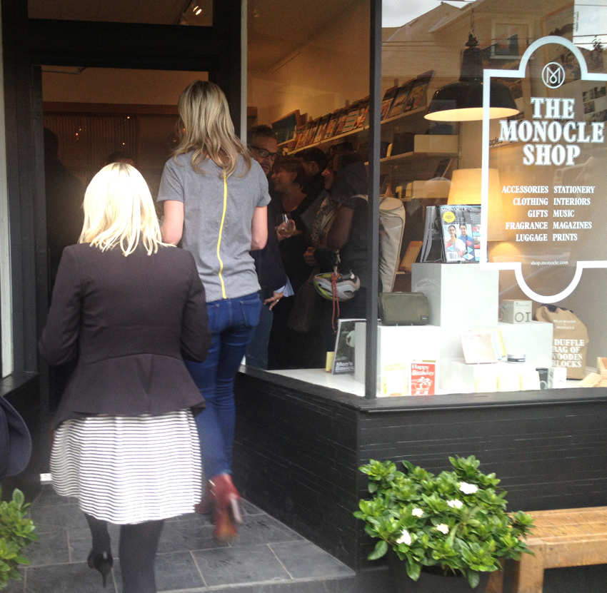
Here we have the Monocle Shop on College St. on the Saturday of its opening. Walking smartly into the shop are two of its enforcers (actually enforceuses), one British, the other Canadian.
These two had followed me out of the store to demand I hand back the perfect-bound Winkreative brochure I had picked up from a pile of such brochures in the office area behind, and clearly demarcated from, the store. We then had quite a discussion about why I was not allowed to take home a brochure. The enforcers alleged that one had to pay for it. But it was a brochure, with no barcode or price tag. One does not sell corporate brochures.
I fact-checked their asses by asking the Monocle online store and Winkreative exactly where I could buy such a brochure and for how much. Whaddya know: No response.
Monocle, a cripplingly dull magazine with a smashing business plan that needs to be duplicated wholesale, always wants you to know you aren’t part of the family. They will fly a woman across the ocean and task her with tailing you outside a store on a winter’s day to tell you that to your face. I contend this is materially worse than getting endlessly strung along for an interview with and by Tyler Brûlé.
What else was I doing at the Shop that day? Loathing the grasping, arriviste young-design-professional clientele visibly currying favour with the boss; trying to get a good photograph of Brûlé’s excellent shoes; and enduring his airy rebuff when I told him his video podcasts required captioning.
Select a category to see additional posts. Add feed/ to a category to subscribe via RSS
The foregoing posting appeared on Joe Clark’s personal Weblog on 2013.07.07 12:53. This presentation was designed for printing and omits components that make sense only onscreen. (If you are seeing this on a screen, then the page stylesheet was not loaded or not loaded properly.) The permanent link is: https://blog.fawny.org/2013/07/07/enforceuses/
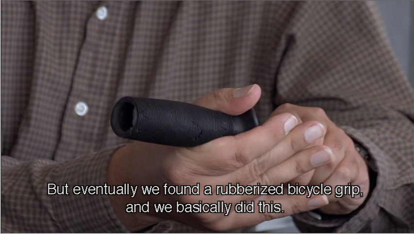
The Times, not content to lie just about gays, now lies about product design, in this case in an obituary for Oxo designer Sam Farber:
Made with a spare, minimalist aesthetic in mind, [Oxo] tools sported what would become the line’s distinctive hallmark: Fat black handles of a soft plastic known as Santoprene, shaped and angled to be easy on the hand.
Except those handles were not “distinctive,” nor were they invented. As Objectified and other sources confirm, Oxo designers gave up trying to “design” a new handle and simply reused a grip from a bicycle handlebar.
Not exactly plagiarism, but not exactly not plagiarism, either.
Then there’s the question, never satisfactorily answered, as to why this allegedly designed and perfected ergonomic grip was exactly the same without variation on dozens of products. Default components are the antithesis of ergonomics. Ask Niels Diffrient, who also had the bad taste to die in the last month.
Select a category to see additional posts. Add feed/ to a category to subscribe via RSS
The foregoing posting appeared on Joe Clark’s personal Weblog on 2013.07.07 10:28. This presentation was designed for printing and omits components that make sense only onscreen. (If you are seeing this on a screen, then the page stylesheet was not loaded or not loaded properly.) The permanent link is: https://blog.fawny.org/2013/07/07/oxo/
We’ve been through this before in the context of E-books. Authors and editors need to understand semantic markup. But that is a lost cause. Jeff Eaton solved the problem for newspapers by writing a CMS that enforces structural thinking.
(The dumb-as-shit slug for that article – controlling-presentation-in-structured-content/ – is an excellent example of another way online publications fuck it up.)
Select a category to see additional posts. Add feed/ to a category to subscribe via RSS
The foregoing posting appeared on Joe Clark’s personal Weblog on 2013.07.07 10:22. This presentation was designed for printing and omits components that make sense only onscreen. (If you are seeing this on a screen, then the page stylesheet was not loaded or not loaded properly.) The permanent link is: https://blog.fawny.org/2013/07/07/structured-cms/
I would take issue with the idea that it is the role of the visually literate to impose their values on those they see as the visually illiterate. And I would question anyone who thinks that effective design, no matter how it looks, is not in some way good design. Design criticism, and design history, rarely enter TRW (the real world), preferring instead to inhabit a cozy province where everything looks lovely and no designer ever has to hear the dreaded words “That’s all very nice, but could you make the type a bit bigger and all capitals?” The fact that graphic designers have to make money and work for other people should no longer be our profession’s dirty little secret. And nor should the fact that graphic design is an essentially multilingual activity in which we should, must, be willing to use the same language as the people with whom we are communicating.
Ignoring the invisible visual communication around us, and the powerful effects it has, and looking down our noses at the 99% of designers who operate in that economy risks [our] producing a generation of designers who shun work they see as beneath them and insist on speaking a visual language only they understand. No wonder the vacuum is being filled with amateurs.
Design criticism: The biggest fraud since poststructuralism.
Select a category to see additional posts. Add feed/ to a category to subscribe via RSS
The foregoing posting appeared on Joe Clark’s personal Weblog on 2013.07.07 10:20. This presentation was designed for printing and omits components that make sense only onscreen. (If you are seeing this on a screen, then the page stylesheet was not loaded or not loaded properly.) The permanent link is: https://blog.fawny.org/2013/07/07/pizzaflyers/
Last year I spent good money to watch a documentary, one shot on video, projected onto a movie screen. (Ordinarily a pointless exercise; documentary is a home-video genre.) But ACT UP is a part of my history that I had almost forgotten. You may not know that I used to write for OutWeek (19 articles). Even I barely remember it.
I gradually realized that every single review – even from heterosexualist males, always the last to know – was an unqualified rave.
I brought all that and more with me to How to Survive a Plague, the best documentary of the 21st century.
Those paragraphs took a year to assemble.
Why did How to Survive a Plague lose the Oscar? Because it was up against a movie about a shaggy nonwhite musician with a guitar. Nothing says “authenticity” like that. It’s rock snobbery taken to the limit.
I told Peter Staley they were facing a Brokeback Mountain scenario: “Chickenshit Academy Jews, liberals, and aging bald heterosexualist males know your movie is better, then proceed to fink out and vote for the safe refuge of the documentary about the black musician. This has been my nightmare scenario for months, in fact.”
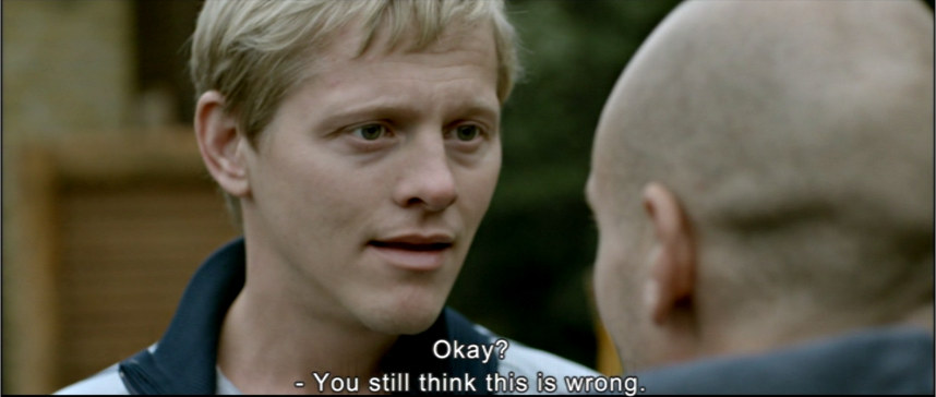
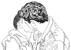
I was one of only two known detractors of Weekend, the film by the uncharitable Andrew Haigh. It was so popular it spawned not fan fiction but fan line art inspired by its publicity photos.
The minute the DVD became available, I bought it. Then every molecule of the universe had to line up just right to find a time to watch it (with, yes, those perverse Captions, Inc. all-centred captions, this time in Arial).
I discovered I had been wrong about Weekend – and why.
To watch the Toronto première, my esteemed colleague and I packed ourselves into a full auditorium at Inside Out on a cold spring evening. Everybody had a coat on or was sitting on a coat or had a coat stuffed under the seat. What I understood at long last is that I simply could not hear half the dialogue in the movie. It was muffled by the room. I needed a volume control that I could adjust myself and, again yes, captioning.
I hadn’t been as impressed with Weekend as everyone else was because – I know now – I couldn’t hear half of the most important lines. Has this ever happened to me before? It meant I did not understand the movie.
I now agree with everyone else. Though futile, I apologize to Andrew Haigh.
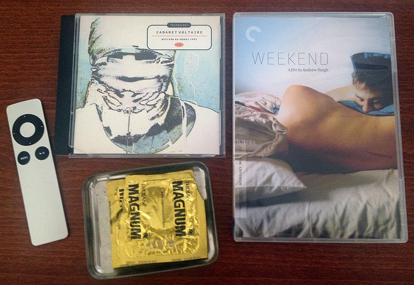
The Criterion package – itself a bit of a coup – sits face up on my desk alongside Cabaret Voltaire as a cultural talisman.
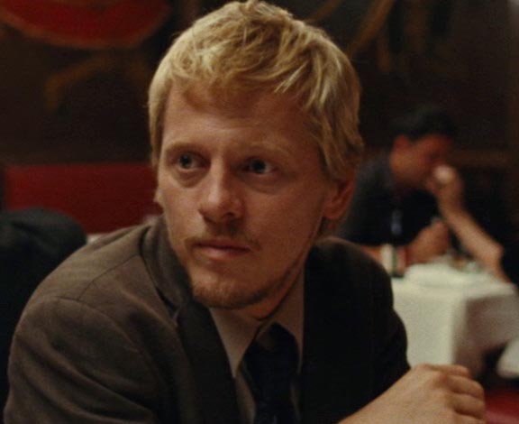
Tom Cullen, who was here and apparently in Sudbury several times, shot some obviously atrocious movie set on Mars. (Presumably its near-moonscape was why he was in Sudbury, though nobody there could confirm that for me.)
He’s in another picture, an Arabian meditation on dance, at whose prospect I cringe. It’s the kind of movie weepy admin assistants and middle-aged ladies in sexless marriages watch. It’s already been done (see Cairo Time; I won’t) and I didn’t want Cullen to turn into an Alexander Siddig manqué. One of all those is more than enough. And, while “Siggy” was admittedly very good in Syriana, Mr. CULLEN is unlikely to spawn a Usenet group in his name.
But here’s where Mr. CULLEN’s future is assured: Getting cast in Downton Abbey ensures he will be an international megastar within five years. Couldn’t happen to a nicer fella.
Keep the Lights On
When you read about Weekend, you also read about Keep the Lights On. They’re presented as peas in a pod.
I called bullshit from the outset because director Ira Sachs has the kind of fatal depressive instinct more suited to Toronto filmmaking. (Toronto cinema is one sad lonely picture after another.) Do not, for example, attempt to watch The Delta, as it will dig a chunk out of your lifeforce. How in the name of Christ he gets funding for his soul-corroding cinematic indulgences I will never understand.
Keep the Lights On, a structural mess beset by almost unremitting bad acting, was abrasively antilife. Nobody else has told you so. You’ve been deceived. I was wrong about Weekend; everybody else is wrong about Keep the Lights On.
But, even having seen Brotherhood –
– I was stunned by the epic openness of Thure Lindhardt. His performances make me, with my sarcastic, critical nature, feel like a mass murderer by comparison. I cannot understand it at all. Not just the infinite blue eyes, the blondest hair in the world… how is it humanly possible even to simulate that level of guilelessness?
It can’t just be acting. You can’t act what you don’t feel. How do you grow up to be that open?
What is someone with an unfathomable degree of heart doing in a movie like this?
Select a category to see additional posts. Add feed/ to a category to subscribe via RSS
The foregoing posting appeared on Joe Clark’s personal Weblog on 2013.07.04 17:02. This presentation was designed for printing and omits components that make sense only onscreen. (If you are seeing this on a screen, then the page stylesheet was not loaded or not loaded properly.) The permanent link is: https://blog.fawny.org/2013/07/04/plague-weekend/
 I was one of only two known detractors of Weekend, the film by the uncharitable Andrew Haigh. It was so popular it spawned not fan fiction but