To date, at least. Oscar Pistorius in court, by Antoine de Ras (cropped).
Pistorius is rich, so his suits fit him well, which explains why at a glance you can tell how fit he is even inside all that clothing. First thing I noticed, actually.
At any rate, didn’t the judge ban photography and recording in the courtroom? If so, did de Ras snap this photo just before the judge uttered those words? I asked him. (Link added.)
This particular image has come under a lot of discussion regarding the legalities, etc. The funny thing is, nobody has bothered contacting me to find out more except AP and local [South African] media companies.
Well, here we are, Antoine.
The big question is whether I was in contempt of court for taking the image! Firstly that photo was taken from outside court through a small pane of glass in one of the court’s back doors. The area outside was jam-packed with public as well as general media trying to catch a glimpse of court proceedings using video, stills, and cell phones, with a lot of the usual jostling for space.
I stayed glued to my small patch for close to an hour and had my height as an advantage. He then swiftly appeared, cried briefly and sat down. From where I was positioned, we could not see the judge or hear him setting down the rules with regards to video and stills in court. Apparently he only mentioned these rules after Oscar had wept. Our lawyers will be taking the matter further tomorrow with the presiding judge to help clear the air as there were complaints from Oscar’s defense team who were agitated by journalists who were miffed/upset for not getting good usable footage of him!
I wrote this to a disabled athlete of my acquaintance: “I need you cripples to stay out of trouble.” “That’s a big ask.”
Select a category to see additional posts. Add feed/ to a category to subscribe via RSS
The foregoing posting appeared on Joe Clark’s personal Weblog on 2013.02.17 15:28. This presentation was designed for printing and omits components that make sense only onscreen. (If you are seeing this on a screen, then the page stylesheet was not loaded or not loaded properly.) The permanent link is: https://blog.fawny.org/2013/02/17/oscarwept/
Venture capitalist Brett Berson talks up a venture-capital-backed darling, Etsy:
Etsy[…] had a substantial “boys versus girls” dynamic, where engineers (mostly male) sat on one side and the women on the other… It was a broken system that required changes on both sides of the house.
But the only changes Berson listed related to recruiting female programmers. Given all sorts of time to explain what “changes” had been made on the “women” side of the company, Berson; Etsy VP Kellan Elliott-McCrea; and Etsy “press contact” Adam Brown said nothing.
On the available evidence, then, Etsy’s is consistent with every other “diversity” program in Silicon Valley: Computer programming is identified as a desirable male-dominated job half of whose positions must simply be handed to women. Etsy wouldn’t know a diverse workforce if SEAL Team Six barged in on its all-female Community department.
Select a category to see additional posts. Add feed/ to a category to subscribe via RSS
The foregoing posting appeared on Joe Clark’s personal Weblog on 2013.02.13 13:41. This presentation was designed for printing and omits components that make sense only onscreen. (If you are seeing this on a screen, then the page stylesheet was not loaded or not loaded properly.) The permanent link is: https://blog.fawny.org/2013/02/13/bothsidesofetsy/
John August will hear none of it! The millionaire screenwriter/developer commissioned yet another version of Courier, Courier Prime, that fails to solve its actual problems.
August states that “the standard Mac Courier is fairly heavy. Screenplays have a lot of white space, which makes thin Couriers look even thinner.”
But so-called Mac Courier, which isn’t its actual name, is heir to the original-LaserWriter stroked-font version of Courier and is too light by a wide margin. The problem, as stated, is exactly backwards.
IBM didn’t bother seeking copyright, trademark, or patent protection for Courier, August claims. But at best it could have trademarked the name. There isn’t any copyright protection for typefaces in the U.S., and typeface patenting did not exist in 1955 even if it theoretically could have been used.
(The typeface’s designer, a hired gun/useful idiot named Alan Dague-Greene, didn’t bother responding to my questions.)
If you want to improve the experience of reading screenplays, use a 21st-century monospaced typeface designed expressly as such. The userbase of Final Draft overlaps almost completely with that of Microsoft Word, meaning that a much more viable typeface, Consolas, is available right now to every working screenwriter. The claim that studios and producers will stop reading your script if it isn’t typeset in Courier is a lie. Then again, Hollywood runs on fear.
Select a category to see additional posts. Add feed/ to a category to subscribe via RSS
The foregoing posting appeared on Joe Clark’s personal Weblog on 2013.02.08 14:18. This presentation was designed for printing and omits components that make sense only onscreen. (If you are seeing this on a screen, then the page stylesheet was not loaded or not loaded properly.) The permanent link is: https://blog.fawny.org/2013/02/08/courierprime/
The Web made pop linguistics possible. Nothing has done a better job popularizing language research than the basic technology of the homepage and blog. (The same is true for typography.) Then you run across people who don’t know what they’re taking about or are just in over their heads.
Marcus Gee managed to write an entire column about the pronunciation of “Toronto” without two necessary components: Field research to back up his claims and the phrase “nasal alveolar flap” – [ɾ̃], the phoneme before the last o. (It isn’t a D or a T.) I asked what gave, but Gee didn’t answer.
Take it from the man who tried to make a go of Canadian Word of the Year and couldn’t: Somebody who also won’t be able to make a go of it is Weisblott, especially since some of his candidates were from previous years.
I don’t know who Dana Wilson is, but that doesn’t mean anything – experts can come out of the blue. But someone who does not know how to read a dictionary entry is poorly qualified to threaten to write an ongoing column on Canadian English. (Wilson wouldn’t explain what his qualifications are.) And anyway, in an environment where stacking superscribed and subscribed characters on top of one another isn’t possible (as it was in WordPerfect 5.1!), sk(c)eptical isn’t how you notate a choice of letters. (Something like s{k|c}eptical would be.)
Select a category to see additional posts. Add feed/ to a category to subscribe via RSS
The foregoing posting appeared on Joe Clark’s personal Weblog on 2013.01.29 14:20. This presentation was designed for printing and omits components that make sense only onscreen. (If you are seeing this on a screen, then the page stylesheet was not loaded or not loaded properly.) The permanent link is: https://blog.fawny.org/2013/01/29/lingopop/
Kristina Virro’s coverage in the Globe of a RyeHigh student architectural competition describes the entry from Krystyna Ng and her group. Oddly, it attempts to solve a problem I know doesn’t exist – the area in front of Christie subway station. But my point of interest is this:
In keeping with the theme, the group proposed using different textures of pavement to differentiate between the street and sidewalk, rather than curbs. The result: A flat, wheelchair-friendly space.
In other words, a woonerf, the Dutch-inspired “shared surface” about which two facts can be stated:
They’re trendy among architects who want to score points by coming off au courant and European.
I don’t expect architecture students to actually know the latter fact. I also don’t expect them to fall prey to the former. In both cases I expect students’ ostensibly qualified architecture professors to steer them away from an urban design that is potentially lethal to a known user group.
The only team member I could find did not answer my question on the Facebook, but I did run this by the professor involved, George Kapelos. All he told me is “I will certainly discuss your concerns with the students.” (I don’t believe him for a minute.) He would not answer an even-more-direct question about why he, as an architecture professor, was unaware of the lethal danger of woonerfs in the first place.
I also read these students’ giant PDF presentation of their work, which was singularly uninformative and written the way architects write (in American spellings, no less). It states: “Different paving textures and orientations of the canopies are used to organize human movement through the site and harmonize the relationship between bike and pedestrian traffic.” In other words, to force pedestrians to dodge cyclists, something blind people cannot remotely do. Rendered illustrations do not manage to show actual paving treatments.
It’s even more galling that this entire enterprise is dressed up in terms of “civility” and “universal design.”
Select a category to see additional posts. Add feed/ to a category to subscribe via RSS
The foregoing posting appeared on Joe Clark’s personal Weblog on 2013.01.24 15:04. This presentation was designed for printing and omits components that make sense only onscreen. (If you are seeing this on a screen, then the page stylesheet was not loaded or not loaded properly.) The permanent link is: https://blog.fawny.org/2013/01/24/das-ryersonu/
In a course of action I have to admit was unfair, this installment of what I am now calling my rebukes to Eye was three months in the making. That’s how long I borrowed the library’s one and only copy of Eye Nº 83. It will be going right back. It’s checked back in.
In fact, I had this issue in my possession for so long that the next issue of this quarterly had enough time to arrive, be processed, be put out on the one and only shelf at North York, and borrowed by somebody else.
Yes, I’ve learned my lesson. Also, I am now in no bloody rush to schlep up there (a 50-minute one-way trip) and do this all again for Eye Nº 84.
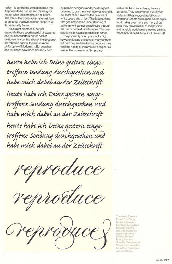
I suppose I do have a quibble with one or two cutlines, but I will act like I don’t. (And “pointed script,” while mentioned several times, is never defined. I’ll pretend it was.)
Like Véronique Vienne, Paul Shaw is reliably reliable. (Vienne has a review of the Pierre di Sciullo exhibit in this same issue that I would unbegrudgingly grade an A–. But the uncontested world leader in graphic design laid out her review with a weird jump page that leads you to believe it stops in its tracks halfway through.)
Two books from the same publisher. Both are hardbacks, both [are] monographs, both protagonists work mainly in three dimensions, and both appear on the publisher’s graphic-design list. So why exactly is Sarah Illenberger’s book so much smaller than Julien Vallée’s?
The designer monograph is a curious beast. In the early 2000s it seemed as if all [that] any self-respecting designer or agency had to do was blink and they’d be offered their own monograph. You couldn’t move for the things, but all too often it was often [often often often] a case of quantity over quality. For every Make It Bigger or The Art of Looking Sideways, there were ten more shallow showcase-type offerings, lacking any real critical insight, heavy on visuals but light on charm. Thankfully, the trend for monographs went away almost as quickly as it appeared (the Design Exchange’s cult-like Gas Books excepted), mainly because the publishers reali[z]ed that despite being very cheap to produce (with essentially no writing or reproduction fees to cough up for), they didn’t actually sell very well.
So what is it that Monsieur Vallée has that Ms Illenberger doesn’t?
Select a category to see additional posts. Add feed/ to a category to subscribe via RSS
The foregoing posting appeared on Joe Clark’s personal Weblog on 2013.01.22 13:19. This presentation was designed for printing and omits components that make sense only onscreen. (If you are seeing this on a screen, then the page stylesheet was not loaded or not loaded properly.) The permanent link is: https://blog.fawny.org/2013/01/22/eye83/
In the early 2000s, [Jason] McBride was the press’s managing editor and co-founding editor of the [Fr]uTOpia series of Toronto-centric books…. “He knows the Coach House way of doing things,” [Alana] Wilcox says.
I take this to mean manufacturing books with perfect bindings so tight you can barely hold them open, all typeset by a cackling Mark Fram in an ancient PostScript Joanna with Bringhurstian small-caps rules that are half-understood and aren’t even followed all the time. (With single quotes, as though we were discussing Toronto topics in an Oxbridge gentlemen’s club.)
I know I got one part of that wrong because Ed told me his new book does not use Joanna. But what else, if anything, did I get wrong?
Why does Coach House get a pass despite the structural failings of its books? Do you really think the darling little anachronism of printing on site excuses everything else? It produces books that fight the reader.
Coach House Books is an artisanal publishing collective set up by friends to print each other’s books on a backyard press. But I expect artisanal publishing to produce beautiful objects you will love to read.
Poor Ed Keenan
(UPDATE, 2013.02.11) Esteemed colleague Ed Keenan got the B.P. Nichol (“bpNichol”) shaft in his new book Some Great Idea. Not only is it replete with fake-ass Bringhurstian small caps and numbers that never appear as such, his book brings an especially egregious Coach House Press folly to new heights: It actually has fat-fuck mayor Rob Ford talking about AIDS in British single quotation marks. (Pictures.)
Select a category to see additional posts. Add feed/ to a category to subscribe via RSS
The foregoing posting appeared on Joe Clark’s personal Weblog on 2013.01.21 15:39. This presentation was designed for printing and omits components that make sense only onscreen. (If you are seeing this on a screen, then the page stylesheet was not loaded or not loaded properly.) The permanent link is: https://blog.fawny.org/2013/01/21/coachhouseway/

 In a course of action I have to admit was unfair, this installment of what I am now calling my rebukes to Eye was three months in the making. That’s how long I borrowed the library’s one and only copy of Eye Nº 83.