Lousy subway maps have become a cause célèbre in the last month. It’s so easy to get upset about them. Sort of like how easy it is to get upset about individual homeless people rather than a fundamental problem like poverty. TTC is certainly impoverished when it comes to design, which, I again insist, is viewed as too girly and faggy for rough, tough mechanical engineers and bus drivers.
I submitted the following to last week’s Commission meeting, where it was summarily ignored. The more evidence of their own failings you show these people, the angrier they get.
In the last week, new local maps at subway stations have received unremitting bad press. TTC “announced,” via private E-mails to Steve Munro and Spacing Wire, that the new maps would be replaced.
You already had a cartographer on staff – didn’t you?
As late as 2004, TTC had its own cartographer, Graeme Parry. Yet in the Toronto Star (2009.09.22), Adam Giambrone claims “there is no one who oversees map creation.”
That article, incidentally, essentially plagiarized Steve Munro’s blog post.
You have no designers on staff…
TTC’s culture of tacky has prevented the Commission from hiring actual graphic designers – and, apparently, cartographers. Few, if any, designers, and certainly no registered graphic designers, would tolerate an all-Windows workplace where every decision is furiously disputed by engineers, and former bus drivers promoted up the ladder, who have a sense of entitlement.
…yet you do everything in-house
You have no design staff, but lots of architects and draftsmen. They know how to execute a few kinds of drawings. They think their cherished software packages, like CorelDraw, are suited to every task. They may know how to drive a car, but they couldn’t build one; these architects and draftsmen can produce a drawing, but that doesn’t make them graphic designers.
Literacy is not a job requirement
What are dismissed as “typos” in the failed maps are actually evidence of poor reading and writing skills. People see right through their own errors, but the fact that nobody has copy-editing or writing qualifications inside TTC means nobody proofs each other’s work – or if they do, they make the same mistakes.
Errors are not the only issue. Even the font is wrong
TTC prides itself on using fake fonts that came free with its cherished CorelDraw. Subway maps cannot even manage to use fake Helvetica, TTC’s “standard”; instead they use that reviled Microsoft clone of Helvetica, Arial. Neither font works well for maps due to confusable characters, among other reasons.
You’ll use this as evidence that things are improving
Whenever any complaint is levelled against TTC surface operations, the claimed reason for the problem is always, without exception, “traffic congestion.” In the same vein, years of concrete evidence that TTC’s entire practice of signage is seriously broken have been met with the insistence that the actual problem is “handmade signs.” That problem was said to be remedied last year, which does not explain the continued use of handwritten signs. (I see them every week.)
Subway maps will now take on the role handwritten signs used to have: TTC will pretend the entire problem of signage was just a problem of bad maps that has been rectified by a promise to fix them.
Adam Giambrone has no qualifications to vet a map
In the Star article, Adam Giambrone states “I’ll see the maps before they go up.” As he is not a qualified writer, editor, or graphic designer and also not a qualified cartographer, all this will mean is that new error-strewn maps will come with the seal of approval of the TTC chair. This is at least consistent with Chair Giambrone’s explicit program of destroying TTC heritage and defending his staff to the utmost.
Whenever outsiders prove something’s wrong, TTC angrily insists it knows best. I suspect this is the core problem. It won’t be fixed in our lifetimes.
Select a category to see additional posts. Add feed/ to a category to subscribe via RSS
The foregoing posting appeared on Joe Clark’s personal Weblog on 2009.10.02 12:29. This presentation was designed for printing and omits components that make sense only onscreen. (If you are seeing this on a screen, then the page stylesheet was not loaded or not loaded properly.) The permanent link is: https://blog.fawny.org/2009/10/02/ttcmaps/
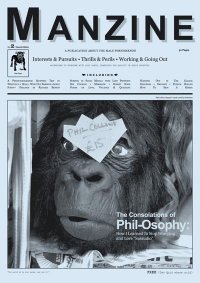
Manzine, “A PUBLICATION ABOUT THE MALE PHENOMENON,” is now on its second issue. It is coedited by former coeditors of legitimate men’s magazines, but has resisted being contaminated by their themes.
“I find the cheaper crumpets taste much better than the more expensive alternatives” – letter from Simon
It is for every Man to decide where he stands on the issue of GRAVY BOATS
(I am pro-)
“I like Santa Monica because it’s got a big British population too. We go and watch the football and rugby” – but apparently not the rugby – “and get a Sunday lunch at the Britannia Pub. Walking in there is just like walking into a pub in Pontypridd” – “Lost Prophets guitarist Mike Lewis”
“And jump in you must. Dipping your toe into water below 15° C is asking for trouble. Some people – and I watch them in amazement – climb slowly down the ladder off the jetty, immersing themselves inch by inch” – David Baker, “I’ve Got Chills. They’re Multiplyin’ ”
“Few things will make you feel more like a man than answering the door covered in flour after knocking out six large loaves” – Damion Lorentzen-White (no relation), “Bread Is My Shed” (but see below)
“To my dismay, nobody was in this amazing little treasure trove – no shop attendant, no customers, just me and my lady. Not what you’d expect in a shop full of such valuable attire. Ten minutes later a burly, suave-looking fellow dressed in an understated British country style walked in with a big smile and said, ‘Having fun? Oh, I really like your coat. Make sure you try everything on and don’t worry about hanging it back up. I’ll be outside if you need me’ ” – “Dapper chap Leo Walton appreciates the cut at Hornets in Kensington”
About the creative potential of the GARAGE, the intriguing psychological SPACE often enjoyed by men. Against SHEDDISM in all its forms
Q. Is it uncool to wear those Orlebar Brown/Monocle limited-edition shorts?
A. NOT REALLY. But it would help if you live in Zurich.
How to play Phil Collins numbers, “Beautiful,” “Layla,” “Invisible Touch,” “The Way It Is,” “Mamma Mia,” “I Could Be So Good for You” (what?), “Take On Me,” and “Alone” on a £199 synthesizer with motion-sensitive keys
At Sharps Barbers, “[i]t all happens while you’re seated in a Belmont barber’s chair, which is a vintage but modern classic…. The Belmont goes for about £5,000 to £6,000 new, or less if reupholstered”
The International Space Station
Monstrous money-wasting carbuncle, or a vital scientific flagpole out there in the Final Frontier?
“So let’s stop this idiotic pursuit of needing to touch God’s face with our own hands and let the robots do the hard work, taking pictures along the way”
“My particular favourite is John Baskerville, the designer, artist and inventor…. It’s a shame that Birmingham doesn’t celebrate his life and work more emphatically. I am currently leading a campaign (now consisting of as many as four people) to persuade the city to use his fonts for all its publications, designs, and utterances”
Select a category to see additional posts. Add feed/ to a category to subscribe via RSS
The foregoing posting appeared on Joe Clark’s personal Weblog on 2009.09.23 15:41. This presentation was designed for printing and omits components that make sense only onscreen. (If you are seeing this on a screen, then the page stylesheet was not loaded or not loaded properly.) The permanent link is: https://blog.fawny.org/2009/09/23/manzine2/
Select a category to see additional posts. Add feed/ to a category to subscribe via RSS
The foregoing posting appeared on Joe Clark’s personal Weblog on 2009.09.23 14:16. This presentation was designed for printing and omits components that make sense only onscreen. (If you are seeing this on a screen, then the page stylesheet was not loaded or not loaded properly.) The permanent link is: https://blog.fawny.org/2009/09/23/tumblr-skills/
Select a category to see additional posts. Add feed/ to a category to subscribe via RSS
The foregoing posting appeared on Joe Clark’s personal Weblog on 2009.09.19 14:52. This presentation was designed for printing and omits components that make sense only onscreen. (If you are seeing this on a screen, then the page stylesheet was not loaded or not loaded properly.) The permanent link is: https://blog.fawny.org/2009/09/19/mapsandhinges/
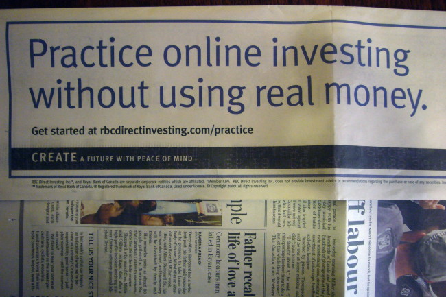
This week, the Royal Bank took over the cover of one of those free papers that litter the subway. It wrapped the cover of the Star and bought an inside display ad in the same issue.
And in two of those three cases, they spelled “practise” wrong.
To recap:
Practice and licence are nouns.
Practise and license are verbs.
A minority of writers ignore this distinction. A smaller minority uses practise for both, an American practice.
The headlines and body copy are not egregiously misspelled (they didn’t write “practize”), but their usage is wrong nonetheless.
“Practice online investing” is a verb phrase, hence uses the wrong spelling. I reported this to the Royal Bank. I had to threaten to list them as having refused to respond before they actually did.
Suzanne Willers wrote back to say “The Canadian Oxford Dictionary deems it acceptable to use the words ‘practice’ and ‘practise’ interchangeably.” Except of course it doesn’t: The first spelling listed is the correct or majority usage, while other spellings are variants. It says so right there on p. xiii of the 2004 Second Edition: “Any variant spellings or forms are given at the main headword in bold type in brackets before the definition…. The main headword represents the most common form in Canadian usage.”
So we’ve got a company that’s richer than God that gets two simple words half-right, and a PR lady with a degree in commerce from Dal (or whatever) lecturing me on how to read a dictionary whose findings I spent two years double-checking. Licence to ill.
Select a category to see additional posts. Add feed/ to a category to subscribe via RSS
The foregoing posting appeared on Joe Clark’s personal Weblog on 2009.09.18 12:27. This presentation was designed for printing and omits components that make sense only onscreen. (If you are seeing this on a screen, then the page stylesheet was not loaded or not loaded properly.) The permanent link is: https://blog.fawny.org/2009/09/18/practise-rbc/
Every time my spellcheck kicks out a Canadian spelling I feel like I’ve been kicked in my Canadian identity. It’s bad enough when my American spellcheck does it, but it really hurts when it is sanctioned by my municipal government. At present all of our software defaults to American English.
He then complains these defaults never get fixed even after he reports them. Fine.
The colourful, rotund former TTC commissioner then goes on to list a number of particularly troublesome words. But some aren’t really a problem.
Half the time, Canadian writers use a single consonant in words like barreled and pummeled. The other half of the time, we use a double consonant. Hence those two terms and councillor, equalled, gruelling, labelled, levelled, marvellous, modelling, panelled, ravelled, shrivelled, signalled, spiralled, totalled, travelled, traveller, tunnelled, woollen, and indeed yodelled are just as correct as the other spellings.
Jeweller is just as correct as jeweler. (Jewellery, which he doesn’t mention, makes no sense to me, but is the majority usage.)
“Check” could mean “check” or “cheque,” hence is not always an error. Paycheck surely is, though.
Manoeuver is wrong in Canadian English, but Moscoe’s preferred maneuver is just as wrong. (It’s one of our trickiest words. Manoeuvre is the closest thing to a “correct” spelling. It produces unpleasant compounds like outmanoeuvred.)
Saltpetre is a correct spelling that will nonetheless be unrecognizable. It’s a strange name for an archaic and obscure substance.
Pyjama is not per se a Canadian spelling. I say this in full defiance of the Canadian Oxford’s listing it first. I shall fight you on the beaches on this one, pummelling you with so much titred saltpetre it will leave you yodelling and shrivelled.
Select a category to see additional posts. Add feed/ to a category to subscribe via RSS
The foregoing posting appeared on Joe Clark’s personal Weblog on 2009.09.17 13:32. This presentation was designed for printing and omits components that make sense only onscreen. (If you are seeing this on a screen, then the page stylesheet was not loaded or not loaded properly.) The permanent link is: https://blog.fawny.org/2009/09/17/moscoe-yodelling/
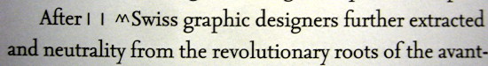
This little book, edited by Helen Armstrong, proves two things the design intelligentsia will go to their graves denying:
There really isn’t much in the way of “graphic-design theory.” Graphic design is practical, not artistic.
What little theory there is you can barely decipher.
Of note
I was going to say this was one of those typical “art” books that are nicely designed and typeset yet unreadable, except for this howler on p. 9:
I think kerning the carets was a nice touch. (But what’s the theoretical basis for doing that? Where’s Jeff Keedy when we need him?)
The book is meant for students and takes a(n) historical approach, presenting essays (with online-only extras) from the early 20th century to present. All the Usual Suspects of graphic-design history are in there, again suggesting a clean linear progression that never actually happened, as Natalia Ilyin has pointed out. The book plays this star card so strongly that the cover shows six (illegible, all-caps) lines of name-dropping. Original hits. Original stars.[continue with: Title as punchline →]
Select a category to see additional posts. Add feed/ to a category to subscribe via RSS
The foregoing posting appeared on Joe Clark’s personal Weblog on 2009.09.13 14:02. This presentation was designed for printing and omits components that make sense only onscreen. (If you are seeing this on a screen, then the page stylesheet was not loaded or not loaded properly.) The permanent link is: https://blog.fawny.org/2009/09/13/graphicdesignhistory/
Open a new tab or window and you get some old page. It’s always the same page. No amount of deletion, including deletion of every reference to it in every hidden file (twice), solves the problem. Opera just goes and picks a new page to show you every time.
Insane caching, to the point where you can never revisit a page without reloading it once it has initially loaded.
Text never quite fits in input areas. Good thing we can read the bottom half of a letter better than the top half.
Ill-coded but widely-used sites, like public-library catalogues, just don’t work at all for any task that requires JavaScript.
Standard Macintosh keystrokes, like Option-Command-F to type in the searchbox, don’t work. That means essentially no Macintosh user can select the searchbox; native keystrokes don’t work and it is functionally impossible to learn the “correct” one. (It’s Command-E.)
Reporting any of these bugs, including the first one, by any method, including filing an actual bug report, does nothing. Among other things, you can never actually read the results of your bug report unless you are an accredited developer, and backchannels elicit zero response.
Incidentally, you have to be fluent in the language of an off-brand nation to do “evangelism” at Opera, unless you’re American. I guess that’s their base.
Select a category to see additional posts. Add feed/ to a category to subscribe via RSS
The foregoing posting appeared on Joe Clark’s personal Weblog on 2009.09.10 13:16. This presentation was designed for printing and omits components that make sense only onscreen. (If you are seeing this on a screen, then the page stylesheet was not loaded or not loaded properly.) The permanent link is: https://blog.fawny.org/2009/09/10/opera10sucks/
Select a category to see additional posts. Add feed/ to a category to subscribe via RSS
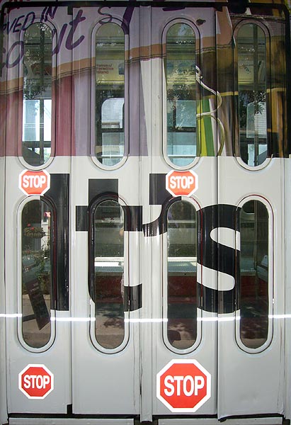
The foregoing posting appeared on Joe Clark’s personal Weblog on 2009.09.08 14:41. This presentation was designed for printing and omits components that make sense only onscreen. (If you are seeing this on a screen, then the page stylesheet was not loaded or not loaded properly.) The permanent link is: https://blog.fawny.org/2009/09/08/streetcar-its/


 When you name your book