Another of those tiresome articles about Windows Users Who Don’t Understand Their New Macs. (They just assume it’s natural when Mac users have to learn Windows, but aberrant and infuriating when the converse is true.)
A couple of columns ago, I introduced you to a friend and lifelong professional Windows user who agreed to let me observe and document her trial run at switching to the Mac.
Have her write her own blog, for fork sakes.
It went on from there to her discovery of pervasive cross-application drag and drop,
Actually usable on Mac, not so on Windows, because Windows defaults to maximizing nearly every window. (“It’s all about the Maximize button.”) As far as a Windows user is concerned, only one program is working at a time. It’s DOS with more garish colours.
In Windows, every document that isn’t nested inside a parent window… is presented as a separate instance of the application
…which is totally fucking nuts. You’re running one program.
Each distinct document has its own window and menu bar, and when you close the last open document, the application exits
…which is also totally fucking nuts. I don’t want to keep reopening applications (Photoshop, anyone?) just because I don’t have a document I’m working on. These are nominally multitasking operating systems; I can have more than one program open if I want even if I’m only going to use it later.
In contrast, each document that is opened by a given Mac application is shown in a menuless window. In fact, no windows have menus.
Not strictly true. Palettes can and do have menus, as do some other applications, like Fire.
They all share one menu bar across the top of the screen, and that menu flips depending on which application has focus (is “on top”). When you close the last document in a given Mac application, the app stays open, but with no visible windows. All you see is the menu. What sense does that make?
Because I didn’t quit the fucking program. I just closed a document. Can’t Windoids differentiate between a document and a program? (I guess not. They can’t differentiate between a program and a program, since they have this need for different “instances” of the same one.)
A single menubar in the same location is dependable and easier to use. In practice, with full-screen Windows applications (nearly all of them), with only one window open at a time (as Windows predisposes you to do), the menubar is in a similar relative location all the time – at the top of the screen.
She’s getting mired in other aspects of Mac-ness, like the fact that two files with the same extension (such as .mpg) can open in two different applications.
A serious problem!
These are small conceptual hurdles that she’ll overcome with time, but on each occasion that the Mac “gets in her way” with issues such as these,
No, she has major conceptual issues. She isn’t using Windows anymore and has to accept that she’s wrong to expect a Mac to act like it.
Select a category to see additional posts. Add feed/ to a category to subscribe via RSS
The foregoing posting appeared on Joe Clark’s personal Weblog on 2007.03.16 16:40. This presentation was designed for printing and omits components that make sense only onscreen. (If you are seeing this on a screen, then the page stylesheet was not loaded or not loaded properly.) The permanent link is: https://blog.fawny.org/2007/03/16/macsense/
Valid XHTML and CSS, but more or less accidentally.
It’s got a bit of Flash fluff at the top that could be made semi-accessible but wasn’t. (I asked. They aren’t embedding it in a way that screen readers can even detect. In fact, my guy didn’t even see any Flash on the page at all.)
But hey! They’re using open-source Joomla as content-management system, so that makes up for everything because it isn’t Microsoft. (Interestingly, the site is served by Apache, giving hope for a TTC redesign.)
The whole thing is half a step forward, I suppose, but a Failed Redesign nonetheless. And we’re supposed to be happy for that sort of thing. It is at least a new third option the TTC can explore that may someday supplant its usual two responses to any call for modernization – ignore the critic (as the TTC did to all transit fans before Transit Camp) or harass the critic (as with permissible noncommercial photography on the subway).
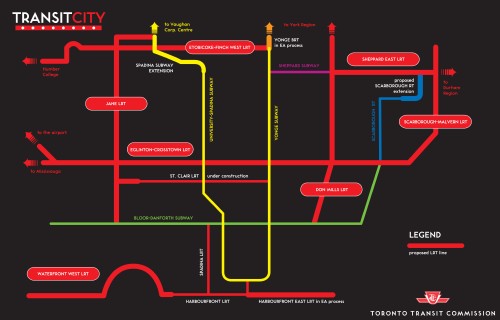
An unprintable map some people can barely read
(UPDATED TWICE, 2007.03.17) Let’s look at a truly serious problem, the “stylized” map (one of several) of a proposed light-rail network:
Except for the single blue line and white type, the entire colour palette of this map is unreadable to a person with strong colour deficiency (protanopia) and probably wouldn’t be very easy to read for someone with weak colourblindness (deuteranopia). And this isn’t theoretical; I checked with My Friend the Protan.
How well can you read this map?
Short answer: Not very well. The red isn’t a problem, but I can barely tell the difference between the yellow and green (I had to ask to make sure there was a difference – they both look yellow to me). It took a while to notice that the purple line wasn’t blue (Sheppard Subway and Scarborough look like similar blues to me) – this was a problem to non-colourblind people in the office, too.
Here are a few questions Blackett could answer for us (which he did, at 2007.03.17 14:20):
Did you design the map (and some lapel buttons that “will be available soon”) for free or for a fee? (How much?)
Yes, I got paid. […]
Who was the client? (Even for a pro-bono job, there’s always a client.)
TTC.
If you designed these items in advance of the announcement of the project, doesn’t that make you an insider who is part of the development process? Does this not reinforce people’s fears of too-close ties between Spacing and City Hall?
No, I just knew the map. No other details. The CBC and the Globe knew more about the report than I did. […] I was hired as a graphic designer, not Spacing’s publisher. It is blurry, no doubt, but if I complain about their design for years and then I’m offered a gig to help with design, I’m not going to turn it down. From a Spacing perspective, we agree with the LRT plan [and] have been advocating for this for two years. Plus, the other editors wrote the main piece on the Wire, I stayed out of it. It’s only been you, a few cranks during the election on Spacing Votes, and one other person that has E-mailed us are the only people who have said we’re too close to City Hall.
What was the actual need for a “stylized” map rather than an accurate and usable one?
A usable map is part of the package, the stylized map is to make the network seem familiar to TTC riders. Again, ask the TTC and Giambrone – they asked for the map.
Why did you design a map when the TTC already has at least one staff cartographer, Graeme Parry?
Ask the TTC or Giambrone. I suspect their cartographer did the technical mapping.
Why is the map flat black, an expensive colour to print even on a laser printer and infeasible on an inkjet?
My instructions were all based on it being a part of the media kit. They choose what to do with it after that. It was created to reflect the TTC style (as stated before). Sorry about your ink cartridge [I have a laser printer], but… you can print out the technical map if you want map. It is your choice and not required to print the stylized one.
(Except of course the Web site, which Blackett does not run, clearly labelled it as printable.)
If you’re a graphic-design instructor, why weren’t you aware of how to design for colour deficiency, particularly since well-researched materials are available, often for free?
To be accurate, I am a publication-design instructor. Aside from that, I didn’t know this and appreciate the update…. This is more a case of why the TTC has maps that don’t work for the colourblind than me not knowing.
Why so defensive, Matt?
I was not defensive, just saying that there will always be problems with these things that are meant for thousands of people to look at because there are folks like you who have specific knowledge and particularities that others may not consider.
And now, a defence of Blackett: TTC’s default route colours are all hard to read for colour-deficient people, too, except for Scarborough blue.
Additional fact about the TTC Web site
Here, let me put this up somewhere for posterity. In the original RFP to redesign the TTC Web site, a list of comparable sites was provided, including – and I shit you not – “Competitive ‘rogue’ information site: Subway Rider Efficiency Guide http://ttcrider.ca.”
Select a category to see additional posts. Add feed/ to a category to subscribe via RSS
The foregoing posting appeared on Joe Clark’s personal Weblog on 2007.03.16 14:22. This presentation was designed for printing and omits components that make sense only onscreen. (If you are seeing this on a screen, then the page stylesheet was not loaded or not loaded properly.) The permanent link is: https://blog.fawny.org/2007/03/16/transitcity/
I asked the person in charge of the public viewing of TTC’s Bay Lower station during Doors Open to reply to my posting on the topic, specifically the issue of hours. I told her three hours on one day “will not suffice to remedy forty years of being sequestered away from public view. Running public tours throughout both days of Doors Open is the least the TTC can do at this point.”
The response?
Thanks very much for your comments, but, at this time, we have no intention of expanding the hours of the open house to Bay Lower.
As this is our first experience with opening Bay Lower to the public, we need to make sure that we do it properly and safely. If things go well, then we may look at expanding to two days and longer hours next year.
“Spoken like a true TTC executive, who never found a transit fan they couldn’t penalize.”
I then asked about free admission. This, at least, we’re getting: “Anyone who enters the subway at Bay station specifically to see Bay Lower as part of the Doors Open tour will not be required to pay a fare.”
Select a category to see additional posts. Add feed/ to a category to subscribe via RSS
The foregoing posting appeared on Joe Clark’s personal Weblog on 2007.03.16 13:06. This presentation was designed for printing and omits components that make sense only onscreen. (If you are seeing this on a screen, then the page stylesheet was not loaded or not loaded properly.) The permanent link is: https://blog.fawny.org/2007/03/16/bldo-3h/
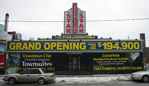
I don’t know where to begin with this one, given its mishmash of el-cheapo jumbo Arial, delicate Optima subheds, and extremely superklassy faux-marquee. (Do you really think parking is ever worth $20,000 anywhere outside Japan?)
This development, by the way, is half a block down the street from the fantastically overdense and troubled St. James Town, and right across from the Food Basics.
Select a category to see additional posts. Add feed/ to a category to subscribe via RSS
The foregoing posting appeared on Joe Clark’s personal Weblog on 2007.03.16 13:03. This presentation was designed for printing and omits components that make sense only onscreen. (If you are seeing this on a screen, then the page stylesheet was not loaded or not loaded properly.) The permanent link is: https://blog.fawny.org/2007/03/16/downtown-star/
Can somebody tell Larry Kramer to shut the fuck up, and, while they’re at it, give a quick bitch-slap to all the old fags who still think he’s some kind of hero?
Over on one of those shitty gay blogs, we are graced with the 7,000 ill-edited words, readably typeset in white on black, that constitute the latest Oscar-bait barnburner from Larry Kramer, the one-time screenwriter/’80s playwright/ACT UP cofounder.
First, some bonafides. I was at his apartment for half an hour on New Year’s Eve sometime in the ’90s, where I believe I patted his dog. I also attended two honest-to-God ACT UP meetings at the Lesbian & Gay Community Center in New York; I knew a lot of ACT UPpers and I wrote for OutWeek. I was a dead body in the ACT UP float at New York gay pride one year. And I wasted my time with the second-rate Toronto analogue, but more on them anon. I know something about this shit.
Where do you begin to critique writing as bad as this?
He makes ACT UP sound like it saved the world. Well, maybe it didn’t. Whom else does one quote but Celia Farber (q.v.)?
[Another example is AZT.] At the time, the FDA agreed to approve it after only 17 weeks of testing [without any of the standard procedures that used to take up to 10 years]. And it flooded the community. Our side says AZT was a catastrophe; AZT killed a generation of AIDS patients. There are orthodox doctors who say that, there are gay activists who silently concede that… To be more concrete, I lived through and reported very carefully about that story and I have a few gay friends who were around then who are still alive today and simply put, they say, categorically, everybody who went on AZT in the early years died. It is the most toxic drug ever approved for human use. It is DNA-terminating chemotherapy that kills all categories of cells. […]
Of course [ACT UP and other activist groups] meant well! Of course they wanted to save their loved ones and brothers! Of course they didn’t know! But it was a disaster and we have to face it.
(Are you able to disprove her assertions?)
Kramer’s version:
Every single treatment against HIV is out there because of activists who forced these drugs out of the system, out of the labs, out of the pharmaceutical companies, out of the government, into the world. It is an achievement unlike any other in the history of the world. All gay men and women must let ourselves feel colossally proud of such an achievement. Hundreds of millions of people will be healthier because of us. Would that they could be grateful to us for saving their lives. […]
We redesigned the whole system of clinical trials that is in use to this day for every major illness. And of course, we got those drugs out. And the FDA approval for a new drug that once took an average of seven to 12 years can now be had in less than one. ACT UP did all this. […] We were consistently right.
Here’s a few talking points for you: The underlying physics and chemistry of the human body did not change the day ACT UP decided to demand quicker drug trials. The result is that drugs began to be tested, approved, and released faster. It became much easier to make mistakes or simply game the system so that known-unsafe drugs went on sale. Or drugs were “tested” on subjects with limited or no ability to ethically consent to the testing, as with destitute and illiterate African villagers. As a result, people who took AZT died, and we got drug scandals like that of Vioxx.
Just as the body does not change, neither does a leopard change its spots: Pharmaceutical companies may be more inclined to get drugs out the door faster, but that is to their benefit and no other part of their behaviour has changed. (Kramer: “[P]ublic exposure of and procedural remedies to sweetheart practices between the NIH and FDA on one hand and pharmaceutical companies on the other [now, with our own decline, unfortunately out of control again].”) Do you really want Gleemonex to “go nonprescription” before all the data are in?
Next, gay rights in the U.S., which I’ve been following since I was a boy watching interviews on Donahue. There’s never been a time when it wasn’t a case of a glass half-empty. The Germans can tear down the Wall and South Africa can nominally metamorphose from racial segregation to a constitutional democracy overnight, but there’s overwhelming evidence that the United States’s glass will remain half-empty for the rest of our lives – and our grandkids’ lives. Kramer essentially makes that point, though he buries it in his usual complaints that nobody in power, at all, gives a shit about us and they are, additionally, engaged in a program of genocide.
Canadians have a hard time understanding Americans sometimes. Really, we are two separate countries, just as the U.S. is a country separate from the five other nations Kramer complains about. We don’t live in the States and Americans don’t live “in Nigeria, in Ghana, in Iran, in Saudi Arabia,” in Jamaica. Americans, more specifically, also don’t have to live in Queens or Wyoming, two Kramer trouble spots. Some queers doggedly insist on living there, but it’s strictly optional. In a free society, you may reside anywhere. And you may emigrate. You may come to the rational conclusion that your rights will never be protected by your country and decide to move to another country that’s willing to do it. Like Canada.
It’s commendable that some gay Americans want to stick around and fight what they consider the good fight, but unless they’re living in rather specific parts of the country, their rights are still at risk while they’re doing it. It’s nothing like being beheaded in an Islamic autocracy, but it represents a danger. The only option Kramer seems to accept is sticking around to fight a battle that, the entire weight of his speeches shows, has been lost. Why martyr yourself? Move. You can still fight for gay rights in other countries, which remain foreign countries from the vantagepoint of your new home. You might even have more impact in agitating for better gay rights in the U.S. from a base abroad. What you’re already doing isn’t working, is it?
Kramer tells us it’s a waste of time trying to understand why ACT UP petered out. (“Many of us have tried to figure out what happened to us and why we ceased to be what we were. We all have thoughts about what happened but… it’s time to stop trying to figure it out and just move on.”) Well, petering out is what happens to “movements.”
He also calls for some kind of ACT UP nouveau for the 21st century, and half-heartedly thinks that more Web sites might do the trick. Oh, come on. They’re far too atomized to engage in the kind of site-specific shock tactics ACT UP succeeded with; you can get a few things done, but you can’t change the world. All the other ACT UP work – the legendary weekly meetings, confrontations with officials, forming direct-care organizations, that sort of thing – isn’t done online in the first place. Set up some blogs and you’d still have to do all that while also having no substitute for the direct action that made the whole thing work.
For this plan, the best defence Kramer can come up with is a Southern-belle-style declaration: “Why, even Time magazine is now stating as a fact that Web sites drive the agendas of political parties.” That’s your justification? It got written in a magazine that nobody who lives online reads? (Which is the greater relic of the past, ACT UP or the idea that newsweeklies still matter?)
Instead of all that, why not look back in honesty at what ACT UP achieved, even if that happened to be the hastened deaths of thousands of the people it purported to support? If your best shot is a couple of blogs, your time really has passed and there is no Plan B.
The 21st century is ill-equipped for a single point of activism, a single hero, a single leader. ACT UP was sui generis. It died a long time ago, and so did the relevance of anything like it. Somebody tell Larry Kramer.
And he misses a genuinely useful application of the Web: Writing one’s own history. If “[g]ays are never included in the history of anything,” how do you account for the ACT UP Oral History Project?
Now, let me ask something for the umpteenth time. Could somebody from ACT UP finally accept that it was not the first direct-action activist group of the 20th century, and maybe not even the most influential? ADAPT was doing shit in the ’80s like blockading inaccessible cablecars in San Francisco and demanding the police arrest the quadriplegics on ventilators who were doing the protesting. Who’s putting whose life on the line? Did they not matter because they weren’t downtown New York queers in army boots?
Select a category to see additional posts. Add feed/ to a category to subscribe via RSS
The foregoing posting appeared on Joe Clark’s personal Weblog on 2007.03.15 15:18. This presentation was designed for printing and omits components that make sense only onscreen. (If you are seeing this on a screen, then the page stylesheet was not loaded or not loaded properly.) The permanent link is: https://blog.fawny.org/2007/03/15/kramer-stfu/
Web Typography Sucks is the (surely hyperbolic) title of a presentation by one’s esteemed colleague Richard Rutter (the calm one at ClearLeft) and Mark Boulton, whom I believe I’ve not yet met and whose talent for malapropism has rubbed off onto Richard.
Shall we look at one set of slides from their gigantic PDF “deck”?
No, they are not. They’re neutral quotation marks, a relic of the typewriter age.
That’s exactly what they are. What they aren’t are “primes.” ′ and ″ are prime and double prime, and they look like this:
Select a category to see additional posts. Add feed/ to a category to subscribe via RSS
The foregoing posting appeared on Joe Clark’s personal Weblog on 2007.03.14 12:46. This presentation was designed for printing and omits components that make sense only onscreen. (If you are seeing this on a screen, then the page stylesheet was not loaded or not loaded properly.) The permanent link is: https://blog.fawny.org/2007/03/14/primes/
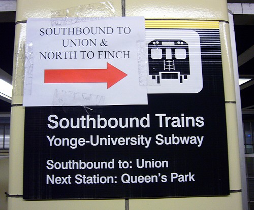
We’re now halfway through six weekends of planned, systematic subway diversion. And how’s that going?
It’s still a disaster in terms of wayfinding. The original prepared signs are still there and still don’t tell you what you want to know in under 500 words and four linear feet of sign. And the crappy ink-jet-printed homemade signs are still there, and as they get beaten to shit by people, they’re printing new ones and putting them up. In fact, they’re putting them on top of the other signs.
I have now talked to many supervisors on site about the signs and the Deaf Problem. One of them said my concerns were noted (he actually said that, as though he were writing an organizational memo) and I was free to contact Customer Service – “where I’ll be ignored until Week Seven, at which point this whole thing will be over,” I interrupted.
Last Sunday, I asked around for the most senior supervisor. I eventually saw him in the distance and, as I walked up to him, I thought I’d hit the jackpot: He was wearing a hearing aid (and a really excellent cap). And in fact he agreed that deaf people would have to be super-vigilant to read the destination sign on the front of the train. I told him of my low-tech solution to the problem, which he claimed he would E-mail around the next day. I gave him the blue card so he could Cc: me. Perhaps curiously, he didn’t. You’d be amazed to learn what he told me about signage, but the walls have ears.
Now, we’re giving these people a billion dollars to extend a subway line?
Select a category to see additional posts. Add feed/ to a category to subscribe via RSS
The foregoing posting appeared on Joe Clark’s personal Weblog on 2007.03.13 14:56. This presentation was designed for printing and omits components that make sense only onscreen. (If you are seeing this on a screen, then the page stylesheet was not loaded or not loaded properly.) The permanent link is: https://blog.fawny.org/2007/03/13/baylower3/
Or: HOW TO BE AT THE RIGHT PLACE AT THE RIGH TIME.
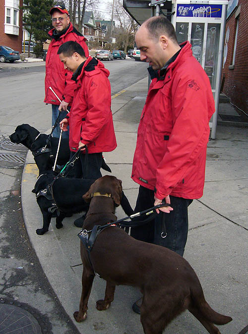
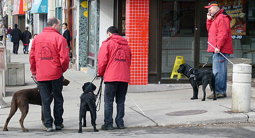
There I was, minding my own business riding in the Beaches, when I saw somebody walking with a guide dog. There is at least one oft-seen Beach resident who is blind, but I don’t think he has a dog. I took a closer look when I actually got closer and, lo and behold, it’s three people with three guide dogs.
“Don’t see three guide dogs very often!” I cheerfully said, and made my usual mistake of keeping right on going past something unusual rather than stopping cold. I came to my senses and noticed, post-facto, that they all wore the same red jackets and did not for a second seem really blind, except maybe the Chinese guy. (The white canes are props and are a dead giveaway.)
I actually did stop, after blowing what would have been a really good shot, and did the standard photojournalist thing of refusing to give up before I got my damned photo. A Uey and a quick positioning in their path got me what I wanted.
“And only you are visually-impaired, right?” I said, pointing to that guy. “No, we all have vision,” replied the actually quite disturbingly hot bald blue-eyed Italian with the wedding ring.
They’re from the Lions Foundation of Canada Dog Guides, which has shockingly inaccessible site.
Select a category to see additional posts. Add feed/ to a category to subscribe via RSS
The foregoing posting appeared on Joe Clark’s personal Weblog on 2007.03.13 13:59. This presentation was designed for printing and omits components that make sense only onscreen. (If you are seeing this on a screen, then the page stylesheet was not loaded or not loaded properly.) The permanent link is: https://blog.fawny.org/2007/03/13/trois-chiens/
Quite a while ago now, I received the following article from Kelly Pierce of Chicago on the topic of live audio description for theatre. He said I could publish it as I see fit, and now, perhaps a tad late in the game, I am. [continue with: ‘Reflections on Live Audio Description’ →]
Select a category to see additional posts. Add feed/ to a category to subscribe via RSS
The foregoing posting appeared on Joe Clark’s personal Weblog on 2007.03.12 14:20. This presentation was designed for printing and omits components that make sense only onscreen. (If you are seeing this on a screen, then the page stylesheet was not loaded or not loaded properly.) The permanent link is: https://blog.fawny.org/2007/03/12/pierce/
![' " Anybody recogni[z]e these characters? These are primes](https://fawny.org/blog/images/webtypography-sxsw2007-notes-primes1.gif)