This is my third full shoot of this hard-to-photograph sign-cum–folk sculpture. I hereby give up.
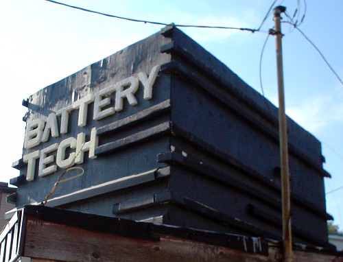
This is my third full shoot of this hard-to-photograph sign-cum–folk sculpture. I hereby give up.
The foregoing posting appeared on Joe Clark’s personal Weblog on 2006.10.05 14:35. This presentation was designed for printing and omits components that make sense only onscreen. The permanent link is: https://blog.fawny.org/2006/10/05/batterytech/
The City of Toronto has a page up on the proposed streetsigns, with all relevant documents in PDF or tiny JPEGs.
The foregoing posting appeared on Joe Clark’s personal Weblog on 2006.10.03 16:07. This presentation was designed for printing and omits components that make sense only onscreen. The permanent link is: https://blog.fawny.org/2006/10/03/streetnamesigns/
It turns out I had photographed this disused and threatened industrial monolith on Dupont, albeit not very well.
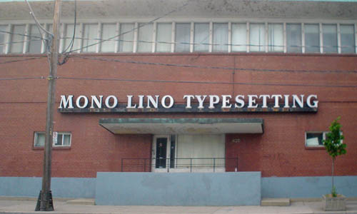
I am daunted by the prospect of having to write a full history of this place, which I called on the telephone as a teenager. I could hear a lot of industrial sounds in the background as I asked the woman (yes) for as many specimen books as they could possibly airlift to New Brunswick.
(Then later I shot the place with a better camera.)
The foregoing posting appeared on Joe Clark’s personal Weblog on 2006.10.03 14:03. This presentation was designed for printing and omits components that make sense only onscreen. The permanent link is: https://blog.fawny.org/2006/10/03/monolinophoto/

The foregoing posting appeared on Joe Clark’s personal Weblog on 2006.10.01 15:33. This presentation was designed for printing and omits components that make sense only onscreen. The permanent link is: https://blog.fawny.org/2006/10/01/guy-in-bus/
The foregoing posting appeared on Joe Clark’s personal Weblog on 2006.09.30 15:24. This presentation was designed for printing and omits components that make sense only onscreen. The permanent link is: https://blog.fawny.org/2006/09/30/sprayfoam/
I mailed away for a number of papers from the Strathy Language Unit, Queen’s University. They weren’t really worth it in the end, but, in the book entitled In Search of the Standard in Canadian English (W.C. Lougheed, ed.), I found a paper by H. MacDonald with the not-unfabulous title “Learning to Live with ‘The Soup That Eats Like a Meal’: A Response to M.O. Nowlan.” MacDonald writes:
[A myth], popular in North America, is that British usage is superior. Have you any peaches? is more gracious, more aristocratic than Have you got any peaches? Whilst is more elegant than while, cinema more refined than movie theatre. […]
[Another myth,] popular in Canada, is that correctness of expression is associated with loyalty to the Crown. It is the Queen’s English, after all. Her majesty is particularly offended if we use American spelling. Writing labor or center is, we all know, tantamount to treason. […]
[Yet another myth] is that English usage is the same everywhere. “English is English – isn’t it?” This is a line I heard over and over when I asked both teachers and students if they knew what might be meant by “Canadian English” or “Canadian usage.” This question caused more perplexity than any other. When pressed, all knew vocabulary differences like the British lorry for truck, and lift for elevator, or the American soda for pop, or Girl Scouts for Girl Guides [not, strictly speaking, a comparable example, since they aren’t the same thing]…. [N]either teachers nor students could think of Canadian English by itself. They thought of it only in contrast to American or British usage. […]
Chances are that those same teachers who can expound at length on the influence of the automobile on the twentieth-century novel and who can rattle off 37 characteristics of ballads at the drop of a hat have not taken a single post-high-school course on English usage…. What remains for them to pass along to their students? The myths – and a queasy feeling in the pit of the stomach.
Hence, an English-lit grad is not per se qualified to do captioning. Sorry you couldn’t get any other kind of job, but captioning ain’t for you either. Do you seriously think your degree sets you up real good to caption Battlestar Galactica, an antacid commercial, a heavy-metal music video, a children’s playtime series, or a promo for Hockey Night in Canada?
The foregoing posting appeared on Joe Clark’s personal Weblog on 2006.09.29 12:09. This presentation was designed for printing and omits components that make sense only onscreen. The permanent link is: https://blog.fawny.org/2006/09/29/eatslikeameal/
Yeah, so this is the kind of pole banner the street-furniture committee didn’t know about.
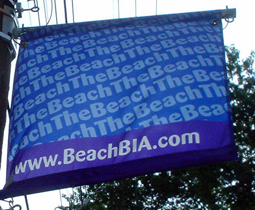
It also represents the chosen typography of the Beach BIA (né Beaches BIA), Dax. Certainly such typography is not trendy and will in no way clash with existing and future streetsigns and street furniture.
And by the way, why not Barmeno instead?
The foregoing posting appeared on Joe Clark’s personal Weblog on 2006.09.29 11:49. This presentation was designed for printing and omits components that make sense only onscreen. The permanent link is: https://blog.fawny.org/2006/09/29/dax-beach/
At the last of the seriously underpublicized viewings of the proposed new Toronto streetsigns this week, I had an argument with the lead designer thereof, Jeremy Kramer of Kramer Design Associates, a company with a simply dreadful Web site that is headquartered in a deconstructivist confection of a building on Dupont.
The meat of the quarrel was as follows, roughly but accurately paraphrased:
- Why did you use Akzidenz and not Clearview?
- We could have, but you can’t have every sign everywhere using Clearview. We think this font works well and strikes a balance between distinctiveness and city character and legibility.
- OK, but what test results do you have to prove your Akzidenz Condensed is as legible as Clearview for a range of user groups?
- We tested our mockups and found them legible.
- OK, but where are your test results?
A defensive Jeremy Kramer started questioning my expertise – always a risky enterprise at a public meeting, where not everyone who shows up is uneducated and a rube. I explained that signage is not akin to other forms of typography like advertising. (“Are you an advertising typographer?” he asked. No, and he isn’t, either.) Legibility comes first, everything else second. And you have to prove your signs are legible, and not only to a couple of designers in your office.
There was much back-and-forth about Akzidenz. I will note here that the use of an (indeed the) aboriginal grotesk sansserif is a nice recherché choice if you want to deflect criticism. “We could have used anything – heck, we could have used Helvetica – but, in deference to our extensive typographic acumen, we went back to the source and used Akzidenz.”
Kramer asked me if the New York subway had been amiss for having used “it.” I told him that Massimo Vignelli did not have engineered and tested signage fonts available to him when he designed the system in the ’60s. (I didn’t also mention it’s a mixture of Akzidenz and Helvetica.)
Kramer told me Akzidenz has been used around the world for signage for decades. It has? Akzidenz has? Akzidenz Condensed has? (That’s what Kramer’s sign mockups use. Condensed vs. normal width is a seriously germane difference in legibility terms.)
I told Kramer I had read the research showing reaction-time improvements in the blue Clearview signs attached to traffic lights at major intersections, a sign design the Spacers and their blog commenters hate. Kramer replied with a mishmash of statements about testing residential streetsigns at speeds in excess of the limit. Who the hell is suggesting that?
I told him over and over again that I would support the use of Akzidenz Condensed on his new signs if it were subjected to A/B testing against typefaces custom-engineered for signage (Clearview, Transit, a few others) and worked as well as those faces. And it has to work for an enormous swath of the population, not the people he works with.
Oh, and one more thing?
Kramer told me with a straight face that Clearview was “derived from” Akzidenz. I answered that I knew the designer personally (I suppose that was a minor stretch; James Montalbano and I have talked on the phone once, but we E-mail from time to time) and I knew for a fact Clearview was designed from scratch. It isn’t even in the same family as Akzidenz, I said, any more than Gill Sans is. And I double-checked this with Montalbano later, who indeed confirms what I said. If he’s going for recherché, it seems Kramer is going to have to try harder.
I don’t think Jeremy Kramer or his company actually understands the stakes involved in designing street signage, or what kind of testing and verification are necessary before his cherished design might actually be put into use. I don’t think the City understands any of these facts, either. Everyone involved – everyone – appears to believe that “I like it” and “I can read it” are all we need to hear to rush right ahead with implementation. (It’s certainly all we need if the people saying “I like it” and “I can read it” are the designers, BIA executives, Spacers at the Clean & Beautiful City roundtable, and city staff.)
We aren’t designing signs for you, your taste, and your reading abilities (or mine); we’re designing signage for everyone in Toronto who can see them. Our æsthetic opinions are well and good, but what matters is performance. And you have to be able to prove it.
The foregoing posting appeared on Joe Clark’s personal Weblog on 2006.09.29 11:37. This presentation was designed for printing and omits components that make sense only onscreen. The permanent link is: https://blog.fawny.org/2006/09/29/kramerquarrel/
Last night (2006.09.26), I attended the last of four public viewings of proposed new Toronto streetsigns (see Flickr photos). I got there early and chatted with the amiable David Nagler, who urged me to walk over and talk to the designers (from Kramer Design Associates). “But I’ll just get into an argument!” I protested. I later relented and struck up a conversation that, inevitably, turned into an argument.
In the discussion below, I’ll use the term “white Clearview sign” (black text on a white ground) to refer to the new residential streetsigns that Spacers and commenters on their blog seem to hate so much. It is to be distinguished from the blue Clearview signs (white text on blue) that are mounted adjacent to traffic lights at major arterial intersections. The Spacers and commenters hate those too, of course, but that doesn’t matter, since they work better than the old ones. No one actually said “white Clearview sign”; I am using it in these notes for clarity.
“Acorn signs” are the old cast-metal signs, which some people think always have embossed metal lettering. They certainly have a knob at the top, hence the name “acorn.”
There were about a dozen people in attendance, maybe 20 by the time the show got underway in earnest. On the panel were Myles Currie, Toronto transportation; Joe Colafranceschi, sign manufacturing; David Monaghan, Kramer; Roberto Stopnicki, Toronto transportation; and Jeremy Kramer. [continue with: Notes from Toronto streetsign introduction →]
The foregoing posting appeared on Joe Clark’s personal Weblog on 2006.09.27 14:10. This presentation was designed for printing and omits components that make sense only onscreen. The permanent link is: https://blog.fawny.org/2006/09/27/streetsign-viewing/