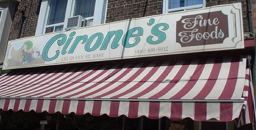
Script or italic?
The foregoing posting appeared on Joe Clark’s personal Weblog on 2006.09.25 15:18. This presentation was designed for printing and omits components that make sense only onscreen. The permanent link is: https://blog.fawny.org/2006/09/25/cirone/
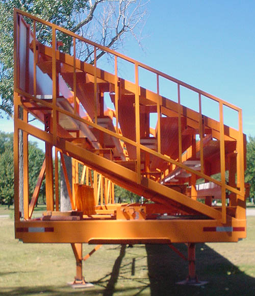
Curious orange bleachers
The foregoing posting appeared on Joe Clark’s personal Weblog on 2006.09.24 14:44. This presentation was designed for printing and omits components that make sense only onscreen. The permanent link is: https://blog.fawny.org/2006/09/24/bleachers/
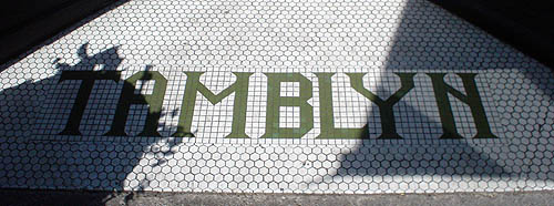
Mosaïcism
Throughout the east end, there are several such entranceway floors reading TAMBLYN in mosaic tile.
The foregoing posting appeared on Joe Clark’s personal Weblog on 2006.09.23 14:54. This presentation was designed for printing and omits components that make sense only onscreen. The permanent link is: https://blog.fawny.org/2006/09/23/tamblyn/
Engineers and AIDS
A previously unforeseeable conjunction of concepts. Toronto Star, 2006.09.18:

Members of UofT’s Lady Godiva Memorial Band belt out “Rubber Ducky” during the 18th Annual AIDS Walk for Life yesterday. […]
Engineering students in Toronto have transformed themselves, seemingly in the blink of an eye, from beer-guzzling, frosh-hazing homophobes to adorable and eccentric mascots.
I credit the presence of an actual homosexualist-engineer club and frogmarching these guys in their trademark, spot-on look of matching blue jerseys, hardhats, overalls, and face- and bodypaint in the gay-pride parade. We have soothed the savage breast of Lady Godiva.
They’re having a wine-and-cheese this Wednesday. And, I mean, come on. “Rubber Ducky” – it’s perfect.
The foregoing posting appeared on Joe Clark’s personal Weblog on 2006.09.23 14:47. This presentation was designed for printing and omits components that make sense only onscreen. The permanent link is: https://blog.fawny.org/2006/09/23/rubberducky/
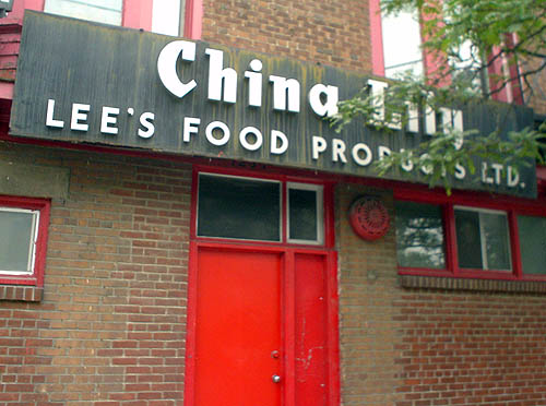
China Lily
A difficult-to-photograph sign. May have to wait till the vanishingly brief period of no leaves on trees but adequate light and no snow.
The foregoing posting appeared on Joe Clark’s personal Weblog on 2006.09.22 16:44. This presentation was designed for printing and omits components that make sense only onscreen. The permanent link is: https://blog.fawny.org/2006/09/22/chinalily/
Gothic ice cream
To use the vulgate. Would this not be textura ice cream?
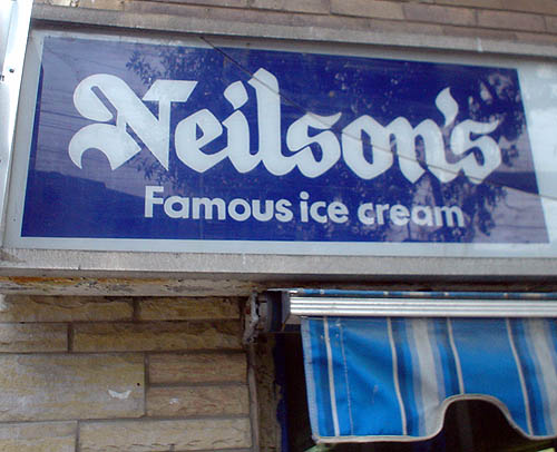
(Is blackletter ice cream like liquorice ice cream?)
The foregoing posting appeared on Joe Clark’s personal Weblog on 2006.09.21 16:21. This presentation was designed for printing and omits components that make sense only onscreen. The permanent link is: https://blog.fawny.org/2006/09/21/neilsons/
Hairdon’t
They’re shooting the remake of Hairspray here in Toronto – nonsensical given the Baltimore-specificity of everything John Waters does. Except of course he really isn’t “doing” this version. John Travolta (separately in the news these days) and a cast of thousands are the ones doing it.
And they’re shooting it along Dupont, in the gargantuan former Mono Lino Typesetting factory that fills me with self-recrimination every time I pass it: Why haven’t I written about it? What if they tear it down? That hasn’t happened yet, because this week the building has become the home of WYZT Broadcasting. Those call letters are sure going to sound different in Canadian English. But there’s a somewhat bigger issue:
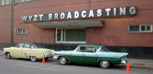
Yes, the Hairspray location shoot uses giant typography typeset in Arial – the gruesome knockoff of Helvetica that stands in for real fonts or is used when you want to prove to the world you don’t know the first thing about typography. The variant in use here appears be an electronically-scrunched Arial Black, and the letterspacing is atrocious.
Just one more pesky detail, though.
Arial was designed in 1982 and started to be used in earnest by the dawn of the ’90s due to its default installation in Microsoft Windows. But Hairspray takes place in the 1960s, and, as the well-preserved antique cars in this shot demonstrate, production designer David Gropman has gone to some lengths to maintain historical accuracy. We wouldn’t want a 1989 Dodge Caravan ferrying Edna Turnblad around, would we?
It is obviously important to make sure that props are accurate and of the right vintage when shooting a period piece. But fonts are just letters; they all look the same and they have all existed unchanged for as long as movie producers can remember. Because typographic ahistoricism actually never happens in the movies – at all.
While anyone could notice a too-modern car in a ’60s comedy, certainly no one will ever notice a mistake like this, and no permanent record of such mistake will be made – at all.
The foregoing posting appeared on Joe Clark’s personal Weblog on 2006.09.21 12:44. This presentation was designed for printing and omits components that make sense only onscreen. The permanent link is: https://blog.fawny.org/2006/09/21/harialspray/
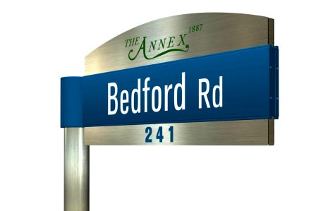
Akzidenz for streetsigns?
I was shitting bricks yesterday setting up for Seven Days of Signage, with the full range of posts that would imply, all in anticipation of next week’s unveiling of new Toronto streetsign designs. (Don’t we have those already?) I even made another peace overture to the Spacers.
In some respects, they responded in kind by providing me with mockup illustrations. They’ve seen the new signs already. While this surely indicates the city’s willingness to give “key stakeholders” a scoop, it also incompletely confirms my apprehension that the Spacers want to own the issue of Toronto streetsignage.
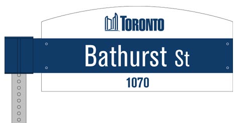
I suppose it makes sense that the only examples provided would come from the west end. Note how tidily the signs work with short street names (“Bathurst St” is a mere 11 characters). Wait till they get to Sarah Ashbridge Ave. (18 or 19), Northern Dancer Blvd. (20), and Joseph Duggan Rd. (16). Perhaps coincidentally, those streets are brand-new and situated in Pleasantville at the periphery of the Beach.
The design is by Kramer Design Associates, the “brainiacs” who gave us the CBC “wayfinding system” and the curiously-named Info-to-Go pillars.
I asked Stewf WTF the font was, since sansserifs are hard to look up. He pegs it as Akzidenz-Grotesk, but the 7 has been modified. (My Berthold Fototypes E2 shows a bold-condensed version with that 7.) In what universe is any grotesk typeface (even Univers) suitable for road signage? Wherever did Clearview go?
I trust the city is not under the misapprehension that these are the final forms. Among other things, I shall be waiting for the publication of test data proving these signs work better than existing ones for many user groups, including people with certain disabilities.
While we’re waiting, you may wish to look at my higher– and lower-interest galleries of Toronto streetsigns.
The foregoing posting appeared on Joe Clark’s personal Weblog on 2006.09.20 07:32. This presentation was designed for printing and omits components that make sense only onscreen. The permanent link is: https://blog.fawny.org/2006/09/20/newsigns1/
Nice day to go kayaking
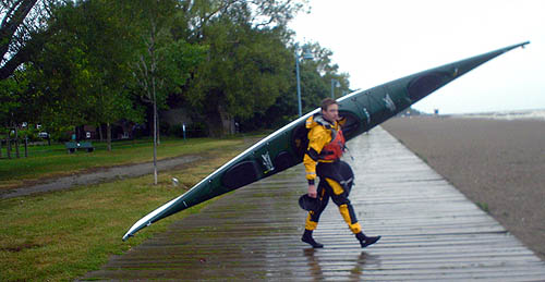
Sadly, I missed a better photo of this fellow portag(e)ing his kayak down the residential sidestreet. Only in the Beach (or at Bondi).
The foregoing posting appeared on Joe Clark’s personal Weblog on 2006.09.17 15:34. This presentation was designed for printing and omits components that make sense only onscreen. The permanent link is: https://blog.fawny.org/2006/09/17/boardwalk-kayak/