The latest in a series of postings on CBC captioning (also see the separate page on the topic)
It seems my legion of detractors has a new junior member, though by characterizing him in such comic-store-habitué terms I make him sound like a nerd who plays too much Dungeons & Dragons, and that wouldn’t be fair. To his credit, he spends no time at all writing “angry nitpicking letters to the CBC.” Rather akin to Ze Frank, I nitpick angrily so he doesn’t have to. Except, as I explained at BarCamp this weekend, what I actually affect is an airy dismissiveness. My detractor’s status as a non-native English speaker may make it all seem the same, leaving him embarrassingly slow on the uptake.
En tout cas, I’m going to proceed down my list of CBC captioning complaints. I mean, somebody has to care. It would be nice if the people earning at least $38K to caption all day actually cared and weren’t such angry nitpickers themselves, but, you know, we can’t expect a billion-dollar corporation to hire people who actually like their work enough not to fuck it up. Nor, at the management level, could we expect anything but sinecurists marking time. (“You want me to run captioning? Le sous-titrage? I can’t think of anything duller. But maybe it’ll get me transferred back to Montreal someday.”)
Select a category to see additional posts. Add feed/ to a category to subscribe via RSS
The foregoing posting appeared on Joe Clark’s personal Weblog on 2006.08.31 22:24. This presentation was designed for printing and omits components that make sense only onscreen. (If you are seeing this on a screen, then the page stylesheet was not loaded or not loaded properly.) The permanent link is: https://blog.fawny.org/2006/08/31/angry/
God, I hate trendy “pop-culture aficionados” who think the word refers to aliens.
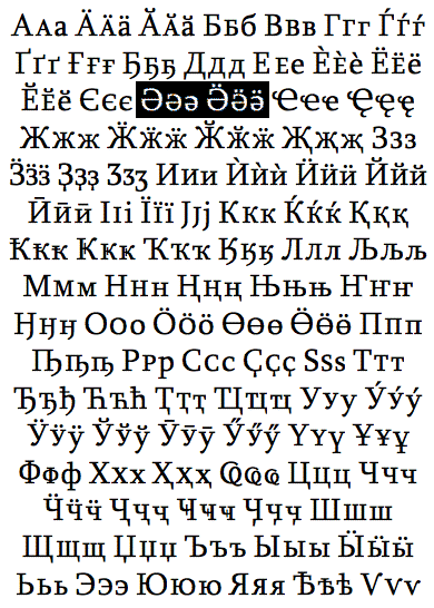
John Hudson has a paper (PDF) on designing his font Sylfaen in which he lists what he thinks is the complete Cyrillic character set. Ever seen a capital schwa with dieresis?
Me neither. By the way, that’s 96 letters. Care for a game of Scrabble?
(Meanwhile, teddybearish Tom Phinney did a lousy job explaining which Cyrillic characters Adobe will include in future fonts, going so far as to type their raw character codes, not the characters, into his blog entry.)
Select a category to see additional posts. Add feed/ to a category to subscribe via RSS
The foregoing posting appeared on Joe Clark’s personal Weblog on 2006.08.31 20:44. This presentation was designed for printing and omits components that make sense only onscreen. (If you are seeing this on a screen, then the page stylesheet was not loaded or not loaded properly.) The permanent link is: https://blog.fawny.org/2006/08/31/schwa/
Select a category to see additional posts. Add feed/ to a category to subscribe via RSS
The foregoing posting appeared on Joe Clark’s personal Weblog on 2006.08.31 11:26. This presentation was designed for printing and omits components that make sense only onscreen. (If you are seeing this on a screen, then the page stylesheet was not loaded or not loaded properly.) The permanent link is: https://blog.fawny.org/2006/08/31/matritsa/
One switches slowly to the Strict variants of HTML (preferably and for all new documents and sites) or XHTML (if I have to preserve something from the past). One simply wishes to be more correct. It is an ongoing quest.
Back dans la journée, the Total Validator told me I was guilty of using incorrect id values in this blog (short for “Web log”), as apparently a colon is not permitted in such values. Well, that’s news to me. Apparently I should never use lang= and only ever use xml:lang=, which could very well be the stupidest rule in Web development ever. (They both contain the same letters in the same sequence. I’m all for gilded lilies when the gilding actually nets you something, like a prettier sitting room.) Maybe I’ll worry about those later. Yes, I know the foregoing is bollocks in the first place and no longer true based on current Total Validator claims (inconvenient to bookmark, so I shan’t).
In the meantime, I’m trying to get rid of align="this" and width="that", which is not simple.
Widths: For horizontal rules, which absolutely are structural elements (they delineate a before and an after), I have a set of styles named w plus a percentage, like .w66 { width: 66%; }. I have a great deal of trouble getting this to work with table columns.
Table captions: There are obscure CSS properties for those. You have to use .captiontop { caption-side: top; } and similar.
map: My accessibility pages, which require improvement, use an imagemap in the header graphic. Strangely, Strict documents require a map to be inside a block-level element, so I create a superfluous div. Incidentally, text needs to be in a paragraph or something similar if it also appears in a table cell or blockquote (but not li/dt/dd, oddly).
Image borders: Can somebody tell my why those are on by default anywhere, at any time? Why don’t future built-in stylesheets in browsers turn them off by default? Nonetheless, I had to do so globally. It doesn’t work all the time.
The problem, really, is this blog, which I set up as XHTML Transitional (WordPress is all but impossible to use in HTML mode). I’m over a thousand posts into Transitional at this point, which, while not exactly equivalent to going under the knife for gender reassignment surgery, is at least almost as hard to undo. How does one batch-edit the contents of a database to remove such items as align="left" and the seriously-hard-to-locate colons inside id values? Should I even bother?
Select a category to see additional posts. Add feed/ to a category to subscribe via RSS
The foregoing posting appeared on Joe Clark’s personal Weblog on 2006.08.29 16:49. This presentation was designed for printing and omits components that make sense only onscreen. (If you are seeing this on a screen, then the page stylesheet was not loaded or not loaded properly.) The permanent link is: https://blog.fawny.org/2006/08/29/constricting/
Select a category to see additional posts. Add feed/ to a category to subscribe via RSS
The foregoing posting appeared on Joe Clark’s personal Weblog on 2006.08.28 16:15. This presentation was designed for printing and omits components that make sense only onscreen. (If you are seeing this on a screen, then the page stylesheet was not loaded or not loaded properly.) The permanent link is: https://blog.fawny.org/2006/08/28/caffe-uncial/
Another in a series of postings on CBC captioning (also see the separate page on the topic)
The seasoned reader of this blog (short for “Web log,” a kind of online journal or diary) will be aware of the litany of problems observable in captioning on CBC, the national public broadcaster. I had previously complained about use of scrollup captioning on fictional programming (but not Godzilla movies!) and the perverse usage of British spellings when there actually is such a thing as Canadian spelling.
Well, paint me yellow and call me a cab, but CBC seems to be listening. But don’t get your hopes up – they are doing so with all the resentment, peevishness, and anger which we associate with them. Additionally, the CBC captioning department’s levels of Unclear on the Concept™ have now reached new highs.
How? Last night they ran a Godzilla movie with a kind of Romulus and Remus of scrollup captioning and half-arsed British spellings. Behold Terror of Mechagodzilla (メカゴジラの逆襲 – or, as the announcer misnamed it, Terror for Mechagodzilla):
Select a category to see additional posts. Add feed/ to a category to subscribe via RSS
The foregoing posting appeared on Joe Clark’s personal Weblog on 2006.08.27 13:18. This presentation was designed for printing and omits components that make sense only onscreen. (If you are seeing this on a screen, then the page stylesheet was not loaded or not loaded properly.) The permanent link is: https://blog.fawny.org/2006/08/27/mechagodzilla/
I am methodically reading every remotely plausible book on graphic design and typography that can be borrowed from the Toronto Public Library, the world’s largest such system, with 99 branches. (If you recently went looking for the only circulating copies of Eye, I’m the one who snagged them.) I am, further, ordering everything under the sun from other libraries via interlibrary loan, which fails about four-fifths of the time but is still worth a go.
Select a category to see additional posts. Add feed/ to a category to subscribe via RSS
The foregoing posting appeared on Joe Clark’s personal Weblog on 2006.08.25 15:55. This presentation was designed for printing and omits components that make sense only onscreen. (If you are seeing this on a screen, then the page stylesheet was not loaded or not loaded properly.) The permanent link is: https://blog.fawny.org/2006/08/25/architext/
Select a category to see additional posts. Add feed/ to a category to subscribe via RSS
The foregoing posting appeared on Joe Clark’s personal Weblog on 2006.08.25 15:52. This presentation was designed for printing and omits components that make sense only onscreen. (If you are seeing this on a screen, then the page stylesheet was not loaded or not loaded properly.) The permanent link is: https://blog.fawny.org/2006/08/25/butlers3/
Select a category to see additional posts. Add feed/ to a category to subscribe via RSS
The foregoing posting appeared on Joe Clark’s personal Weblog on 2006.08.24 18:40. This presentation was designed for printing and omits components that make sense only onscreen. (If you are seeing this on a screen, then the page stylesheet was not loaded or not loaded properly.) The permanent link is: https://blog.fawny.org/2006/08/24/butlers2/
![Graffiti on wall reads [rotated schwa]-RAMZ](https://fawny.org/blog/images/Schwa_graffiti_full.jpg)