On 2006.06.20, CNIB, which is now the only name for the former Canadian National Institute for the Blind (though they write it in lower case, sort of like K.D. Lang), published a literature review and a set of purported “print clarity standards,” i.e., standards for large print. This organization, widely despised by large swaths of the blind population (like nearly the entire membership of the AEBC), again attempts to speak for every blind person in the country. What it actually ends up doing is failing even at the simple task of communicating its message, which itself is suspect.
Let’s start with their shitty new Web site. The actual Clear Print page shows their ill-executed new blue-green site design, complete with:
Tables for layout (six, even used for something as simple as a navbar).
Invalid HTML with incorrect character encoding, no doubt due to some factotum trying to paste a Microsoft Word document into Microsoft FrontPage.
A measure as wide as your window, since obviously the widest possible line will be the most readable one. Make your window wide enough and the search field disappears, an amazing achievement.
Select a category to see additional posts. Add feed/ to a category to subscribe via RSS
The foregoing posting appeared on Joe Clark’s personal Weblog on 2006.07.07 14:08. This presentation was designed for printing and omits components that make sense only onscreen. (If you are seeing this on a screen, then the page stylesheet was not loaded or not loaded properly.) The permanent link is: https://blog.fawny.org/2006/07/07/ckearprint/
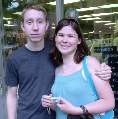
Here we have young Noel D. Jackson and his missus, Stephanie:
They were in town last week for a lesbian wedding (sorry, an equal marriage) and we had luncheon in between torrential downpours.
Noel has assisted me in many ways over the years. Did you know that, apart from being a standardista at an age where, in many U.S. states, he could not buy alcohol, Noel is a photography student who has a business on the side retouching photos for foreign A-list magazines?
What were you doing at his age? And what, indeed, was I?
Select a category to see additional posts. Add feed/ to a category to subscribe via RSS
The foregoing posting appeared on Joe Clark’s personal Weblog on 2006.07.05 16:02. This presentation was designed for printing and omits components that make sense only onscreen. (If you are seeing this on a screen, then the page stylesheet was not loaded or not loaded properly.) The permanent link is: https://blog.fawny.org/2006/07/05/noeldj/
Seasoned readers will be aware that I am engaged in a Sisyphean battle with feudal management at CBC and antagonistic petits fonctionnaires at the Canadian Human Rights Commission. The topic? CBC’s proven, and in fact uncontested, noncompliance with a human-rights ruling requiring 100% captioning on CBC Television and Newsworld (q.v.).
My previous mentions of this topic – which, by the way, would later require a 12,500-word rebuttal of CBC’s nonresponses – generated white-hot animosity among Anonymous Cowards. My three-year documentation project was dismissed as Post-It®–noted jotting (presumably by Peggy Zulauf, the oldest captioner working at CBC), while everything from my social skills to my employability was ridiculed by someone else (presumably Jason, the guy I kicked out of Webstandards.TO). (If I have incorrectly identified the authors, the true authors can reveal themselves – for attribution, by full name – and demonstrate their authorship.)
I can attest that these anonymous comments were fabulously effective at hurting my feelings. Good show! Now, how did any of that improve captioning at the CBC? How did it improve the presumed Zulauf’s job there, or the presumed Jason’s lot in life? It didn’t. Both writers, whoever they were, did, however, score points for malevolence.
But, you know, I’ve been in this business forever, I know more about it than they do, I’m right and they’re wrong, and I’m not going away. So, just as a little present, I thought I would discontinue my practice of keeping my ongoing notes on CBC captioning errors and omissions all saved up for a rainy day. Instead, I’m going to publish a running tally, which you can even subscribe to via RSS. Hot, right?
Can you say “openness” and “accountability”? Do you have sufficient social skills to jot those down on a Post-It®? (Why not take a picture?)
And kooky fun fact: The only straight male in offline captioning in Canada actually works at the CBC and runs a blog. He should be aware that I’m reading it since I’ve sent him E-mail inviting him for tea on two separate occasions. The blog address is publicly available should you wish to put in the couple of minutes max it would take to look it up.
Update
(2006.07.05) As I mentioned chez Ouimet, this is kind of a golden opportunity for departments within CBC to begin blogging themselves. Yes, I know, feudal upper management is scared shitless of the idea of employees actually saying what they think. That’s why they hired Maffin, a nice guy (he always wears a tie!) whom they can keep on a tight leash without even using a collar.
At any rate, my two proposed departments – captioning and engineering – have some blogging overlap, given the transmission irregularities in the translation of analogue captions into HDTV on the French network.
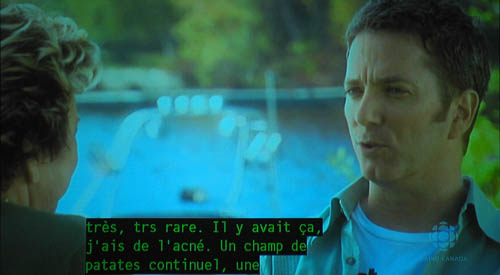
This is an unfair example in some respects, as dropped characters (nearly always in pairs, as you get two characters per frame and a frame is the most likely unit to be dropped) can occur almost spontaneously everywhere. But when they occur repeatedly during a show, as it did in this example, it means the tape got corrupted at some point. You can usually fix it by duplicating the original again onto brand-new media, but sometimes you have to re-encode (or, as the New Yorker and I would usually write it, “reëncode”) the master.
If you’re wondering why the single character è is missing in the above image when I just told you characters get dropped in pairs, understand that, due to lousy system design by monolingual American engineers, you need two bytes to transmit any character in the set àèâêîôû. Top that, Anonymous Cowards.
Select a category to see additional posts. Add feed/ to a category to subscribe via RSS
The foregoing posting appeared on Joe Clark’s personal Weblog on 2006.07.04 14:42. This presentation was designed for printing and omits components that make sense only onscreen. (If you are seeing this on a screen, then the page stylesheet was not loaded or not loaded properly.) The permanent link is: https://blog.fawny.org/2006/07/04/cbccc-eo/
Select a category to see additional posts. Add feed/ to a category to subscribe via RSS
The foregoing posting appeared on Joe Clark’s personal Weblog on 2006.07.03 16:18. This presentation was designed for printing and omits components that make sense only onscreen. (If you are seeing this on a screen, then the page stylesheet was not loaded or not loaded properly.) The permanent link is: https://blog.fawny.org/2006/07/03/chromostereoptic-oz/
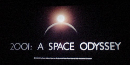
On Friday, my esteemed colleague and I made sure to attend the final showing at the current incarnation of the Royal Cinema, 2001: A Space Odyssey. It goes without saying that I snapped samizdat photographs.
I scarcely ever watch this picture, as it is already a fundamental component of my being. It came out in 1968, and that was the first time I saw it: I sat on my mother’s knee and I was three years old. I distinctly remember the curtains closing on a title card reading INTERMISSION, right after HAL lipreads the astronauts. I really was there and I really do remember it.
I scarcely ever watch this picture, as its intent is to appear so realistic as to be a documentary. It achieves that intent, hence 2001 is an elementally frightening picture. (Right now, today, who is hiding these monoliths from us?) Whenever they appear, their rectilinear perfection is so out of place it can only mean we’re outmatched. Anything that could manufacture a perfect solid like that, and install it where they did, can and will outgun us on every level. It is disturbing to consider that evolution could occur in jumps, each of which has to be triggered by a metallic alien monolith whose owners can demonstrably do whatever they please with us.
2001 is hair-raising. It is a kind of religious experience for atheists. It is an insanely difficult acid test for captioning and description, which, inevitably, I never stop thinking about while watching it. 2001 is, moreover, an index of a generation gap among cinéastes, since the group that considers 2001 the finest motion picture of the 20th century simply will never get along with the group that recapitulates tired arguments for the consensus choice, Citizen Kane.
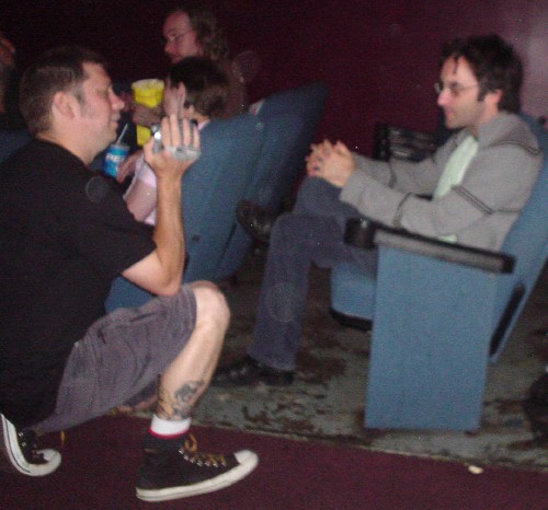
But I must report that the Royal went out with a whimper. The event started – a half-hour late – with lengthy thank-yous to the Royal in-crowd. (The projectionist was singled out for especial thanks. He would proceed to blow two full reel changes during 2001.) There was much discussion of keeping alive this form of cinematic experience, particularly with a movie that demands to be seen on the big screen. The word “DVD” was never mentioned.
We were forced to endure the worst short subject that could possibly run before a classic of philosophical science fiction, a Three Stooges caper lasting 20 excruciating (and ear-piercing) minutes. What was billed as a “treat” was actually a chore that wasted our time. And, best of all, it was presented to us on DVD. We even saw the vaunted projectionist fumble repeatedly with the onscreen menus.
And inevitably, the only attendee who received any attention was the guy who never fails to receive attention, Don McKellar. Better grab his picture before he disappears, never to be documented again.
I’m not picking on Don, whom I was permitted to meet once and who is always one step ahead of you. A fine lad, really. But, even without seeing the footage from this “videographer,” I know my story of 2001 is better than Don’s.
Select a category to see additional posts. Add feed/ to a category to subscribe via RSS
The foregoing posting appeared on Joe Clark’s personal Weblog on 2006.07.03 13:18. This presentation was designed for printing and omits components that make sense only onscreen. (If you are seeing this on a screen, then the page stylesheet was not loaded or not loaded properly.) The permanent link is: https://blog.fawny.org/2006/07/03/2001/
Previously, I wrote (and, on many occasions, rewrote) a long post on the freakonomics of captioning errors. My conclusion, which I believe is the only supportable one, is that applying a simple number to captioning errors (like “99% accurate”) is meaningless and beside the point, because even in that case, the 1% you’re allowing to be in error could be important (dropping the word “not” in “not guilty”) or unimportant (dropping one “very” in “very, very angry”).
Now I’m gonna do the same thing to audio description, which, as you know, is an added narration track that explains to a blind person what’s happening onscreen that cannot be understood from the main soundtrack alone. Audio description talks you through a movie, a TV show, a theatrical performance, or any number of other audiovisual events. It’s much less common than captioning, which also implies that it hasn’t been studied as much. But in fact several experiments have concluded that blind viewers receive less information exclusively from the description track than many of us would believe. [continue with: The freakonomics of audio description →]
Select a category to see additional posts. Add feed/ to a category to subscribe via RSS
The foregoing posting appeared on Joe Clark’s personal Weblog on 2006.07.02 13:49. This presentation was designed for printing and omits components that make sense only onscreen. (If you are seeing this on a screen, then the page stylesheet was not loaded or not loaded properly.) The permanent link is: https://blog.fawny.org/2006/07/02/freak-dx/
Select a category to see additional posts. Add feed/ to a category to subscribe via RSS
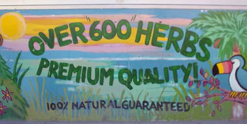
The foregoing posting appeared on Joe Clark’s personal Weblog on 2006.07.01 17:43. This presentation was designed for printing and omits components that make sense only onscreen. (If you are seeing this on a screen, then the page stylesheet was not loaded or not loaded properly.) The permanent link is: https://blog.fawny.org/2006/07/01/over600/
James D. Roots is the executive director of the Canadian Association of the Deaf (CAD). It appears he will remain in that position for life: During one of my occasional excavations through file boxes, I found the following letter he wrote way back on 1988.02.10 in response to a query of mine on captioning.
I have never, at any time or any place or to anyone, implied that hearing people should not have a major say in decisions related to captioning…. I prefer to work WITH these people, not AGAINST them, especially as we have a common goal. […]
I said [to a Commons committee] that IN A PERFECT SOCIETY, all programs would be captioned and all television sets would have built-in decoders…. But that is only a FANTASY: I never suggested it was a realistic goal to be pursued.
Lastly, you ask me to confirm my comments regarding quantity versus quality. In my eyes, the question is not one of quantity VERSUS quality. We want both quantity AND quality. However, my impression from our conversations is that you, personally, define “quality” in terms of the functional versus the aesthetic. If that is the case… then, yes, we prize quantity above “quality.” We want the captions to be up there on the screen: Colours, variegated typefaces, crewelwork borders or whatever are not essential elements of captioning; they can wait. Moreover, it is so difficult to get broadcasters and legislators to agree to fund the existing functional captions that asking them to fund “fancy” captions would be a strategic disaster.
If, on the other hand, “quality” is defined as the clarity, accuracy, and timeliness of the captions – rather than as their aesthetic pleasingness – then we see no need to choose between quantity and quality: The two should go hand-in-hand.
However, one thing I do want to make absolutely clear to you is that I am NOT suggesting that we don’t care at all what the captions look like. Illegible or garbled captions are no better than no captions – maybe even worse than no captions, due to the frustration they cause the viewer.
I hope this clarifies the issue.
I mean, crewelwork borders?
Note that this is the same Jim Roots who would later use government funding to publish a pamphlet ostensibly on HDTV captioning that called for more government funding for CAD and a veto on essentially all captioning decisions in Canada. Your tax dollars at work. (When this happens in the copyright field, it’s a scandal.)
Select a category to see additional posts. Add feed/ to a category to subscribe via RSS
The foregoing posting appeared on Joe Clark’s personal Weblog on 2006.06.30 13:30. This presentation was designed for printing and omits components that make sense only onscreen. (If you are seeing this on a screen, then the page stylesheet was not loaded or not loaded properly.) The permanent link is: https://blog.fawny.org/2006/06/30/crewelwork/
Select a category to see additional posts. Add feed/ to a category to subscribe via RSS
The foregoing posting appeared on Joe Clark’s personal Weblog on 2006.06.30 08:46. This presentation was designed for printing and omits components that make sense only onscreen. (If you are seeing this on a screen, then the page stylesheet was not loaded or not loaded properly.) The permanent link is: https://blog.fawny.org/2006/06/30/tarp/