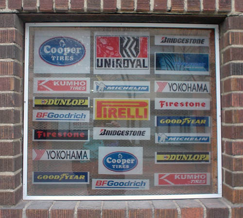
Untold automotive logos
The foregoing posting appeared on Joe Clark’s personal Weblog on 2006.03.17 17:15. This presentation was designed for printing and omits components that make sense only onscreen. The permanent link is: https://blog.fawny.org/2006/03/17/autologo/
B. Mould, typophile
Entrevue avec former notorious closet case Bob Mould, Punk Planet, “March and April 2006”:
Artwork-wise there were a couple [of] different things going on. The front cover, it’s [by] two guys who have a graphics house up in Vancouver called Mondolithic. Ken[n] Brown, the main guy, he and I sort of got together and I said, “This is the font I want to use.” Stop me if this is getting way too theoretical.
No, Bob, it isn’t. Letters are things, not pictures of things, let alone theories of things.
I sort of used that dense compressed Helvetica font on the three records Modulate, LoudBomb and the live record [sic], so I go to the Interstate font. It’s a little bit louder version of it. It’s got a little bit more pitch….
And Univers, seen in his blog header, doesn’t? Somehow I have a hard time accepting that the evolving persona of Bob Mould can be adequately communicated by angled terminals. (“What kind of sansserif typeface defines me as a person?”)
The foregoing posting appeared on Joe Clark’s personal Weblog on 2006.03.17 14:00. This presentation was designed for printing and omits components that make sense only onscreen. The permanent link is: https://blog.fawny.org/2006/03/17/mouldism/
Yet more Le Griffe
Not, as it turns out, in Yorkville.
The foregoing posting appeared on Joe Clark’s personal Weblog on 2006.03.16 18:28. This presentation was designed for printing and omits components that make sense only onscreen. The permanent link is: https://blog.fawny.org/2006/03/16/yet-more-le-griffe/
The freakonomics of captioning errors
When hearing people first watch captioning, they lose their shit when so much as a word is dropped. I don’t know where people got the idea that every single word has to be captioned. And, as this posting will explain, there is no useful way to assign a number to captioning errors.
What we’re gonna talk about
- What captioning actually is
- How captioning errors are measured
- Dropping words from captions, and whatever difference that might or might not make
- An actual example
- And a conclusion
What captioning actually is
Captioning is not transcription; it merely starts with transcription. There are many circumstances where we strive for, and very often attain, verbatim captioning, and other cases where we do not and do not.
But if we use, as a basis, a verbatim transcript (even an idealized verbatim transcript that does not exist in any form), how do we count or quantify captioning errors?
I was thinking about this while reading the many FCC interventions. Let’s start with real-time captioning, that is, captioning produced by a stenographic process. (See photos of stenotype keyboards.) It is ordinarily reserved for live events, but now also used by cheap-ass producers who don’t give a shit about captioning and shop only on price.
Qualified stenotypists can produce 180 words a minute for long periods. That’s actually a conservative estimate. My esteemed colleague Gary D. Robson, who really should start answering my E-mails, writes in The Closed Captioning Handbook: “Real-time stenocaptioners must regularly work at sustained speeds of over 225 words per minute with accuracy of 99% or better.”
That gives us many variables to start with. [continue with: The freakonomics of captioning errors →]
The foregoing posting appeared on Joe Clark’s personal Weblog on 2006.03.15 13:02. This presentation was designed for printing and omits components that make sense only onscreen. The permanent link is: https://blog.fawny.org/2006/03/15/caption-errors/
Tandoori Tango
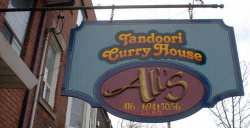
The foregoing posting appeared on Joe Clark’s personal Weblog on 2006.03.14 15:40. This presentation was designed for printing and omits components that make sense only onscreen. The permanent link is: https://blog.fawny.org/2006/03/14/tango/
Truth in advertising
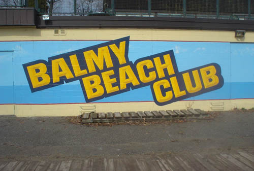
Of course, I’m also riding along there when it’s –10° or colder. (Cf.)
The foregoing posting appeared on Joe Clark’s personal Weblog on 2006.03.12 15:20. This presentation was designed for printing and omits components that make sense only onscreen. The permanent link is: https://blog.fawny.org/2006/03/12/balmy/
Pixelation
Dan Savage, The Commitment (special to Bronislaw Smigel):
“See those women over there? Try to turn off your gay male pixelation.” I tend not to notice women, attractive or not; it’s as though they’re pixelated, like the bad guys on Cops.
(Q.v.)
The foregoing posting appeared on Joe Clark’s personal Weblog on 2006.03.11 13:56. This presentation was designed for printing and omits components that make sense only onscreen. The permanent link is: https://blog.fawny.org/2006/03/11/pixelation/
Green bolts
I have a surprisingly large collection of photos of coloured truck wheels.
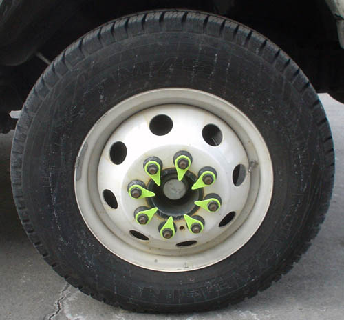
I suppose at this point that sort of thing shouldn’t be surprising.
The foregoing posting appeared on Joe Clark’s personal Weblog on 2006.03.11 13:37. This presentation was designed for printing and omits components that make sense only onscreen. The permanent link is: https://blog.fawny.org/2006/03/11/bolts/
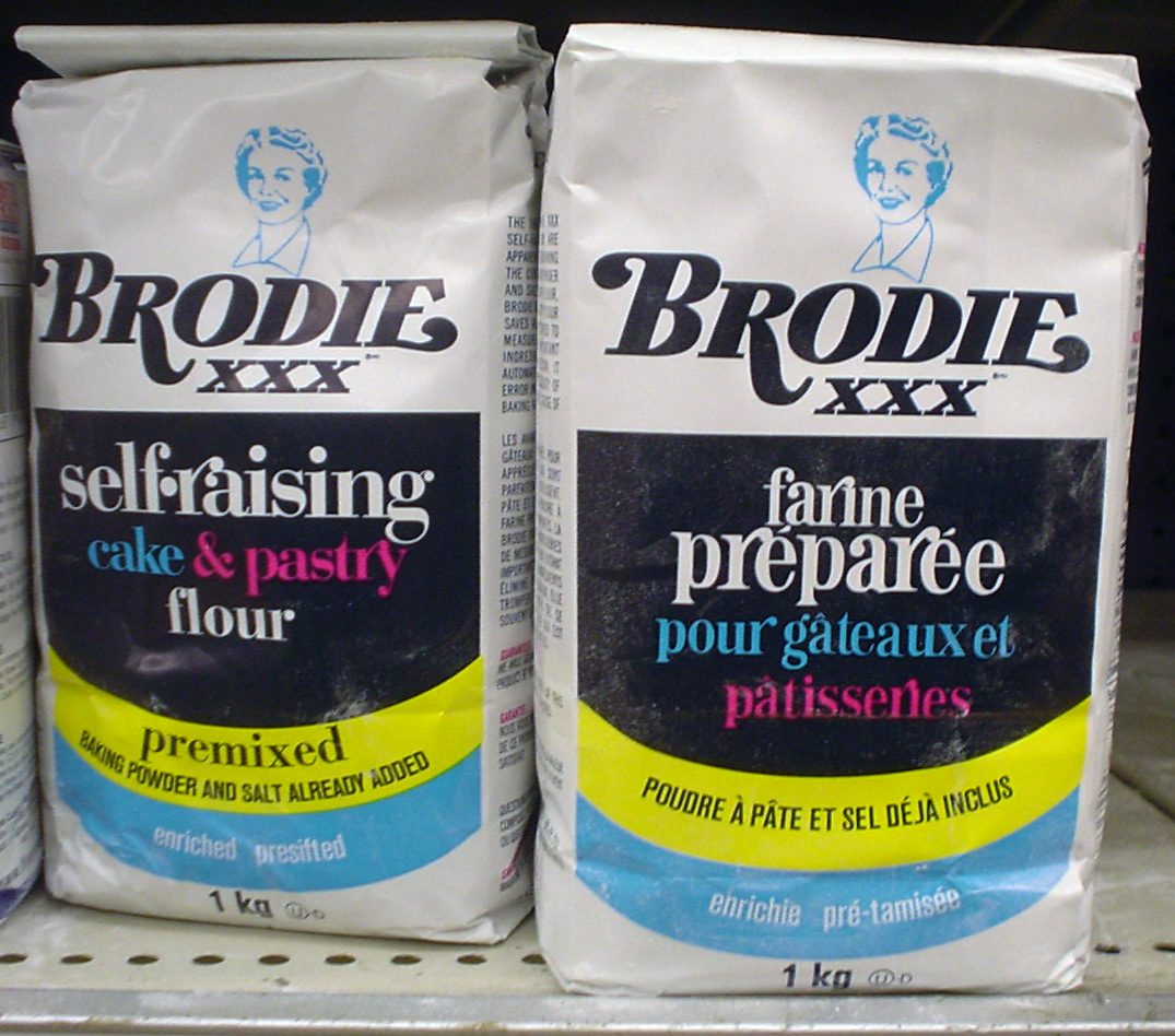
Self-raising pastiche
I think this is a skilful pastiche given the bottom three lines (in Helvetica Condensed, mismatched on English and French sides).
The foregoing posting appeared on Joe Clark’s personal Weblog on 2006.03.09 18:20. This presentation was designed for printing and omits components that make sense only onscreen. The permanent link is: https://blog.fawny.org/2006/03/09/self-raising-pastiche/