No, they gave him a radio show instead. Jesse Brown is now apparently the host of another of those CBC Radio programs for shut-ins and the media elite (pace Gzowski – they’re the only groups sitting at home listening to radio at 11:30 in the morning).
Search Engine drops buzzwords like crowdsourcing and mob and so on, but reveals the fundamental cluelessness of the CBC by hiring the capo di tutti usual supects, Cory Doctorow, who will literally rewrite his newspaper columns and read them on the air. (All with no DRM. You did not wake up this morning wanting to do less with your recycled content than you could yesterday!)
Putting Doctorow on your first episode rings a bell here. It’s like having no talent, a tendency to be mistaken for an Arab, a propensity to issue statements like “I was born to wear J. Lindeberg suits,” and a staff who despise you and also slotting Peggy Twatwood into the first episode of your new arts-and-culture newsmagazine. Welcome to CBC, where creative is always in renewal.
Additionally, Brown flatly admits that the show’s efforts to drum up excitement, to conjure a community like sea monkeys from a foil pouch, failed. Of course it did; you’re too late to the party and the whole enterprise is inauthentic.
Select a category to see additional posts. Add feed/ to a category to subscribe via RSS
The foregoing posting appeared on Joe Clark’s personal Weblog on 2007.09.07 01:09. This presentation was designed for printing and omits components that make sense only onscreen. (If you are seeing this on a screen, then the page stylesheet was not loaded or not loaded properly.) The permanent link is: https://blog.fawny.org/2007/09/07/creative-renewal/
HDTV allows you to select font, size (within certain increments), foreground and background colour, and opacity, among other features.
I’m sorry, but this is like locating a daycare centre right next to a dingo farm.
It takes no time at all to create a type/colour combination you cannot even read. Then you have to put in about the same amout of time to undo your mistakes.
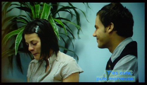
Don’t assume this is a kind of joke that makes for cute little pictures. If you give people the chance to hurt themselves, they will (Cf. Comic Sans). This is only one way in which the HDTV spec induces you to hurt yourself.
[Translucent backgrounds are almost never a good idea, based on my rather extensive experience (the old MyCap Jr. decoder had them, and they didn’t work then, either).]
Select a category to see additional posts. Add feed/ to a category to subscribe via RSS
The foregoing posting appeared on Joe Clark’s personal Weblog on 2007.09.06 20:31. This presentation was designed for printing and omits components that make sense only onscreen. (If you are seeing this on a screen, then the page stylesheet was not loaded or not loaded properly.) The permanent link is: https://blog.fawny.org/2007/09/06/14atypi1h/
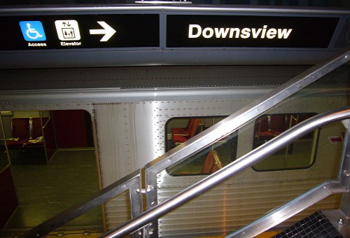
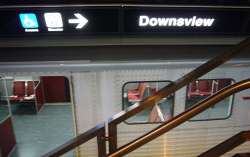
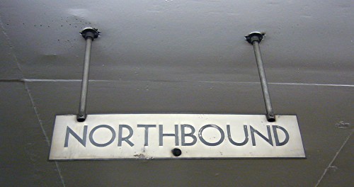
Downsview station, located in the middle of nowhere, was a trial run for the Sheppard sign “standard.” Except it doesn’t look anything like Sheppard and is dominated by a continuous angled and illuminated strapline over either platform.
That’s really the only information you get from the strapline. There isn’t even an indication of where to go to catch the bus. More on that tomorrow.
Select a category to see additional posts. Add feed/ to a category to subscribe via RSS
The foregoing posting appeared on Joe Clark’s personal Weblog on 2007.09.06 20:20. This presentation was designed for printing and omits components that make sense only onscreen. (If you are seeing this on a screen, then the page stylesheet was not loaded or not loaded properly.) The permanent link is: https://blog.fawny.org/2007/09/06/14atypi2f/
This guy ran development at a screen-reader company for years and claims to use four of the damn things now, but he still cannot figure out who owns and writes different blogs. I never wrote a single word that is quoted or referred to in Hofstader’s post of today. Nor was “Jeff Bishop” the owner or author of the blogs he quotes. I’m mentioned three times by name and every single mention is untrue, incorrect, totally wrong, and merely the latest total fucking embarrassment from the man who gave you Jaws.
Select a category to see additional posts. Add feed/ to a category to subscribe via RSS
The foregoing posting appeared on Joe Clark’s personal Weblog on 2007.09.06 15:45. This presentation was designed for printing and omits components that make sense only onscreen. (If you are seeing this on a screen, then the page stylesheet was not loaded or not loaded properly.) The permanent link is: https://blog.fawny.org/2007/09/06/hoferror/
The Line 21 captioning system we use over here was designed by unilingual American engineers. The same group was responsible for its two upgrades. These are not the people you want in charge of your character sets and typography.
Prime victim? ¡, the inverted exclamation point. ¿ has always existed in the character set, but ¡ exists only in an extended range, incompatible with Unicode and many old decoders. For years, people faked ¡ by just using a small i, which also isn’t sustainable.
And if you have a shitty HDTV font, as most are, well, maybe the punctuation and accented characters will be in roman even if the rest of the caption is in italic.
Gotta keep them Mexicans in their place. That shit is foreign.
Select a category to see additional posts. Add feed/ to a category to subscribe via RSS
The foregoing posting appeared on Joe Clark’s personal Weblog on 2007.09.05 17:08. This presentation was designed for printing and omits components that make sense only onscreen. (If you are seeing this on a screen, then the page stylesheet was not loaded or not loaded properly.) The permanent link is: https://blog.fawny.org/2007/09/05/14atypi1g/
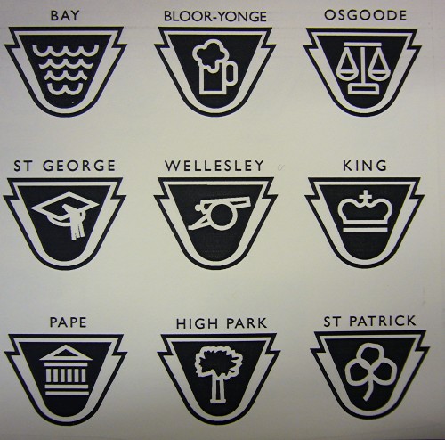
Lance Wyman, a pioneer of signage and wayfinding who worked on the Mexico City Olympics and the subway in that city, worked with Paul Arthur to gin up about 15 candidate pictographs in the 1993-era TTC redesign. It started out as an arduous task, and everyone assumed that a lot of research would be involved, but it turned out that local historian Mike Filey already had all the histories of each station mapped out. Nonetheless, some of the stations were difficult to epitomize.
Bay: Waves
Bloor-Yonge: Beer stein (for some reason)
Osgoode: The scales of justice
St. George: A mortarboard (also a lion)
Wellesley: A cannon (historical reference)
King: A crown
Pape: Acropolis
High Park: A tree
St. Patrick: An extremely ill-rendered three-leaf clover
Skeptics should keep in mind that the icon does not have to perfectly epitomize the station. It merely has to be memorably associated with the station, particularly for illiterates, children, or people with cognitive disabilities. Such performance was never explicitly tested.
Select a category to see additional posts. Add feed/ to a category to subscribe via RSS
The foregoing posting appeared on Joe Clark’s personal Weblog on 2007.09.05 12:52. This presentation was designed for printing and omits components that make sense only onscreen. (If you are seeing this on a screen, then the page stylesheet was not loaded or not loaded properly.) The permanent link is: https://blog.fawny.org/2007/09/05/14atypi2e/
Select a category to see additional posts. Add feed/ to a category to subscribe via RSS
The foregoing posting appeared on Joe Clark’s personal Weblog on 2007.09.04 21:38. This presentation was designed for printing and omits components that make sense only onscreen. (If you are seeing this on a screen, then the page stylesheet was not loaded or not loaded properly.) The permanent link is: https://blog.fawny.org/2007/09/04/14atypi2d/
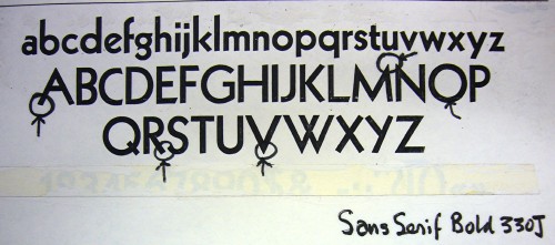
As mentioned yesterday, the esteemed Paul Arthur was rather crap at identifying typefaces. He thought he hit paydirt in an old Cooper & Beatty specimen book, pegging Sans Serif Bold 330J (in various spellings) as the TTC subway font.
Eureka? Sadly, no, as it is merely a version of Kabel.
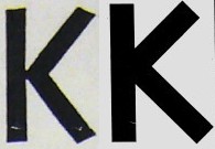
Just compare the Ks (Kabel left, TTC right):
The TTC typeface is not Gill Sans and is not Kabel. It isn’t anything but itself. It is sui generis.
Select a category to see additional posts. Add feed/ to a category to subscribe via RSS
The foregoing posting appeared on Joe Clark’s personal Weblog on 2007.09.04 16:33. This presentation was designed for printing and omits components that make sense only onscreen. (If you are seeing this on a screen, then the page stylesheet was not loaded or not loaded properly.) The permanent link is: https://blog.fawny.org/2007/09/04/14atypi2c/
As the only homosexualist who does not go to the gym (yes, I’m the one), it seems like a distant memory that I was ever a member of the Y. But I was, for the better part of ten years. [continue with: Randy Gunz →]
Select a category to see additional posts. Add feed/ to a category to subscribe via RSS
The foregoing posting appeared on Joe Clark’s personal Weblog on 2007.09.03 16:40. This presentation was designed for printing and omits components that make sense only onscreen. (If you are seeing this on a screen, then the page stylesheet was not loaded or not loaded properly.) The permanent link is: https://blog.fawny.org/2007/09/03/morvil/