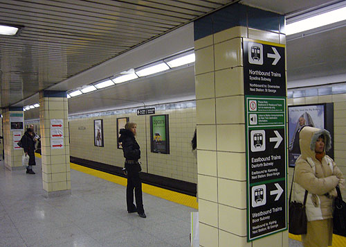
…for the TTC to make its signage during the subway diversion even worse. Not only do we have enormous wordy signs on every column, all cunningly Typeset in faux-Helvetica with random Capitals, a day after the diversion began we now have that TTC favourite, the shitty laser-printed sign (in Times all-caps) that gets ripped to shreds.
Except we’ve got three of them on each of several pillars.
And did you know they’re still informing people which train to get on by bullhorn? I actually asked the most reasonable-looking “supervisor” present (the only woman) if they’d even considered deaf people. She had – that morning. But that’s pretty much it. (The bullhorn announcements were completely incomprehensible on day two.)
You understand there is a perfectly viable low-tech way to solve this problem, right?
And did you know they intend to leave all those signs up on the columns for the full six weeks, even during weekdays when the diversion isn’t happening?