(UPDATED) Or, in this case, griping about a related site, TransitCity.CA, launched today, run by the City of Toronto.
- Valid XHTML and CSS, but more or less accidentally.
- It’s got a bit of Flash fluff at the top that could be made semi-accessible but wasn’t. (I asked. They aren’t embedding it in a way that screen readers can even detect. In fact, my guy didn’t even see any Flash on the page at all.)
- Tables for layout – 11 of them.
- Dumb-arse
alttexts, like:alt="advertisement.png, 0 kB"alt="Advertisement"alt="powered_by.png, 1 kB"input type="radio" name="voteid" id="voteid13" value="13" alt="13"- (also
14through19)
- Spacer GIFs.
But hey! They’re using open-source Joomla as content-management system, so that makes up for everything because it isn’t Microsoft. (Interestingly, the site is served by Apache, giving hope for a TTC redesign.)
The whole thing is half a step forward, I suppose, but a Failed Redesign nonetheless. And we’re supposed to be happy for that sort of thing. It is at least a new third option the TTC can explore that may someday supplant its usual two responses to any call for modernization – ignore the critic (as the TTC did to all transit fans before Transit Camp) or harass the critic (as with permissible noncommercial photography on the subway).
An unprintable map some people can barely read
(UPDATED TWICE, 2007.03.17) Let’s look at a truly serious problem, the “stylized” map (one of several) of a proposed light-rail network:
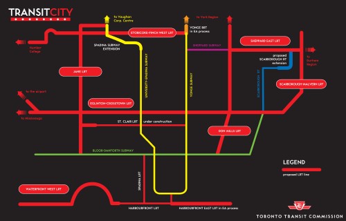
Except for the single blue line and white type, the entire colour palette of this map is unreadable to a person with strong colour deficiency (protanopia) and probably wouldn’t be very easy to read for someone with weak colourblindness (deuteranopia). And this isn’t theoretical; I checked with My Friend the Protan.
How well can you read this map?
Short answer: Not very well. The red isn’t a problem, but I can barely tell the difference between the yellow and green (I had to ask to make sure there was a difference – they both look yellow to me). It took a while to notice that the purple line wasn’t blue (Sheppard Subway and Scarborough look like similar blues to me) – this was a problem to non-colourblind people in the office, too.
And who designed it? Take a bow, head Spacer Matt Blackett.
Here are a few questions Blackett could answer for us (which he did, at 2007.03.17 14:20):
- Did you design the map (and some lapel buttons that “will be available soon”) for free or for a fee? (How much?)
-
Yes, I got paid. […]
- Who was the client? (Even for a pro-bono job, there’s always a client.)
-
TTC.
- If you designed these items in advance of the announcement of the project, doesn’t that make you an insider who is part of the development process? Does this not reinforce people’s fears of too-close ties between Spacing and City Hall?
-
No, I just knew the map. No other details. The CBC and the Globe knew more about the report than I did. […] I was hired as a graphic designer, not Spacing’s publisher. It is blurry, no doubt, but if I complain about their design for years and then I’m offered a gig to help with design, I’m not going to turn it down. From a Spacing perspective, we agree with the LRT plan [and] have been advocating for this for two years. Plus, the other editors wrote the main piece on the Wire, I stayed out of it. It’s only been you, a few cranks during the election on Spacing Votes, and one other person that has E-mailed us are the only people who have said we’re too close to City Hall.
(And the article in the Globe, of course.)
- What was the actual need for a “stylized” map rather than an accurate and usable one?
-
A usable map is part of the package, the stylized map is to make the network seem familiar to TTC riders. Again, ask the TTC and Giambrone – they asked for the map.
- Why did you design a map when the TTC already has at least one staff cartographer, Graeme Parry?
-
Ask the TTC or Giambrone. I suspect their cartographer did the technical mapping.
- Why is the map flat black, an expensive colour to print even on a laser printer and infeasible on an inkjet?
-
My instructions were all based on it being a part of the media kit. They choose what to do with it after that. It was created to reflect the TTC style (as stated before). Sorry about your ink cartridge [I have a laser printer], but… you can print out the technical map if you want map. It is your choice and not required to print the stylized one.
(Except of course the Web site, which Blackett does not run, clearly labelled it as printable.)
- If you’re a graphic-design instructor, why weren’t you aware of how to design for colour deficiency, particularly since well-researched materials are available, often for free?
-
To be accurate, I am a publication-design instructor. Aside from that, I didn’t know this and appreciate the update…. This is more a case of why the TTC has maps that don’t work for the colourblind than me not knowing.
- Why so defensive, Matt?
-
I was not defensive, just saying that there will always be problems with these things that are meant for thousands of people to look at because there are folks like you who have specific knowledge and particularities that others may not consider.
And now, a defence of Blackett: TTC’s default route colours are all hard to read for colour-deficient people, too, except for Scarborough blue.
Additional fact about the TTC Web site
Here, let me put this up somewhere for posterity. In the original RFP to redesign the TTC Web site, a list of comparable sites was provided, including – and I shit you not – “Competitive ‘rogue’ information site: Subway Rider Efficiency Guide http://ttcrider.ca.”