I still cannot get used to calling the Ontario College of Art “OCAD” even years after the addition of & Design to its official name. For old-timers, OCAD is and shall always be “OCA.” (Old-timers have all experienced a long string of complete nonresponses to applications to teach there. And those of us familiar with the Banff Centre have little confidence in the recently-installed president, Sara Diamond.)
But this is about the new generation. Every year, OCA papers nearly all its walls (and, with the new sky-high addition, there are a lot of walls) with exhibits by graduates. I initially planned to cruise by with my esteemed colleague half an hour before closing on Friday night. I ended up there on Saturday morning, didn’t leave until well into the afternoon, and ended up so wiped out I had to have a three-hour nap and stayed in on a Saturday night. That’s dedication!
First: Can we teach these kids about copyright, please?
Everywhere you looked, you saw ill-photocopied squares on the walls with a camera in a bar dexter and the declaration NO PHOTOGRAPHY. How quaint. Perhaps you’d like to ban promotional screenings of your student movies, or search our bags for cameraphones on the way in? It’s the same philosophy: All copying is illegal copying and we’re gonna ban it.
Except of course certain kinds of copying are perfectly legal, particularly under the fair-dealing provisions of the Copyright Act, which permit insubstantial excerpting for purposes like review and criticism. (Read my user’s guide of sorts.) The Supreme Court later held that some works, like photographs, may need to be copied in their entirety to be dealt with fairly.
Thus, no, I am not going to refrain from photographing works at a public exhibition just because somebody who doesn’t know the first thing about copyright tacked up a few signs. And I ended up having that conversation with five different “monitors” – the first was an argument (“But there are signs on the walls saying NO PHOTOGRAPHY.” “That’s fine, but it’s still your opinion”), the second started as an argument and ended up as a discussion, and the last three involved my walking right up to the monitors and getting them to understand that photography must be allowed for certain purposes. Everyone agreed with that, actually, though they said they had had a hard time on Friday with hundreds of school-age children armed with cameraphones. The head monitor, a particularly cool dude with a particularly cool anglicized version of his Korean name, also agreed.
So a word of advice for next year: Train your monitors that some kinds of photography are permitted, and instruct them to ask people why they’re taking pictures. Don’t just run up to them and act like a hall monitor (hence the name, I suppose) and get on their cases for carrying out what might be perfectly legal activities. And, viewed practically, these are still students we’re talking about, and without an easy way to depict their visual works, there is no hope whatsoever of getting any kind of press. If you want a permanent discussion of students’ work, then you have to get real about copyright.
And just for reference, how many of the students whose works were being so vigorously protected have completely legal collections of music, fonts, and software?
The star of the show
Karin von Ompteda takes the prize. (Literally: She also received a medal in the event’s judging.) I spent a long time chatting with her dad, who Just Happened to Be Hovering Near Her Exhibit. (Karin herself wasn’t present.) According to her dad and published reports you could look up, Karin has a degree in biology. This makes her, prima facie, a scientist. Now she’s got a degree in design, and she’s going for another degree at the Royal College of Art. In which field? Typeface design.
Her portfolio, which looks like a solid block of paper and was a bit of a puzzle to actually operate, contains quite a few illustrations (the pink fists were great, if an example of a trend for translucent clones of a central image). She’s got a set of photographs of meat in the shape of letters that I found really distasteful. And she’s got an ultra-light monoline typeface with little stars at the terminals, ostensibly like textura terminals but more like the outline of a mace. (A font that’s beautiful but deadly. Watch your back, 007.)
But her real claim to fame is design work for the CNIB (inevitably) and a pair of purported legibility typefaces, Include and Inclusive Print (L to R below):
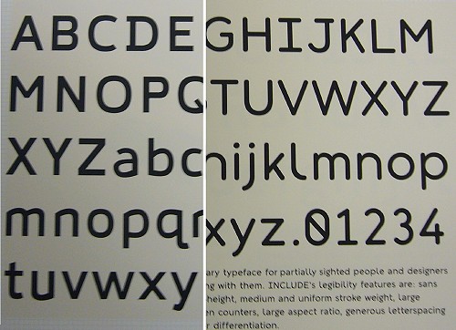
These prompted rather a lot of discussion with a monitor and her dad. I have read a lot of the literature, perhaps all of it, on typefaces custom-crafted for certain disabilities, including dyslexia. Let’s call these extreme-legibility fonts. These fonts must be distinguished from other typefaces that are intended to be used for everyone and also are legible for low-vision users. Signage fonts like Clearview are the classic examples.
Extreme-legibility fonts are confronted a few categorical obstacles. One that will never be resolved is the fact that low-vision people spend nearly all their time, if not actually all of it, reading other fonts. There’s almost no chance that your extreme-legibility font will be used in a piece that the intended audience will actually read, and even then it will be only one piece. (And, in practice, it will be a document concerning actual visual impairment. By analogy, are black people only supposed to read about being black?)
While some of the remaining materials they read may have a kind of “classic” print accessibility, like large-print books (about which the type research is seriously equivocal), everything else is gonna be the same shitty fonts we deal with every day. Like using Arial for everything – exactly what Karin’s comrades at CNIB did when typesetting their little brochure on how to make typesetting accessible to the blind. (The phrase “Clear Print” came up a lot in Karin’s portfolio.)
Second, fonts like these illustrate my point that so-called universally-designed products are actually specifically and intentionally custom-designed just for the disabled. Quick: Is your doorknob universally-designed? How about your car? Your newspaper? The TV shows you watch? Your computer? Your city? No. But your Oxo Good Grips potato peeler is, right? Sure. And that’s the only example you can come up with. (And it is certainly curious that all those Oxo products use exactly the same handles.)
Third, if you design an extreme-legibility font, it will inevitably lead to two versions of the same document: One with real type and graphic design, another that’s simply an MS Word printout at 18 point in the new font, with no graphics or photos and on a 7-inch measure with no extra linespacing. You are not going to be able to persuade graphic designers or company managers to convert everything they do to your single custom font. That contradicts the entire purpose of typography and graphic design. If we wanted that, we wouldn’t be fighting so hard to prevent the entire world from “melting into Arial.”
I am not willing to say the whole thing is a doomed enterprise, though that is actually what I think. The odds are against anyone who wants to make it work.
What’s in Karin’s favour is her background in science. That means she knows how to run an experiment. She’ll emerge from RCA with a master’s or a doctorate in type design, supported by quite a bit of knowledge about an important functional aspect of typography, accessibility. This would be a good time for my esteemed colleagues at Microsoft to nail down some internships or simply make an offer.
TTC redesigns
One of course recalls the article in the Globe (now subscribers-only and one of the few by that writer that was not plucked straight from a blog) about student work on signage for parking on Toronto streets and improved design features on the subway. (The signage students were on TV the other week. I can never get a straight answer about when any of the work, in either category, will be released or published.)
At the exhibit, I saw two installations regarding the TTC.
- Minah Huh’s Local Linker project attempts to tell you what’s nearby in your subway journey, and makes use of a rather complex above-door display system inside subway cars. For most of your journey, half the display is dominated by an ad, just like those atrocious OneStop display screens (which, in their favour, have the clearest type I’ve ever seen on a video screen). The whole thing displays the station name as you approach it. Fonts, unhelpfully, are the TTC’s fake Helvetica. There’s also an effort to indicate direction of travel, which is a misnomer, since there are only two directions in the subway, the right way and the wrong way. Somewhat unpersuasive on the whole.
- Lawrence Ang investigated lighting as a comfort factor in the TTC (Travel Light). His installation was impossible to photograph and included an apparent scale model of a platform at Bloor station. It didn’t look a lot like a subway station to me. After scrunching down a bit so I could see under the model’s ceiling, I noticed an animated running banner along the top edge of the wall, in the same relative position as the ad caissons in the subway, showing things like flocks of geese (their direction of travel indicating yours). Illustrations of beavers are also proposed. (What next? Zebra mussels?) I didn’t understand his points about ambient lighting in subway stations, but that’s only because I couldn’t read his entire prospectus while standing there. (I’ll ask for a PDF. Memo to students: Make a one-page version without using Arial, print out 100 copies for people to take home, and post it online.)
Others
Quick mentions of other works:
- I had a long chat with the woman behind the Pink Nail Project, something that did not seem to be “design” in any sense. It’s an attempt to introduce more women to trades like carpentry. She actually ran a pilot project with Habitat for Humanity that involved 500 hours of volunteer work. We talked a lot about the ditzy little chicks on the renovation programs on TV (and on Mythbusters), and I told her she needed her own show. She does. I pointed out that strength is overrated as a requirement in construction (that’s why we use wheelbarrows and nailguns); based on what little I’ve seen, it’s more a case of persuading nice young girls that a hammer is something you use to really hit with. Inevitably, I was handed an actual pink nail on my way out.
- I didn’t quite understand all of Katherine Morley’s Good Cab, Greener City, again because I couldn’t read the whole thing, It seems to involve improving the quality of life for cabdrivers while also marginally improving the passenger experience. I say “marginally” because fixing the whole problem would involve entirely new purpose-built vehicles; I’ve been reading about those every few years since I was a boy, and to this day we’re stuck with Crown Vics. She overlooked the problem of seatbelts and child restraints.
- Rachel Wallach’s Milo is an idea that could become a commercial product tomorrow: A USB tag for your dog’s collar that stores all its medical history. (In what format, by the way?) Get that thing going pronto.
- Christine Hunt’s Dining Room Guild for Seniors re-engages a social aspect to dining for isolated seniors. At essence, it’s also a meal-delivery service like Meals on Wheels, but the difference lies in its beautifully-designed livery. Hunt could work anywhere as a packaging designer.
- I was not sold, at all, on Naseer Roopani’s accessibility product – pill bottles for seniors and blind people. Actually, he doesn’t make the pill bottles accessible; he gives you a remote control of sorts that reads individual bottles and talks to you. (You can also record your own notes for each bottle.) Well, that’s an expensive object you are likely to lose. (If you’re so blind you can’t read your pill bottles, won’t you lose the remote? Probably not, but isn’t it at least possible?) What happens when the batteries run out? A separate electronic object may be the only option for a totally-blind person, but for others, why not just use Deborah Adler’s redesigned bottle, ClearRx? (Target doesn’t have worldwide rights, does it? Somebody could use her design in Canada.)
- Laura Bennett’s photo exhibit “Remnants,” about the “obscene” amount of greenfield land that’s been converted to urban sprawl, is a good idea that isn’t well executed. That’s OK: There’s so much of this happening that she can just keep reshooting until she gets a good set. (She should really run with one of her visual tropes – enormously dominating the foreground of the shot with landscape, leaving only a tiny horizon of buildings far away at the top.)
The kids are, as they say, all right.