Illustrations from artists selected for two TTC station renos have been published.
-
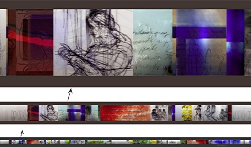
At Union Station, Stuart M. Reid with “Zones of Inclusion”:
-
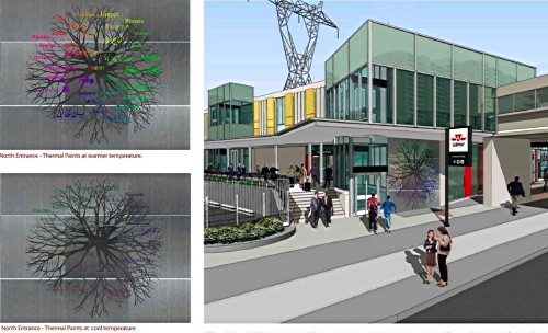
At Victoria Park, Aniko Meszaros with “Roots” (detail):
I’m fine with all this. I don’t like the Union artwork much, though I do like the Vic Park design. Neither of those opinions matters.
However, both these works intend to incorporate typography. Reid’s will include “typeset text pieces” (the illustration shows handwriting). Meszaros’s will use the following:
Text by the artist [single quotes sic – this isn’t England], ‘Toronto, a city where those with diverse roots can grow and intermingle into a complex and exciting multicultural garden,’ will be sandblasted into the existing ceramic glazed block…. The words ‘community’ [again sic] in different languages are layered on top of the root patterns…. A layer of the word ‘Roots’ [again], translated into various languages on top of the image, subtly changes colours throughout the day and seasons depending on the outside weather.
I see a few dangers here:
- Wrong fonts. Exactly what the right fonts are is open to discussion. But let me tell you right now that Arial and Times (“New Roman”) aren’t gonna cut it.
- Wrong weight, size, and spacing. If you’re going to be sandblasting, you need just the right weight and size. Spacing has to be very carefully determined and is certainly not going to be the default spacing of the typeface, because the words have to be readable from a distance. (Even standing distance is still “a distance.”) Pay too little attention to spacing and you end up with Museum (or Sheppard).
- Windows-style abominations like fake italics, Microsoft Word or CorelDraw default spacing (the culprit at Sheppard), and neutral apostrophes.
- Permanent copy errors, of the sort seen in memorial plaques. (You really don’t want to use British quotation marks on something that will stay in place for 50 years.)
I note that TTC considers sandblasting a public artwork into the living tile OK, but every other sign in the system has to use fake Helvetica on a plastic panel.
Additionally, what are the “various languages” going to be, and how will their different scripts be balanced? Contrary to popular belief, it is possible to put Latin alongside Arabic alongside Chinese and not have them clash, though the city of Toronto, and the TTC specifically, have a piss-poor record in this regard. The city and the TTC believe that each language needs its own font even if all of them are written in the same script and even if the same font is available in multiple scripts:
-
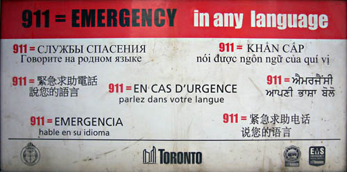
Here the Russian, Vietnamese, French (a pointless exercise in political correctness in Toronto), and Spanish all could use the same font.
-
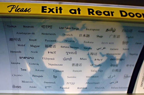
Here at least 45 of the language names (very much including Hausa, bottom line) could all use the same font. (I’m blanking on only about a dozen of those names without looking them up. I’m lousy at Indic scripts.)
So let’s not make these mistakes, please.