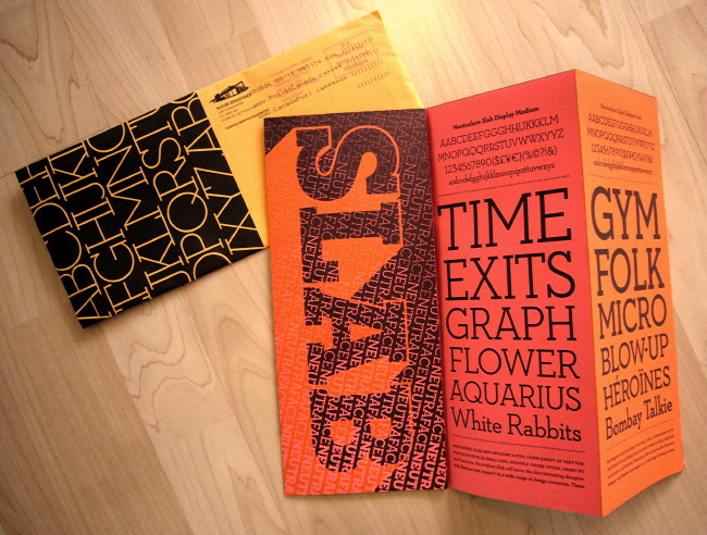
Here is House Industries’ latest mailing, on Neutraface Slab:
(Sent, incidentally, from Zurich.)
House Industries (q.v.) is an entirely independent typefoundry and design shop located just off the highway from the middle of nowhere in Delaware. It was founded by, and is run by, a bunch of cool dudes. It is a very guyish shop, but these are painstaking and exacting kinds of guys, not slobs. (They’ve hired a few women over the years. But this is not a female æsthetic in any sense.)
I’m not sure it is possible to name a design operation with higher standards, at least if we’re considering shops smaller than Pentagram. Even though half its typographic output harkens back to hot rods and Planet of the Apes and cheesecake calendars, this is a first-class operation all the way. There is no such thing as a half-assed House Industries product. (Unless you look at the codebase of their site. But I am referring to graphic standards, not Web standards.) They put their money where their taste is; even their specimen sheets cost them a fortune.
At a certain point you run out of ways to quantify or even explain House’s thoroughgoing and relentless pursuit of quality and high standards. The needle hits 100% and keeps trying to push through the top of the gauge. How do they manage to care so much?
There was some concern from the old farts in the type business, the kind who still pine for Poliphilus and Blado in original Monotype hot metal, when House Industries bought the entire inventory of Photo-Lettering Inc. in 2003. Photo-Lettering was a sui generis typesetting house in New York in the ’70s and ’80s, an era when such houses were actually possible (cf. Spectrum, Mono Lino, Cooper & Beatty). Photo-Lettering offered hundreds, really hundreds, of unique, unduplicated, irreplaceable display typefaces, which Mad. Ave. plundered for commercial advertising. (Or just never used – hundreds, really hundreds, never left the shop.)
As a youngster I remember writing to, then calling up, Photo-Lettering and demanding they send along every scrap of type specimen they had in the place. Such demands were greeted with all the charm you’d expect from Manhattan in 1980. Besides, there barely were any specimens. In a fractal replication of itself, Photo-Lettering’s wares were sui generis. You want something bold with a tall x-height and a really weird swash R? Listen, flip through this binder of photostats and pick something. I got work to do here.
House Industries now owns the Photo-Lettering library lock, stock and barrel and it could not possibly be in better hands. They aren’t acting dumb as a mule and just “digitizing” every face that was illustrated, sometimes solely in one-liner settings, in the myriad books (and tons, literally tons, of film and plates). They’re taking krazy old shit and adapting it to krazy new shit, with OpenType features like you wouldn’t believe. Some of these fonts require more programming than the Apollo 11 mission.
It’s taking them a while. But when they’re done, the genetics of the vast herd of Photo-Lettering fonts will be distilled and transcribed into new outline fonts with a mind of their own. It will be worth the wait. Everything they do is worth the wait.
Now let’s talk about Ascender
They do “independent” type work that is largely, though probably not mostly, for and at the behest of Microsoft. Ascender is where you buy the Microsoft C-fonts if you don’t have them already. They do a few other things. They were the ones who paid me not a lot of money to write a report on screenfonts for captioning in 2006, though the intended audience was of course Microsoft all along. Nothing came of it.
Somehow now Ascender is selling the old Letraset collection. Though hardly as storied as the Photo-Lettering inventory, it’s another thing I grew up on. I still have old Letraset catalogues and they are still useful. (If you want a historically pure Helvetica, the one with very thin crossout strokes in $ and £, look no further.) There was a press release that got cut and pasted up on Typophile (a shovelware habit that is one of that site’s many deficiencies). And it included this graphic, apparently thrown together in Microsoft Paint:
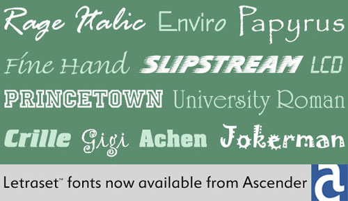
Apart from picking some seriously tacky typefaces to show (and not tacky in a good way), the problem here is that two of the font names are misspelled, as even Ascender’s own E-commerce site will verify.
- Crille is actually Crillee (tied with Serpentine in frequency of use for action movies, “mixed martial arts” fight posters, and techno albums).
- Achen is actually Aachen.
The distinctions to be drawn between House and Ascender mostly have to do with personal skill. These companies are what their people are. But Ascender is what it is because it draws from the tainted well of Microsoft. Just as Microsoft users are the most likely to top-post, pretend that Arial is really a typeface, or be unable to typeset a quotation mark, Microsoft’s arm’s-length type vendor is the most likely to get the names of somebody else’s fonts wrong.