Finally. Since the rest of them pretty much do.
 The Wayfinding Handbook: Information Design for Public Places by David Gibson is meant for students. It’s somewhat elementary, but that is a relief compared to other books, which assume a degree of reader expertise and lovingly indulge in detailed exegeses of claims that are just incorrect in the first place.
-
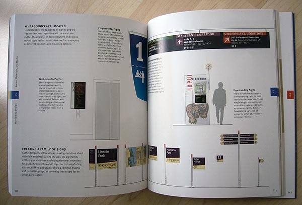
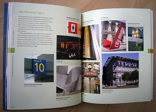
It’s a tale told mostly in pictures. I’m amazed by the breadth of examples Gibson dug up – and the fact that the signage displayed is crystal clear even in reduced thumbnails. (Gibson is Canadian but hasn’t lived here in a while. That may explain why he thought the Astral Info-to-Go advertising panels were worthy of inclusion [mislabelled as “Information kiosk”].)
-
There’s a lot of explanation about how to bid on contracts, something I haven’t seen before. And I’d never seen the corporate, university, or other “campuses” broken down into four wayfinding models.
-
The book turned me into a believer in a bit of whimsy in one’s signage. Or just something other than perfectly legible type at all times. (In other words, keep the TTC font on subway walls. But I believed that already.)
-
I learned a lot from the discussion of sign materials and fabrication processes.
-
And, refreshingly, the book is very well designed and apparently free of typos. (Typefaces: Meta; TheMix.)
Sins
-
The focus on students is undermined a couple of ways.
-
I expect few students will be part of a team bidding on a major sports arena, a practice area discussed over and over again. Fun, high-profile, and guyish, but actually quite rare. Still, I can see the counterargument: These jobs are so rare that they aren’t documented at all. They’re redone from scratch every time; there’s no institutional or professional memory for the genre.
-
The typography chapter uselessly recaps serifs, ascenders, x-height and other type basics I have read in 40 other books. (Students should know all this already. If they don’t, this is not the place to find out.) Egregiously, the book leaves the impression that essentially all roman typefaces are equally legible for signage. One must take care not to assume a font will solve your signage problems, but choosing just any font will probably worsen your problems.
This chapter is a serious dereliction of critical duty. We don’t need to learn a little bit about everything involved in typography. We want to know what works and what doesn’t and why.
Then there are other errors, like misnaming oldstyle and lining figures (the latter as aligning).
-
-
Gibson claims “there are no hard-and-fast rules” for colour. Oh, yes, there are. Since 4% to 8% of the male population, and some females, cannot distinguish red/green/orange, there definitely is a rule not to use confusable colours. All the colour-coded signage designs featured in the book do that, and, worse, often use minor variations of the same colour.
I don’t know why this isn’t obvious: Colour-coding schemes have to use unconfusable colours whose names everyone agrees on. Paul Arthur, Effective Environmental Communication Design (manuscript):
The first principle in selecting colours for signs, if colour coding is involved, is never to use a colour you cannot name: blue, green, purple, grey are in, while heliotrope, puce, and turquoise are out.The former are in, simply because blue (whether dark or light) is likely to be called and, therefore, recognized as blue by most people, and similarly with green. The latter, however, are out, because no one knows what puce looks like and as many people will call turquoise blue as will call it “green” (and almost no one will call it turquoise).
Namable colours are: red, yellow, and blue, green, orange, and purple, brown, pink, and beige, black, white, and grey. Twelve or so in all – including red and green that you shouldn’t use if you can possibly avoid it, as they ought to be reserved for safety purposes.
Or why not just use the fabled Brewer palette?
-
There’s an amazingly bitchy guest sidebar by Leatrice Eiseman, who “heads the Eiseman Cent[re] for Colo[u]r Information and Training and is executive director of the Pantone Colo[u]r Institute.” I think it has something to do with how her pan-global audience research always results in globally applicable findings, and if you can’t explain your colour choices to your client, you must not be much of a designer.
A similar sidebar, twice as long, by a sign fabricator reads like an ad for that fabricator.
-
I see a dozen pictograms from the Olympics (a cliché at best), but I have a hard time taking any such listing seriously if it leaves out the best Olympic symbols ever: Lillehammer’s.
-
The book also commits the sin of further confusing the terms “signage” and “wayfinding.” These days those words not only are interchangeable, they have mated for life: signageandwayfinding. Signage is a collection of signs. Wayfinding is a process of the mind. Except now I guess wayfinding is just a more recherché word for signage. It has more syllables, so it has to be more precise, I gather. The fact that it’s just wrong in that sense is not discussed in the book. I’m going to lose this battle, of course. Eventually the two words will have exactly the same meaning.
Value-adding fact
David Gibson dedicates the book “to my domestic partner, Rich Kiamco, whose love and support keep me going each day.” So there you have it: An homosexualist graphic designer, a creature as rare as an albino alligator.