Web Typography Sucks is the (surely hyperbolic) title of a presentation by one’s esteemed colleague Richard Rutter (the calm one at ClearLeft) and Mark Boulton, whom I believe I’ve not yet met and whose talent for malapropism has rubbed off onto Richard.
Shall we look at one set of slides from their gigantic PDF “deck”?
![' " Anybody recogni[z]e these characters? These are primes](https://fawny.org/blog/images/webtypography-sxsw2007-notes-primes1.gif)
No, they are not. They’re neutral quotation marks, a relic of the typewriter age.
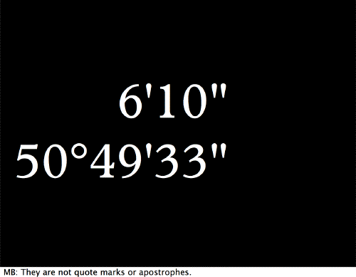
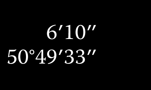
That’s exactly what they are. What they aren’t are “primes.” ′ and ″ are prime and double prime, and they look like this:
Other than that, smashing presentation.