Borked Unicode: Tips for journalists on Unicode and writing clean copy

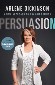
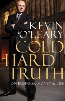
How the Globe’s nonexpert, Courtney Shea, assesses two business-book covers that are so unoriginal and rote they could in fact have been designed by algorithm.

‘Persuasion’ cover ‘Cold Hard Truth’ cover
With the aqua lettering [“lettering”!] and Dickinson’s ethereal wardrobe choice, the book, at first glance, looks like The Secret for 2011 audiences. Too bad Oprah wasn’t around to trumpet it. [Oh, snap] With his imposing stance and thick, gold-embossed lettering, the look is very Art of the Deal. (Thankfully, O’Leary didn’t feel the need to imitate Donald Trump’s hairstyle.)

The foregoing posting appeared on Joe Clark’s personal Weblog on 2011.09.18 14:31. This presentation was designed for printing and omits components that make sense only onscreen. (If you are seeing this on a screen, then the page stylesheet was not loaded or not loaded properly.) The permanent link is:
http://blog.fawny.org/2011/09/18/coldhardpersuasion/

Values you enter are stored and may be published.


Search for very early blog entries, and for anything else on fawny.org:


Information

Other reading

FriendFeed puts everything in one place.

Popular topics

Photographs to look at · Typography; graphic design; the death of design criticism · Leslieville · TTC · Canadian English · Accessibility

Archives by date

Just add /year/month/day/ to the end of site’s URL, blog.fawny.org. You can add just /year/month/, or just /year/, if you wish. Years are four-digit, month and day two-digit (with padding zero below 10). For example:

Very old archives are still available.

Archives by category

Copyright © Joe Clark 2004–2012. All rights reserved.

You enjoy fawny.blog