It isn’t in dispute that Wired (U.S.) is the best-designed consumer magazine. Possibly just the best-designed magazine, period. I would certainly go so far as to say the latter. Even Eye, the graphic-design magazine that fears and loathes the Internet, admits its genius. Can we be real here? This is stunning work.
Credit for Wired’s design triumphs goes first to the smartest designer on the West Coast, dapper Mr. SCOTT DADICH (video), and a flotilla of designers who should really be as famous as Dadich.
Online early, atrocious always
Wired was online very early with a gopher site (≈1993–1996), then with many instantiations of Web sites. The magazine has always blown it when it comes to Web design, as esteemed colleague Jason Santa Maria has previously detailed. (Other magazines have made the same mistakes.) Now Wired has blown it in a completely new way with its iPad app. (I haven’t seen or used it, largely because I seem to be the only person on my peer group with no definable use case for an iPad. I have to rely on firsthand accounts and Wired’s own announcement.)
Critics wonder if book and magazine iApps will become the CD‑ROM of the Aughties
What they should really be wondering is why the Wired app has already become a Web site from the Nineties. Well before Web standards and Webfonts retrained design thinking, print designers who begrudgingly worked on the Web demanded absolute control over typography. That’s something they can’t have, a lesson some refuse to learn even today. But a decade ago, the more famous and self-impressed the designer, the more likely the Web site to be rendered as a picture of text. (That trend was later usurped by Flashturbation.)
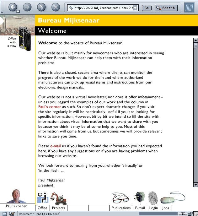
A good example was that of Bureau Mijksenaar, the Dutch house that does a lot of work in signage. Circa 2001, its homepage really was a picture of text.
While the current site doesn’t have the best code in the world and uses Flash graphics here and there, it at least reads as a Web site in more than one sense.
Wired.app does not read
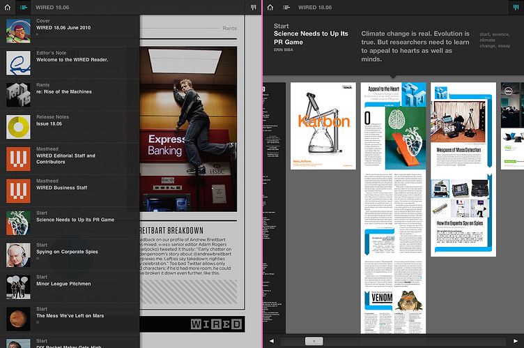
Even the Wired Web site circa 2001 wasn’t as bad as that design firm’s. But its iApp today really is worse, isn’t it? There’s so-called “interactivity” wheatpasted on top like graffiti fingered onto a dirty hatchback, but everything you’re looking it is a picture of text. A picture of beautifully typeset text, but a picture nonetheless.
There’s no live text, meaning there’s no search. It also means there’s no accessibility on the first computers that are accessible by default if you the developer do no extra work at all. (Follow the spec exactly and your app is accessible right away.) Think of how much effort it takes to blow an opportunity like that.
Jonathan Hoefler designed the typeface and gamely sticks up for his client, but surely he realizes he’s defending a turd. Anyone with a copy of InDesign and good type skills, which admittedly take a decade to acquire, can produce a PNG export of type that is set as nicely as Wired.app’s. But it’s still a picture.
Now Adobe wants to monetize this nonsense
Using a Microsoft-like facility for descriptive yet forgettable product names, its “Digital Viewer technology” creates “a digital magazine format” made up of pictures. Twice I asked publicist Russell Brady how this output differs from exporting a PNG from Acrobat, and twice Brady refused to answer. (He didn’t ignore the question. He just didn’t answer it.)
If you want to “publish” a “magazine” as an “app” consisting solely of flat image files, you can already do that quite handily right now with a copy of Acrobat. It won’t have Wired’s cachet, but as we’ve seen, the magazine of the digital revolution does everything wrong when it tries to visually express itself in digital form. Whatever Wired does online and on the iPad, you should do the opposite. Wired.app proves that even a smart magazine with a crackerjack designer has yet to come to grips with what a “digital magazine” really is.
Wired worked night and day and all it did was paint a still life of a magazine. The Wired app is a stag’s head hung over a mantelpiece, a pitiful reminder of a formerly living thing.