Another issue of Eye riven with mythmaking and contradiction.
Structurally, what is Eye doing?
 Structurally, Steven Heller’s piece about “US picture magazines of the late 1960s and 70s” (sic) is an argument for the perpetuation of the failed genre of graphic-design criticism that Heller himself dominates. (It’s also one of Heller’s two articles in this issue – plus a book of his got reviewed.)
Now: Why?
The full dek for the article is as follows (copy errors and lack of italics corrected):
New York magazine, Esquire, Ramparts, Show… U.S. picture magazines of the late 1960s and ’70s are still a vital source of inspiration
Here’s what this actually means.
-
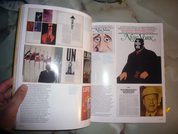
Any full‑ or double-page selection from a magazine, and essentially any magazine cover, that is dominated by a single image reduces beautifully into a photograph on the page of Eye. Photos that big work even in small sizes. But a discussion of body-copy typography – among many other design features – is functionally impossible in this format, hence cannot be held up as “a vital source of inspiration.”
-
As cultural theorists say, the use of big pictures privileges big-picture usage in design criticism. (For analagous reasons, minimalist movie posters work great online.)
-
To this day, design magazines keep churning out the same kinds of articles they’ve churned out since those “U.S. picture magazines” were current. I’ve been reading these articles since my teen years poring over the newsprint pages of U&lc. Far from being “a source of inspiration,” they’re a ready-made means of filling a magazine’s feature well.
(In a similar vein, how many weeks do you have to wait before you run across yet another interview with George Lois? Didn’t the last one come out in mid-September in Gym Class?)
“U.S. picture magazines of the late 1960s and ’70s” are what now-aged designers and critics grew up with. They’re the norm, the default. Like popular music, everything that came after them pales by comparison and barely qualifies as such in the first place.
(That music the kids are listening to – it’s just noise.)
Endless spreads on magazines from the middle of a previous century amount to lecturing a younger generation of designers on what they should consider important. (At these kids’ age, their parents were barely interning for Vignelli or Chermayeff or Bernbach.) It is, to borrow another phrase from cultural theory, a form of manufacturing consent.
Standbys of the design press
-
Eye falls back on another standby of the design press that reveals a structural failing: A pointless profile of a designer of film titles. These profiles are pointless because you cannot actually depict film titles on the printed page. (We’ve been through this already.) Also structurally, the effect of such profiles is to boost the business of the subject; it is a form of official imprimatur.
This time the lucky winner is Momoco. I’ve seen their work and I think it’s boring as shit and derivative of Saul Bass (e.g., in the titles for Zen). They’ll be earning more business nonetheless. (Surely earning it is what they will have done.)
-
A second crown of laurel leaves was bestowed in this issue, this time onto Sara De Bont, a perfectly banal Belgian with a fondness for big type in architectural applications. (Keep at it, Sara! Someday Paula Scher will retire and you can take her place at Pentagram.) She gets a dozen pages.
-
But the Greatest Hits of Design Magazines just keep coming! Immediately after the Momoco panegyric one finds an illustrated spread on the use of handwriting in design illustration. Don’t worry: You’ve seen these examples before. And if you haven’t, another one just like them will show up on a construction hoarding near you in no time at all.
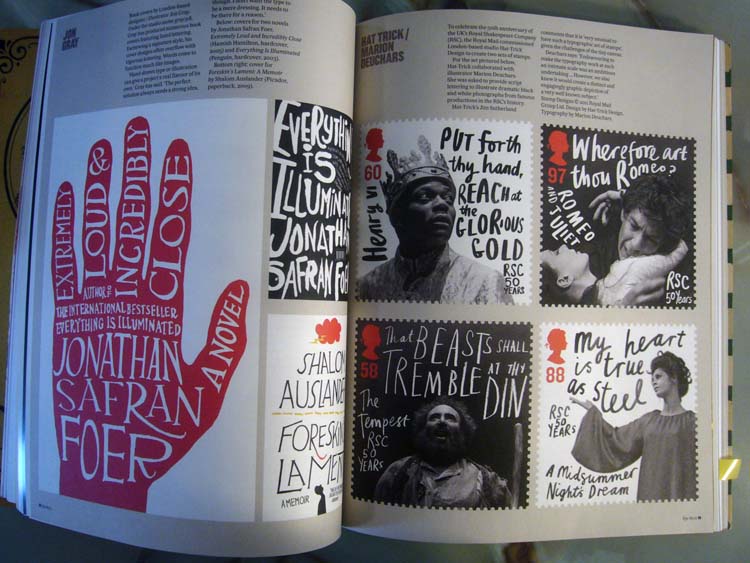
Post–Keith Haring, it borders on impossible to look at illustrations like these and not conclude they amount to a solution in search of a problem. (Baffled by a design brief? Apply the instant “street cred” of unschooled handlettering.)
-
I assume the irony of following up this feature with a profile on Alejandro Paul’s fanatically detailed script typefaces escaped the notice of Eye’s editor-for-life, John L. Walters. (That profile’s illustrations, on heavy card, were minimalist when maximalism was called for and were a waste of time. But, as with large-format photo magazines and hand-scrawled advertisements, low-detail illos like these look dramatic on the page.)
-
Since I’m talking about irony, here is a question posed to Robin Kinross in this issue’s profile of him:
Your use of images as a publisher has developed over the past 20 years. The Neurath and Tschichold books are highly visual productions with a lot of images. But in a letter to Eye in 1994 [Nº 12, Vol. 3], you critici[z]ed the “doll’s-house effect of reduction.” You seemed at that point to regard reproduction of design work as inherently dubious.
I see nothing’s changed. Structurally, it cannot, because to do so would knock the legs out from the entire micro-industry of design magazines. And it would put John L. Walters out of a job.
Items that work
-
Johnny Hardstaff (no relation) writes a solid two columns about his lifelong dream of “the designer as instigator” – a recasting of my recurring observation that the Web has, for the first time, enabled graphic designers to produce what artists have called personal work. But Hardstaff (still no relation) takes the concept further, claiming that clients, even in advertising, are much more willing to trust a designer’s own desires.
Isn’t self-directed design – either with a client paying for it or sold for a profit online – the modus operandi of the most interesting design shop in the world, Berg?
-
The only thing that made sense in (highly unsympathetic) Gerry Leonidas’s piece about “page-layout programs” is his observation that angle of incidence makes a difference in evaluating an object: “There is something to be said about looking at things at 1:1 scale, and at the same angle as your readers.”
Actually, I’m doing him a disservice here, because he does make sense in other places.
Instead of a positive value, explicitly marked as an element of the composition, space becomes the leftover of systems that handle boxes where dark bits flow in…. And the visual edges become subservient to structural ones…. [P]lacing at an angle is not the same as rotating something that always starts out straight.
But really: “Palettes are evil”? A throwaway line, but you can use a nail clipper as a shiv if you want to. I understand the structural criticism of layout software and I violently agree that defaults influence behaviour, but please: Sometimes a toolbar is just a toolbar.
-
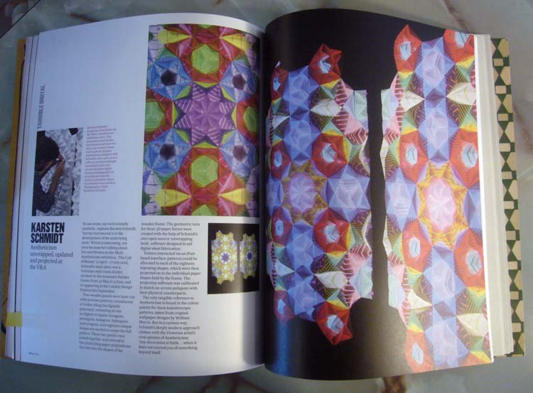
Carsten Schmidt’s generative designs that actually are not quilts:
Alice Twemlow: If I’m going down, I’m taking you with me!
A close runner-up to the title of chief defender of the dying genre of graphic-design criticism, graphic-design critic Alice Twemlow actually runs a graduate program in graphic-design criticism. And right on cue, she uses the pages of a graphic-design-criticism magazine to deplore the other medium she uses for graphic-design criticism, blogs. I see nothing ever changes with these people.
You would have thought that blogs would have afforded more analysis and interpretation of regular and mass-market design…. And yet, all the blogs seem to do is to document and catalogue images of these things. Lists… and collections rarely convey meaning, and they do not contribute to design discourse.
She writes this in a squib with no pictures. Twemlow seems to be doing three things at once:
-
Excluding Design Observer (q.v.) from the discussion, since that site is all about endless streams of words but no pictures or lists, and anyway, she’s a writer there
-
Mistaking Tumblères for blogs in the classic sense of the latter
-
Ignoring the value of seas of pictures, which value Heller elsewhere extols and which has a long and storied history.
If nearly-all-pictorial treatments didn’t work, then last year’s best design book wouldn’t have been 100 Years of Menswear. And I wouldn’t be learning quite so much from Tumblrs that do nothing but put dozens of photos of the same thing in my face, my favourite at the moment being Fuck Yeah(,) Brutalism. And I wouldn’t have learned so much just from looking at pictures and reading hundred-word cutlines in Jencks’s numerous books about postmodern architecture.
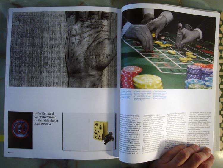
But here’s the kicker: Near the back of the book is an encomium to “Peter Kennard’s angry, wordless montages” – in effect, to Kennard’s series of political picture books that stand smartly in the tradition of everything from Polish activist posters (endlessly anthologized in the design press) to Powers of Ten, antecedents conveniently forgotten in the pursuit of making a point.
Alice Twemlow isn’t happy unless there’s an abundance of design criticism in the world, all of which looks, acts, and reads like a master’s thesis. The irony here is that I have been quite surprised by the originality and unstuffiness of the work of her program’s graduates.
Meanwhile, in another part of the forest, the inevitable Rick Poynor praises John Coulthart’s Feuilleton, a blog made up mostly of pictures and cutlines. But important pictures (“many luscious images… a refined, inquiring, complex[,] and original sensibility”) and well-done cutlines (“a fine writer”).
(Bonus points for Poynor’s revisionist history of the man whose history Eye revises quite often, Barney Bubbles.)
Other articles
-
I didn’t even bother counting how many “interviews” in this ish were obviously carried out over E-mail. But I’ll say again that nobody talks in parentheses (p. 39: “going back and forth with him as we tried to reinvent our [well, his] style”).
Actually, I suppose I should be interested in that interview, with soi-disant “lazy” Bloomberg BusinessWeek designer Richard Turley. Calm the fuck down, people: It’s just another magazine typeset in Helvetica. And that’s exactly the impression you’re supposed to get:
[T]hat font choice was really far more about being bored with custom typography at the time. I just wanted something that didn’t surprise anyone and was just a typeface, rather than a branding exercise. I just chose the most obvious idea for a font. I didn’t think about it for long. In fact, pretty much as soon as I put the phone down after being asked to submit a pitch, I thought I’d do it in Helvetica.
Brody did the same at – and more or less said the same about – Aréna Hommes +.
If we take this magazine’s creative director at his word, what is the basis for a profile of it in a design journal? It has a lot to do with how nice BusinessWeek’s pages look in thumbnail.
-
Sue Steward’s cri de cœur about the demise of legitimate or high-status photography was weak and unconvincing. In fact, I’d say it’s self-contradictory, lamenting the loss of touchstones of the past (darkrooms, Polaroids, Kodachrome) while praising students for rediscovering those, a trend so small it couldn’t even be called micro.
-
Parametric design – paging Su – produced 10,000 unique covers for a paper sampler, Walters tells us in a quick piece with ironically great illos. But all 10,000 were vetted: “I am convinced the designer’s eye is the most important thing,” says codeveloper/codesigner Vera-Maria Glahn.
-
Now, this is the kind of design-history minutiæ I can get behind: Alex Cameron bangs out a quick review of A Symbol for the Festival, viz “Abram Games’ Britannia symbol for the 1951 Festival of Britain.”
-
In an inversion of the natural order, Rob Waller’s excoriation of architects’ refusal to design for inevitable signage – an instant classic – works much better in its companion blog post than online or in the pages of Eye, where it is pointlessly illustrated by a custom drawing instead of incriminating photographs.
That words, whether in signs or captions, are an admission of failure seems to be quite a common belief – the utopian vision of universal communication is largely pictorial (viz numerous discussions of data visuali[z]ation). But language is the supreme human ability. I am happy to see words on the door if it avoids the humiliation of trying to push when I should have pulled. And I would rather see the word “Paris” in a film if it averts the accordion music.
-
Yet again a British design publication acts as though everyone knows what “CND” refers to. The Neville Brody books took this to insane extremes. I pored over every word looking for an expansion of the acronym, but there wasn’t one, and there was absolutely no way to look it up in the era those books came out. It is such a deep-seated assumption that graphic designers are opposed to nuclear power that obviously every possible reader knows the Coalition for Nuclear Disarmament by abbreviation.
Ah. No, I see it’s actually Campaign for. But nobody else is going to make that mistake, obviously.
-
Worst paragraph in the history of graphic-design criticism (in a review of a St. Bride conference):
Rick Poynor [already off to a bad start] interrogated curatorial practices as a three-dimensional spatial interpretation capable of creating and establishing connections, “layered like a magazine spread.” Simultaneously, he established a defence of the “white cube” and the realism of accepting easily-graspable narratives as a necessity in the task of communication – a thought that raised questions about student, professional and general publics and whom the writer is hoping to entice and inform.
Here’s to you, Jim Aulich.
-
Little squibs about design conferences, published months after the event, are a cœlecanth of the publishing industry that, like stock and TV-program listings, need to be eliminated right away. I’ll take a half-dozen liveblogs (but absolutely not a stream of disconnected Twits) any day. I should know: Nobody does liveblogging better than I do. (Runner-up: Adactio.)
-
And whatever could repel the Toronto reader more than yet another article telling us how famous and important General Idea was and still is, even though they actually were not so at the time and their whole reputation is a post-facto creation?
Production details
-
Page numbers are pretty much illegible due to a too-small point size of a too-condensed font. (In, moreover, bold.)
-
The Momoco panegyric ends with a reference to “stereoscope” (apparently meaning 3D) without ever having mentioned it before.
-
And exactly how many times did this issue use the term soixante-huitards without defining it?