Archive for August 2006
- Angry nitpicking (2006.08.31)
-
In lieu of “sending angry nitpicking letters to the CBC,” I thought I’d use picture postcards
- How many ways can you torture a schwa? (2006.08.31)
-
God, I hate trendy “pop-culture aficionados” who think the word refers to aliens.
![Graffiti on wall reads [rotated schwa]-RAMZ](https://fawny.org/blog/images/Schwa_graffiti_full.jpg)
John Hudson has a paper (PDF) on designing his font Sylfaen in which he lists what he thinks is the complete Cyrillic character set. Ever seen a capital schwa with dieresis?
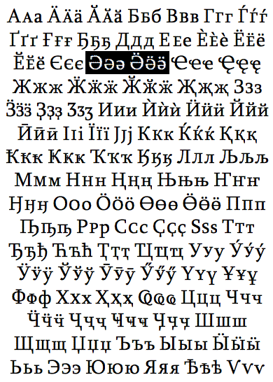
Me neither. By the way, that’s 96 letters. Care for a game of Scrabble?
(Meanwhile, teddybearish Tom Phinney did a lousy job explaining which Cyrillic characters Adobe will include in future fonts, going so far as to type their raw character codes, not the characters, into his blog entry.)
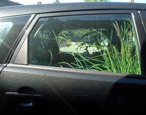
- Matrix of grass (2006.08.31)
-
- Constricting (2006.08.29)
-
Just how hard it is to switch to Strict HTML
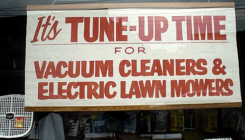
- Surely the best sign in the city (2006.08.28)
-
The green/white/red of the Italian flag, the word “caffé” written thus, and the use of Irish uncial type – all on the same sign.
The only thing missing is German “gothic” type, or maybe Comic Sans.
- All your Mechagodzilla are belong to us (2006.08.27)
-
‘Analyse’! ‘Metre’!
- Words/Lettering in/on/& Buildings/Architecture (2006.08.25)
-
I am methodically reading every remotely plausible book on graphic design and typography that can be borrowed from the Toronto Public Library, the world’s largest such system, with 99 branches. (If you recently went looking for the only circulating copies of Eye, I’m the one who snagged them.) I am, further, ordering everything under the sun from other libraries via interlibrary loan, which fails about four-fifths of the time but is still worth a go.
Recently, I read the three classic treatises on words/lettering in/on/& buildings/architecture (for their titles are merely permutations of those words and you could generate your own): (more…)
- Butler’s Week (3) (2006.08.25)
-
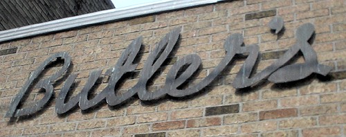
- Butler’s Week (2) (2006.08.24)
-